- aims
- Dépliant
- Aims
- Paris
- Dépliant
- Aims
- Paris
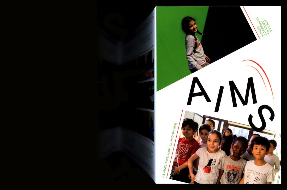
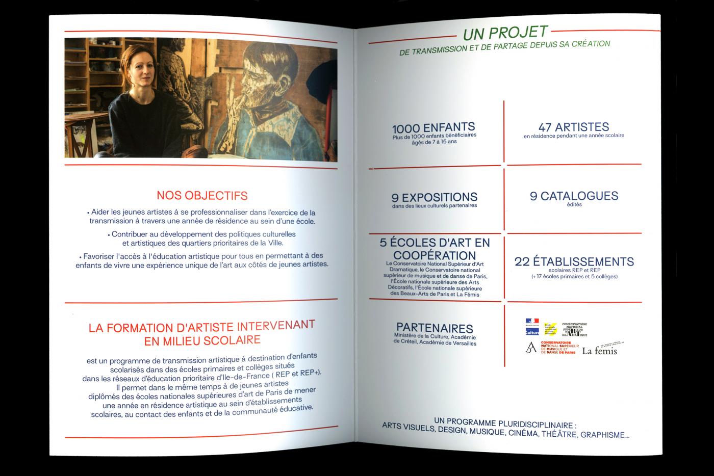
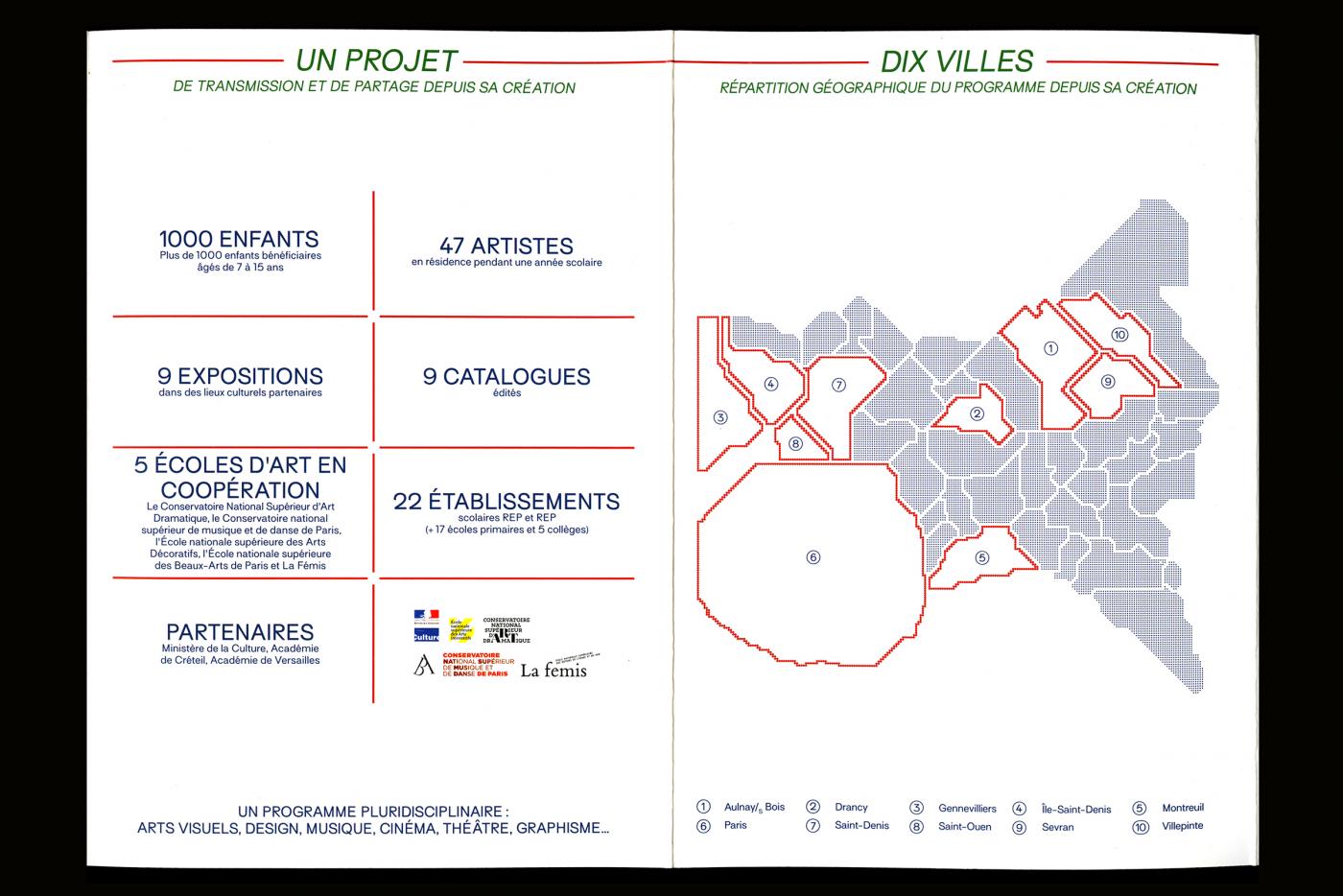
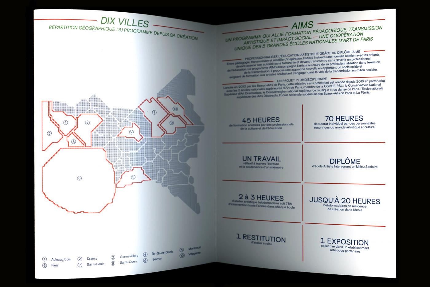
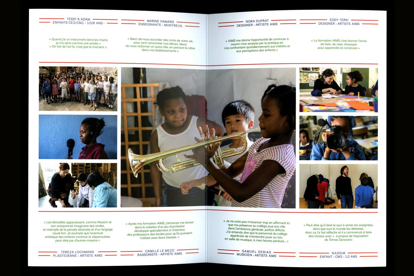
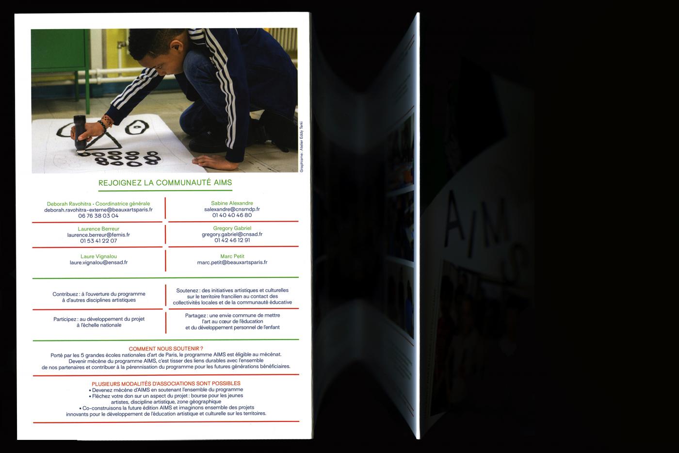
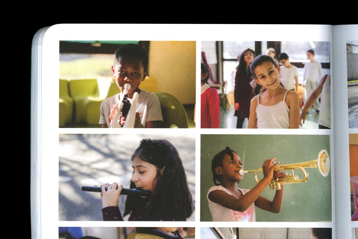
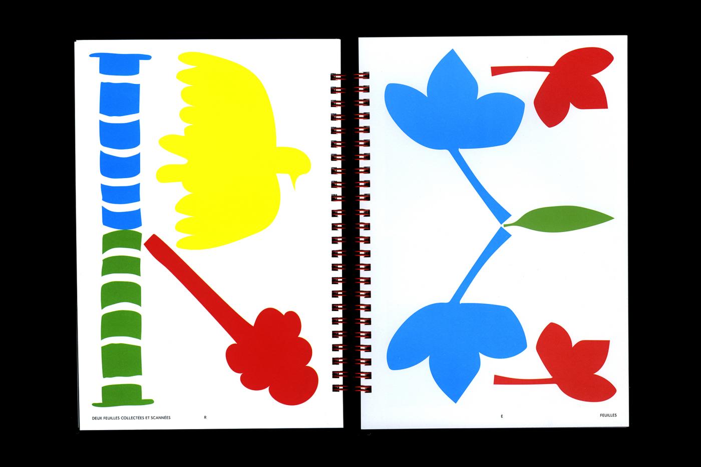
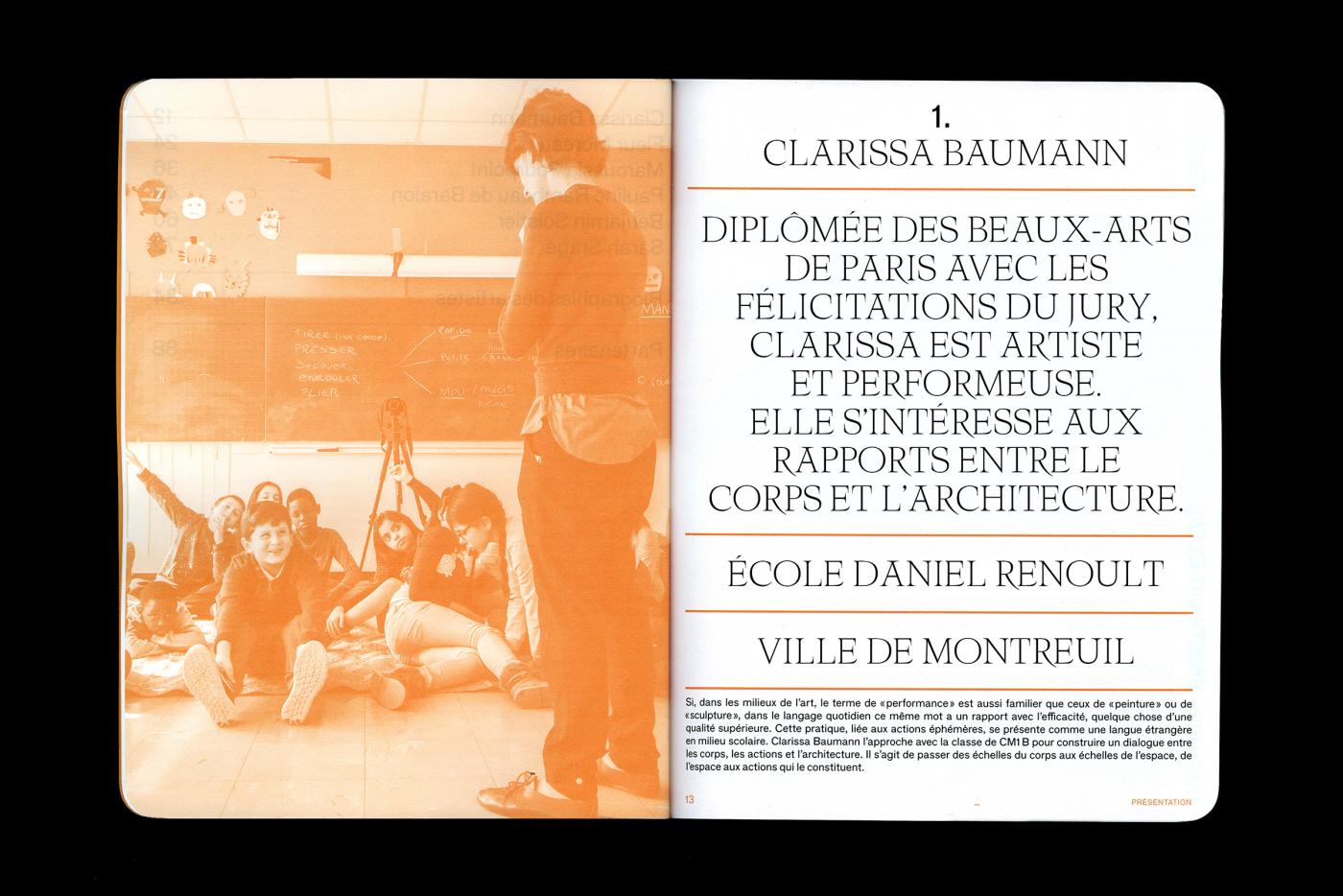
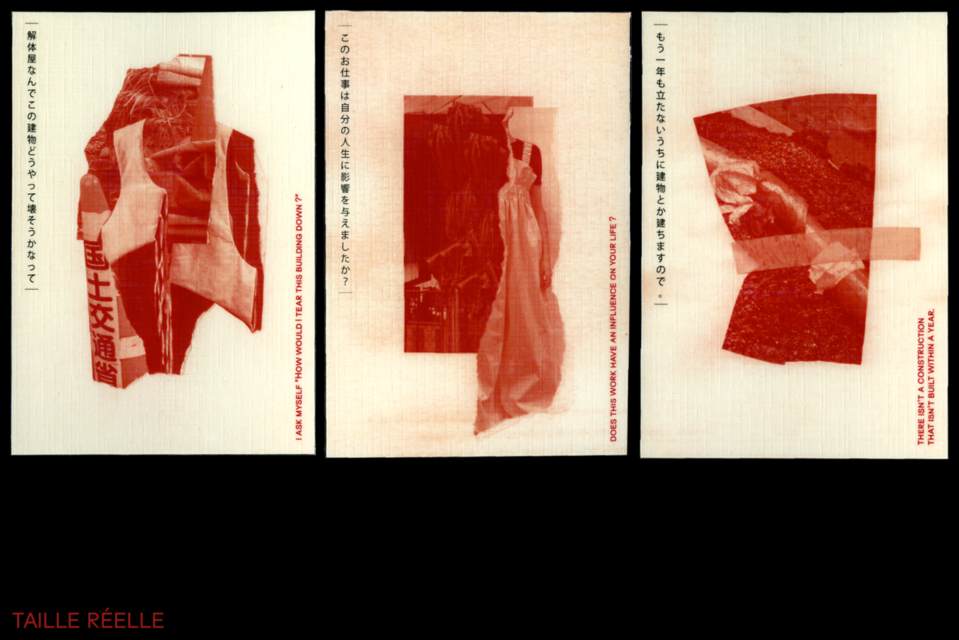
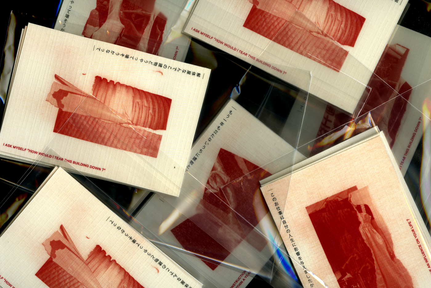
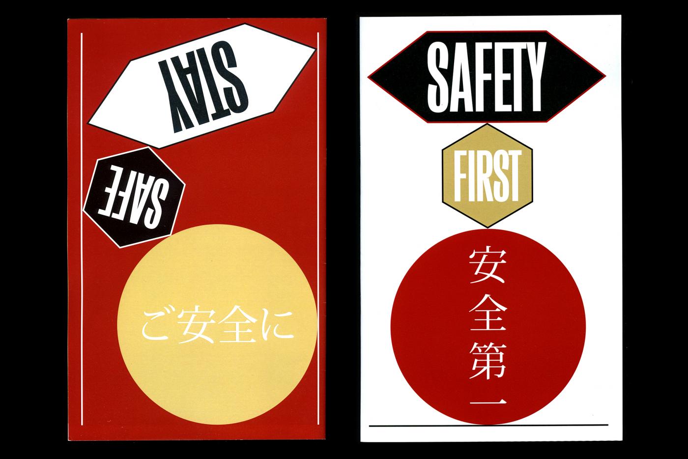
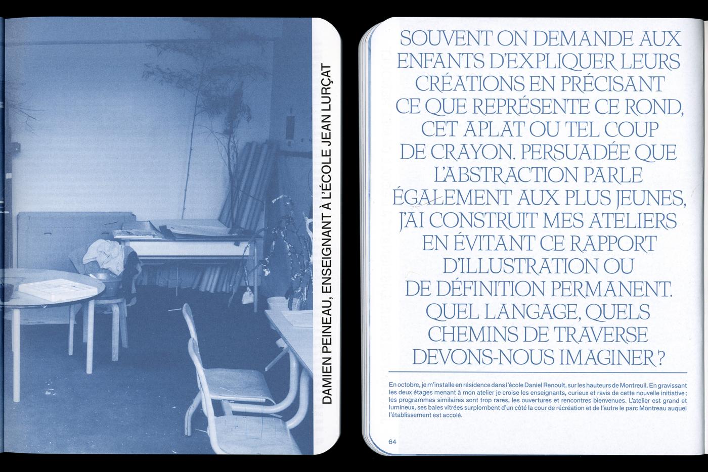
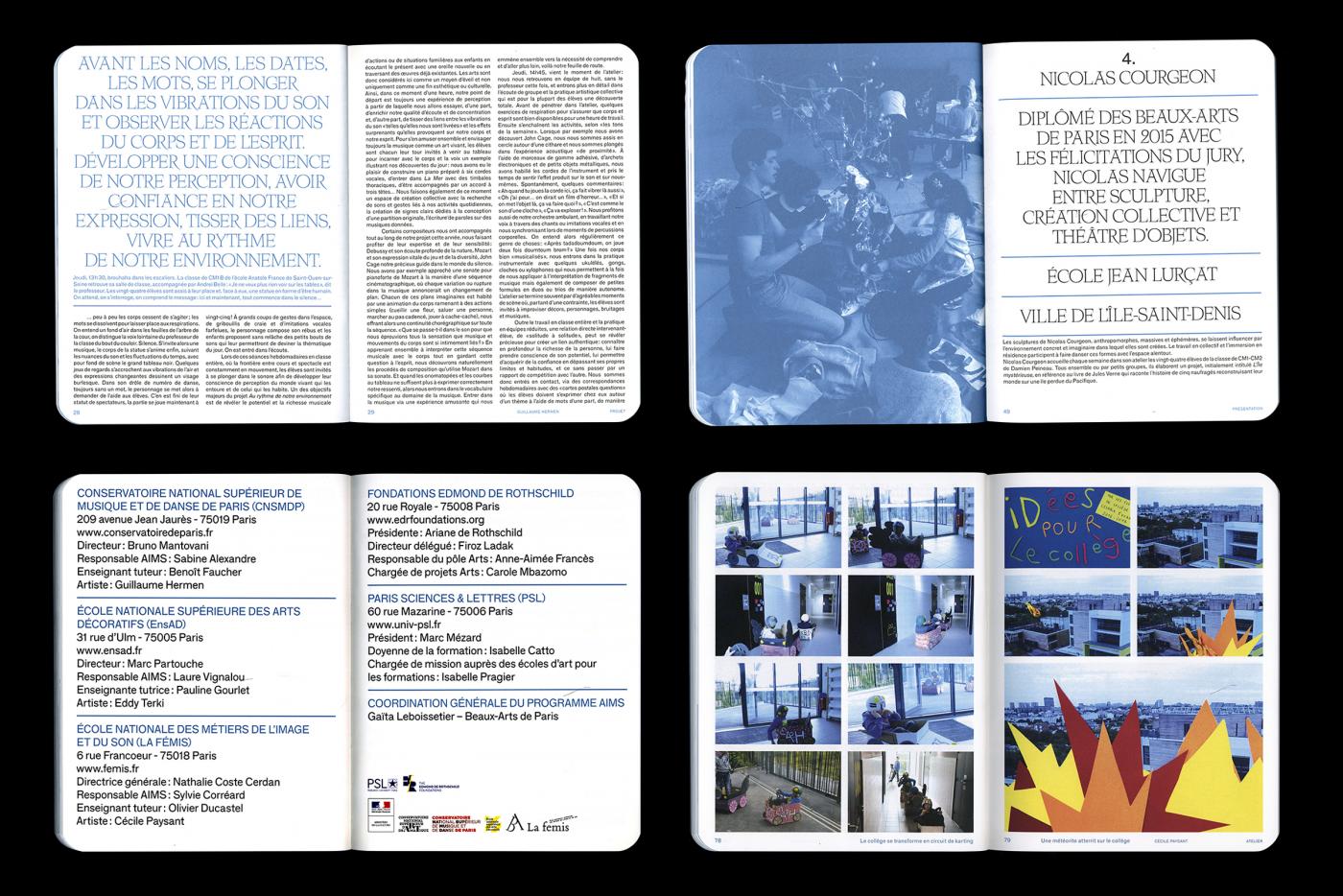
Print for the kids program AIMS with EnsAD-Paris.
- AIMS – Artiste intervenant en milieu scolaire
- catalogue
- École des Beaux-Arts de Paris
- Galerie du Crous de Paris
- catalogue
- École des Beaux-Arts de Paris
- Galerie du Crous de Paris
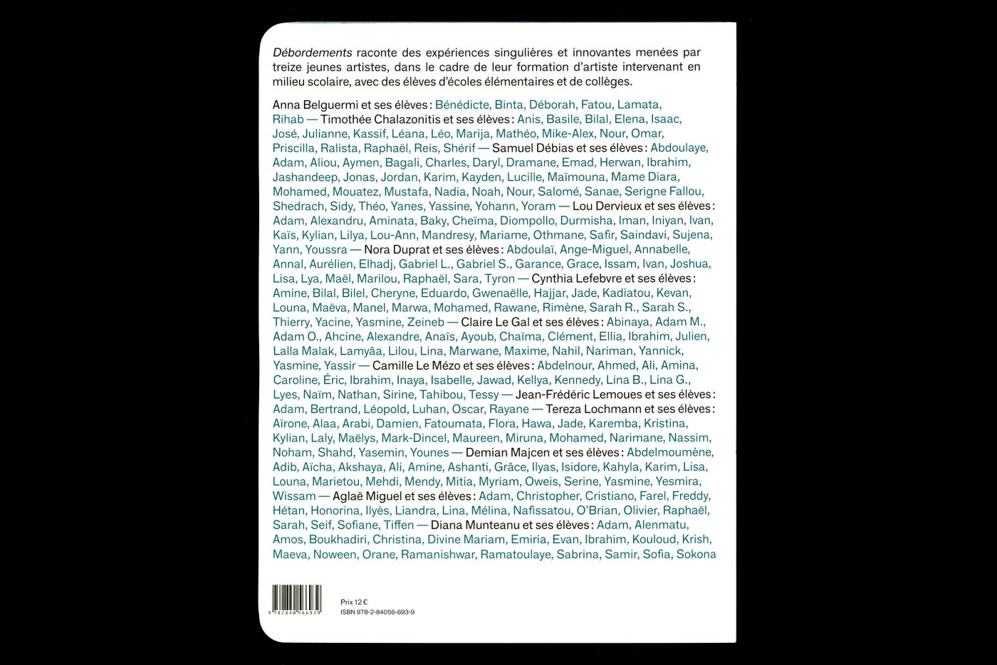
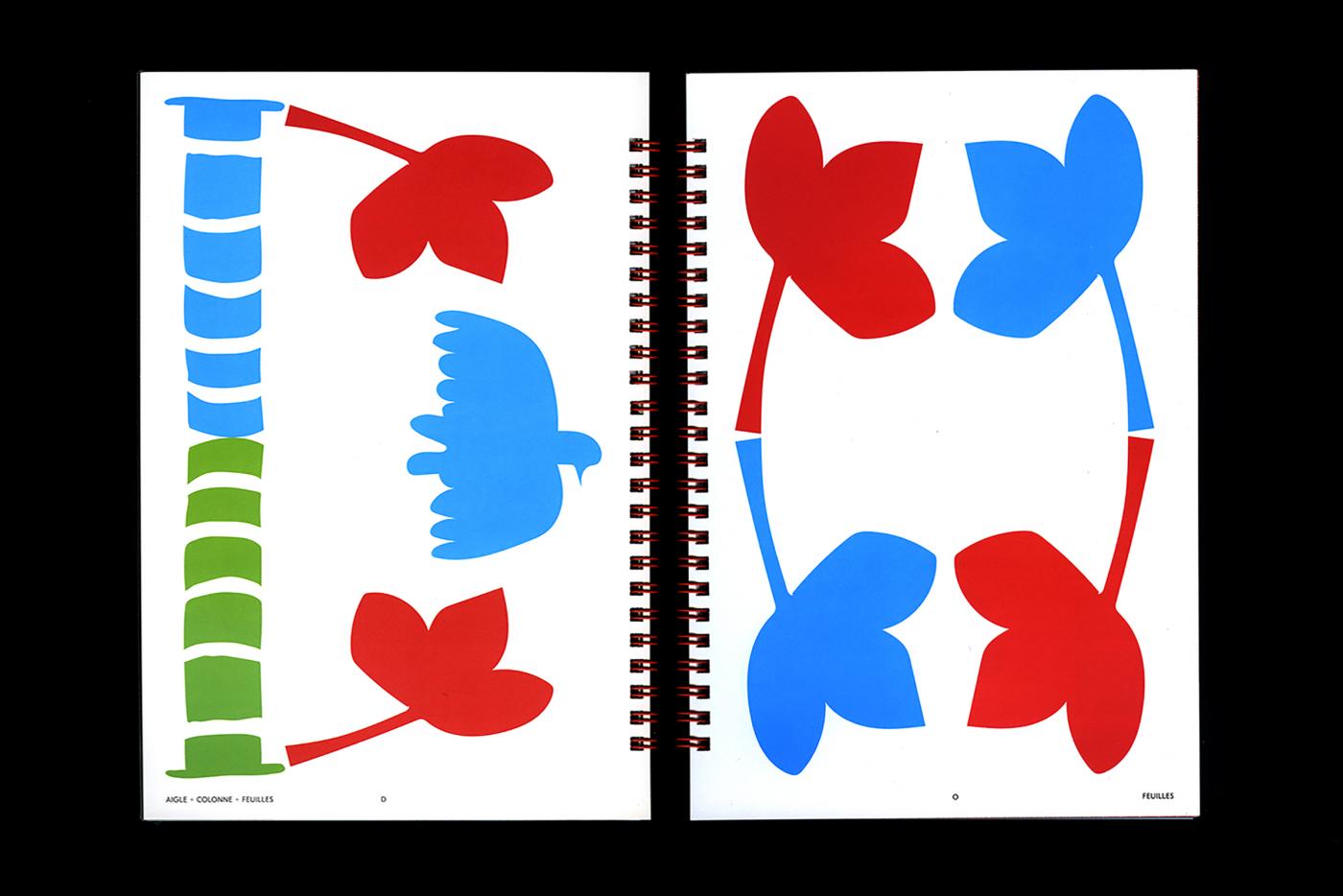
Issue d'une collection dessinée en 2017, voici le catalogue pour l'année 2019 pour l'École des Beaux-Arts de Paris et l'EnsAD-Paris.
- CHEZ•KIT
- Affiche
- CHEZ•KIT
- Paris
- Affiche
- CHEZ•KIT
- Paris
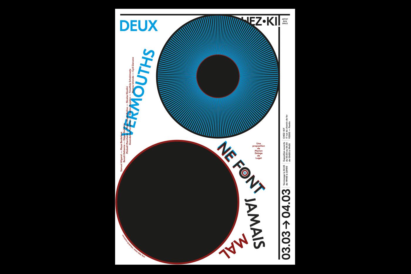
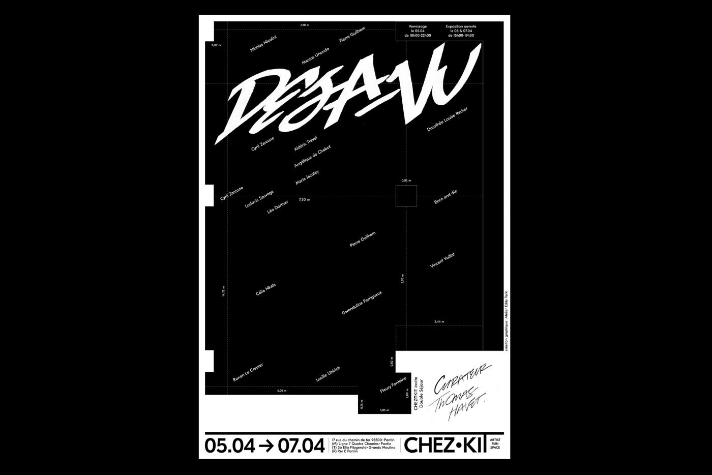
Poster et direction graphique de l'espace de résidence indépendant CHEZ•KIT
- J'habite langres !
- catalogue
- Le Signe - centre national du graphisme
- Biennale de design graphique
- catalogue
- Le Signe - centre national du graphisme
- Biennale de design graphique
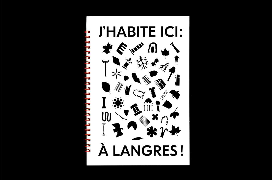
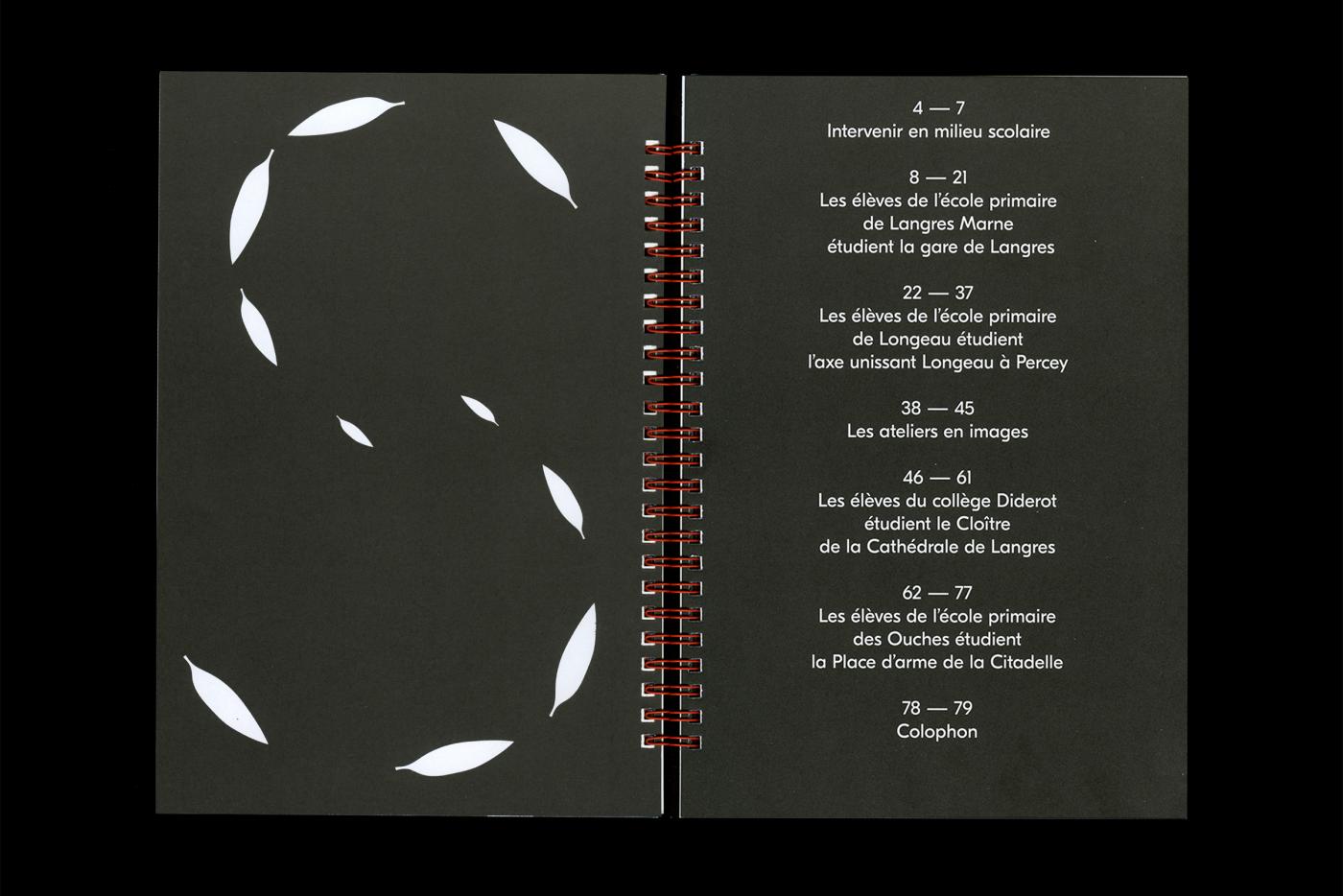
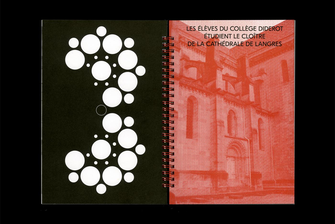
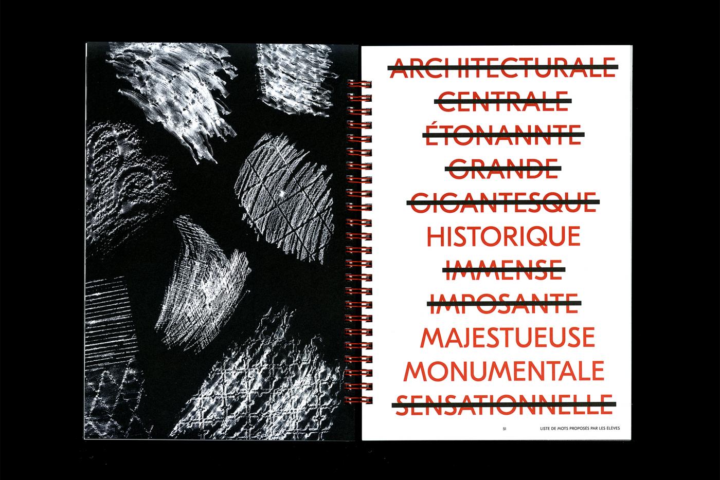
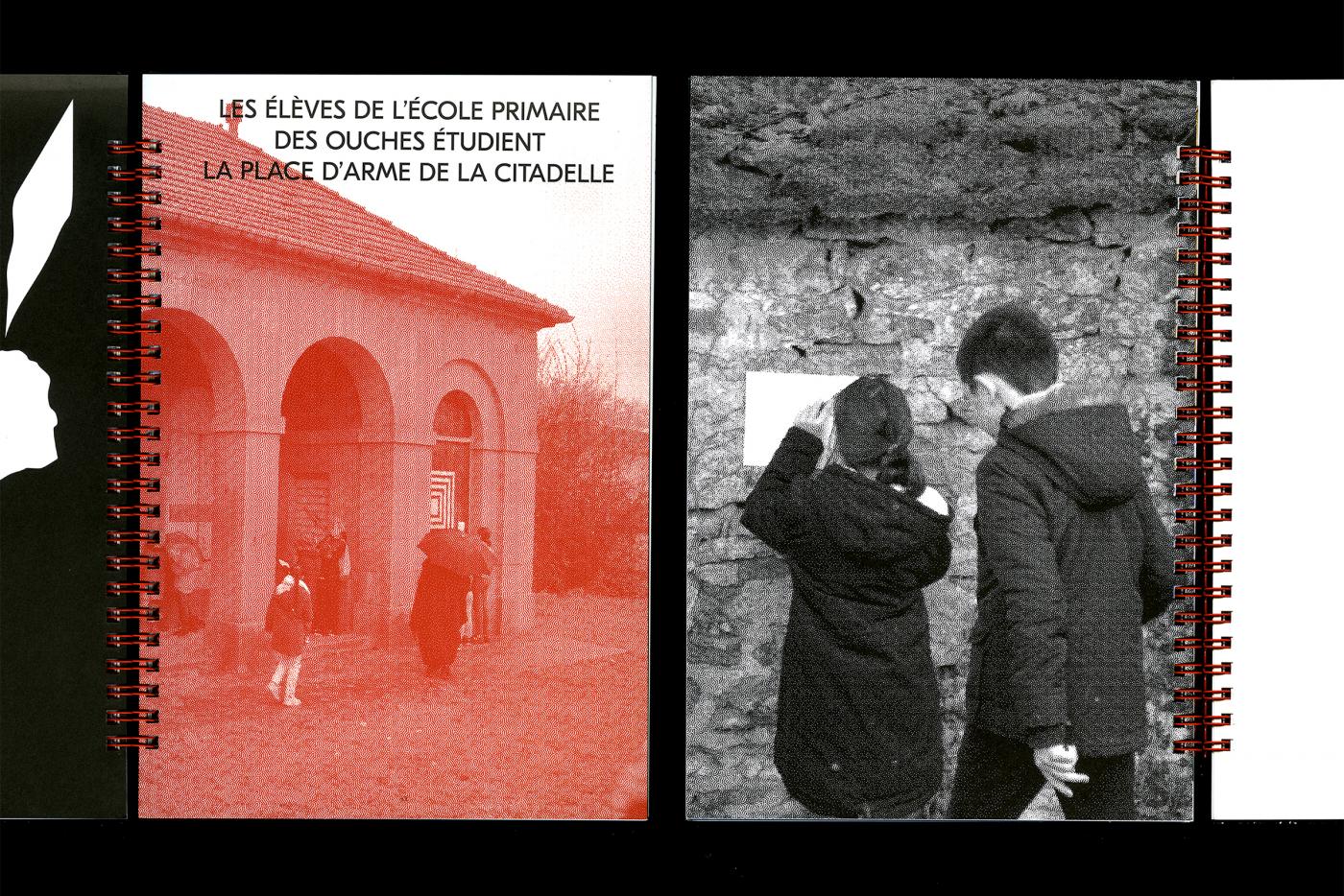
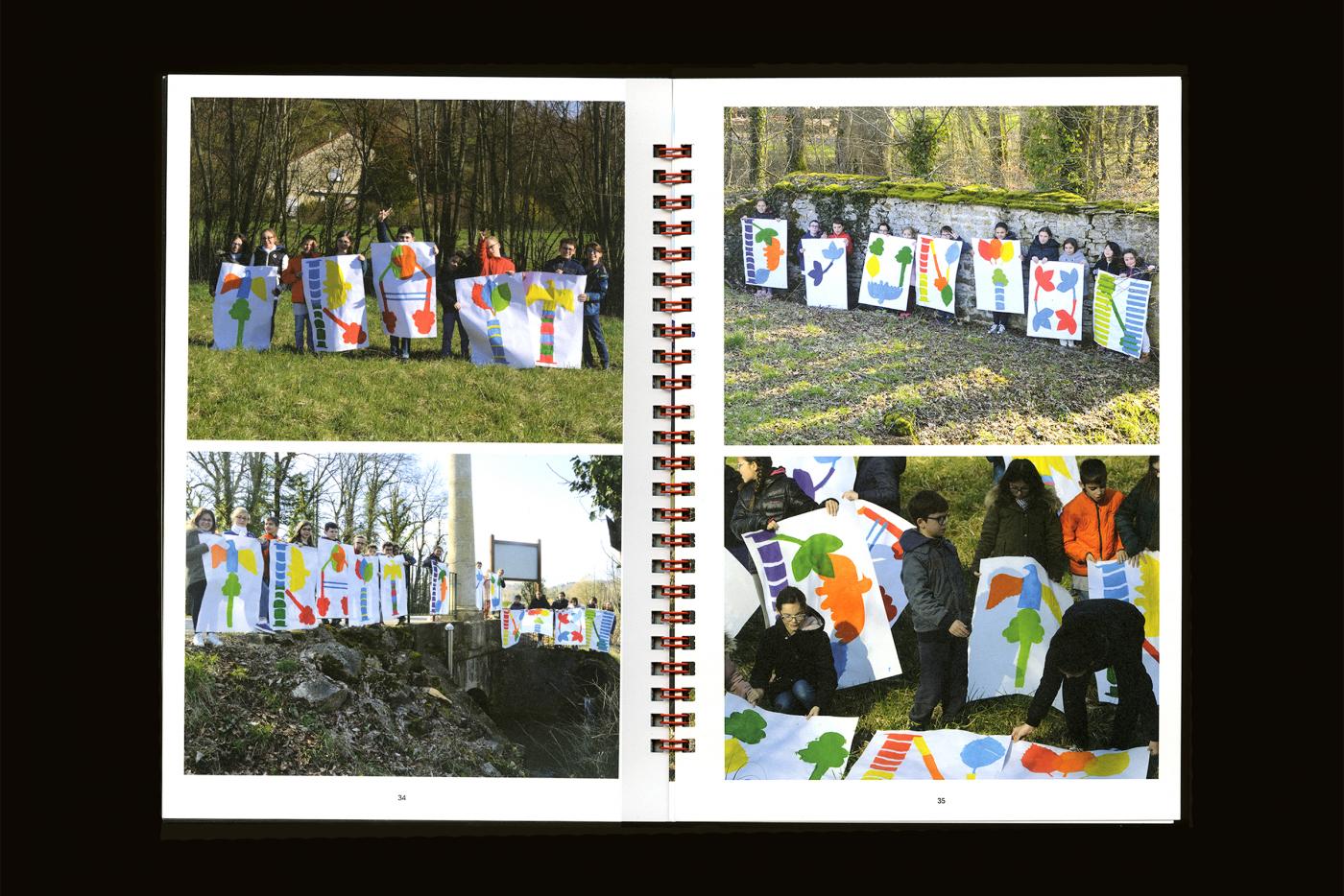
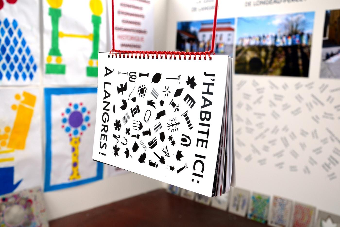
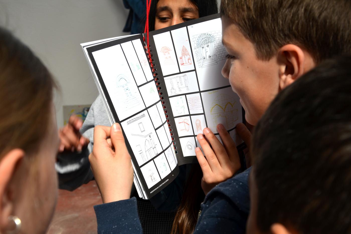
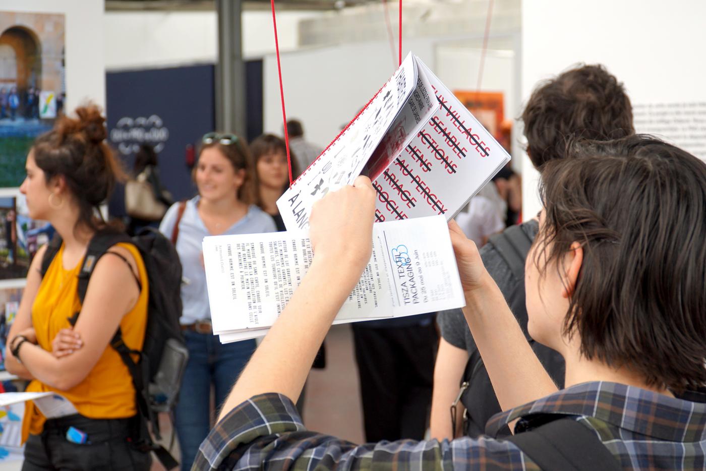
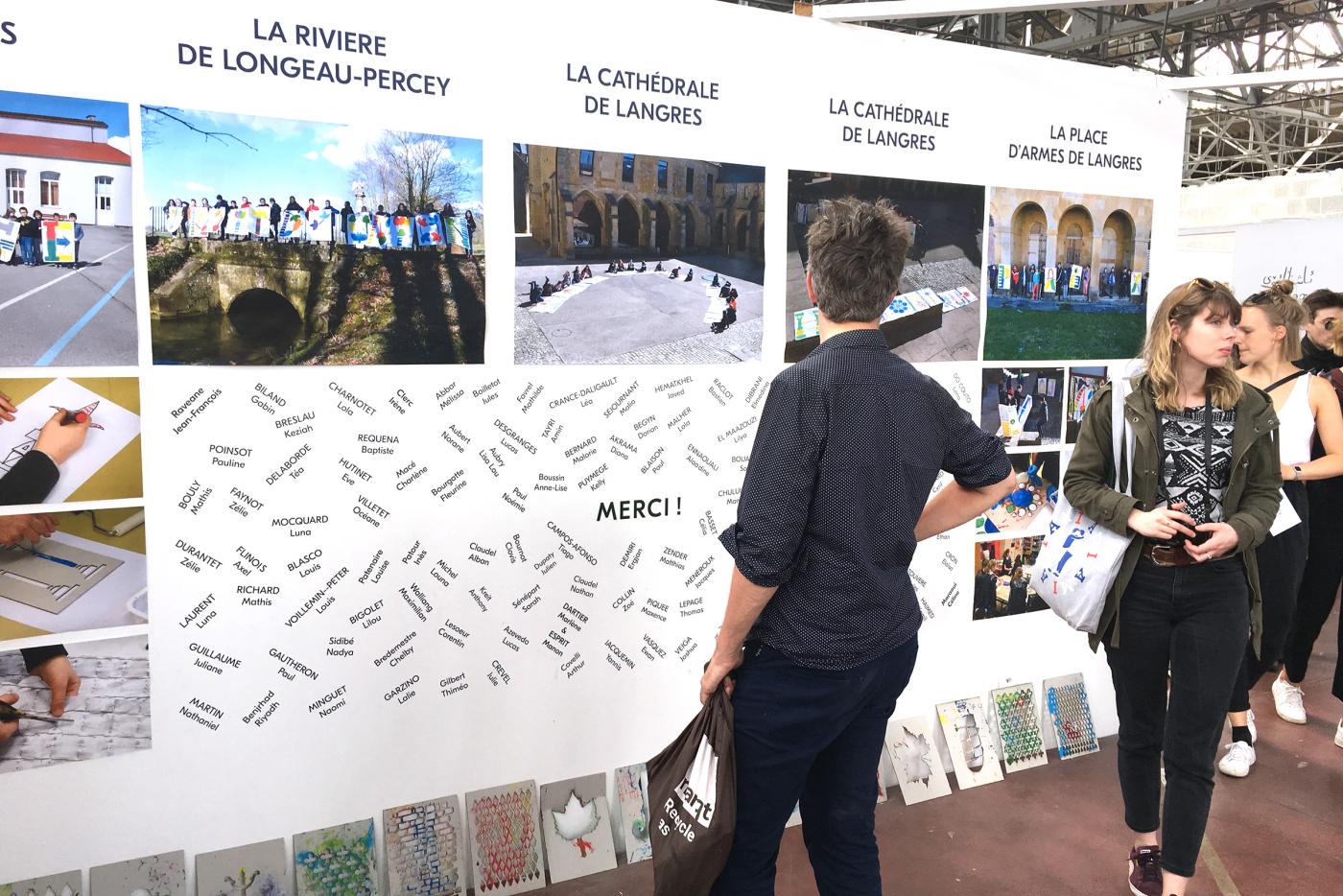
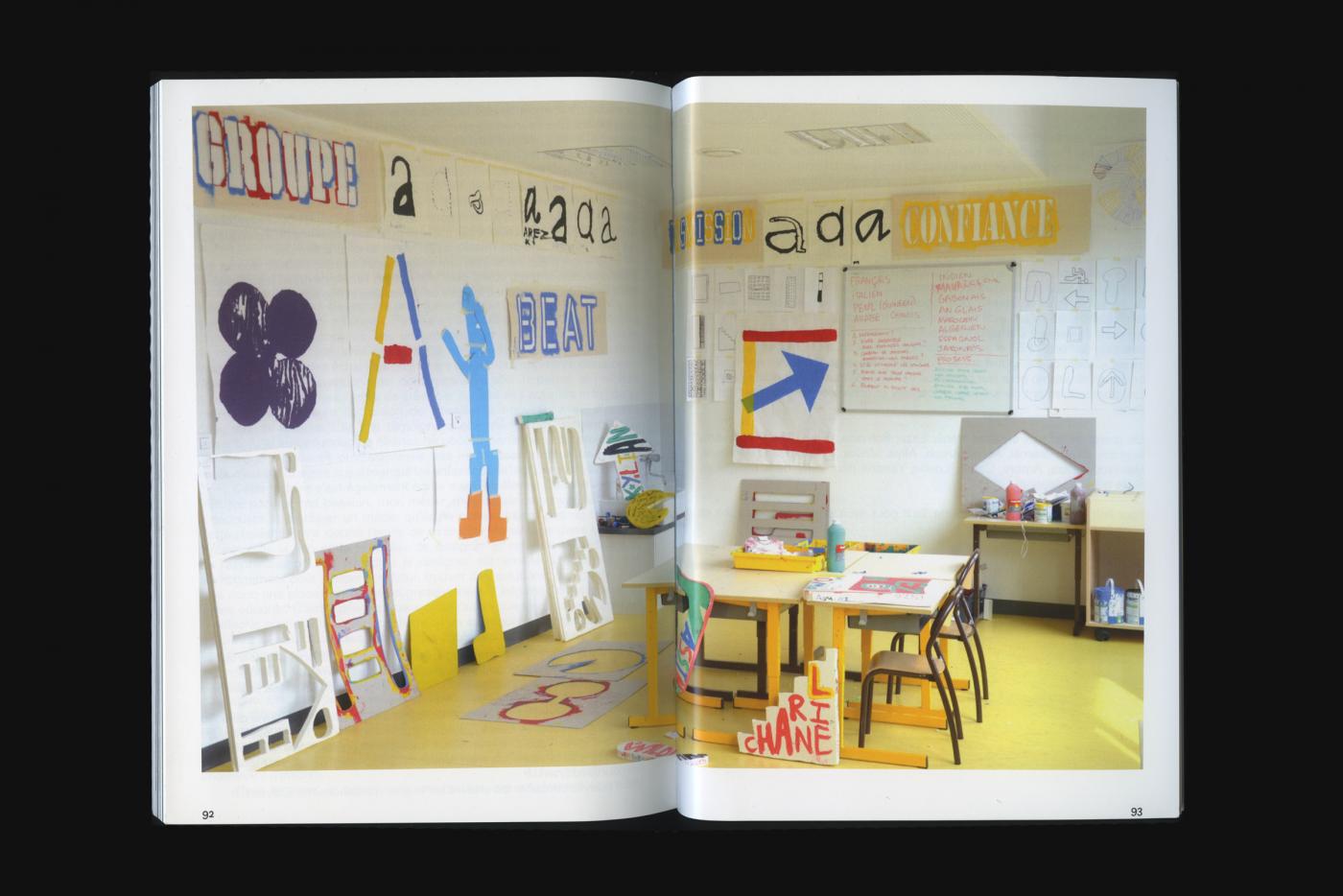
Some pages of the catalog produced in May and distributed during the biennale presenting the whole of the residence. From the concept to the realization "I live here: in langres! " show the process of creation inviting each class to work on the identity of the public space which they choose. In total this Kids Prgram represents 20 workshops, around 125 children and 5 teachers.
- Internationale Biennale of Graphic Design
- identité d'exposition
- Le Signe - centre national du graphisme
- TizsaTextil
- identité d'exposition
- Le Signe - centre national du graphisme
- TizsaTextil
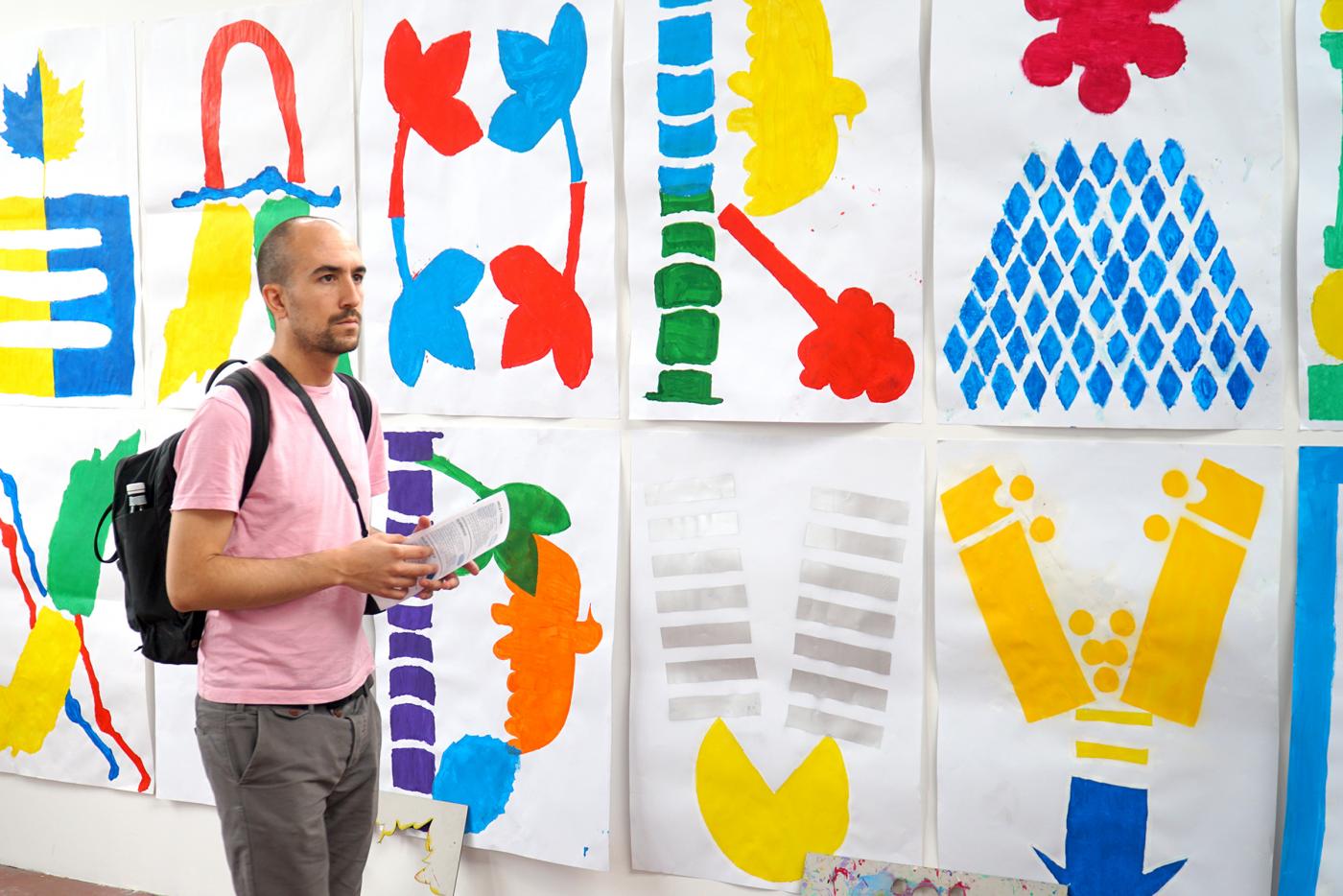
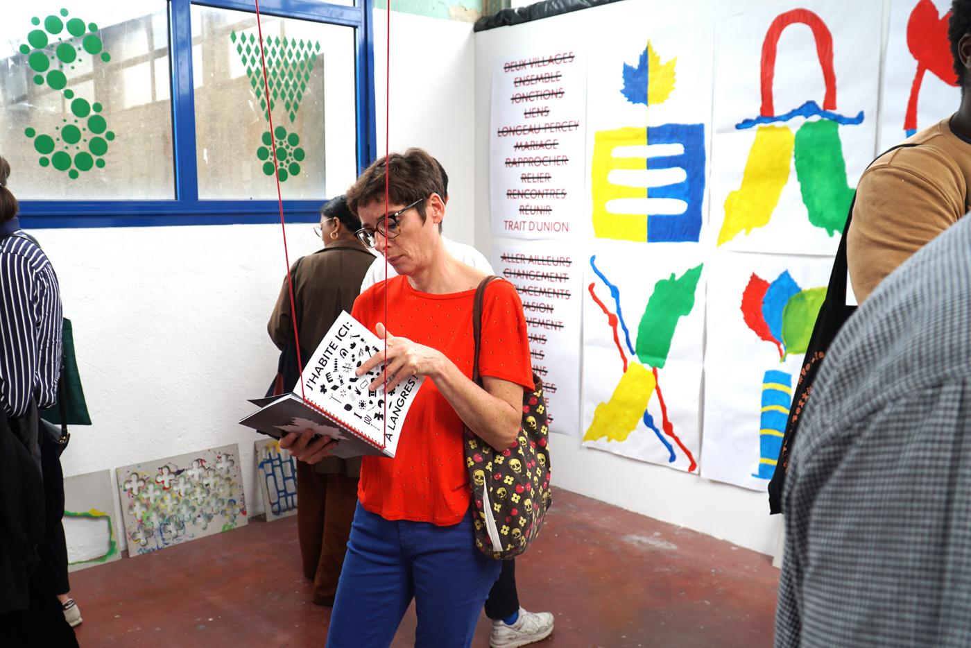
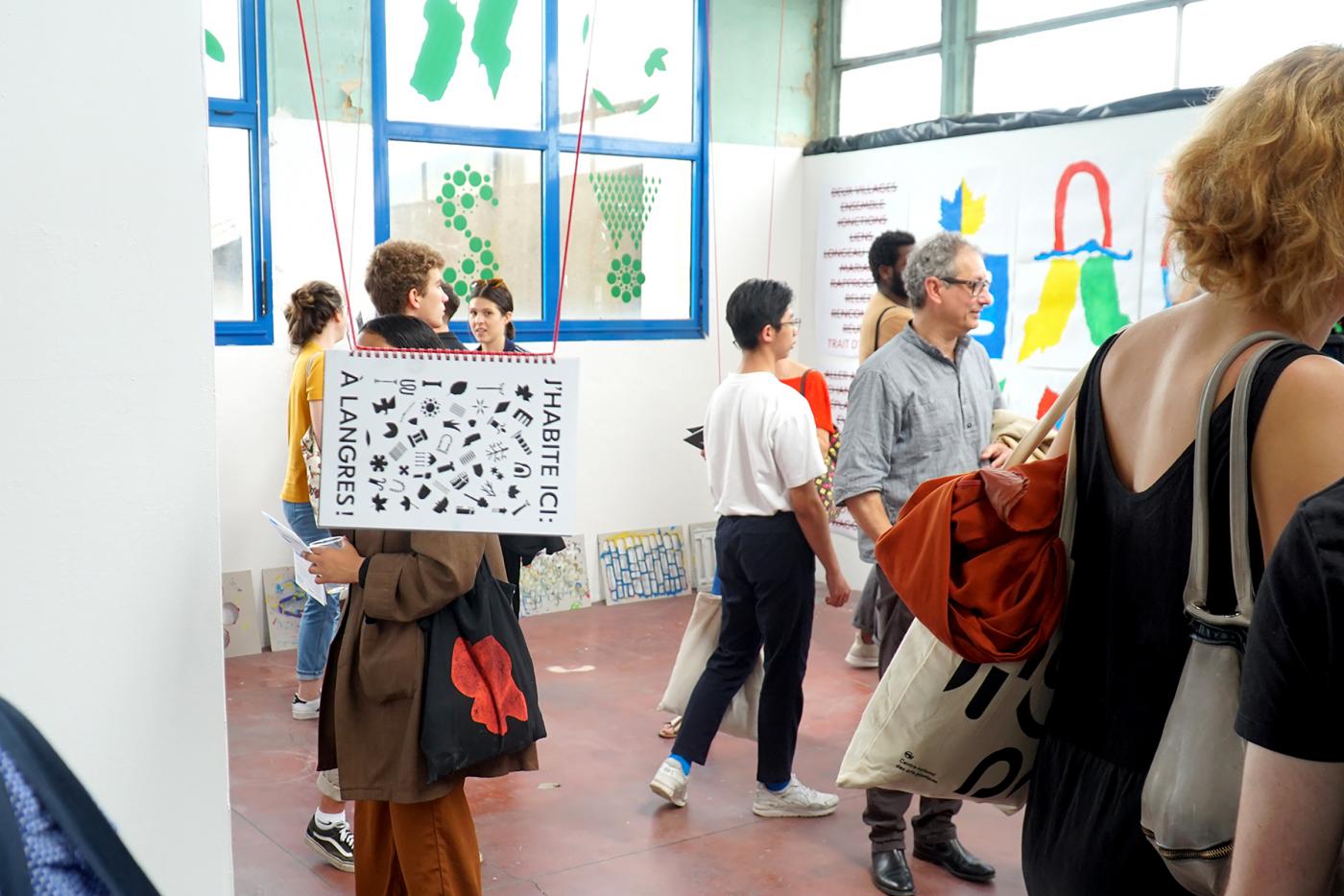
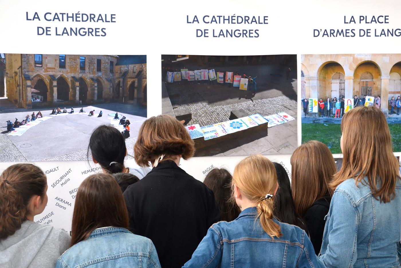
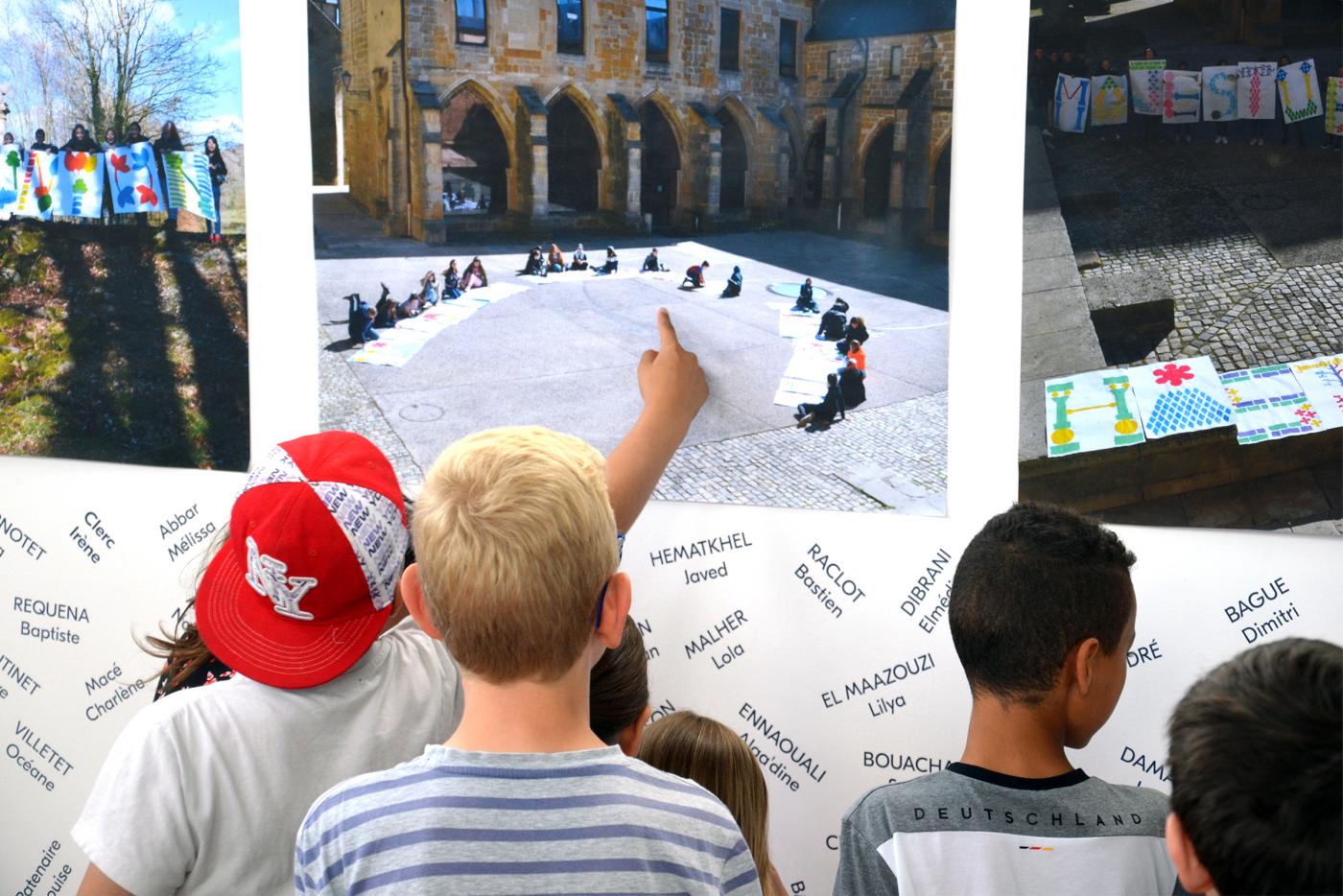
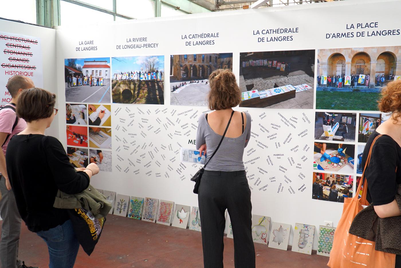
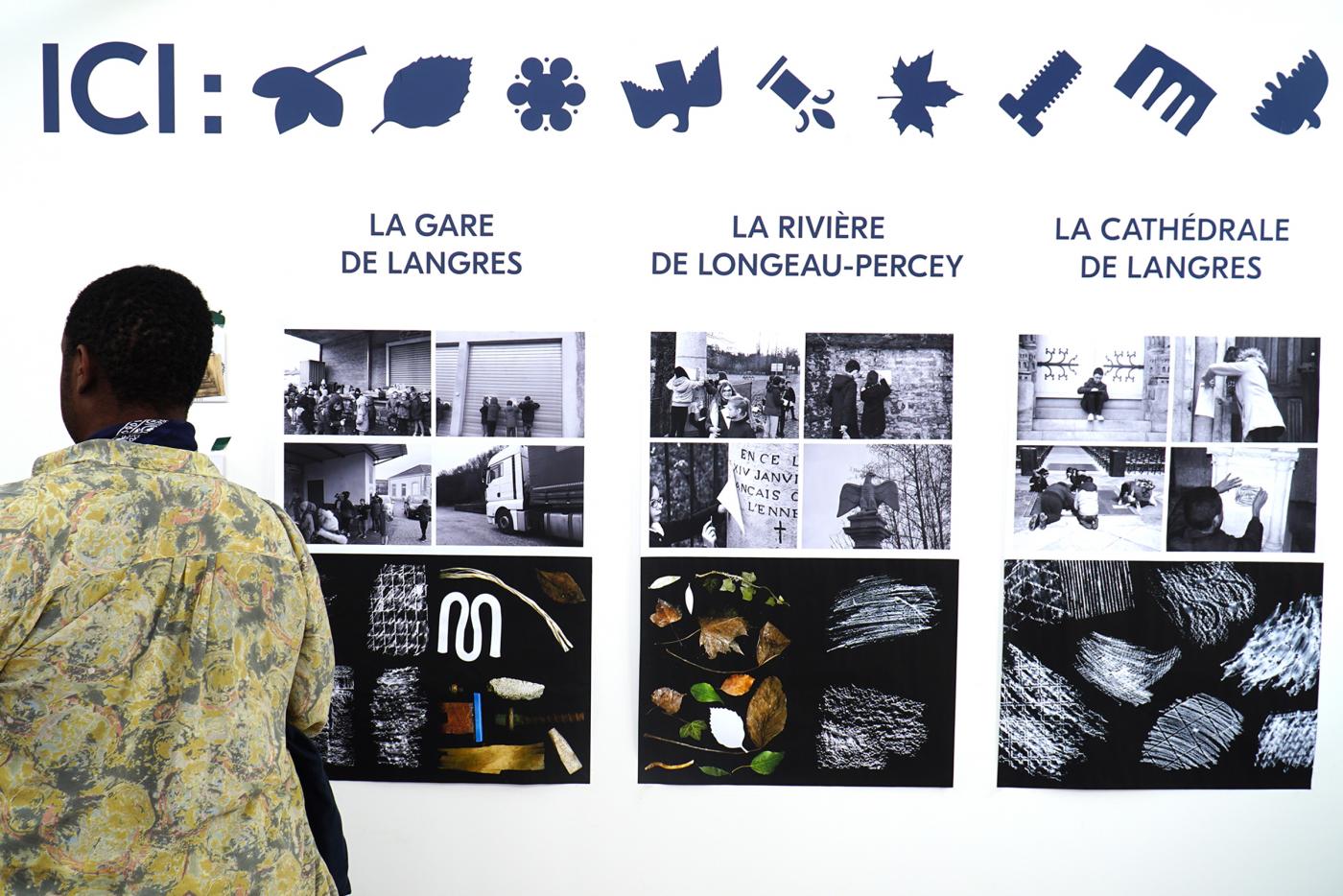
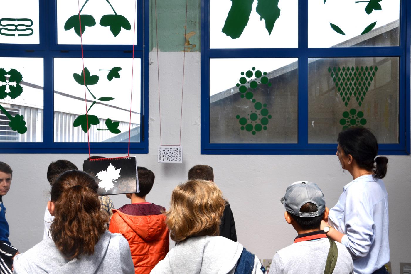
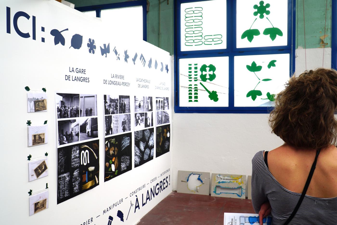
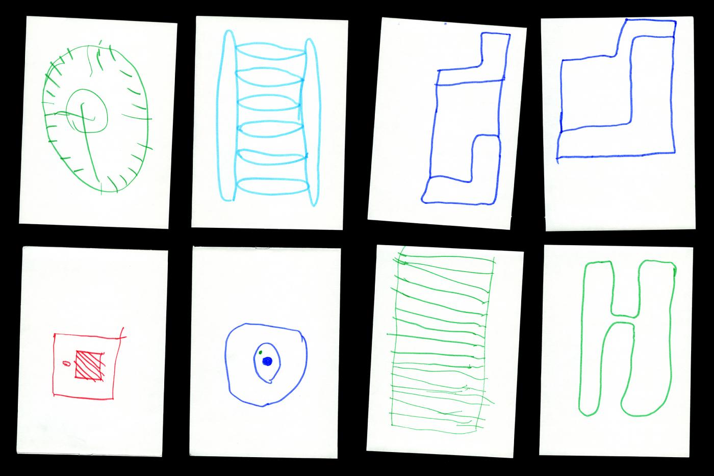
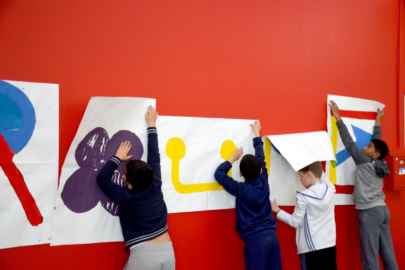
Restitution of the residence during the biennial organized by LeSigne at the TizsaTextil factory. The scenography I drew focuses on the creative process and explains step by step how the children were able to reveal the identity of their public space to speak better. Four walls, four stages: the first wall presents the research they conducted on the spot such as inspectors / ices. The second shows the different shapes they have selected. The third shows a very small selection of letters and the last wall leaves room for their final intervention in the public space.
- PAG Langres : Kids residency
- Résidence, Enseignement, Éducation, Workshop
- Le Signe - centre national du graphisme
- Langres
- Résidence, Enseignement, Éducation, Workshop
- Le Signe - centre national du graphisme
- Langres
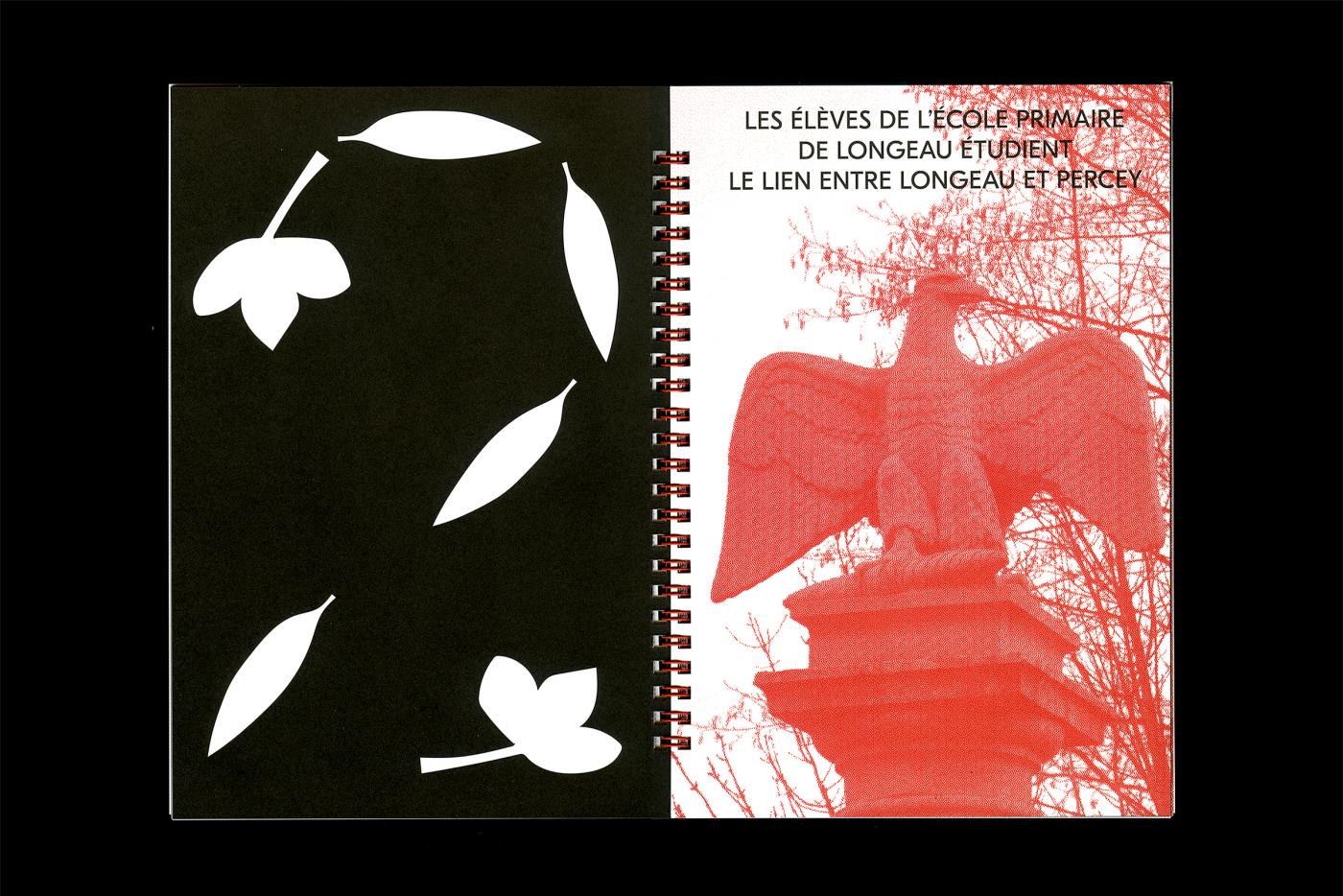
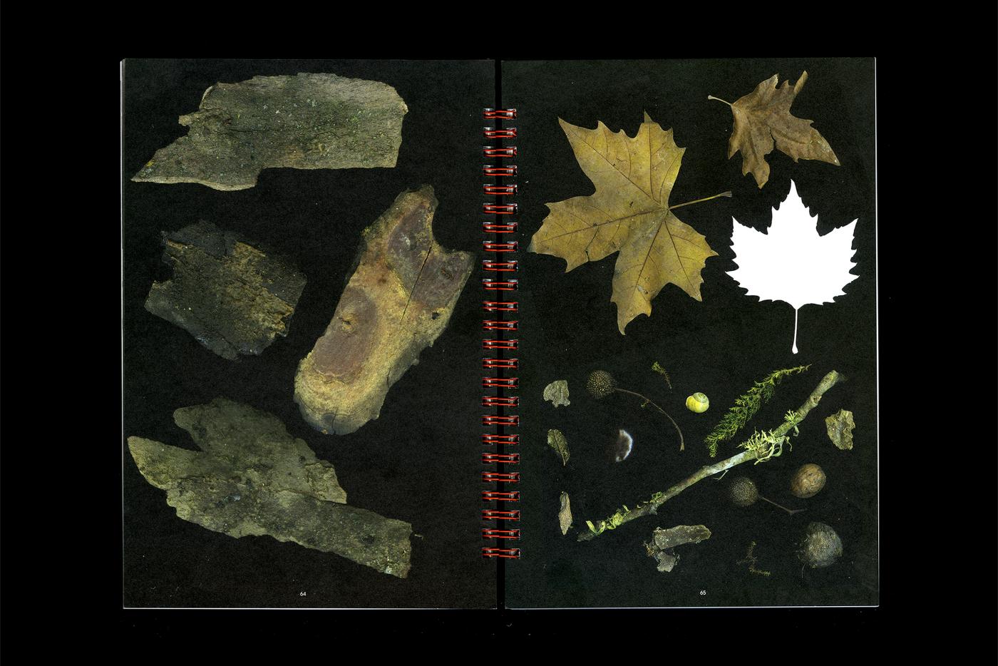
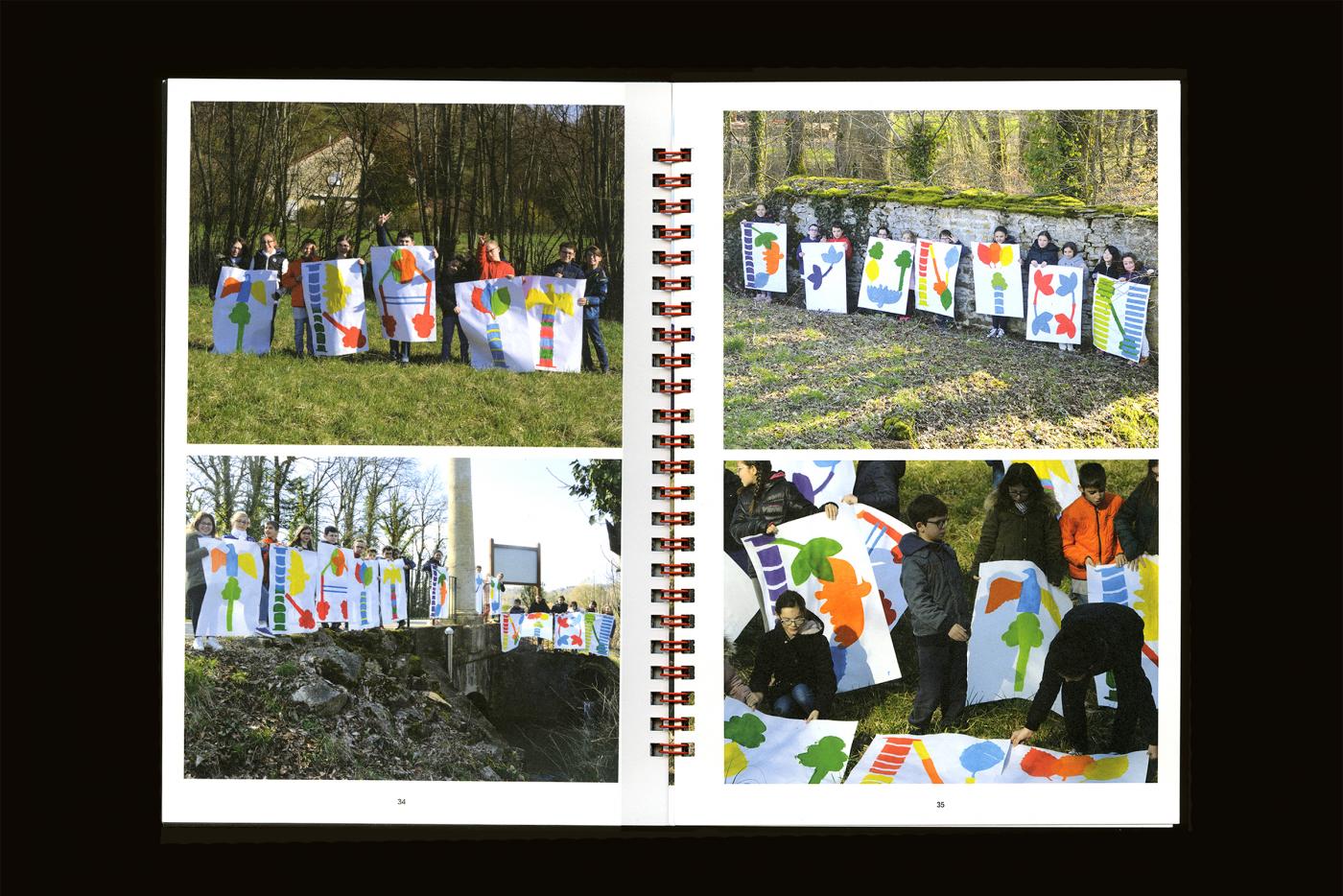
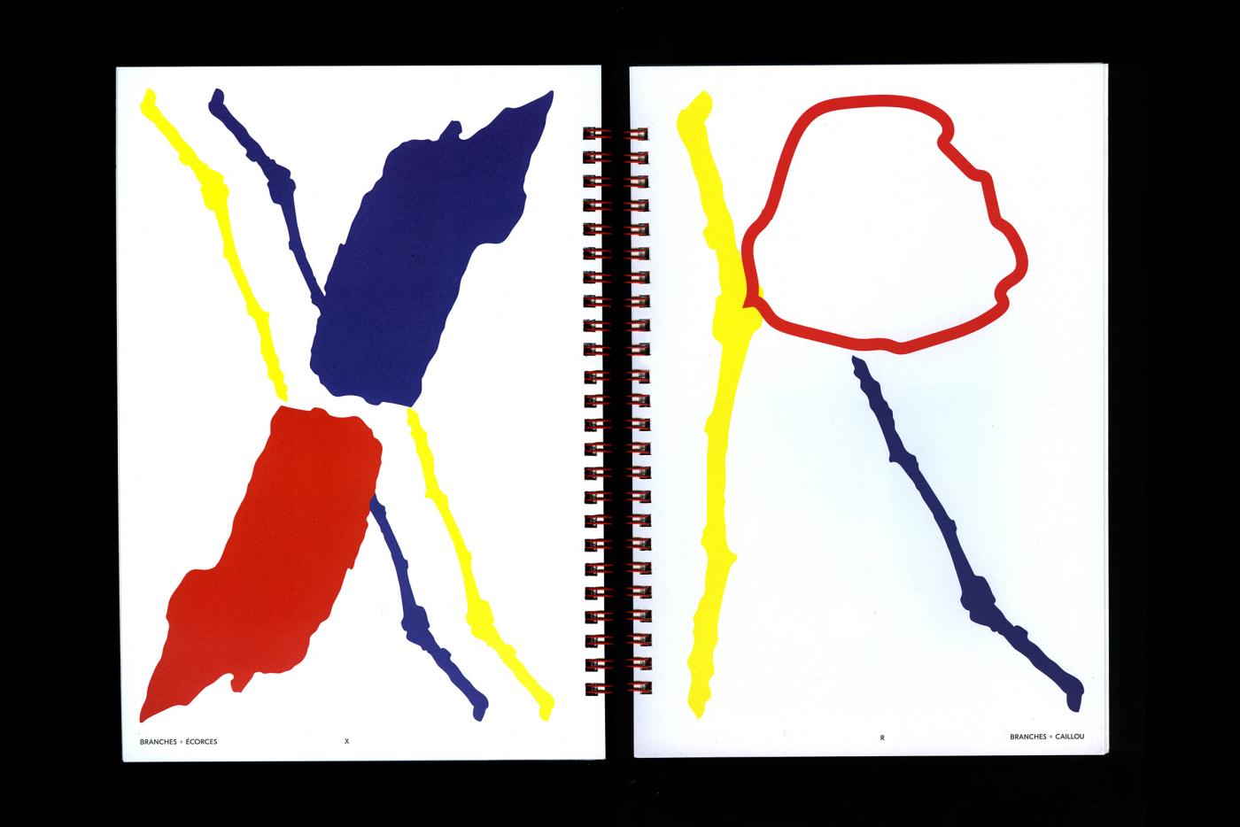
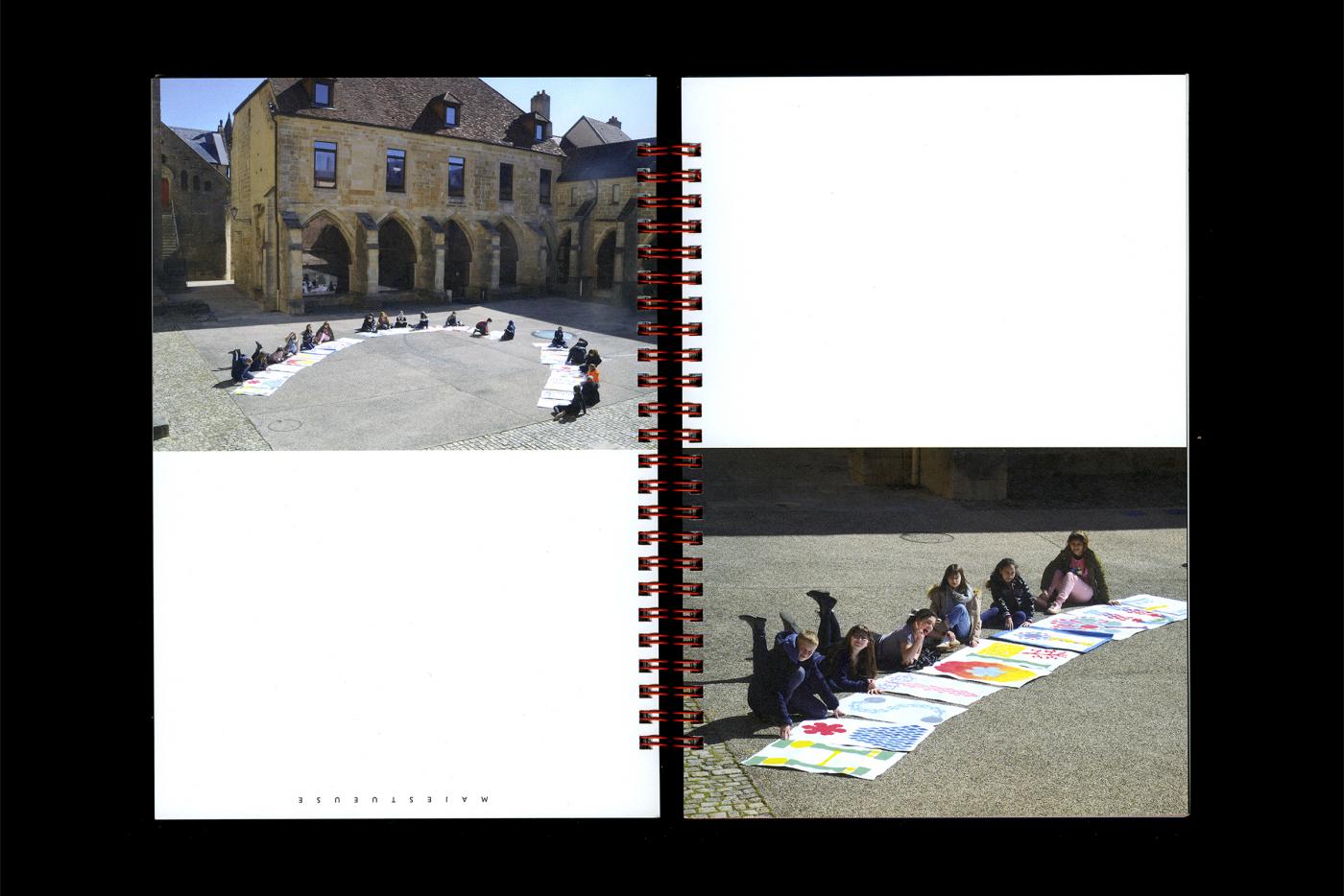
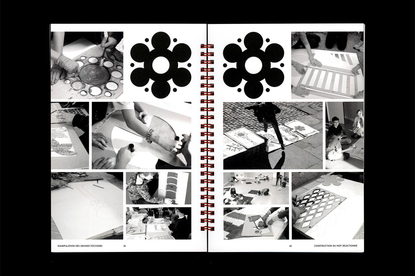
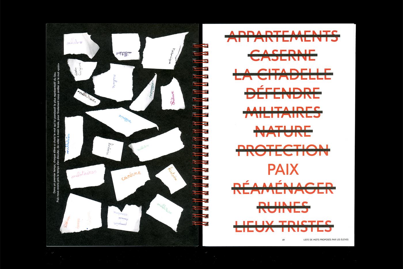
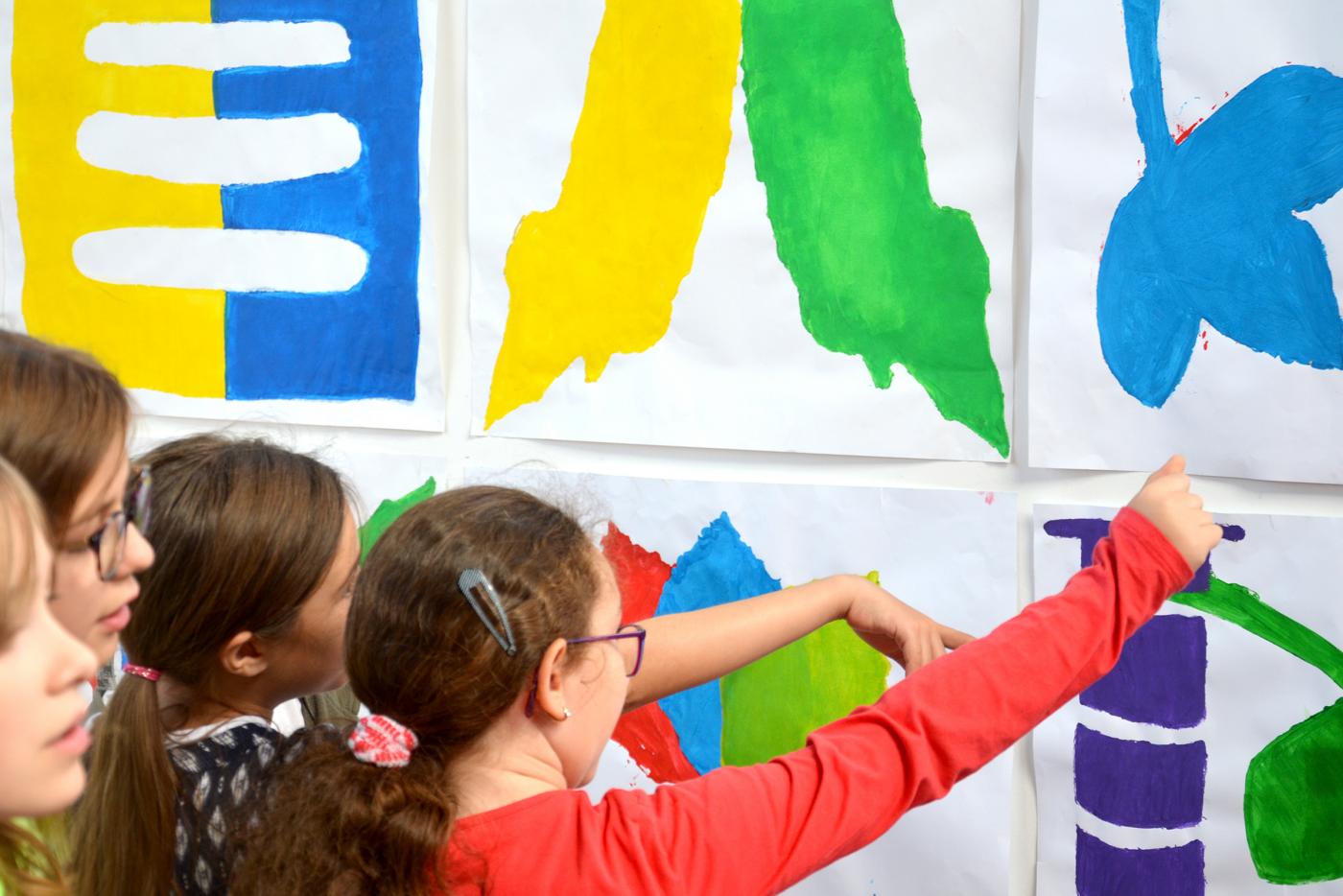
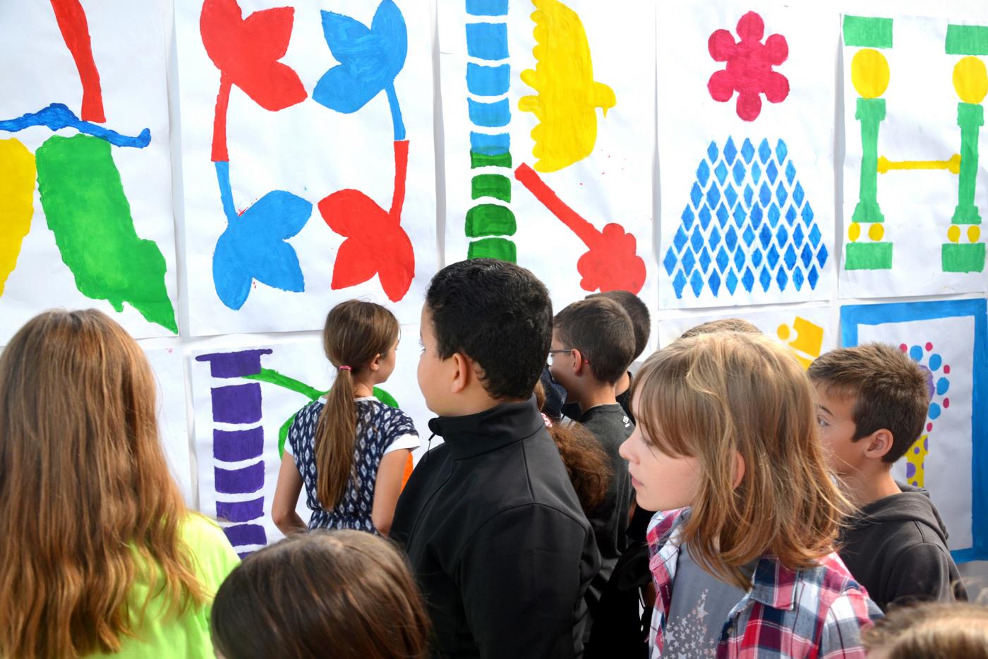
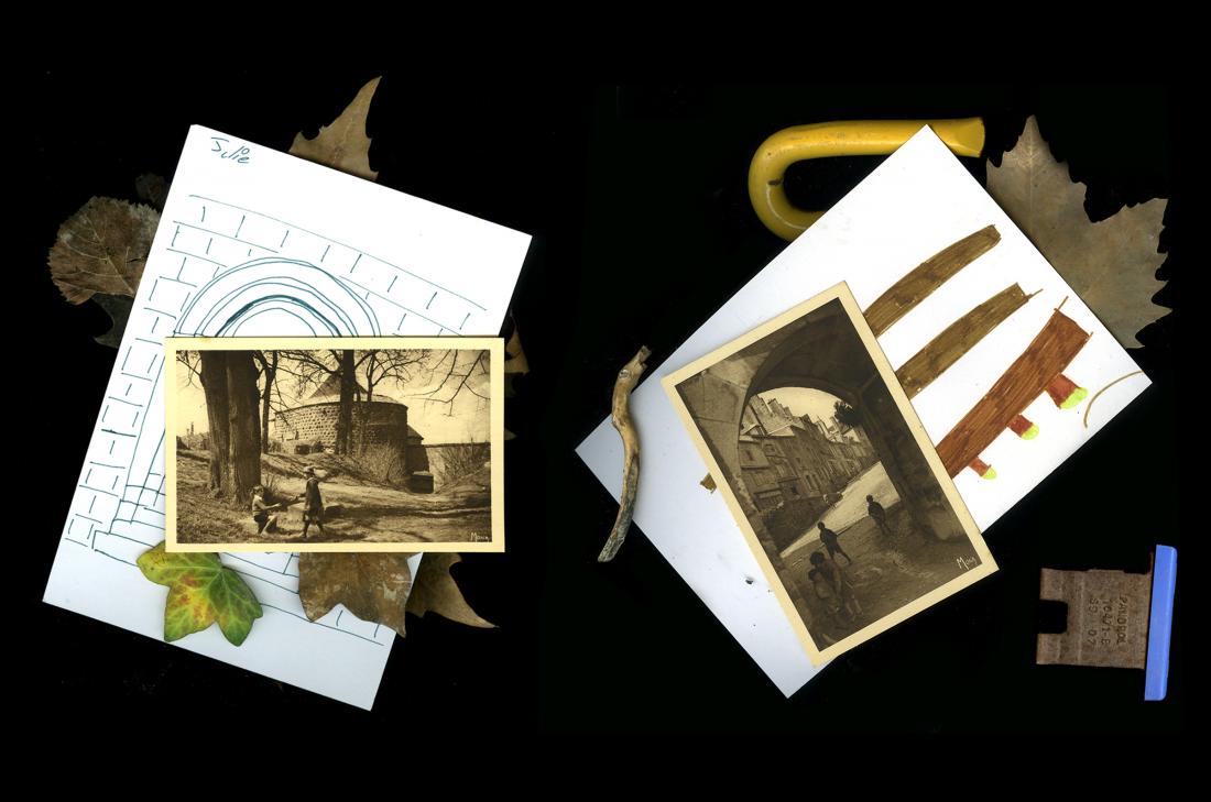
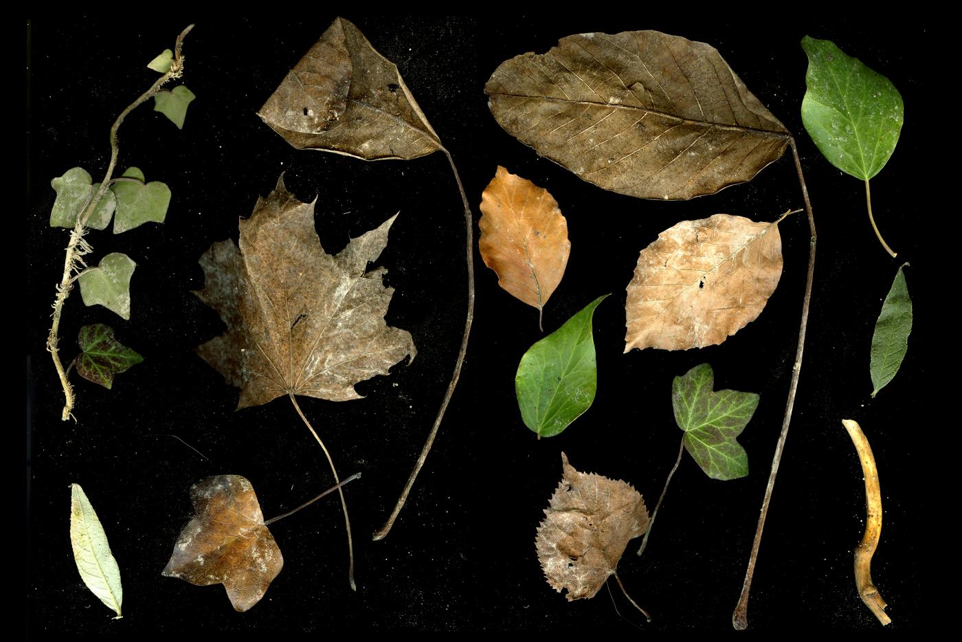
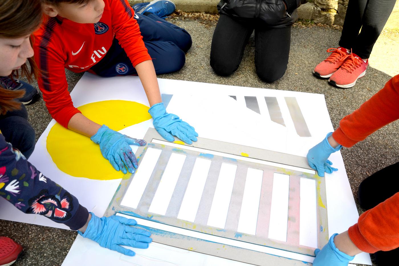
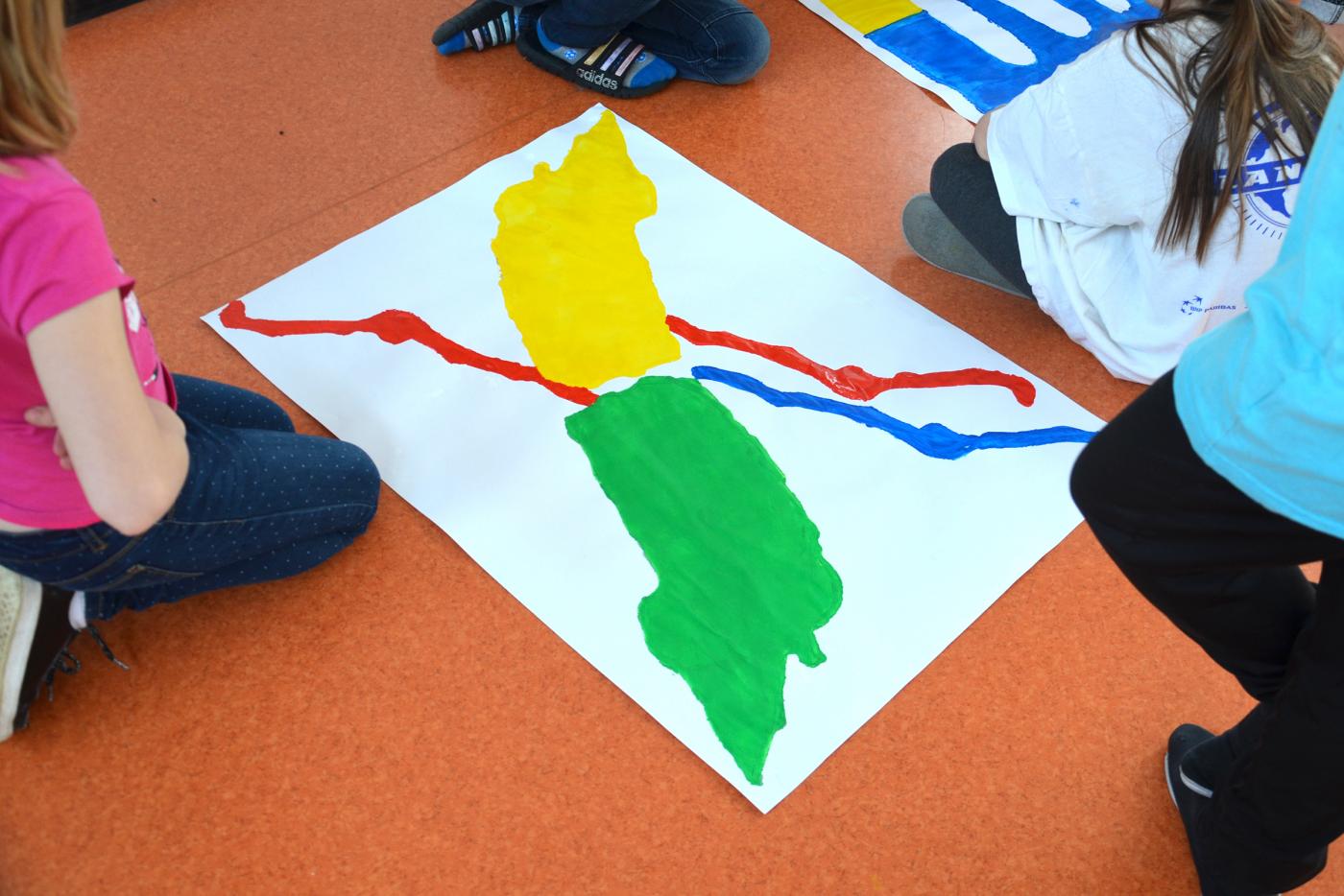
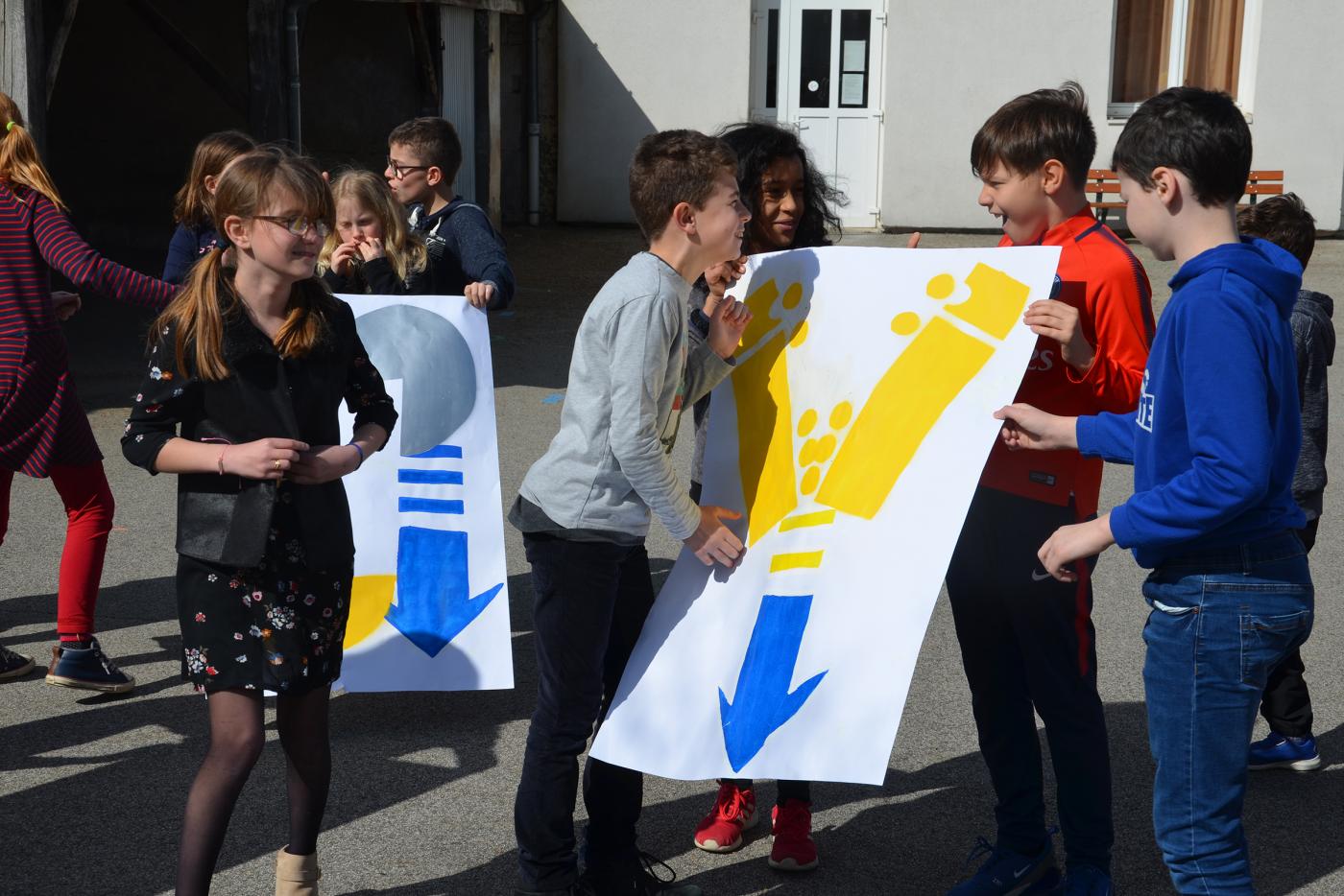
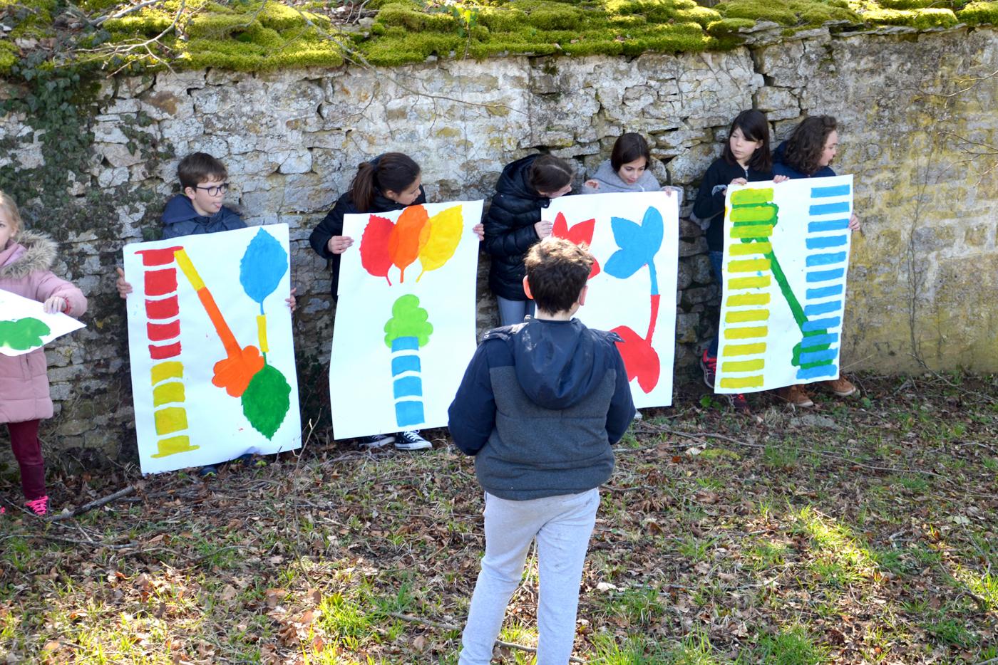
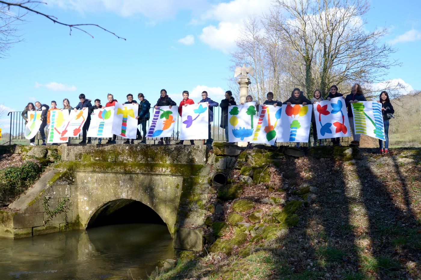
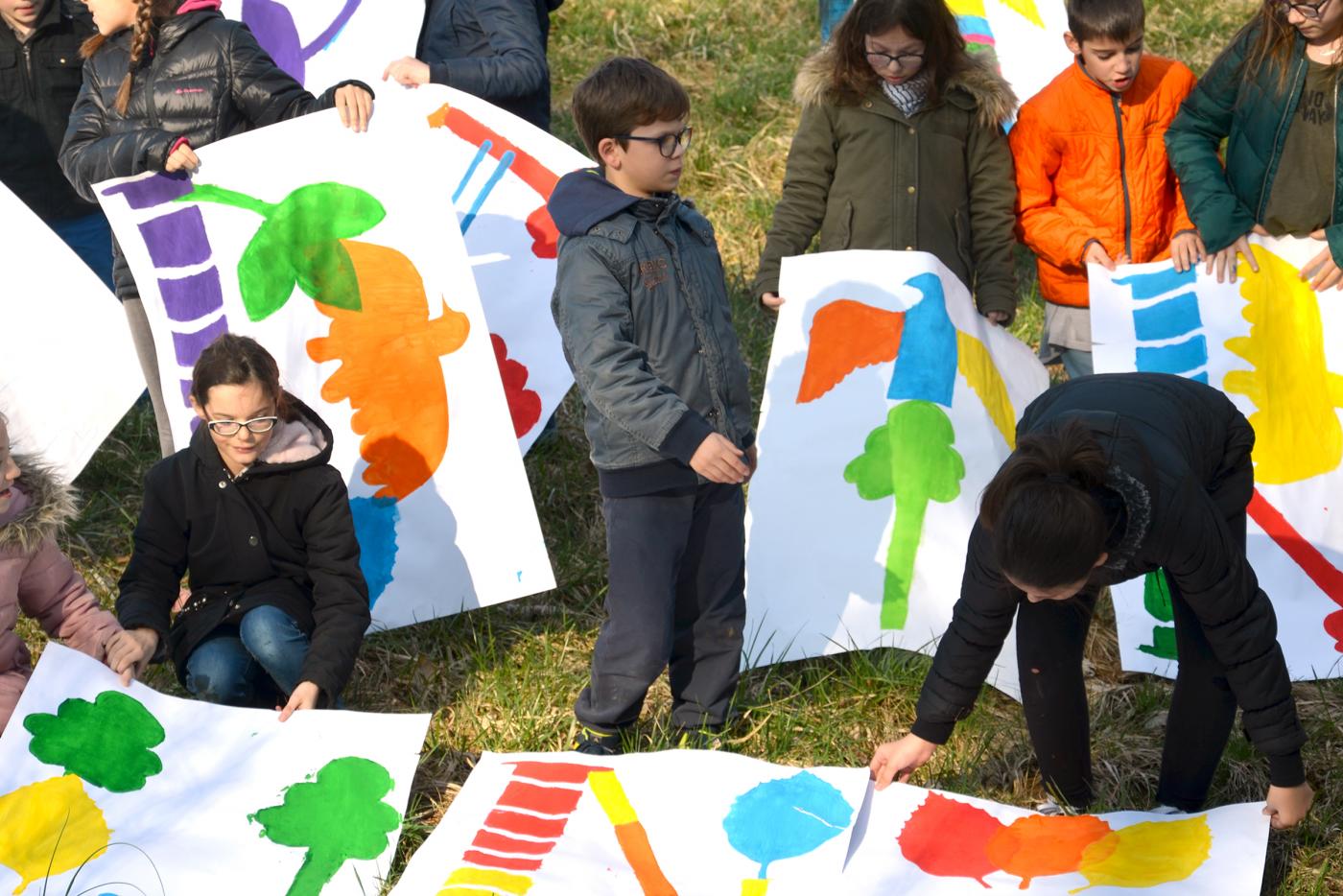
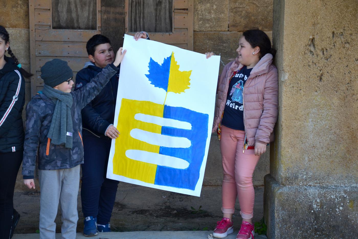
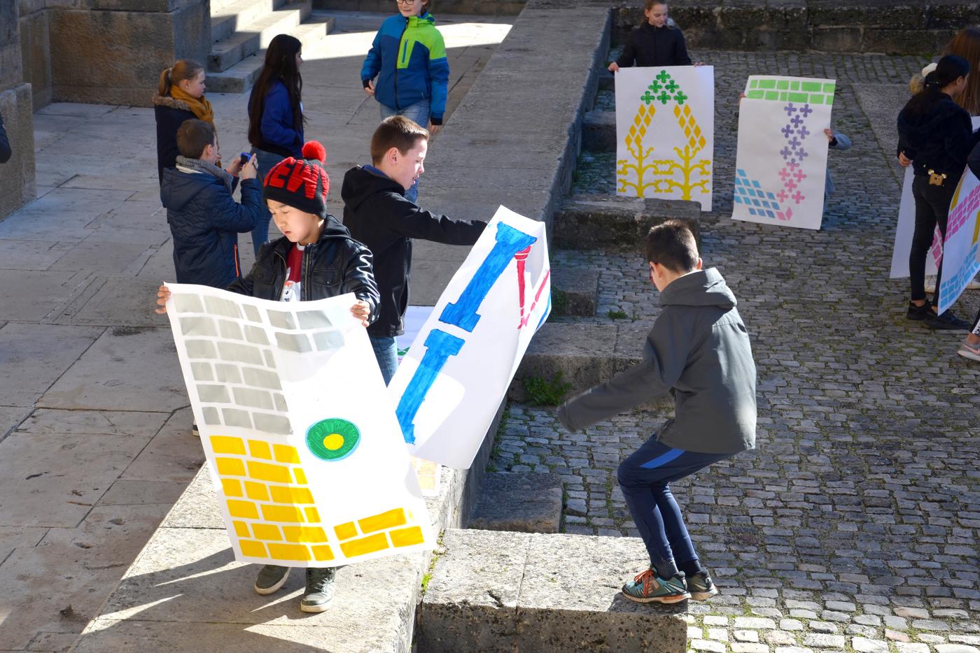
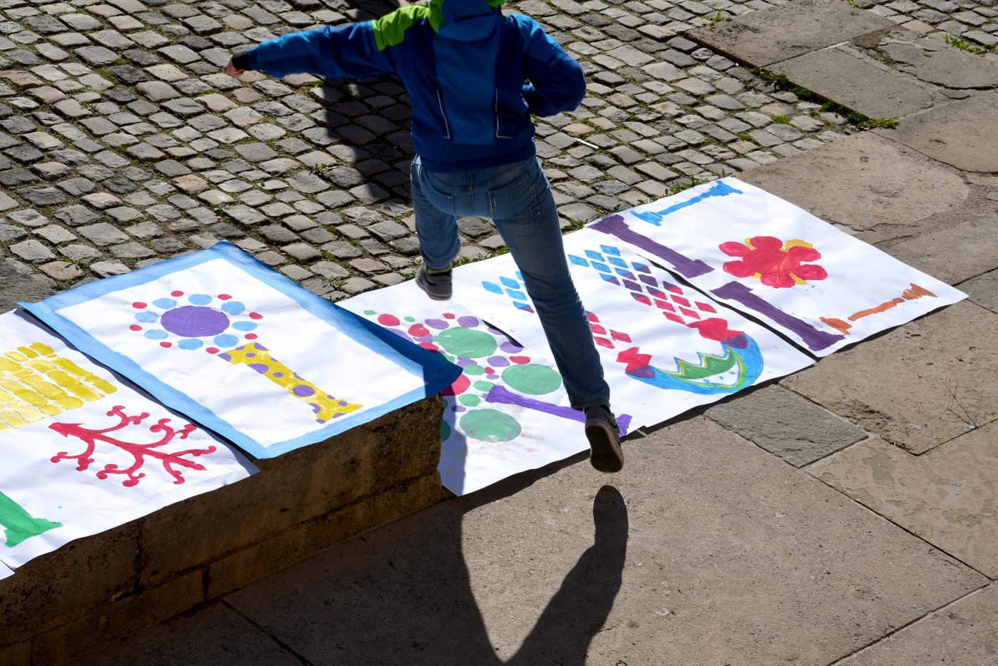
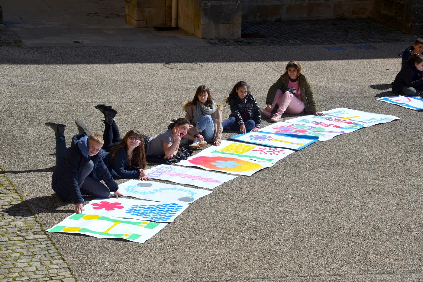
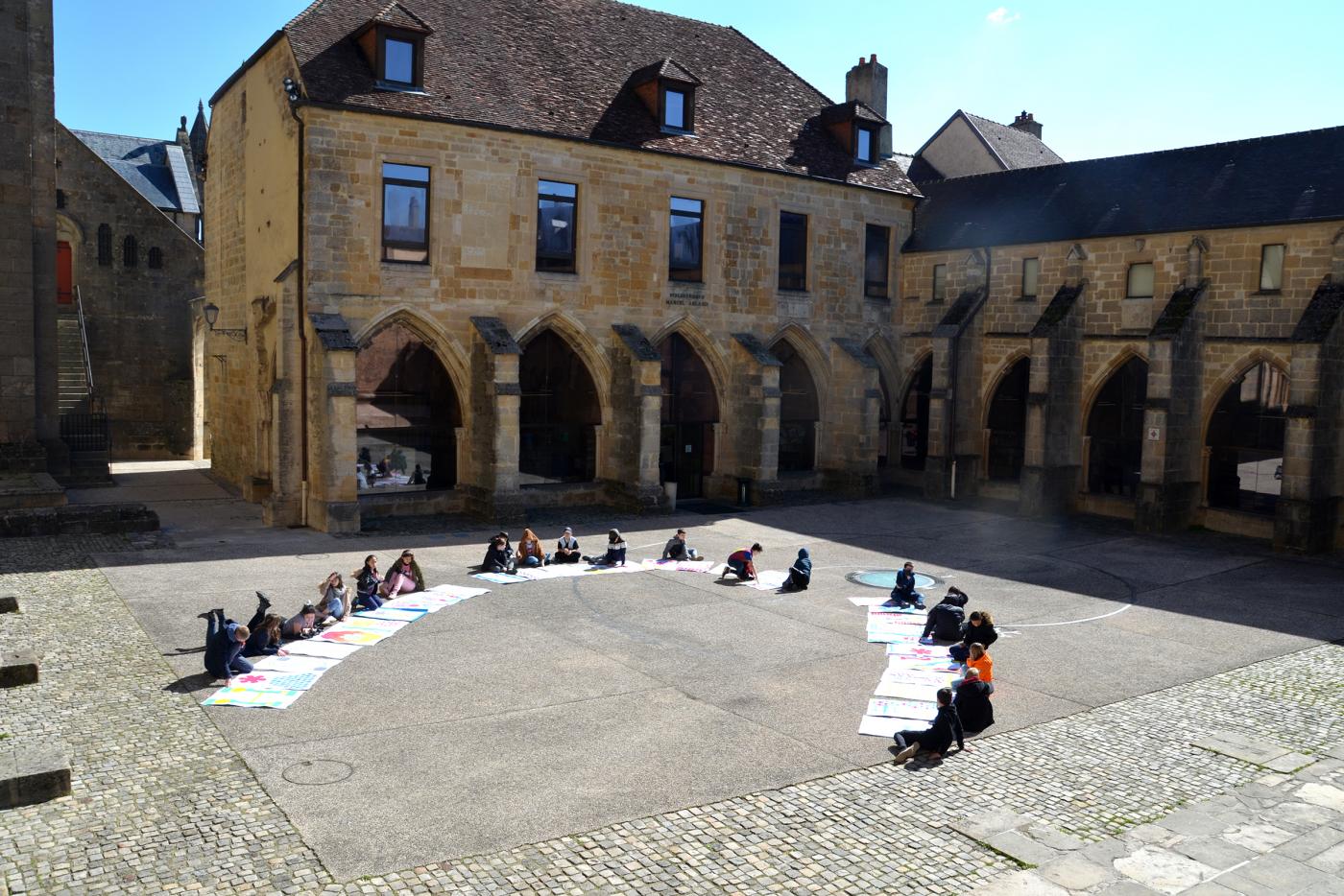
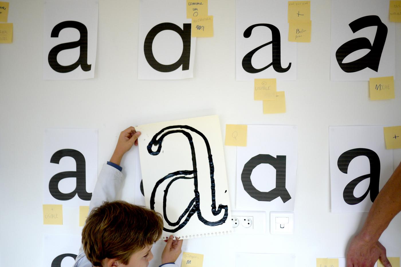
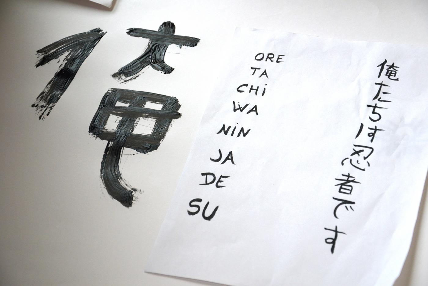
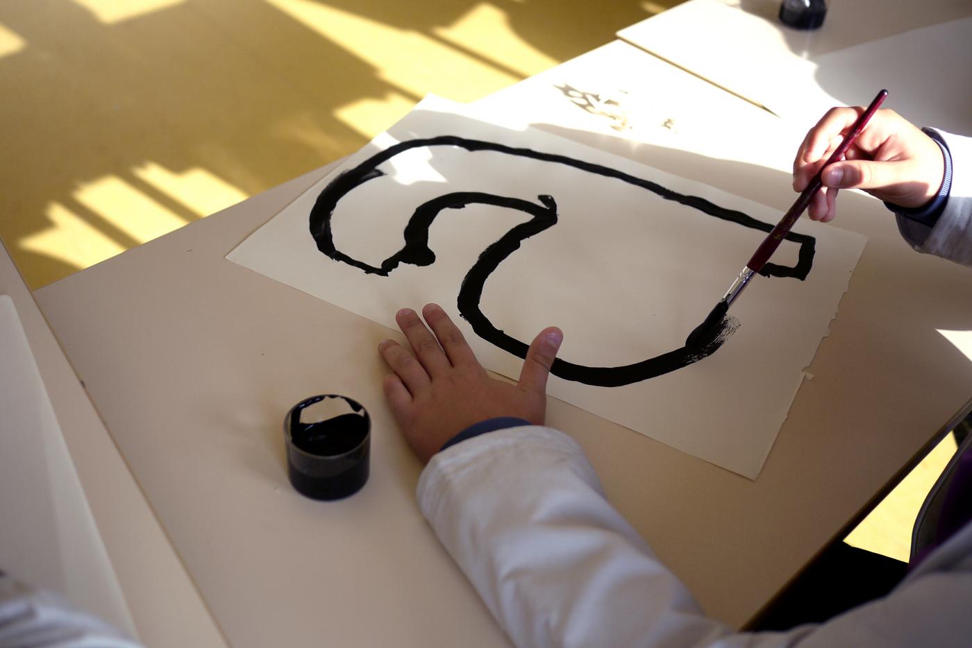
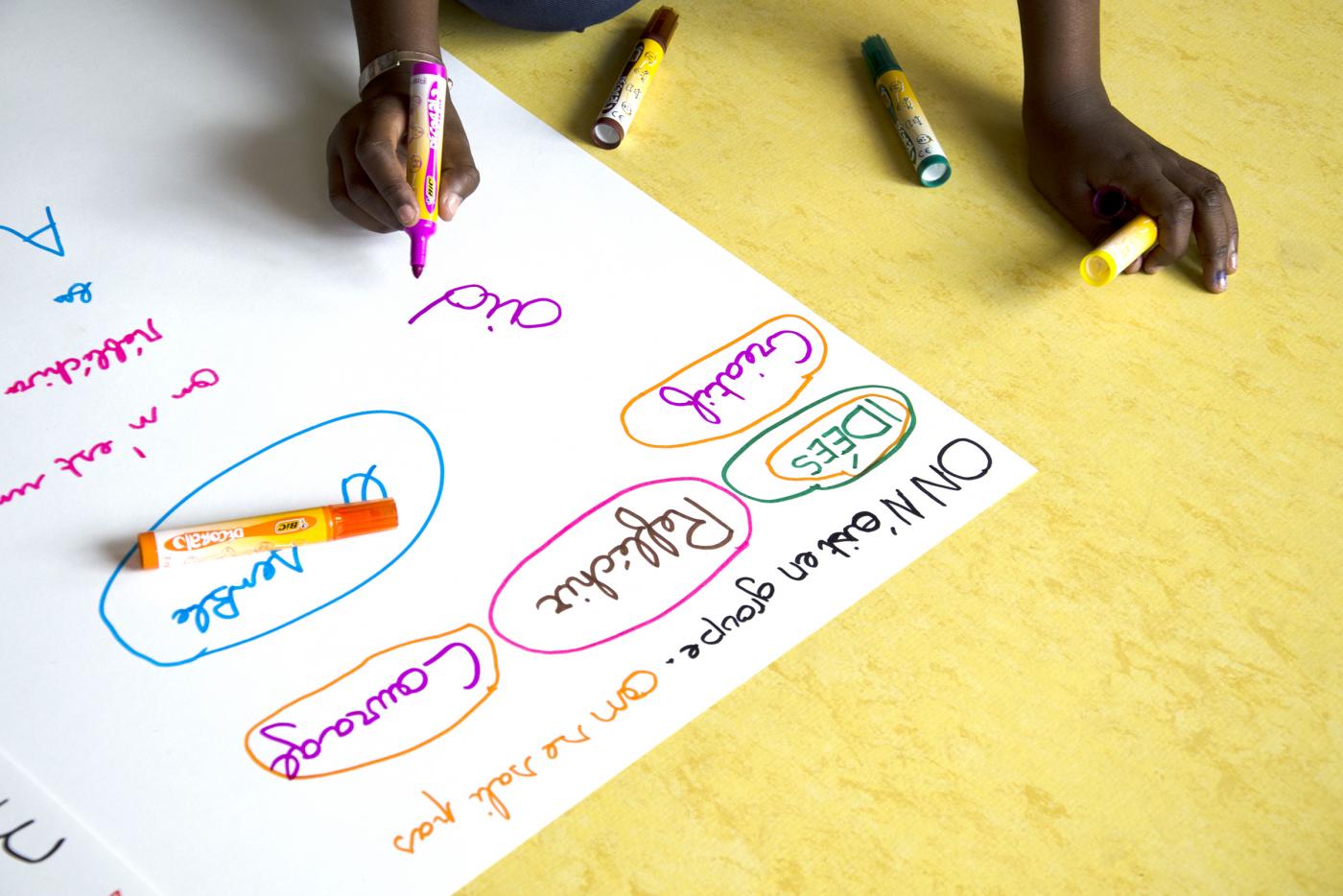
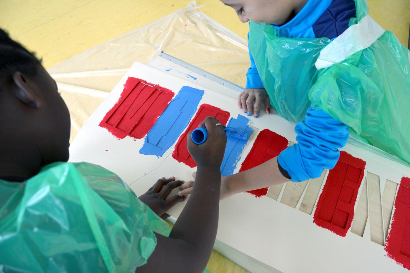
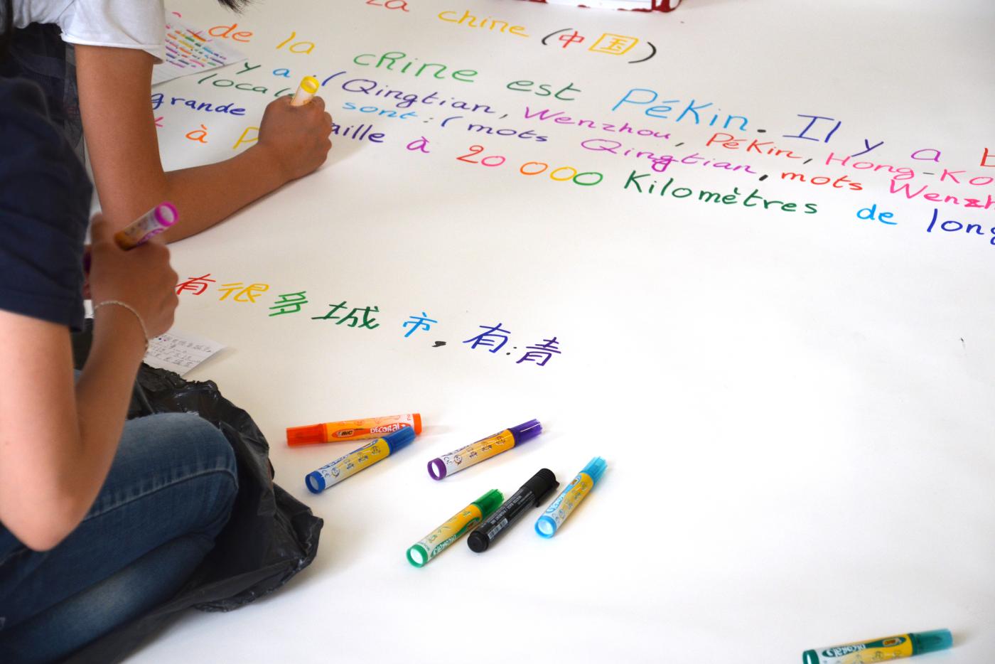
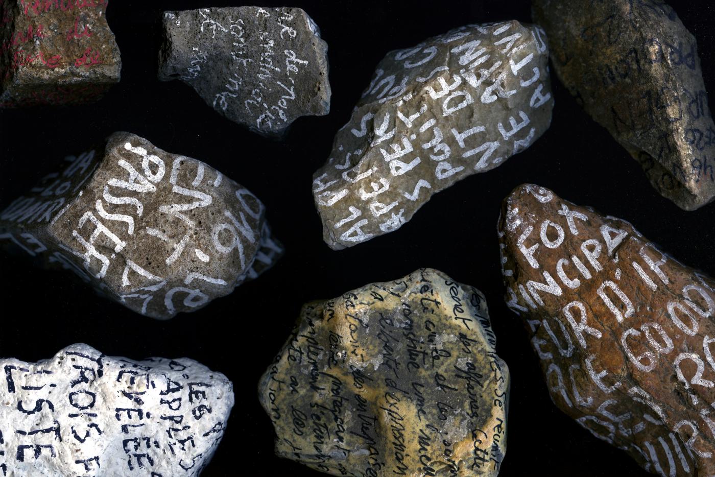
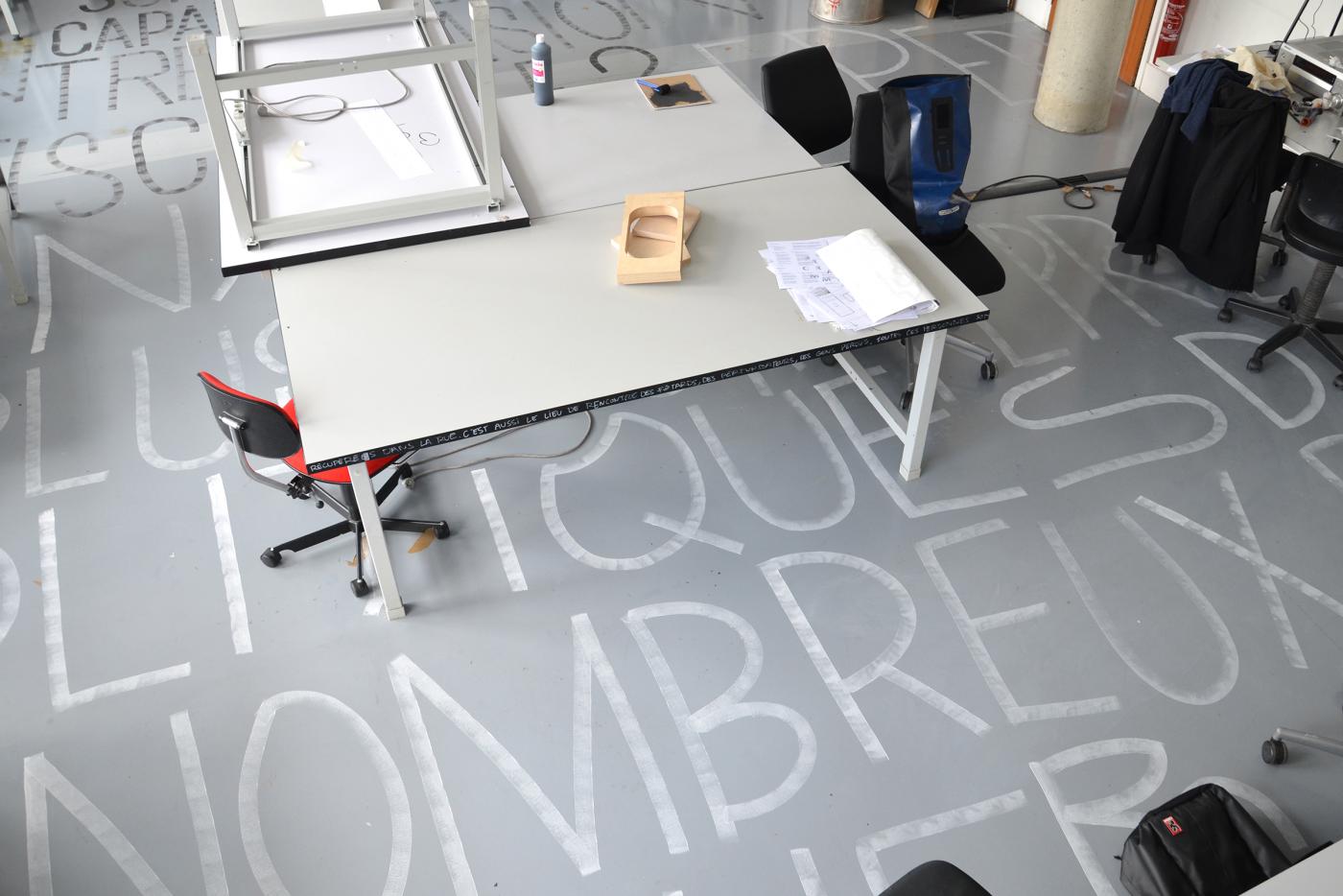
At the invitation of The Sign - National Center of Graphic Design, I conducted this year a project with five classes (three classes in primary school and two classes of 6th Diderot College) totaling about 125 students supervised by 5 teacher (e) s. With the students we took the time to observe the city and its public space to understand their environment. After choosing the space that speaks to them and makes a sign in their city, I proposed to draw their identity. "I live here: in Langres! It is a project inviting students to document / observe their city to better inhabit it. Each class chose the space that interested them. Together we began to collect all the information that would allow us to better understand this public space through four tools: photography, drawing, fingerprinting and on-site collecting. Then, we selected the most interesting elements for the rest of the workshop. At the same time, the students conducted a research project on the identity of the place: what does it evoke for you? What place does he have in the city? Why are you going there? What is his story ? What will be his future? Sessions of exchanges and reflections to define this place. They looked for the words that would make sense and resonate the time of the final installation, giving their point of view as a young Langrois resident. In order for the word to make an image in space, we drew each letter from the shapes from the place. In the end, students installed this word / group of words outdoors. Through this project I wanted to give them the desire to invest the city in words by inviting them to speak in the public space. So we have: "PEACE" for the guardhouse (former military camp), "MAJESTUEUSE / MONUMENTALE / HISTORIQUE" for the cathedral of Langres, "TRAIT-D'UNION" for this isolated place creating the link between the two communes of Longeau and Percey and finally "VOYAGE" for Langres station.
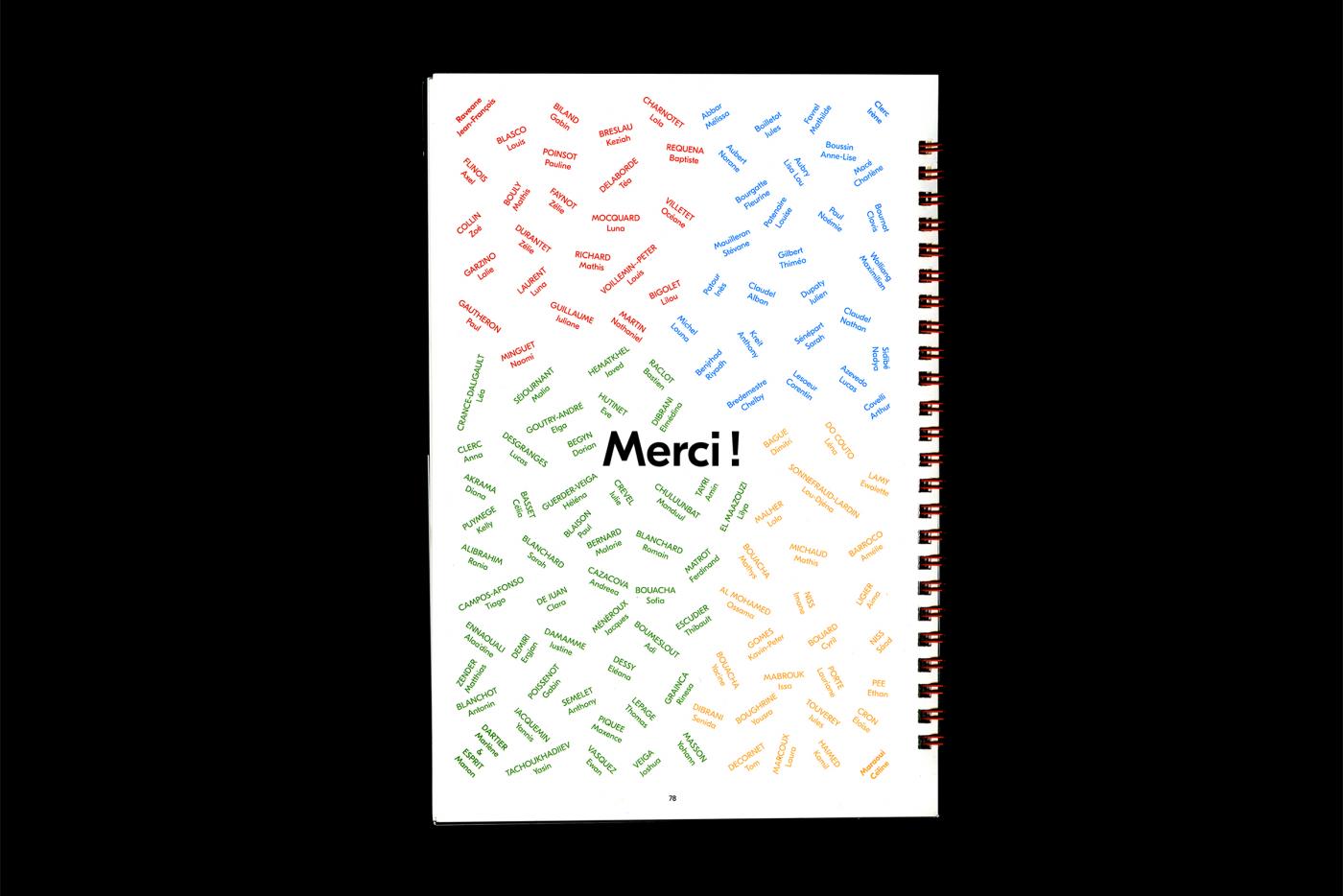
For the entire project, I want to thank all the students for their participation all year long and their involvement.
- Tornado
- intervention en milieu scolaire
- Université du Québec en Outaouais
- Ottawa
- intervention en milieu scolaire
- Université du Québec en Outaouais
- Ottawa
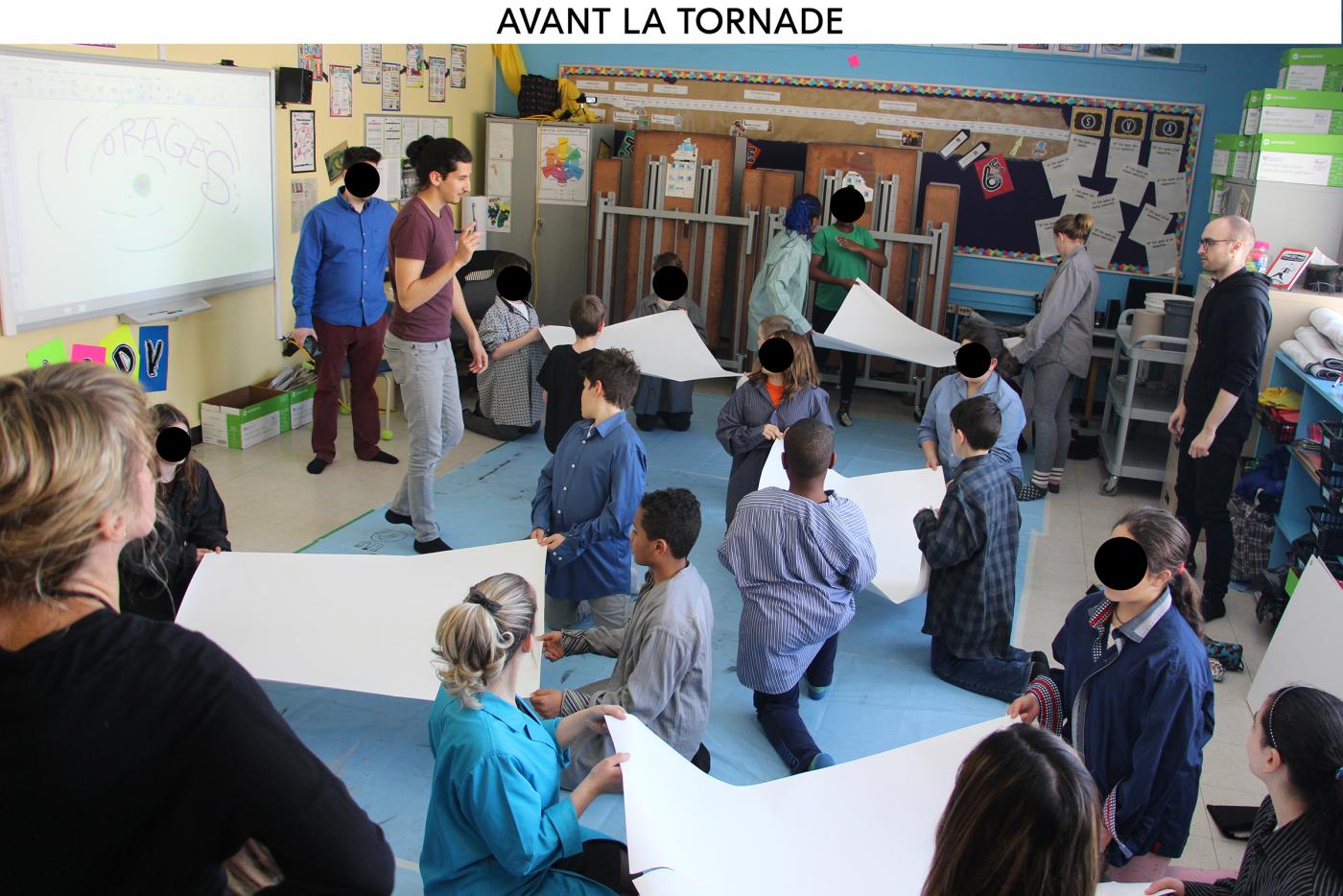
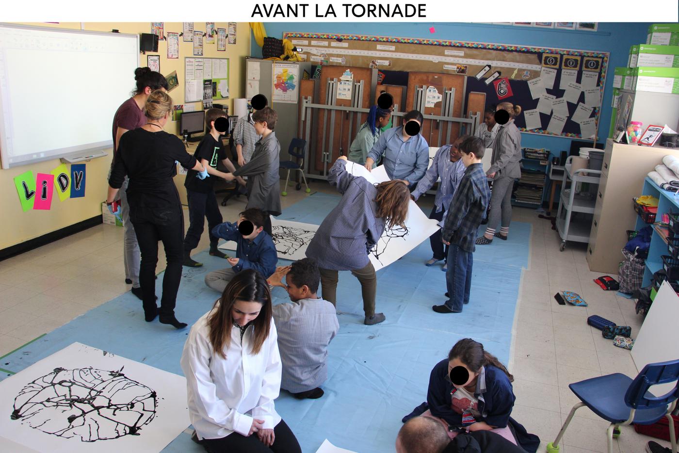
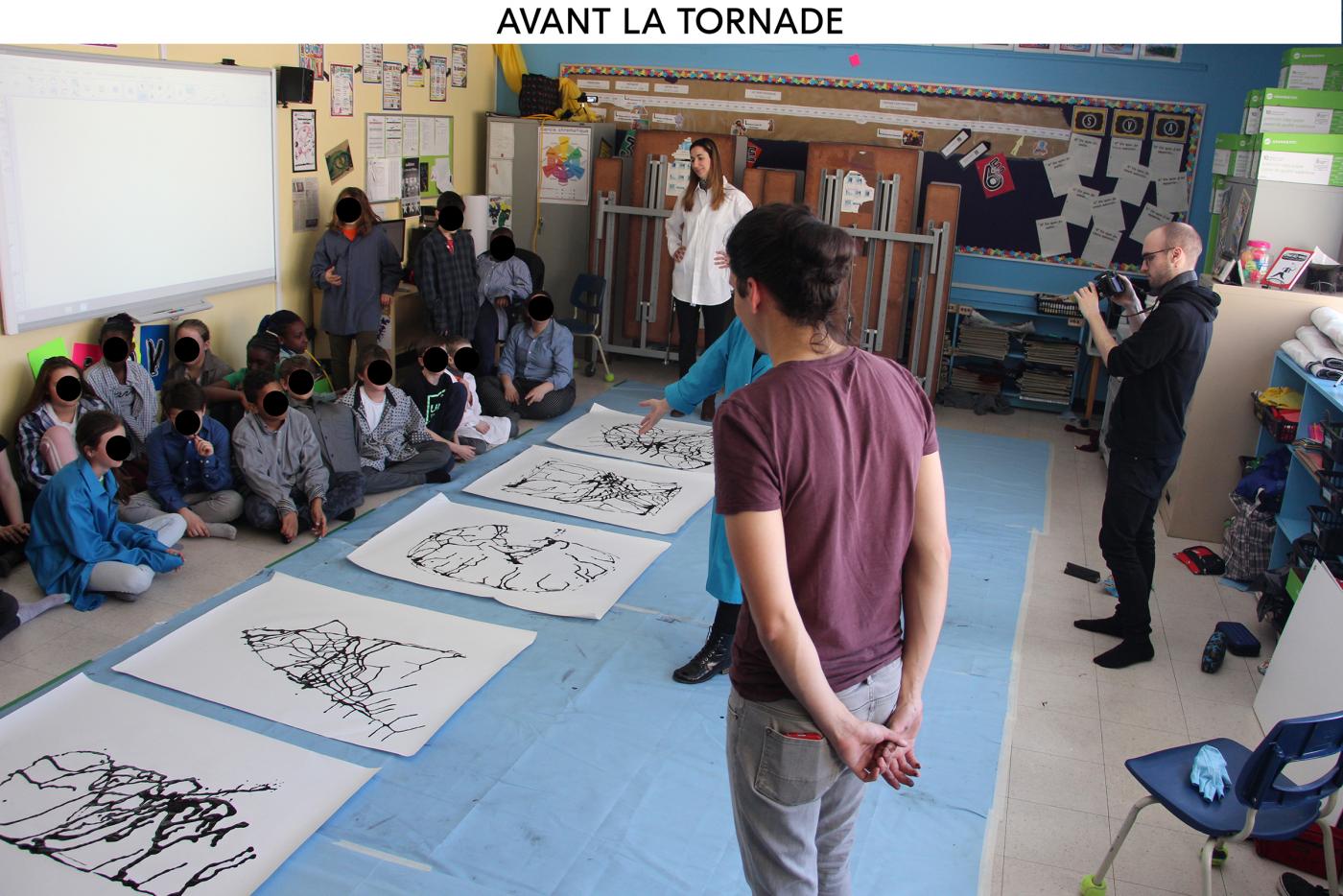
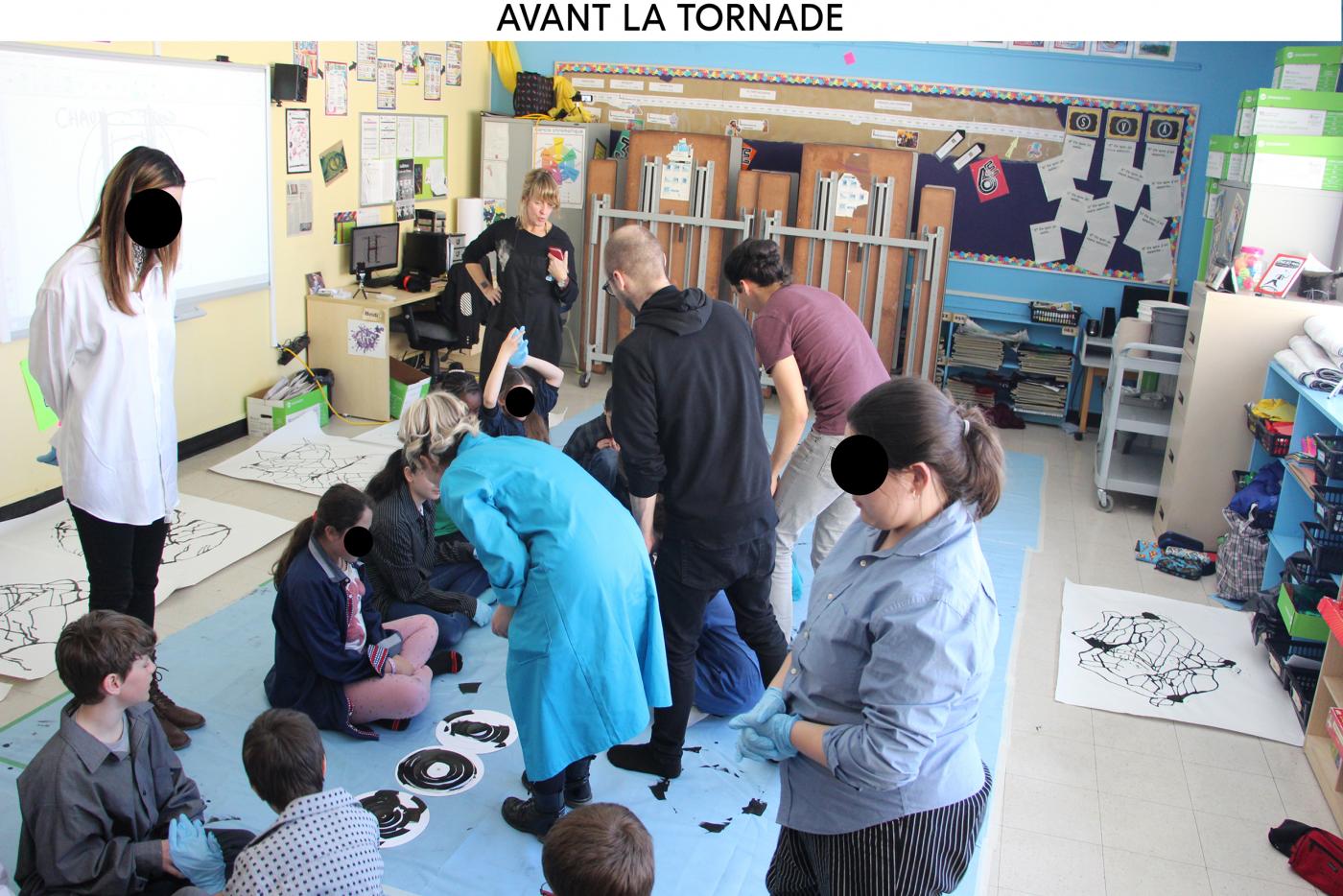
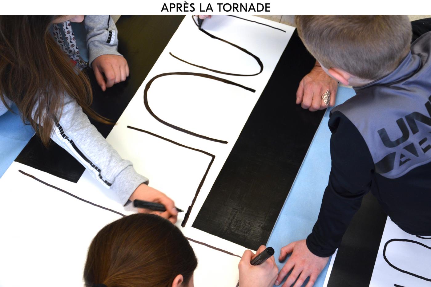
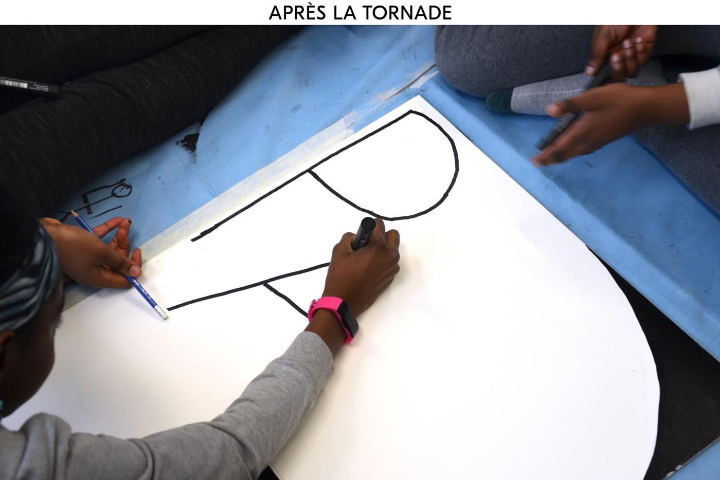
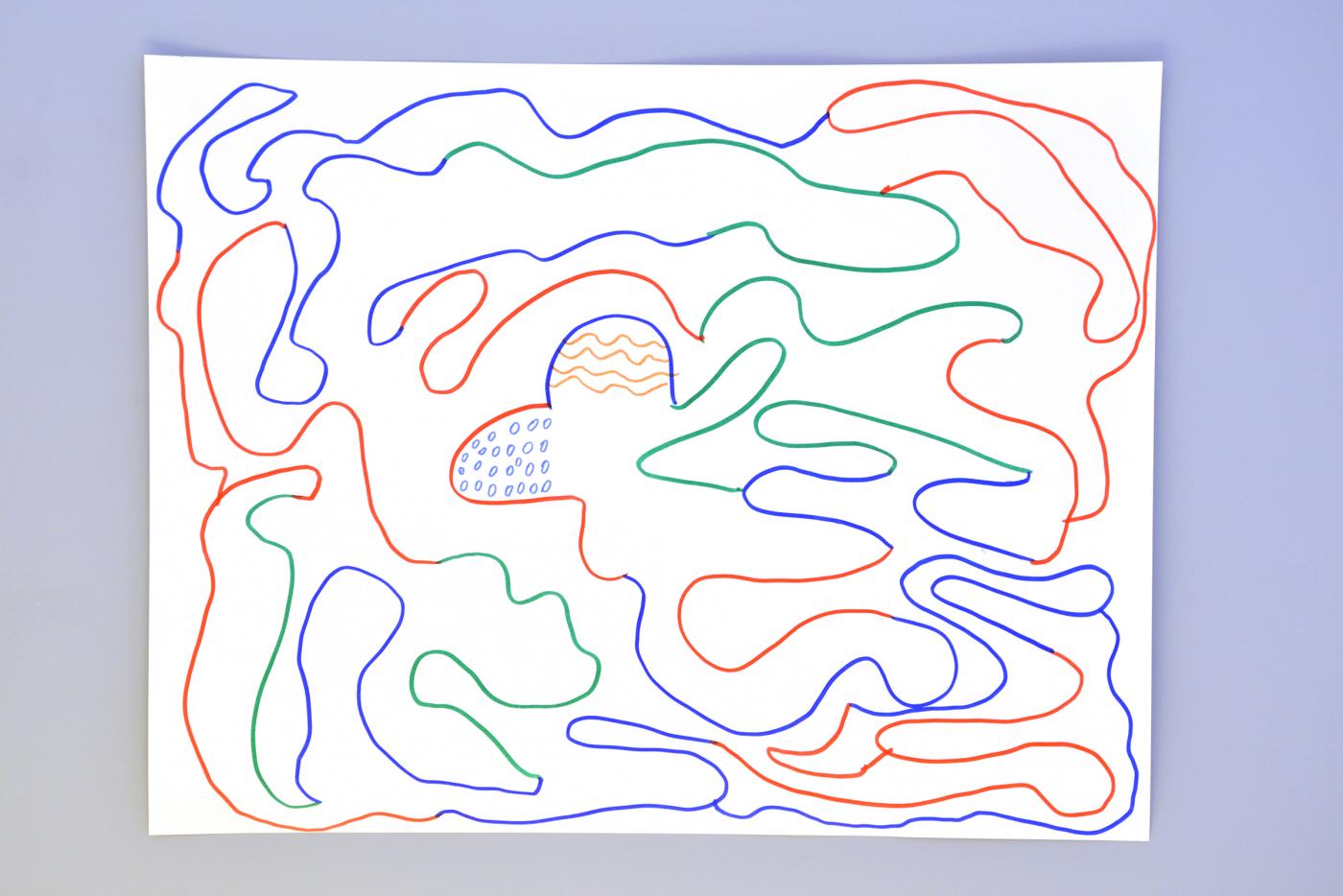
BEFORE — First day with kids at the elementary schoolin Ayler Village. It’s the beginning of the tornado, we a re focus on the eyes of the tornade, it’s the meeting between the cold and warm wind. The size is not so big for kids, they are exploring the link between their movement and the line. From Lines to Letters.
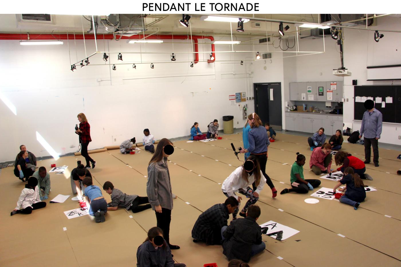
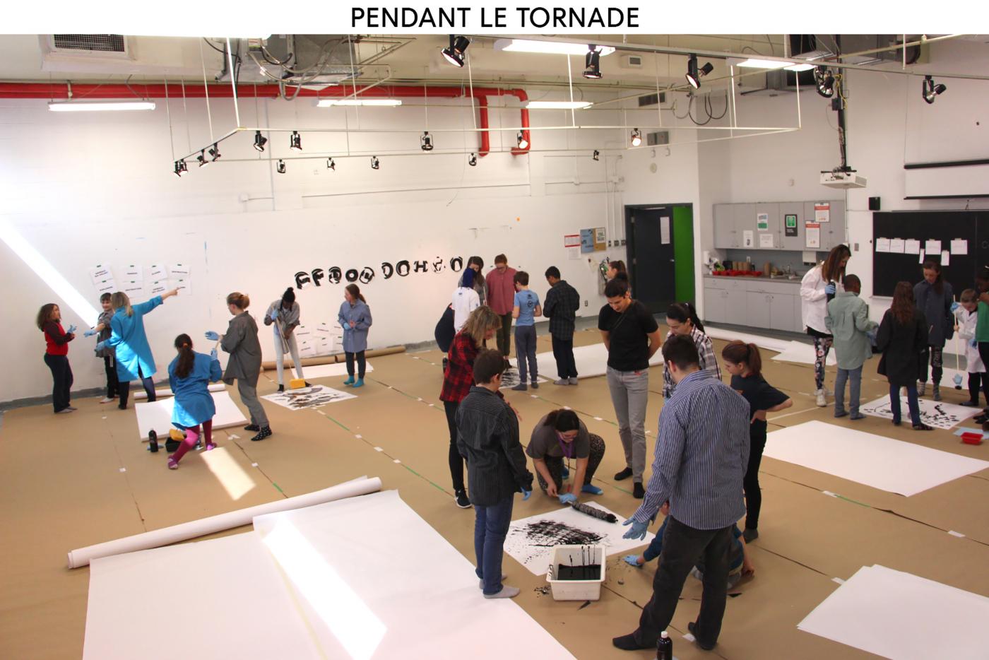
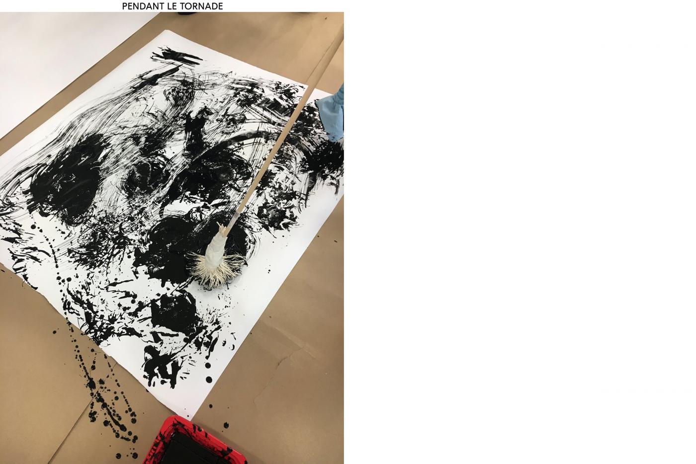
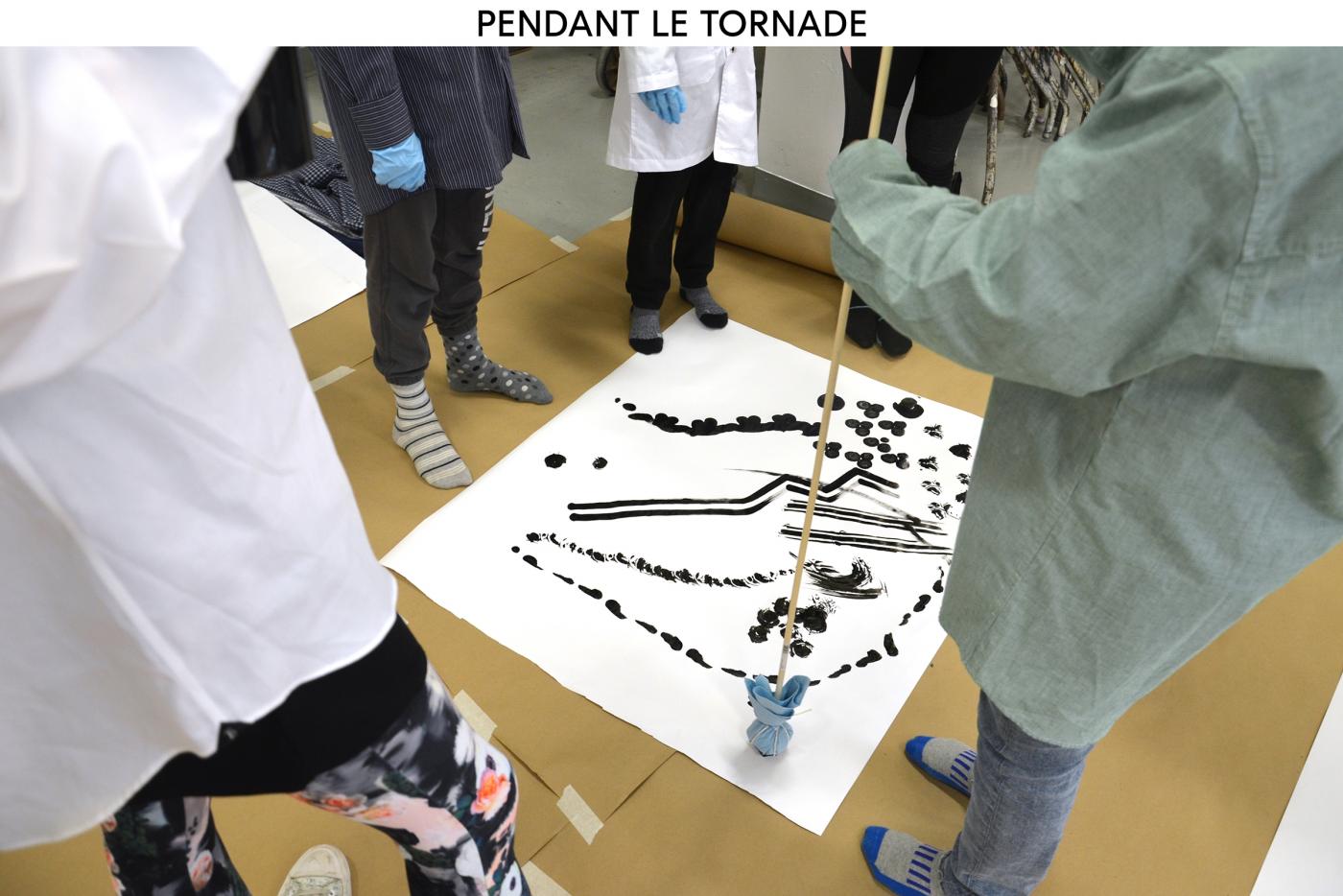
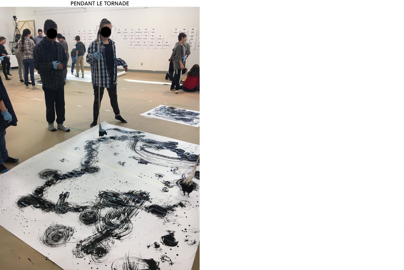
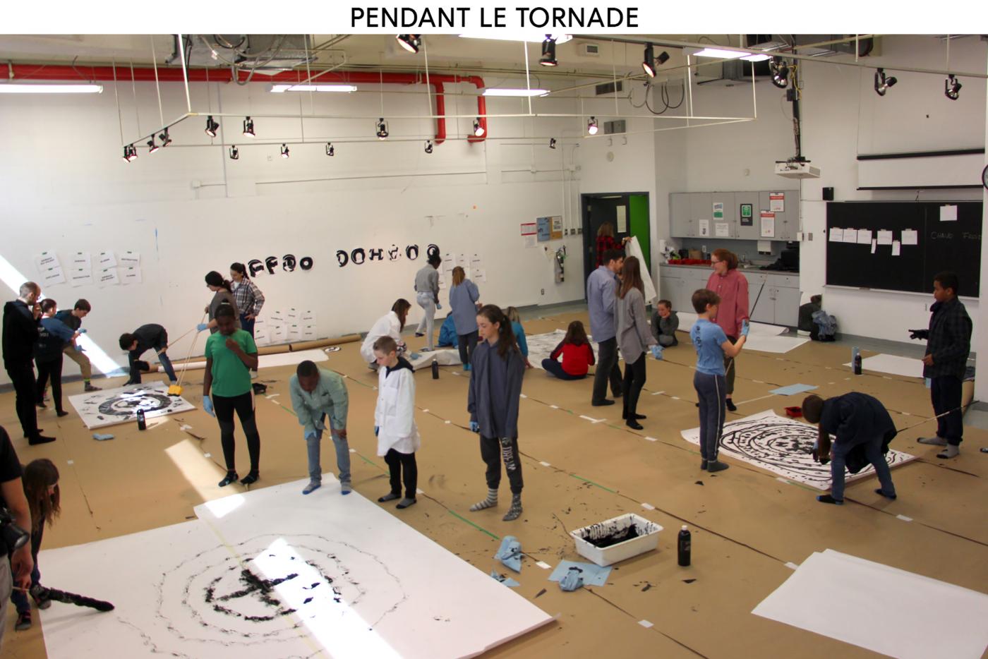
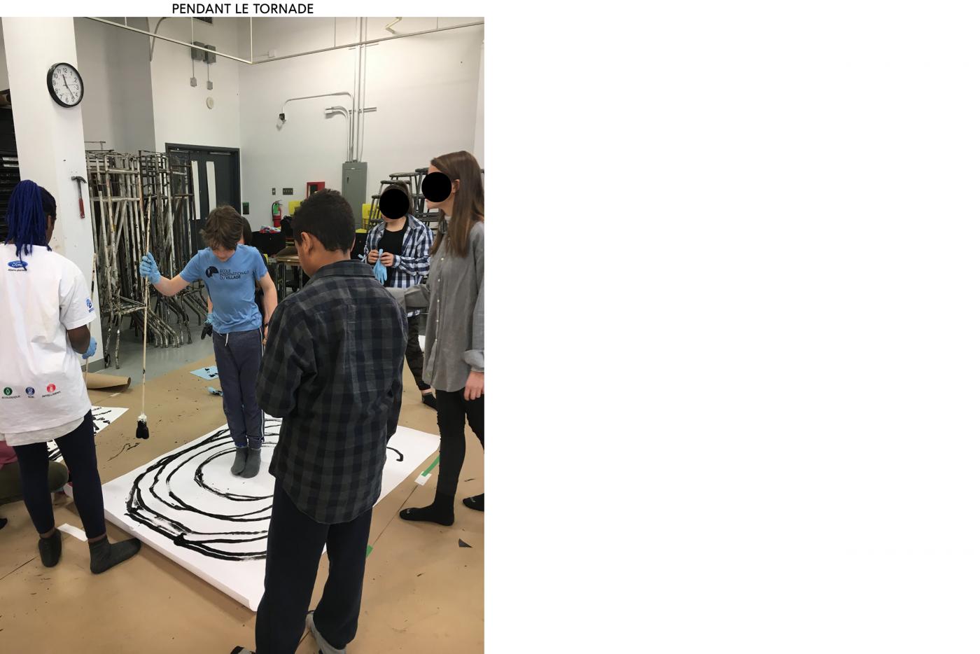
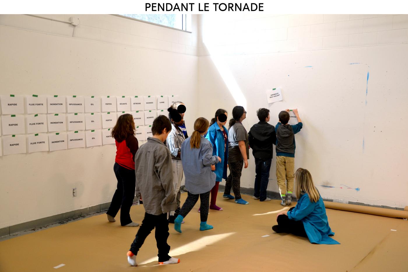
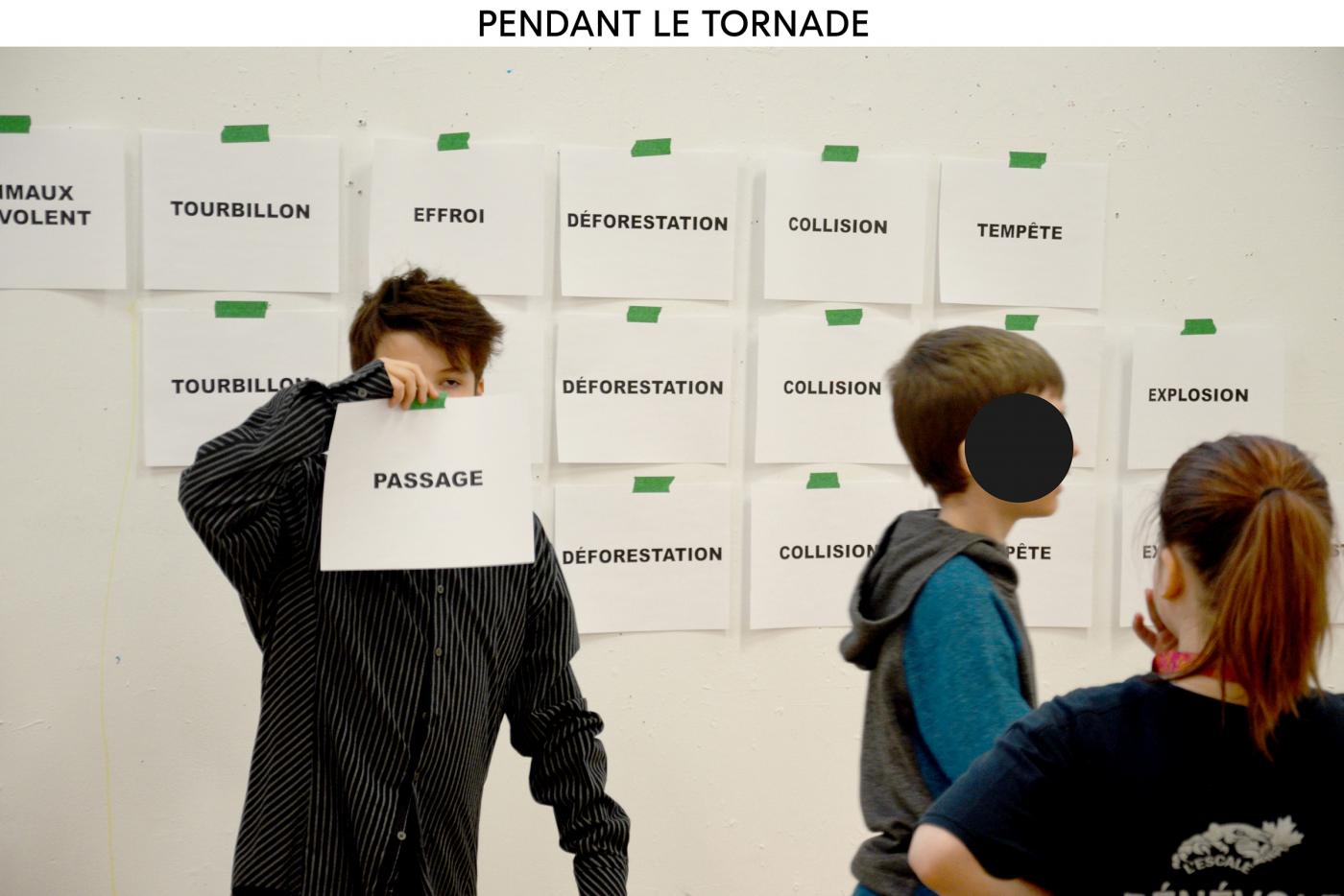
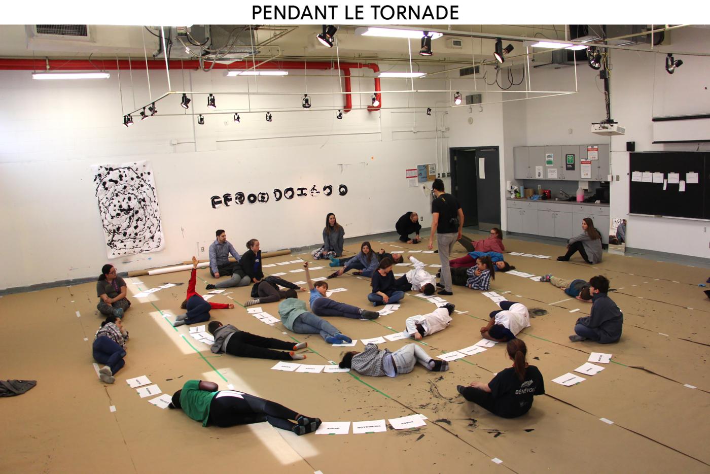
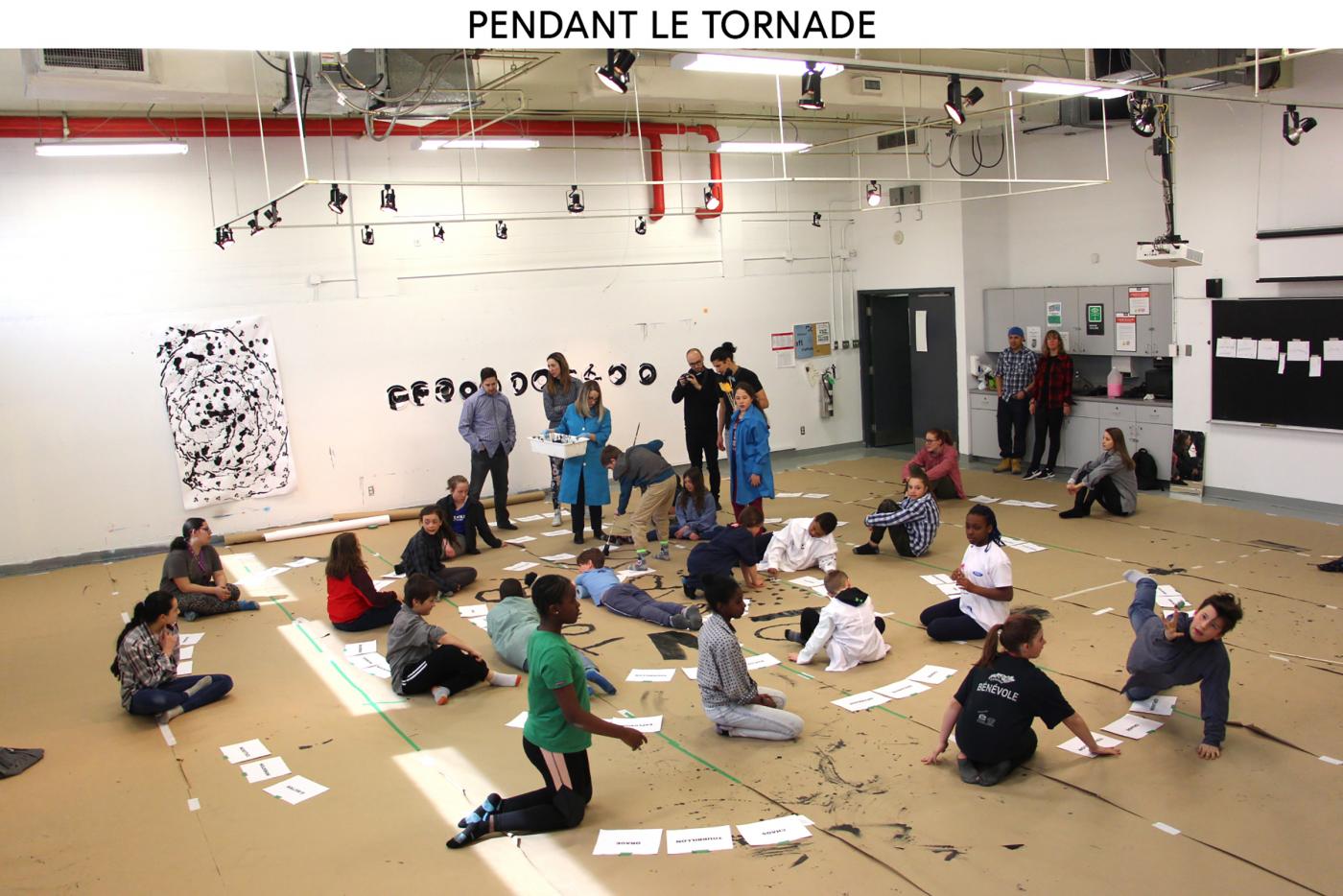
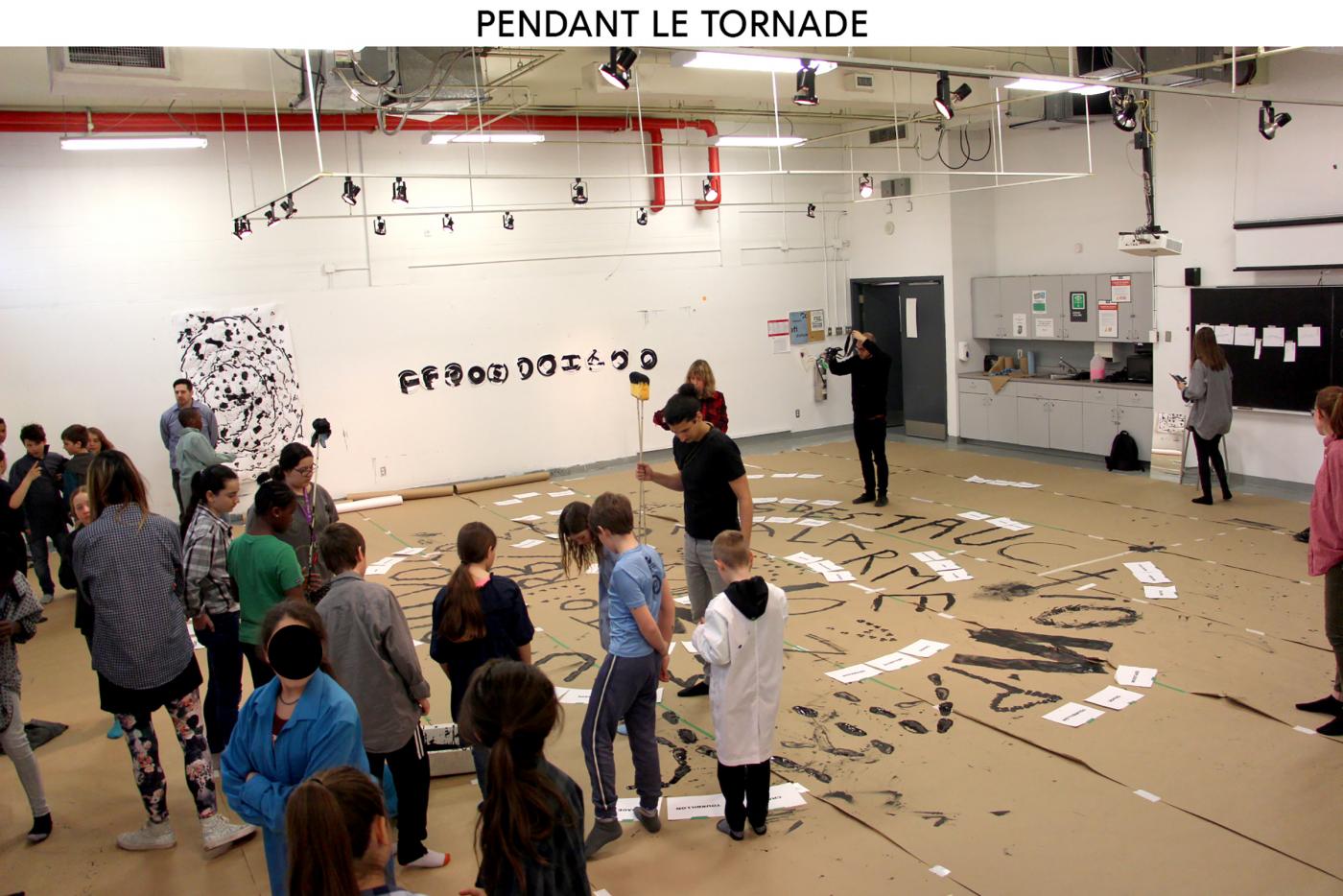
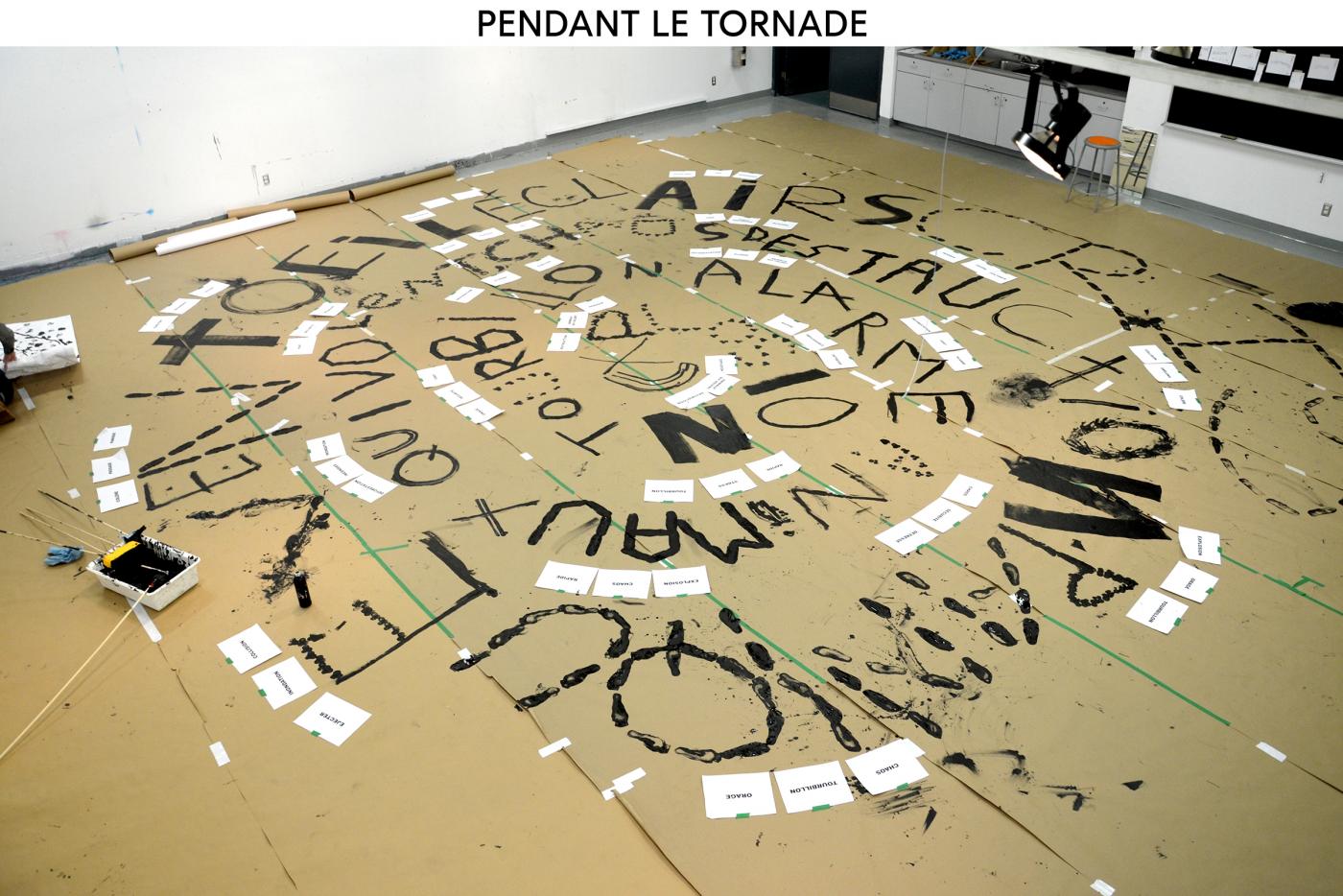
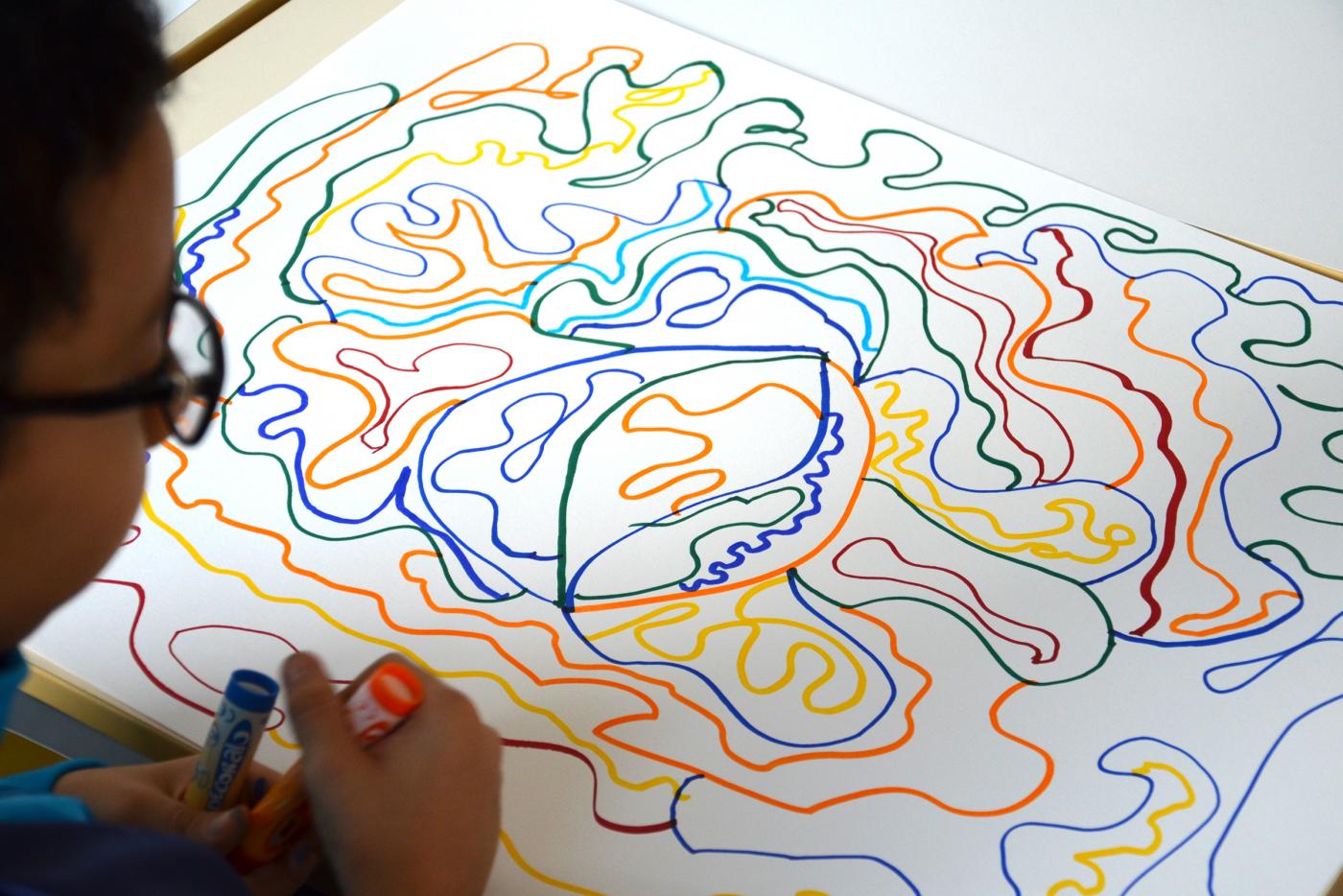
DURING THE TORNADO - We are now entering in the tornado, and this time the scale is totally different, so we are going to work at uqo university to have a big enough room. Second day of workshop with kids from Aylmer Elementary School, we start by creating a list of words with the students to classify them as important or less important: explosion / destruction / panic / fast / impotence / wind ... more about sixty words divided into three categories. This first moment is important to understand the feeling/memory of the childrens.Then we created four tools giving four different gestures and postures, leading to the creation of four different tornado drawn by the students. Finally the tornado is growing to take a large part of the room. It will be formed by the students and structured by the set of the most important words, expressing the most violent feelings they may have felt or the most striking elements they have observed / experienced during this tornado. PENDANT LA TORNADE
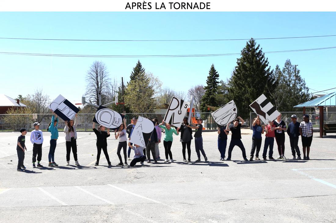
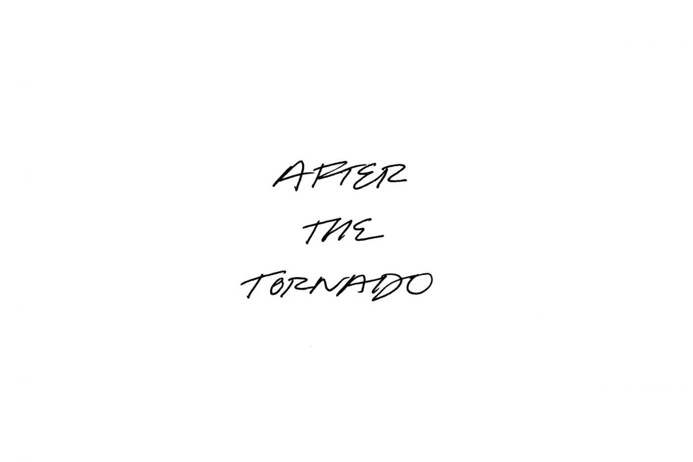
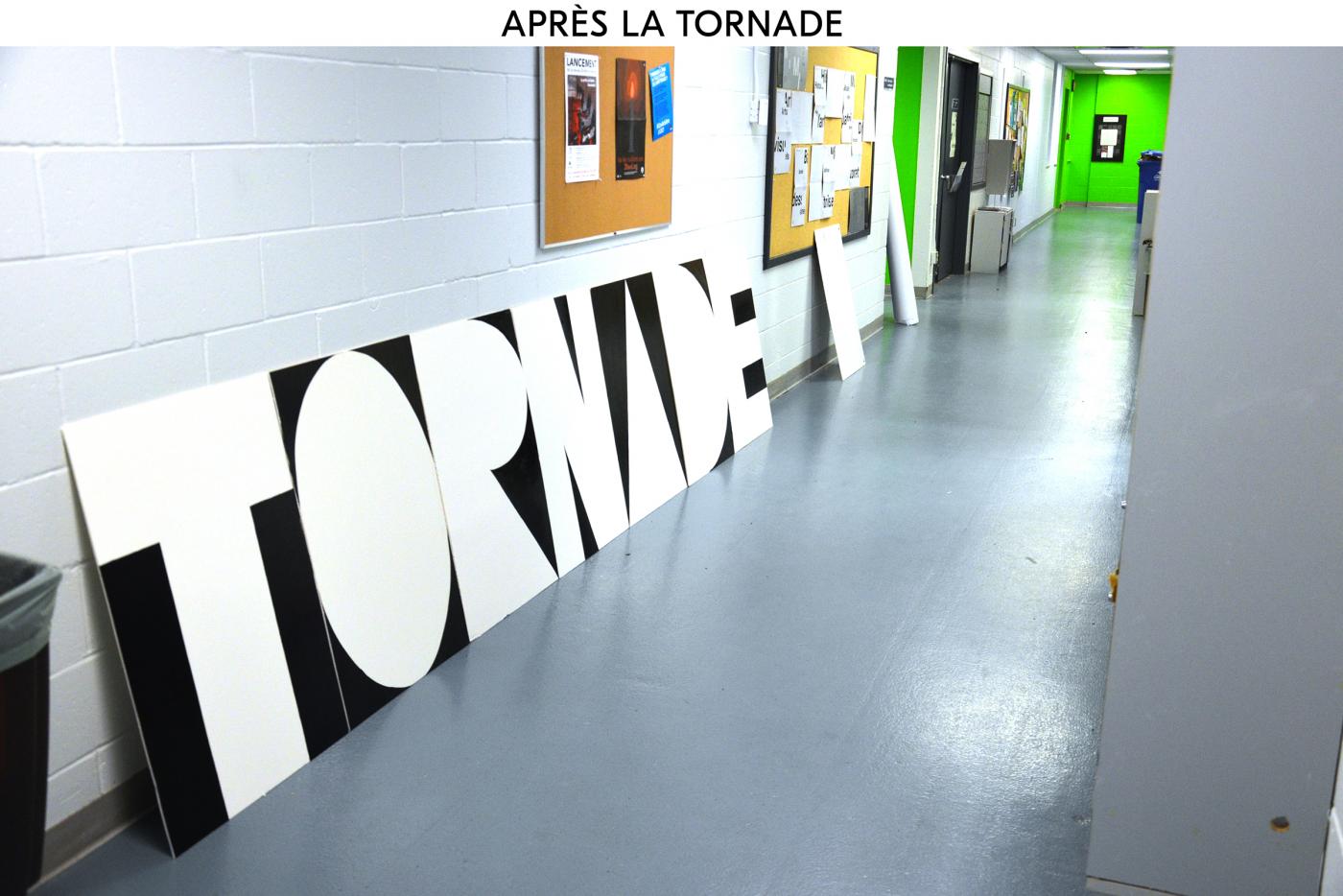
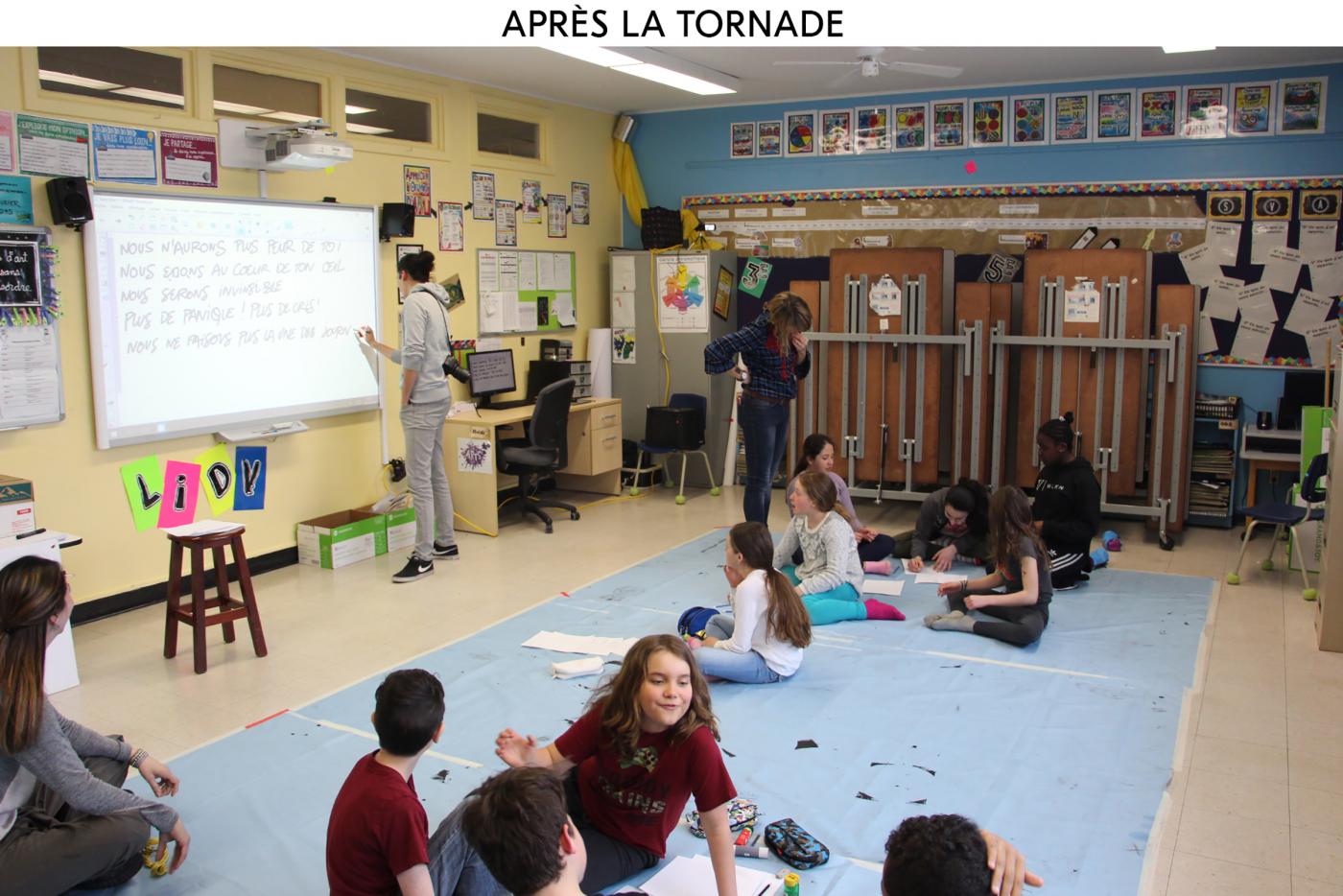
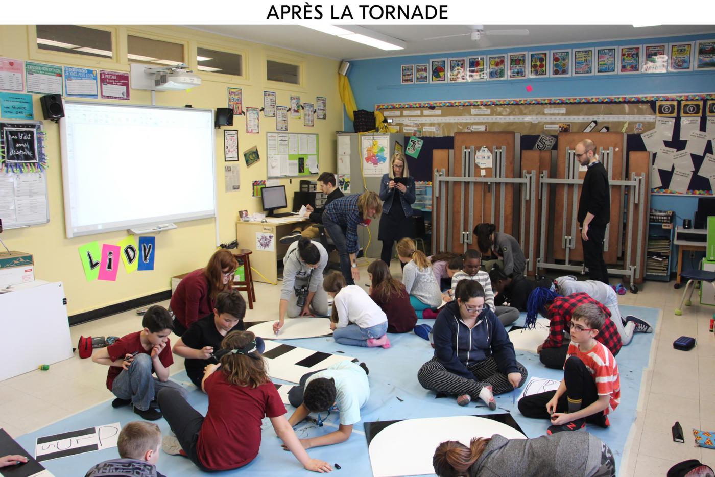
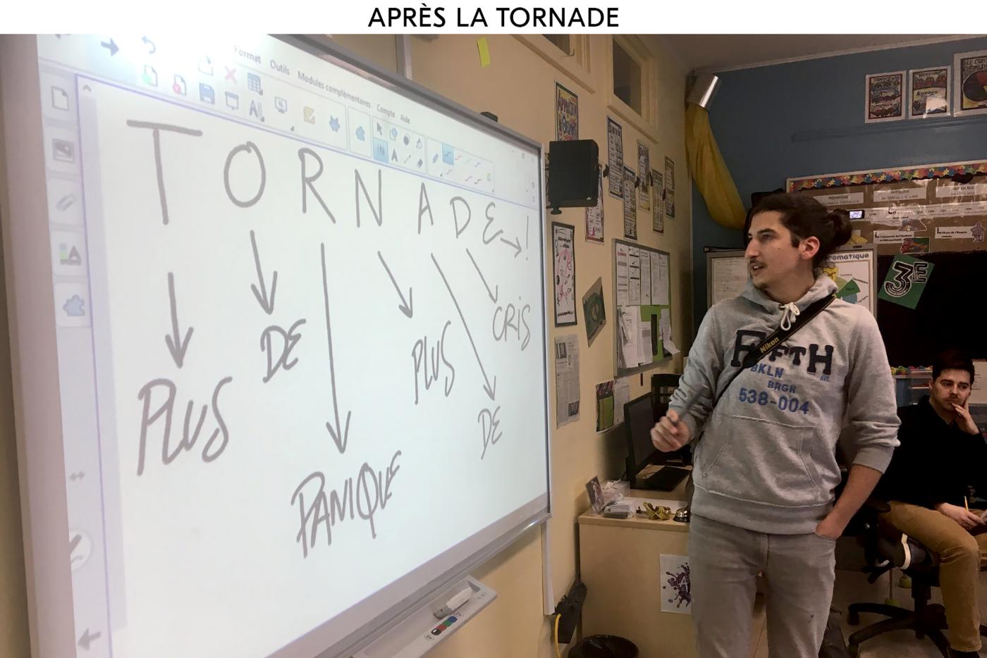
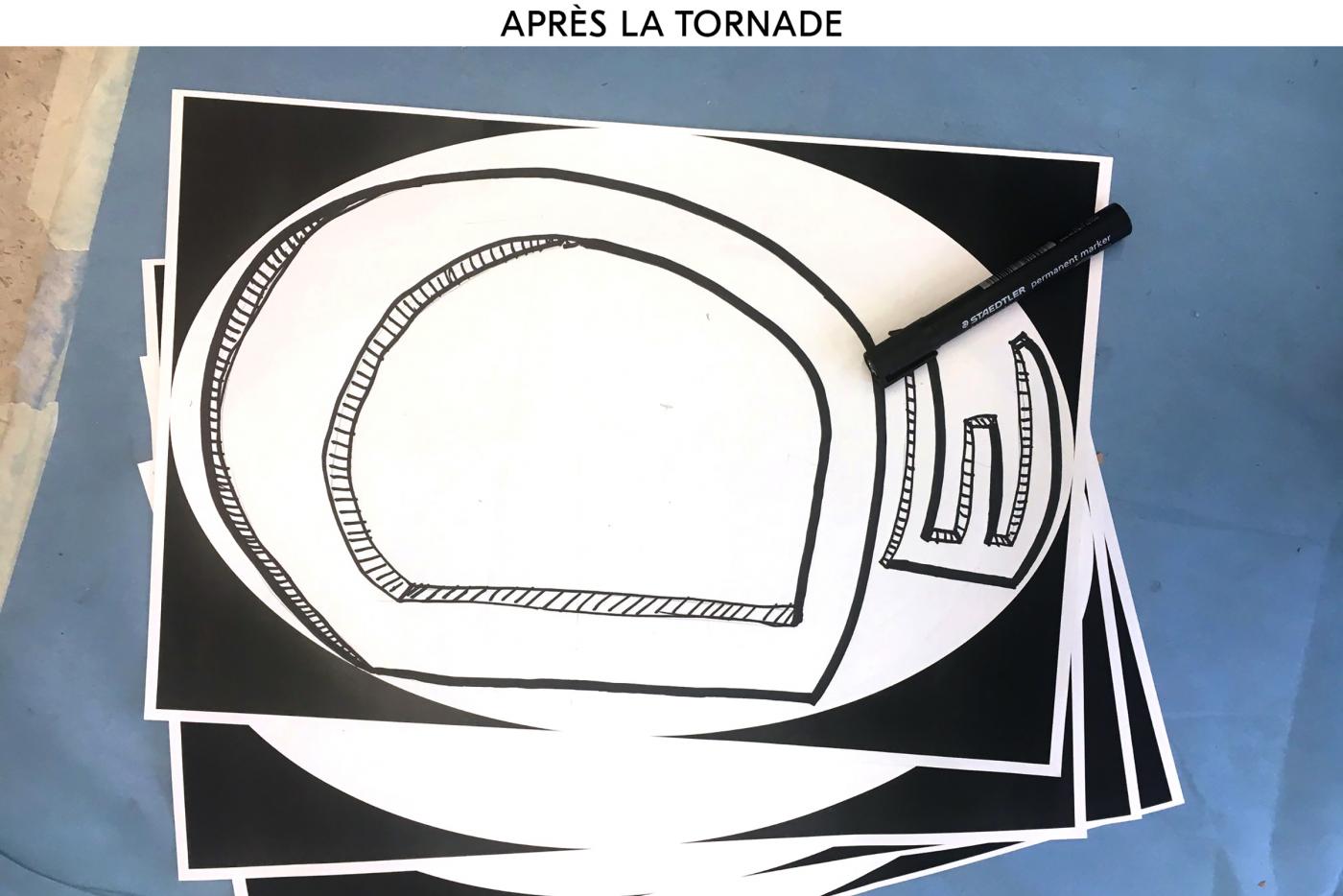
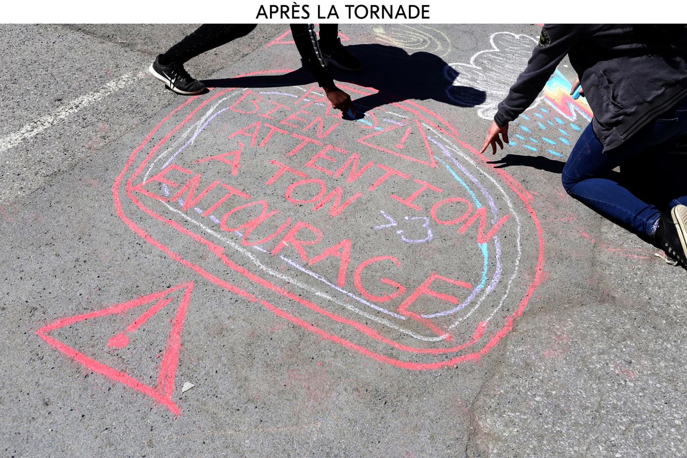
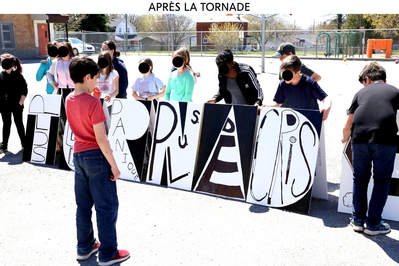
AFTER THE TORNADO THERE ARE ONLY WORDS TO TESTIFY - For this last day of workshop, we return to Aylmer Elementary School to focus on the future. What happens after the tornado? The students created several sentences in seven words: « Tornado… » . The sentence have to be writing in the fill the word TORNADO, one word for on letter. After about twenty sentences and we vote for "TORNADO, NO MORE PANIC. NO MORE CRIS! ». Then students started to work on the typography by distorting each letter to create a typographic composition almost drawing posters.
- BORDERS EXPOSITION ITINÉRANTE
- Affiche
- Tribu Grafik
- Canada
- —
- Affiche
- Tribu Grafik
- Canada
Borders (borders) poster created in 2018 on the issue of migration, part of the Migration exhibition "Migratory issues put our humanity to the test, whether for economic, climatic or armed conflict reasons more and more people are forced to leave their country, how do they get help, how do we welcome them? " I chose to talk about this concept of boundary that prevents some (s) advance. Silkscreen The insolante for printing in two colors.
- Design & pedagogy
- Kids program
- —
- Kids program
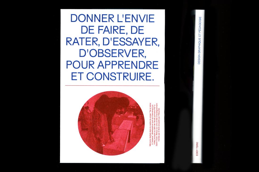
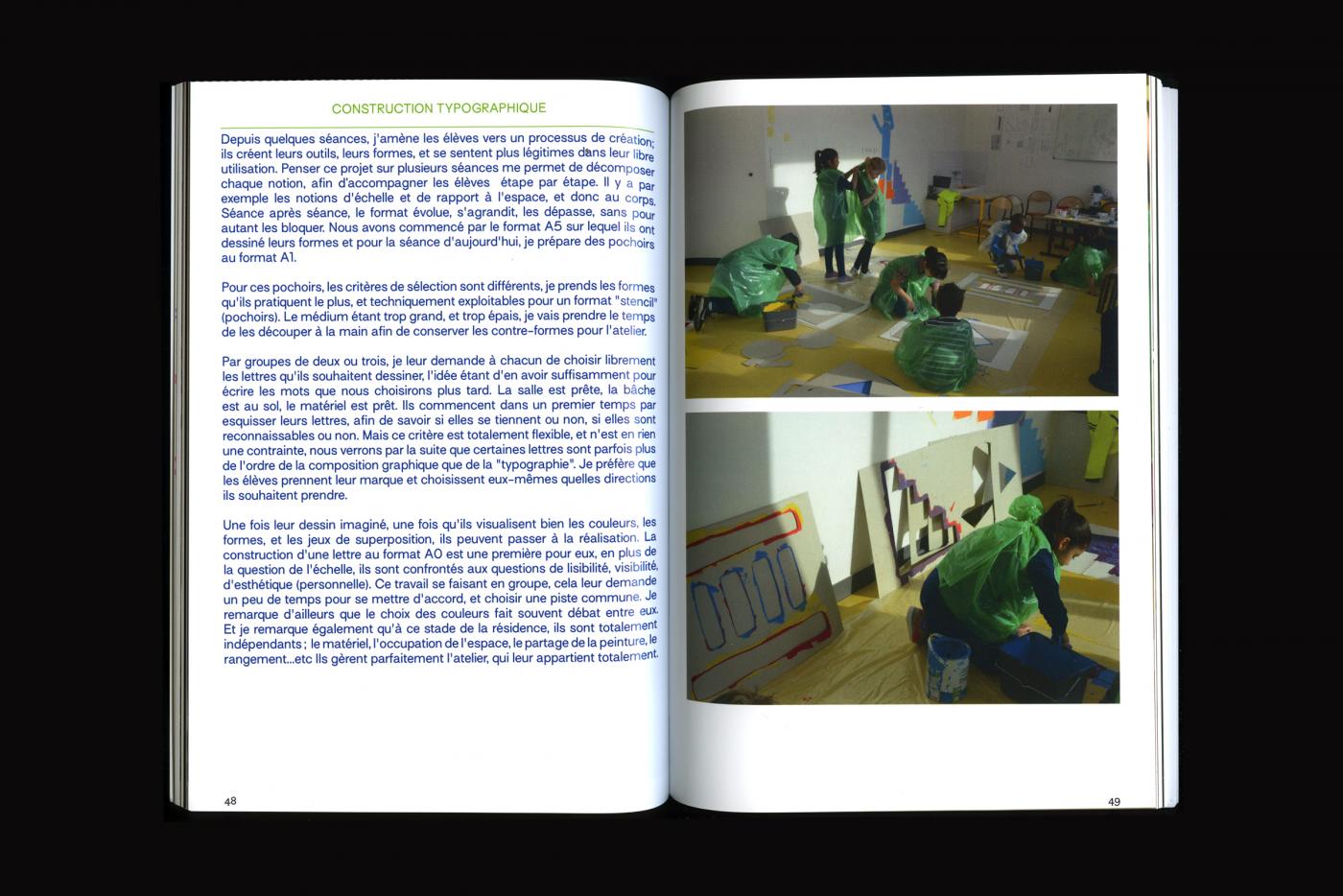
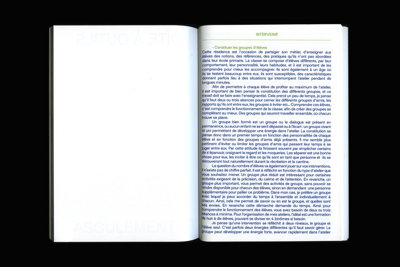
This thesis present my intervention for kids program. I take time to explain the workshops and give somes advices for designers who wants to create workshops too.
- Te retrouver
- Cover design & website
- Carole M'Bazomo
- Paris
- —
- Cover design & website
- Carole M'Bazomo
- Paris
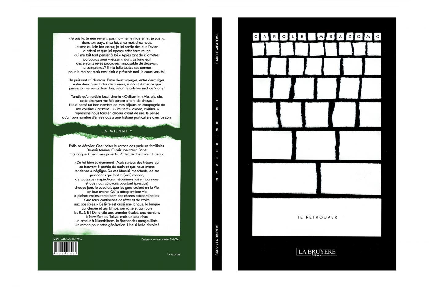
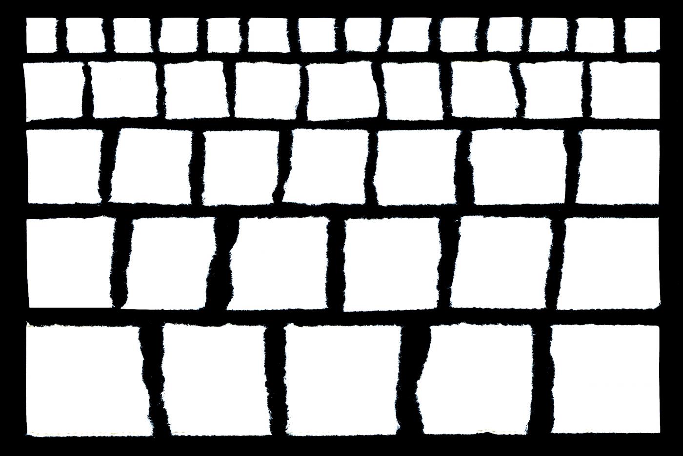
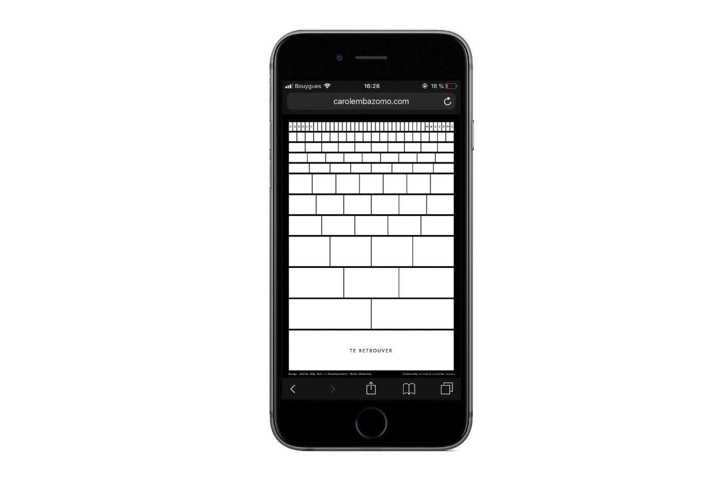
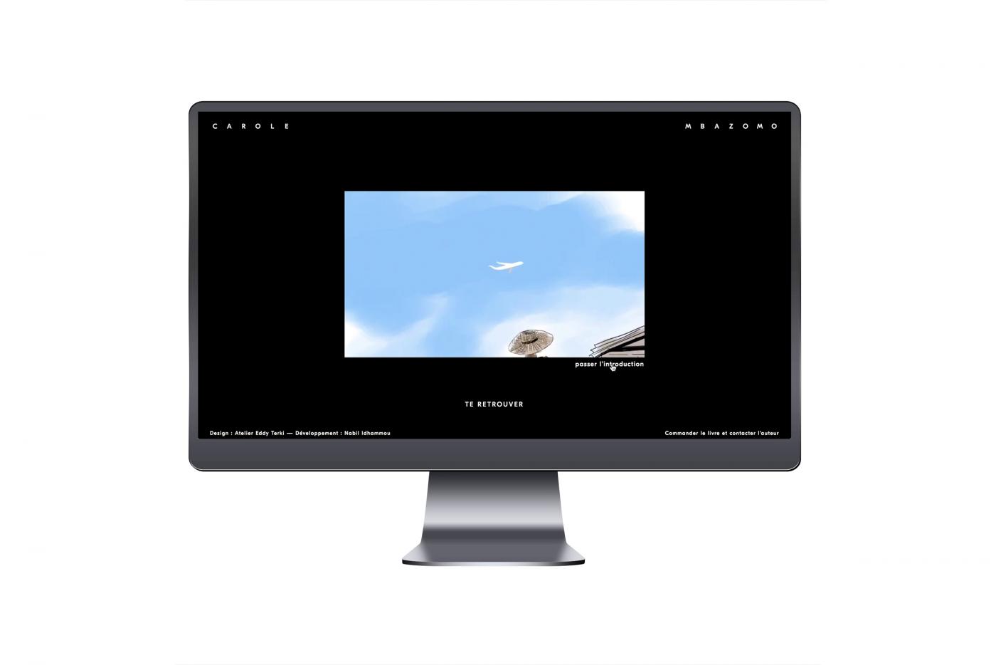
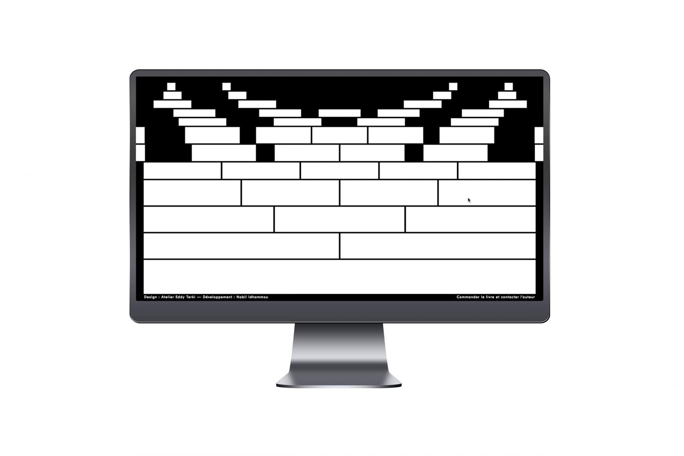
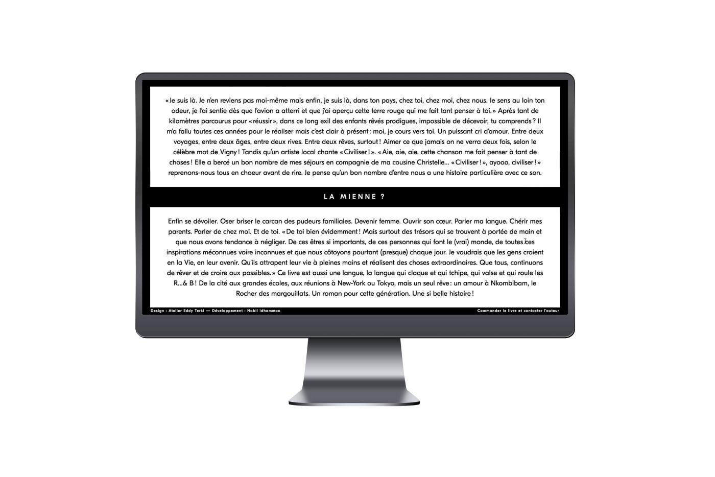
Back to basic, papier découpé, scanne, blanc et noir. « Te retrouver » c’est une histoire inspirante questionnant la vie, la famille, les origines, la construction et l’identité. Fiction ou réalité, ce livre publié par les Editions La Bruyère raconte l’histoire d’une héroïne qui prend le temps de repartir dans son pays d’origine pour mieux comprendre son histoire et celle de sa famille. Découper les morceaux pour mieux les recoller. Prendre le temps de se construire, de re-construire son histoire familiale, c’est ce qui a donné naissance à ce visuel. Merci à Carole Mbazomo Pro pour sa confiance. Le livre est disponible sur toutes les plateformes, let’s go !
Développement web: Nabil Idhammou
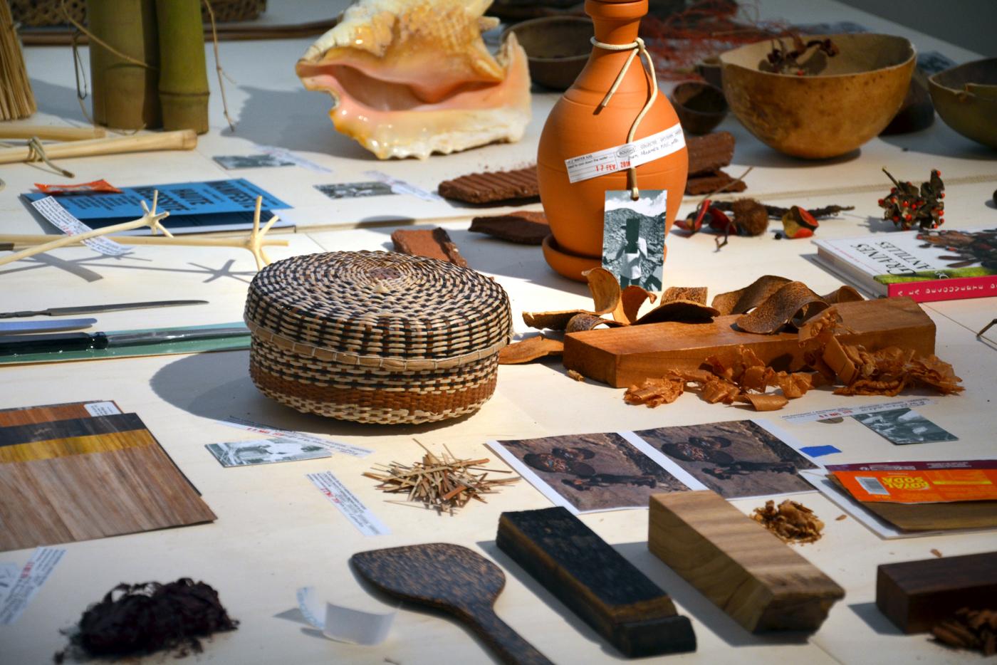
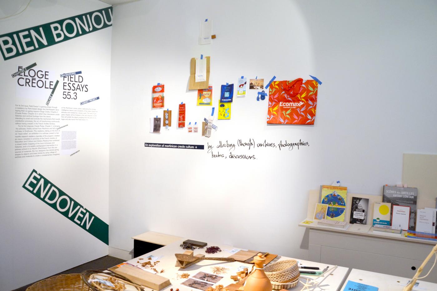
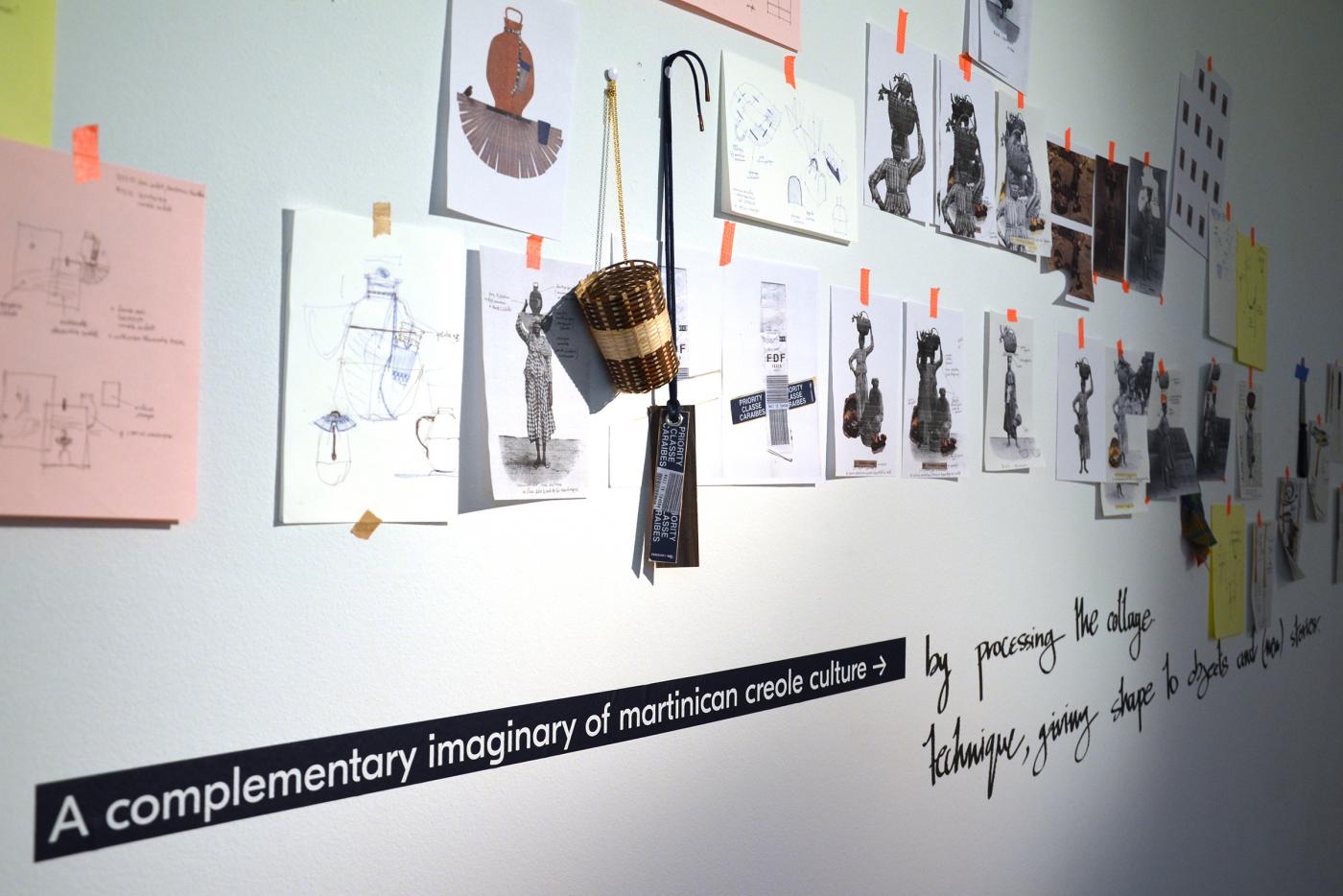
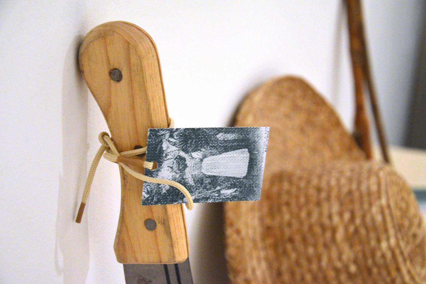
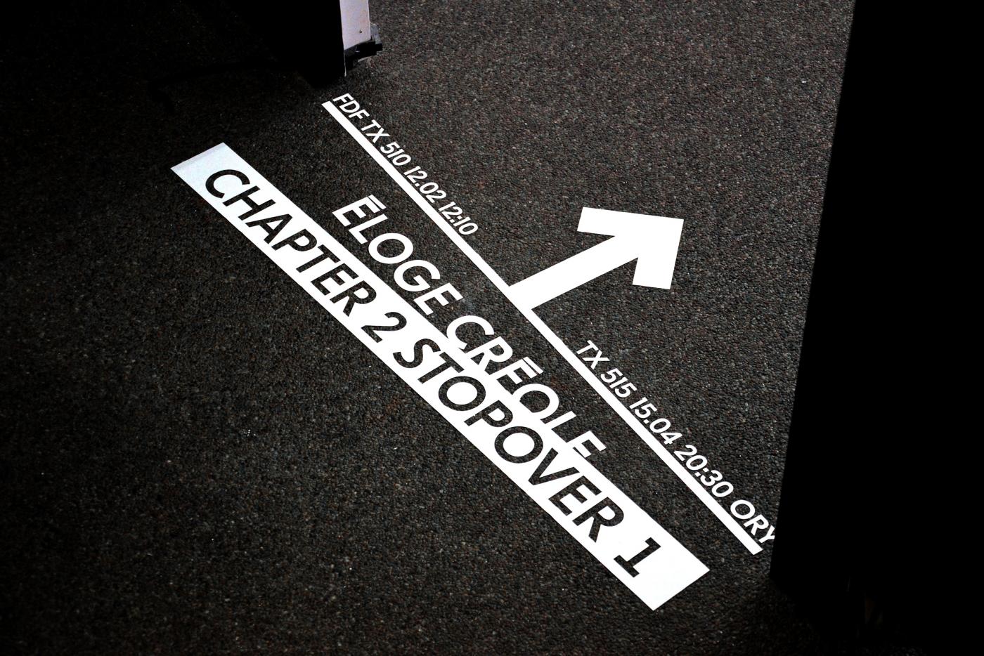
- Éloge Créole Chapter 2 Esc 1
- identité d'exposition
- Fields Essays
- Onomatopee Gallery, Dutch Design Week
- —
- identité d'exposition
- Fields Essays
- Onomatopee Gallery, Dutch Design Week
Nouveau projet
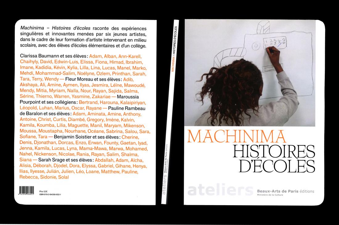
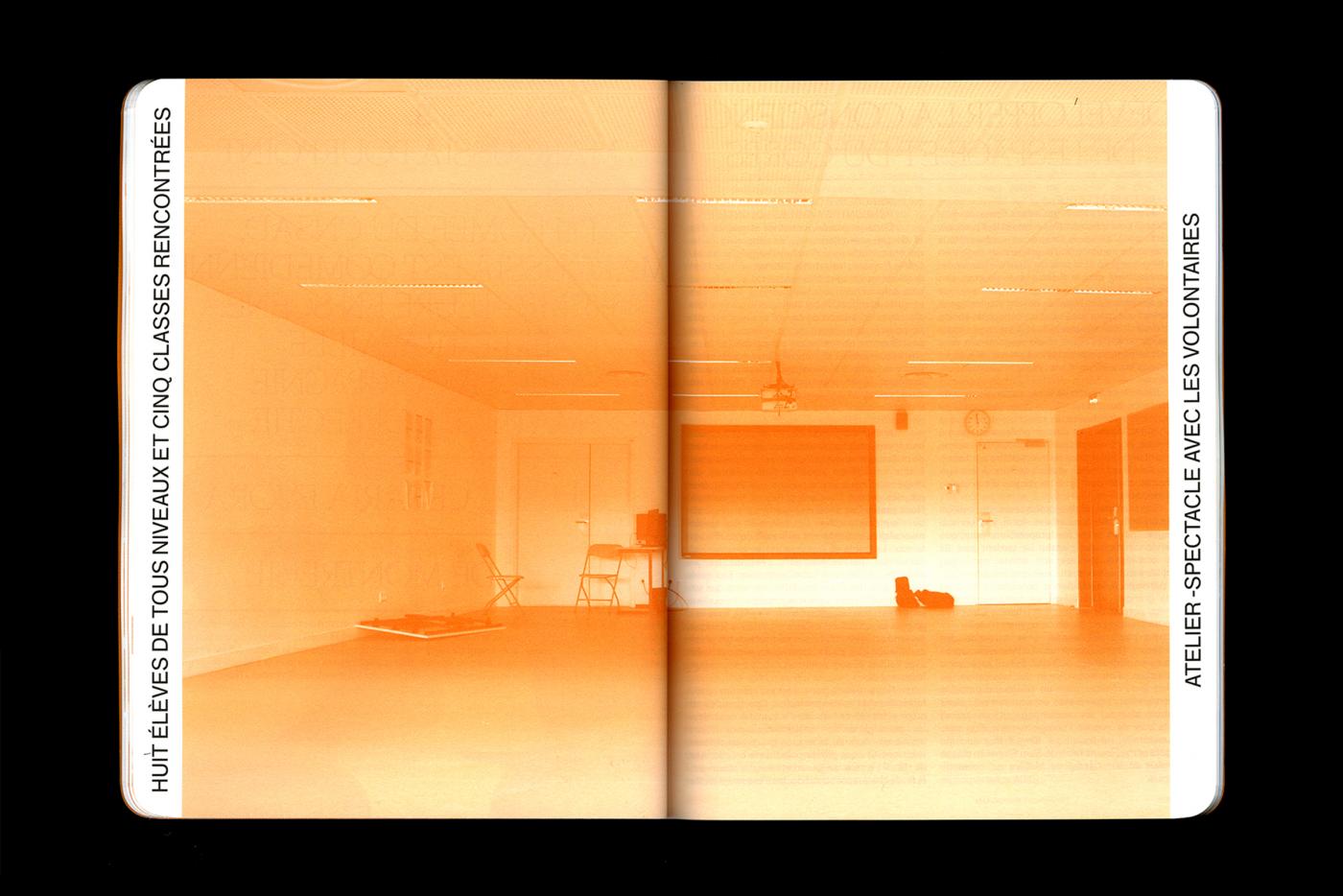
- Machina
- catalogue
- École des Beaux-Arts de Paris
- Galerie du Crous de Paris
- —
- catalogue
- École des Beaux-Arts de Paris
- Galerie du Crous de Paris
Nouveau projet
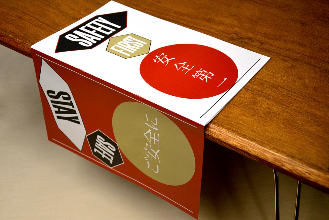
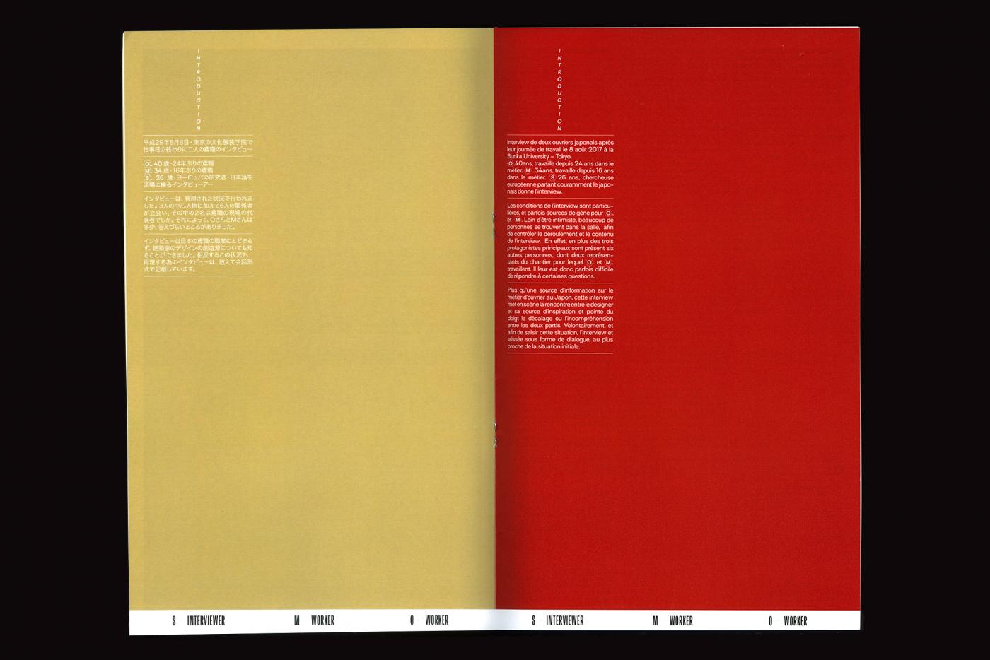
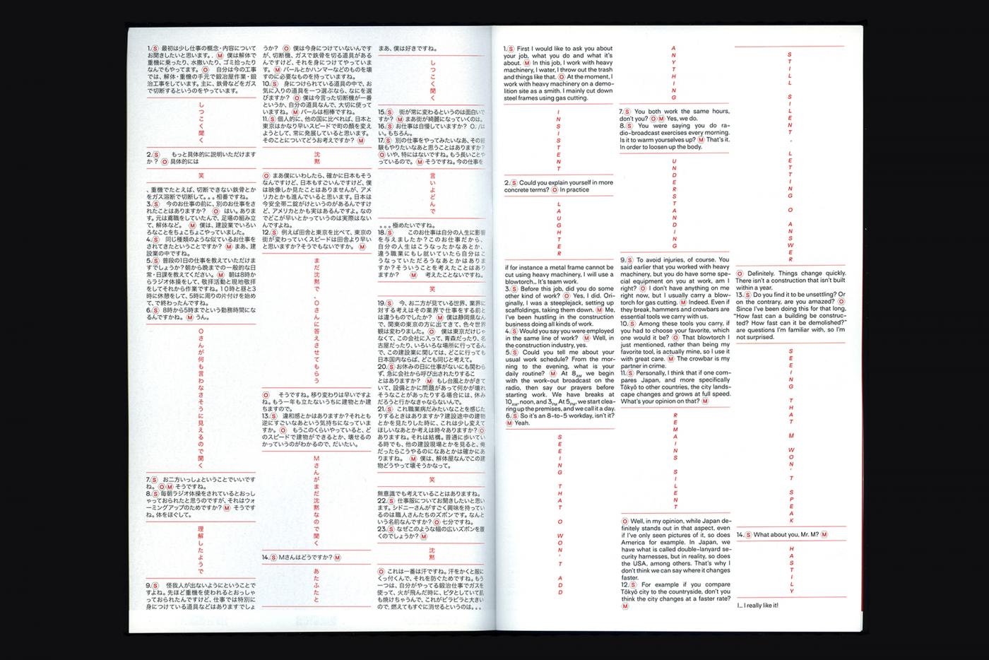
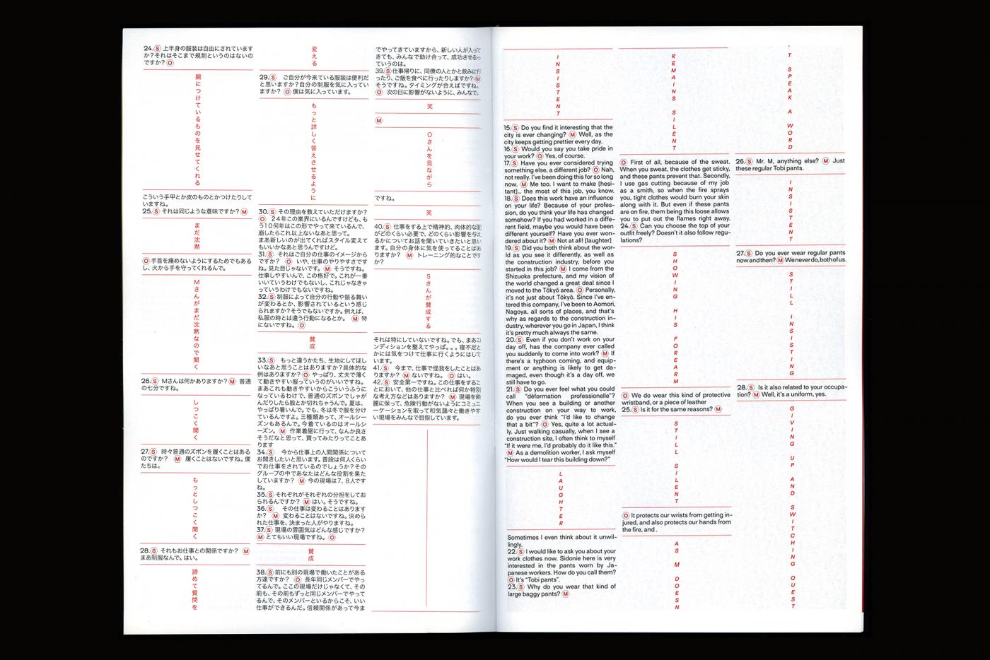
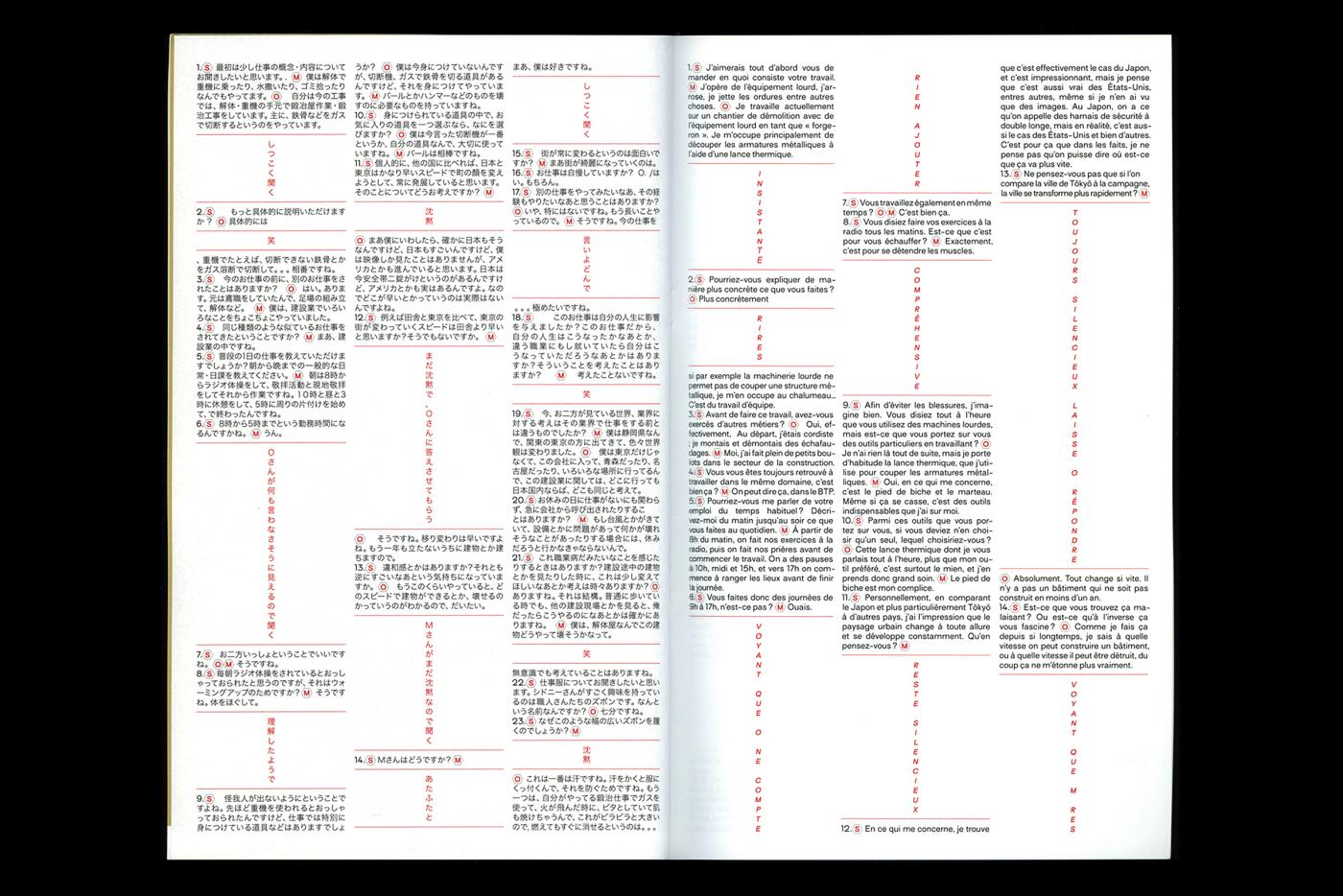
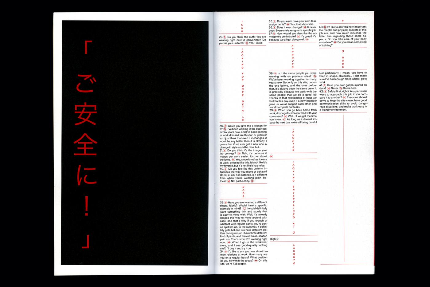
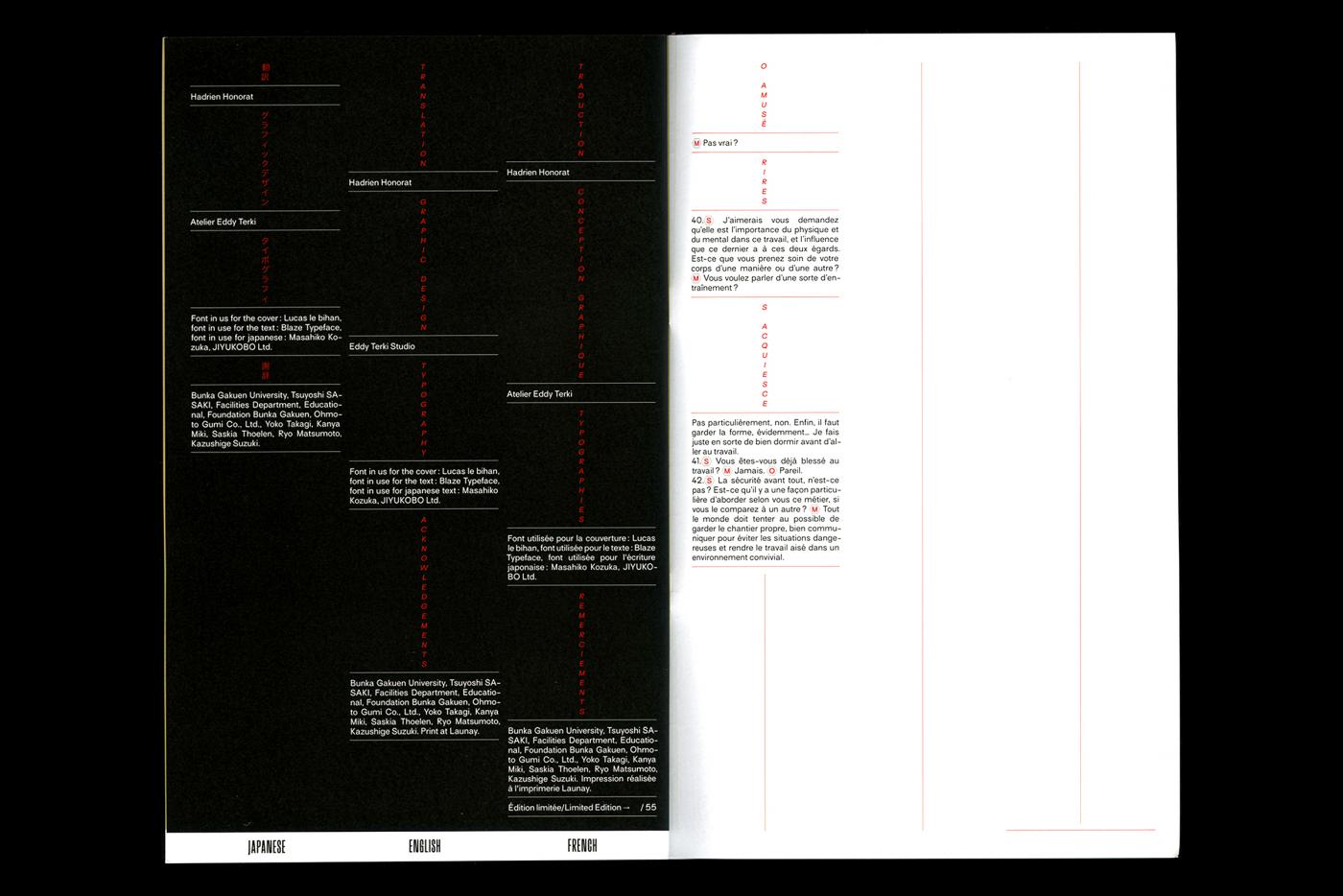
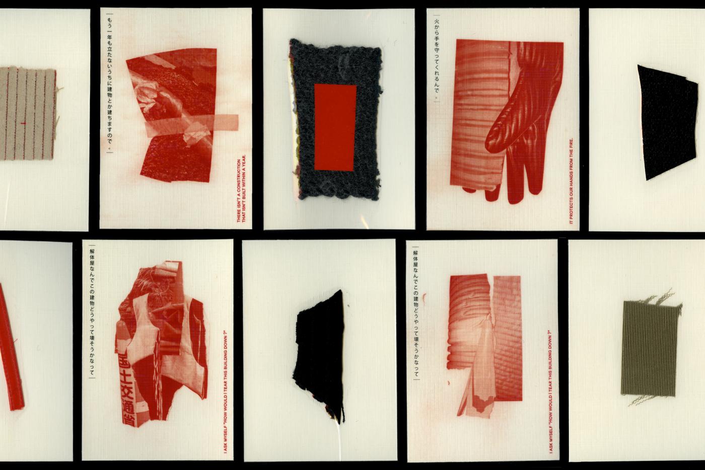
- SAFETY FIRST: EDITION PLURILINGUE
- Design éditorial
- Sidonie Boiron
- Paris
- Design éditorial
- Sidonie Boiron
- Paris
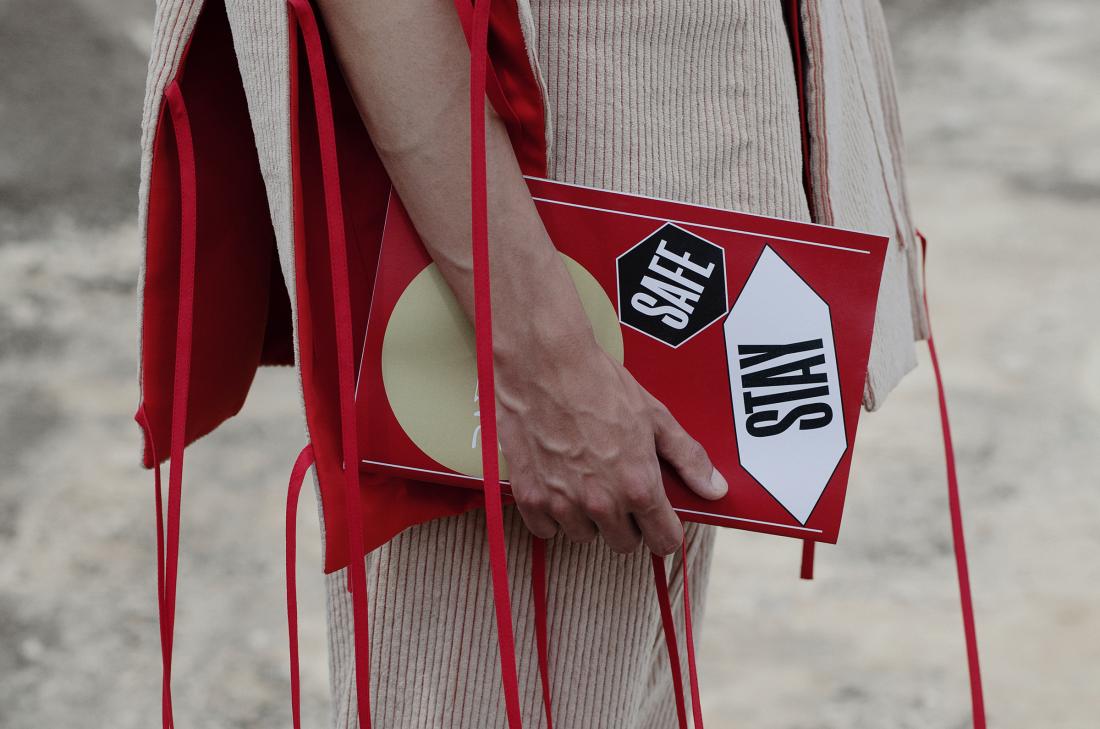
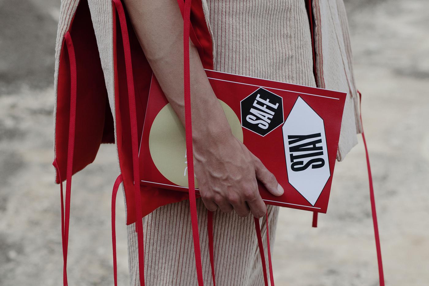
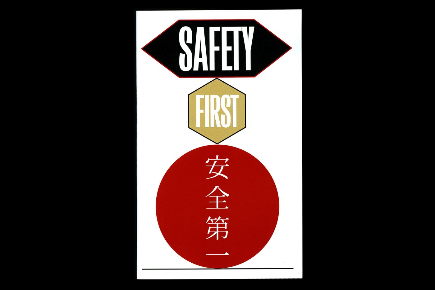
See on Instagram !
Second image (shooting exterieure): Louise Desnos.
- Travel diary
- Design éditorial
- Théâtre de Sartrouville et des Yvelines
- Sartrouville
- Design éditorial
- Théâtre de Sartrouville et des Yvelines
- Sartrouville
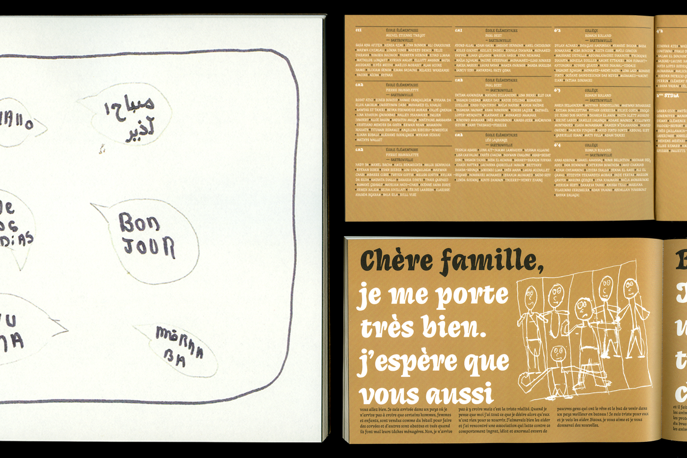
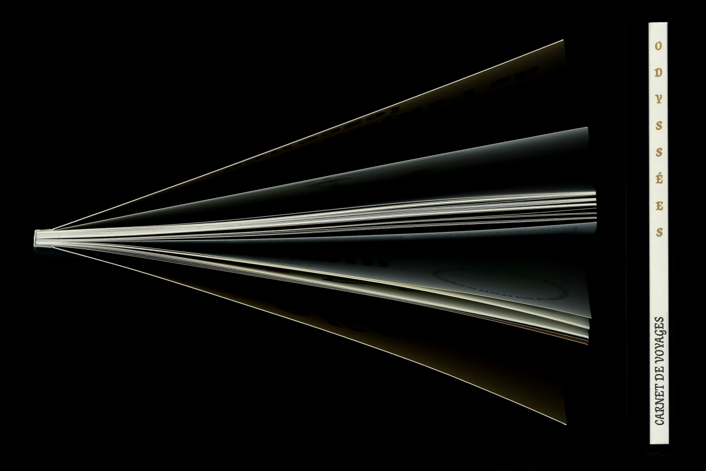
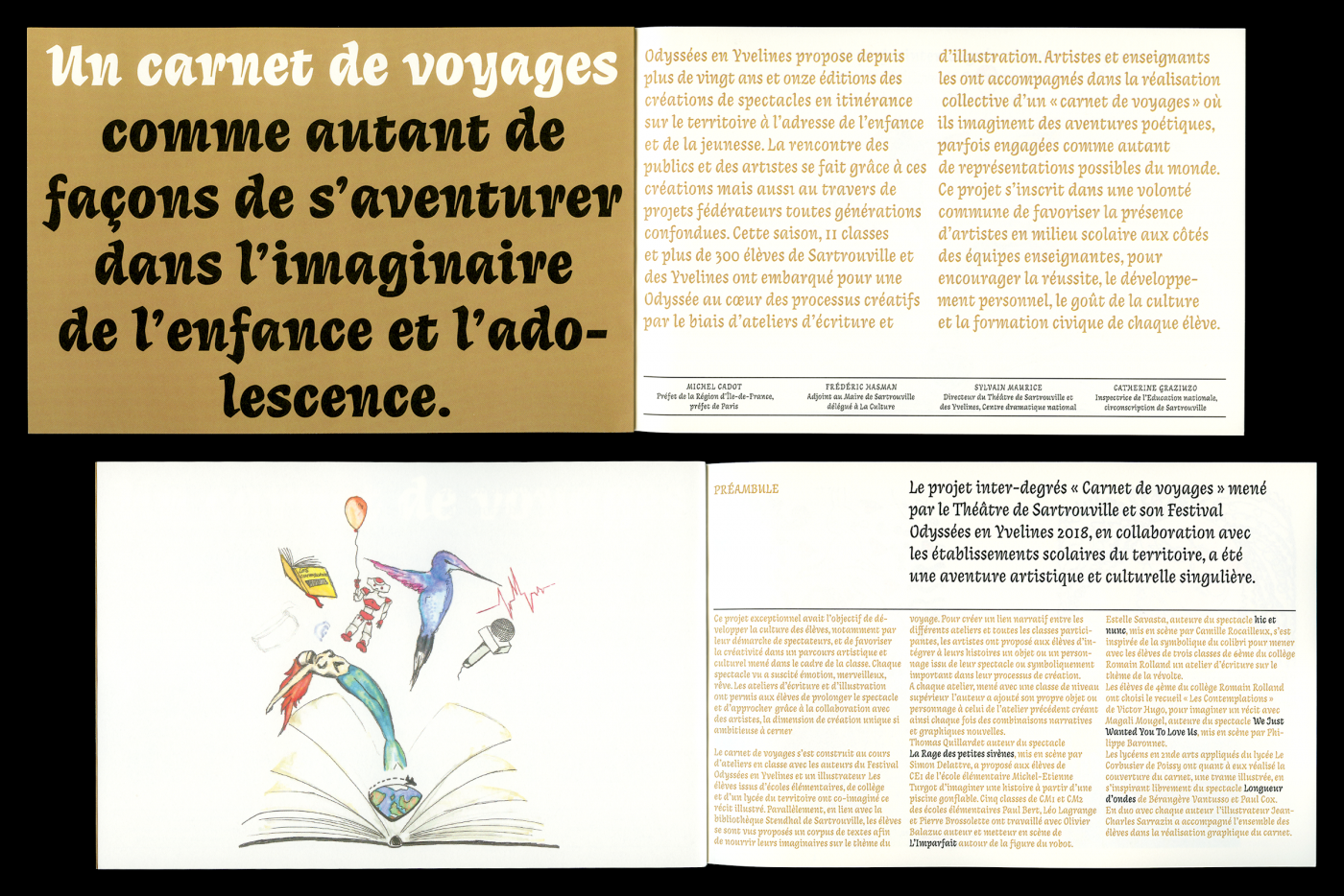
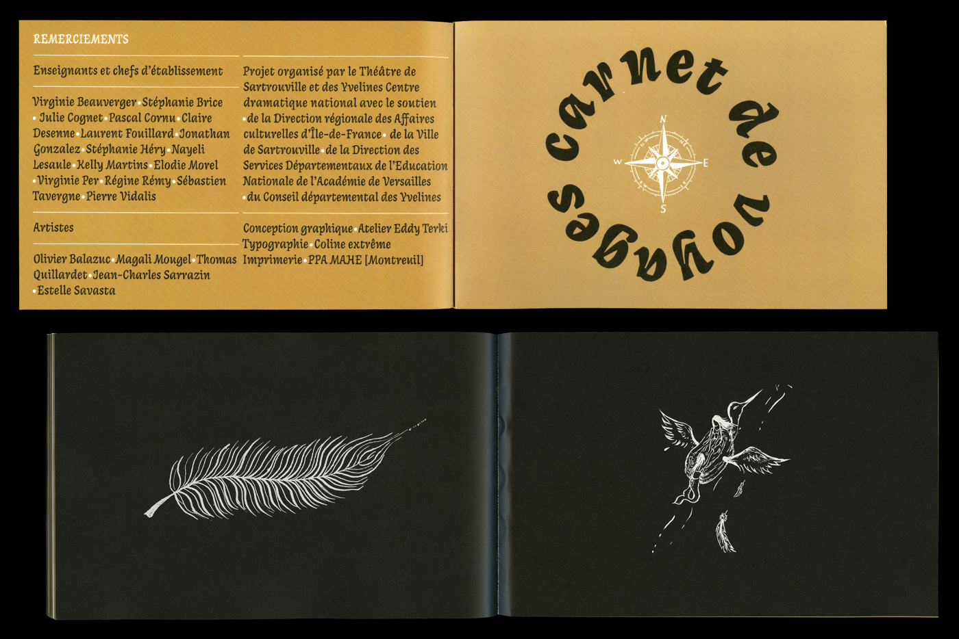
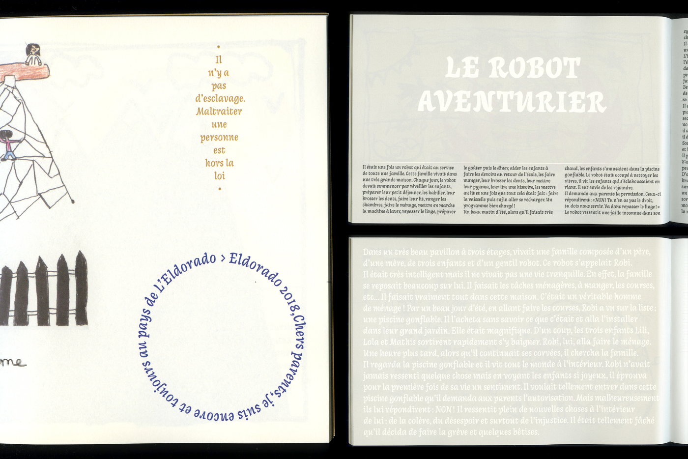
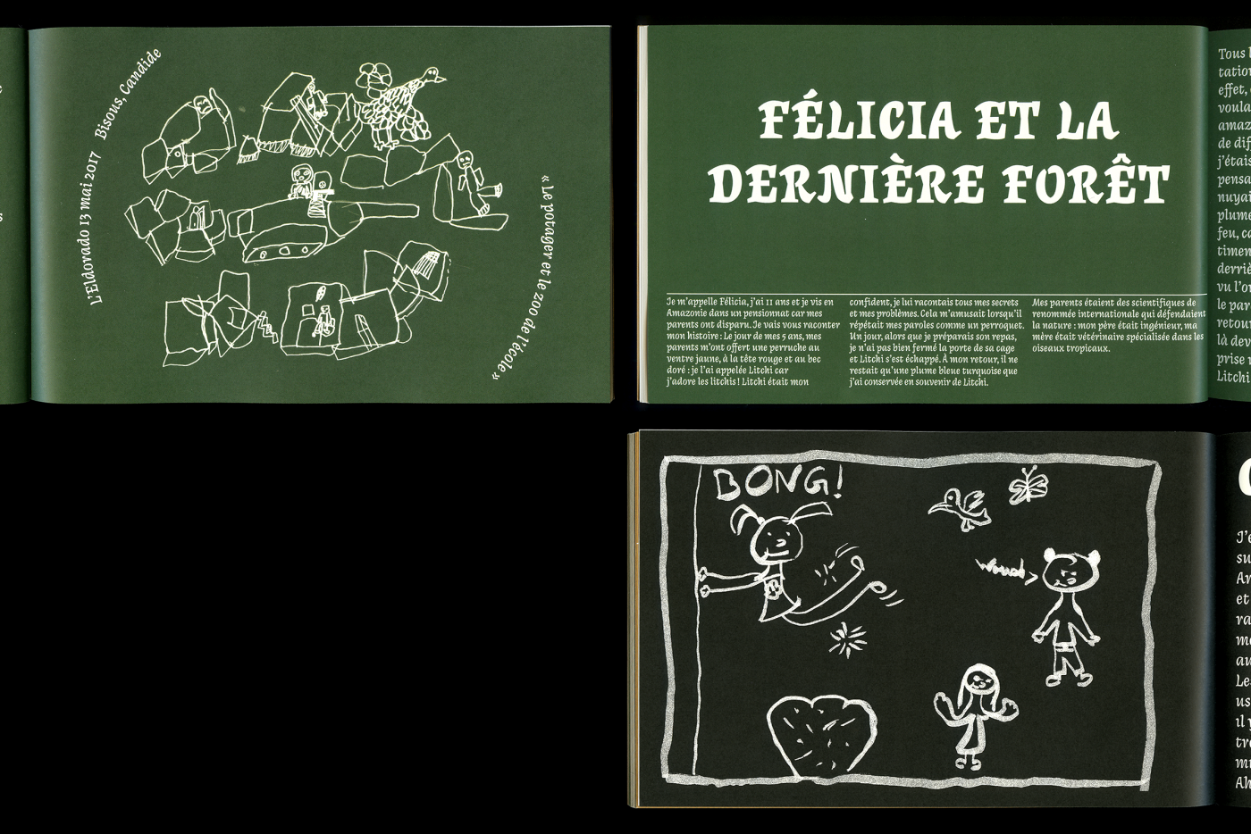
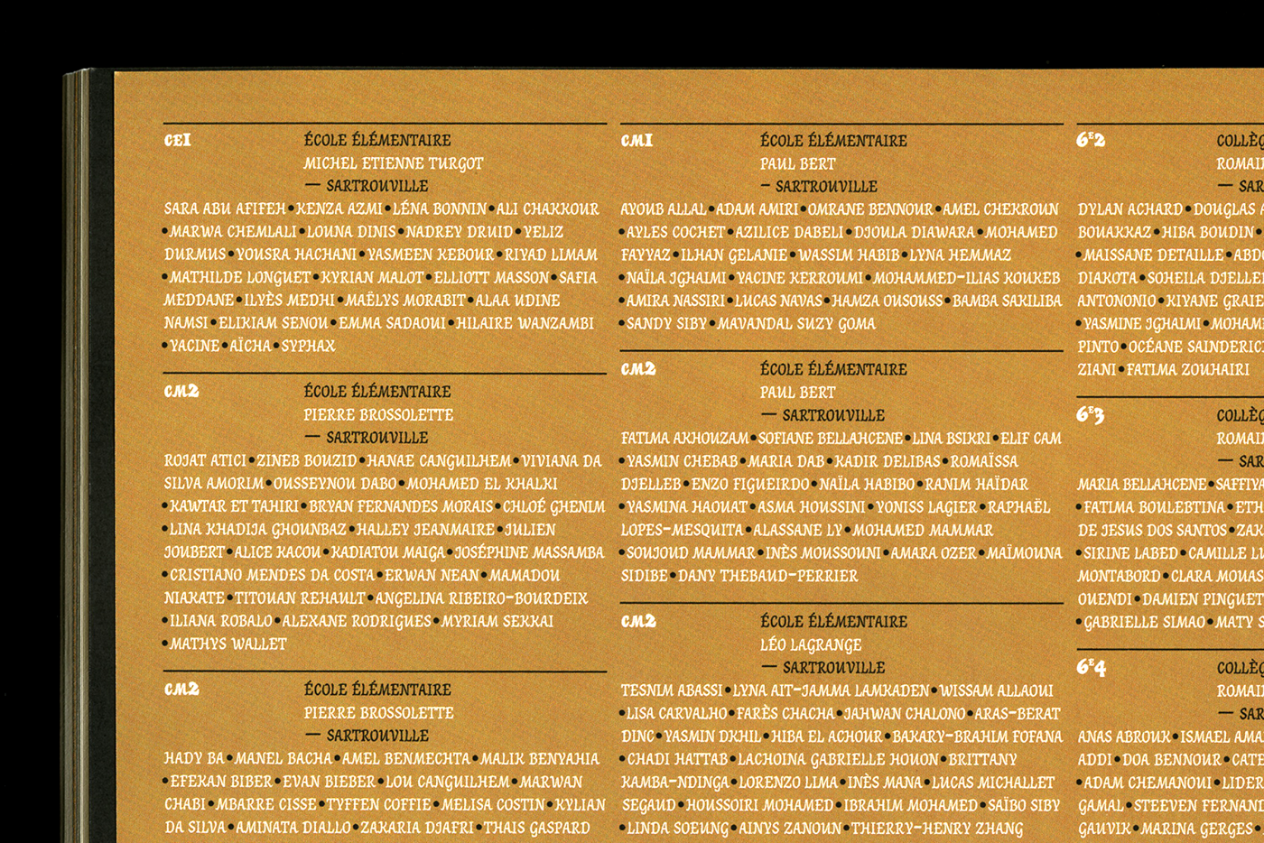
Graphic design of the "travel diary" edition printed in 500 copies as part of the Odyssées des Yvelines Festival. This catalog presents itself as a fresco, composed of many works by students of different levels (primary school, middle school, high school), as part of workshops led by different artists and illustrators. Thanks to Cyril and his team for their trust.
- From Paris to Oran : Dialog between two cultures
- Design social, Intervention textuelle, Installation littéraire, Direction artistique
- Institut du Monde Arabe
- —
- Design social, Intervention textuelle, Installation littéraire, Direction artistique
- Institut du Monde Arabe
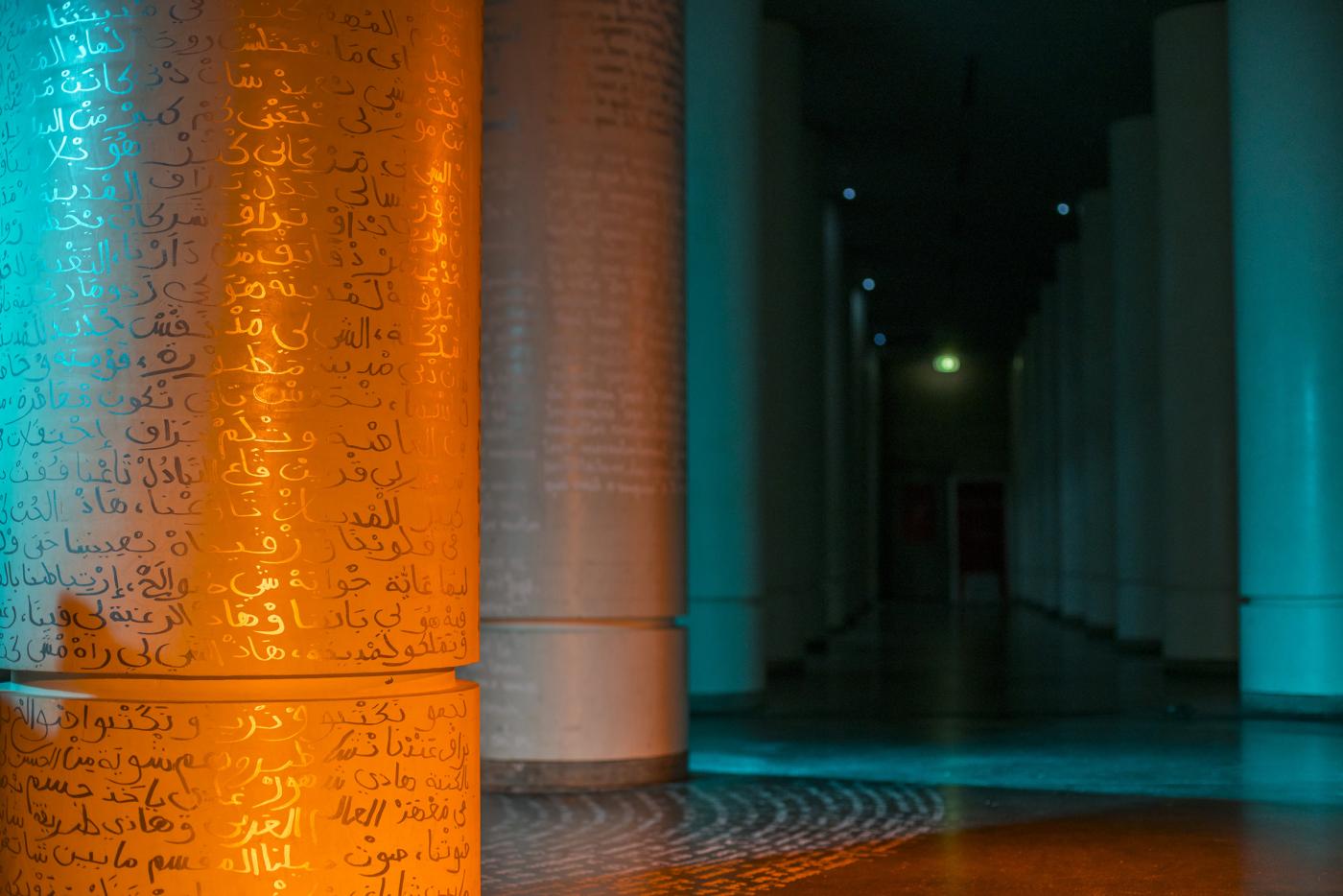
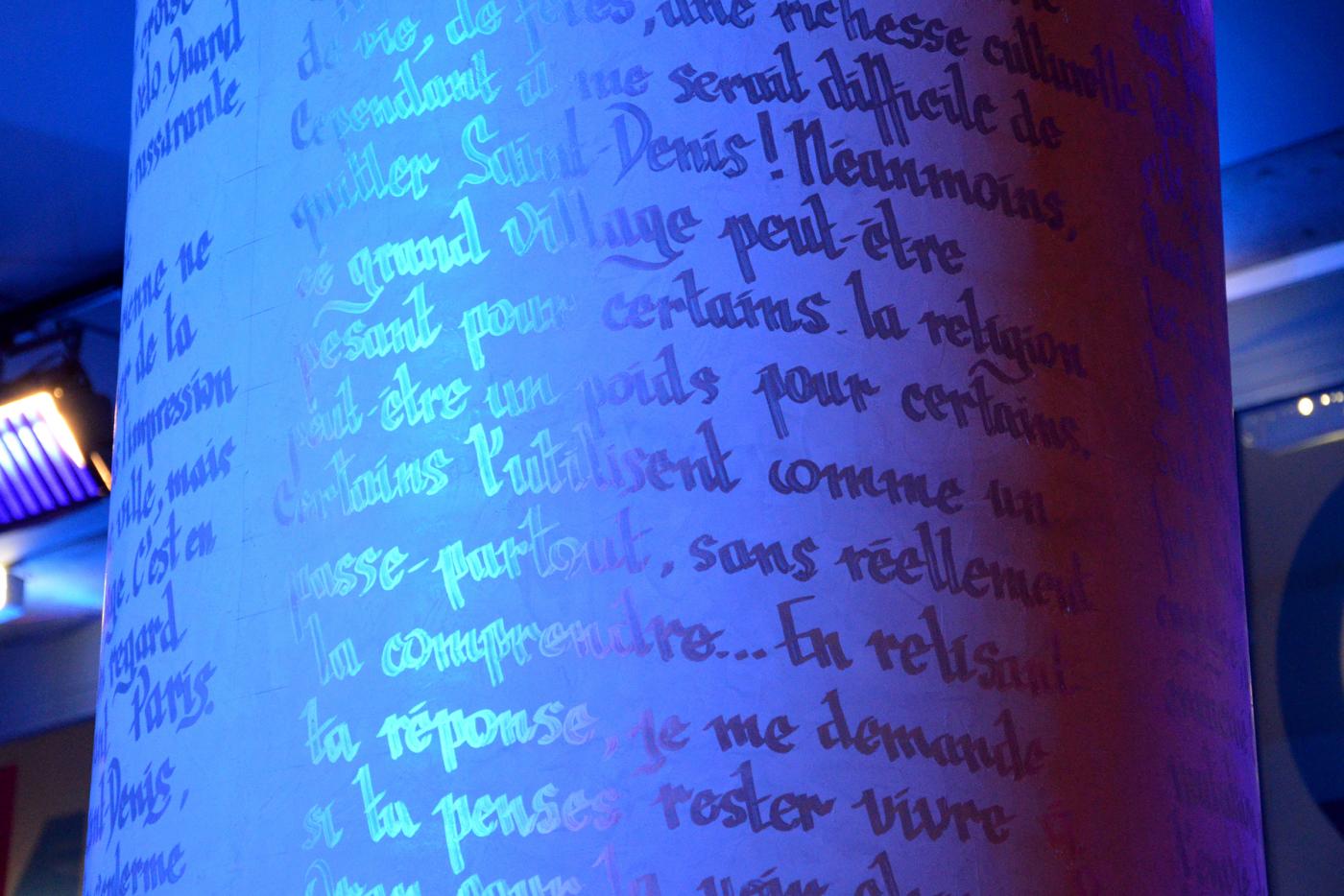
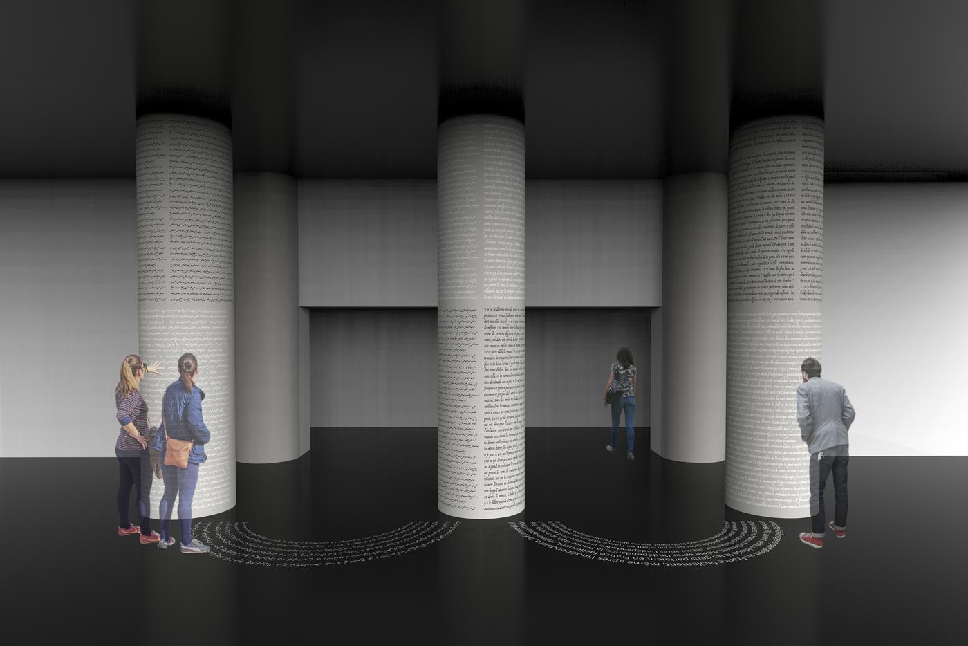
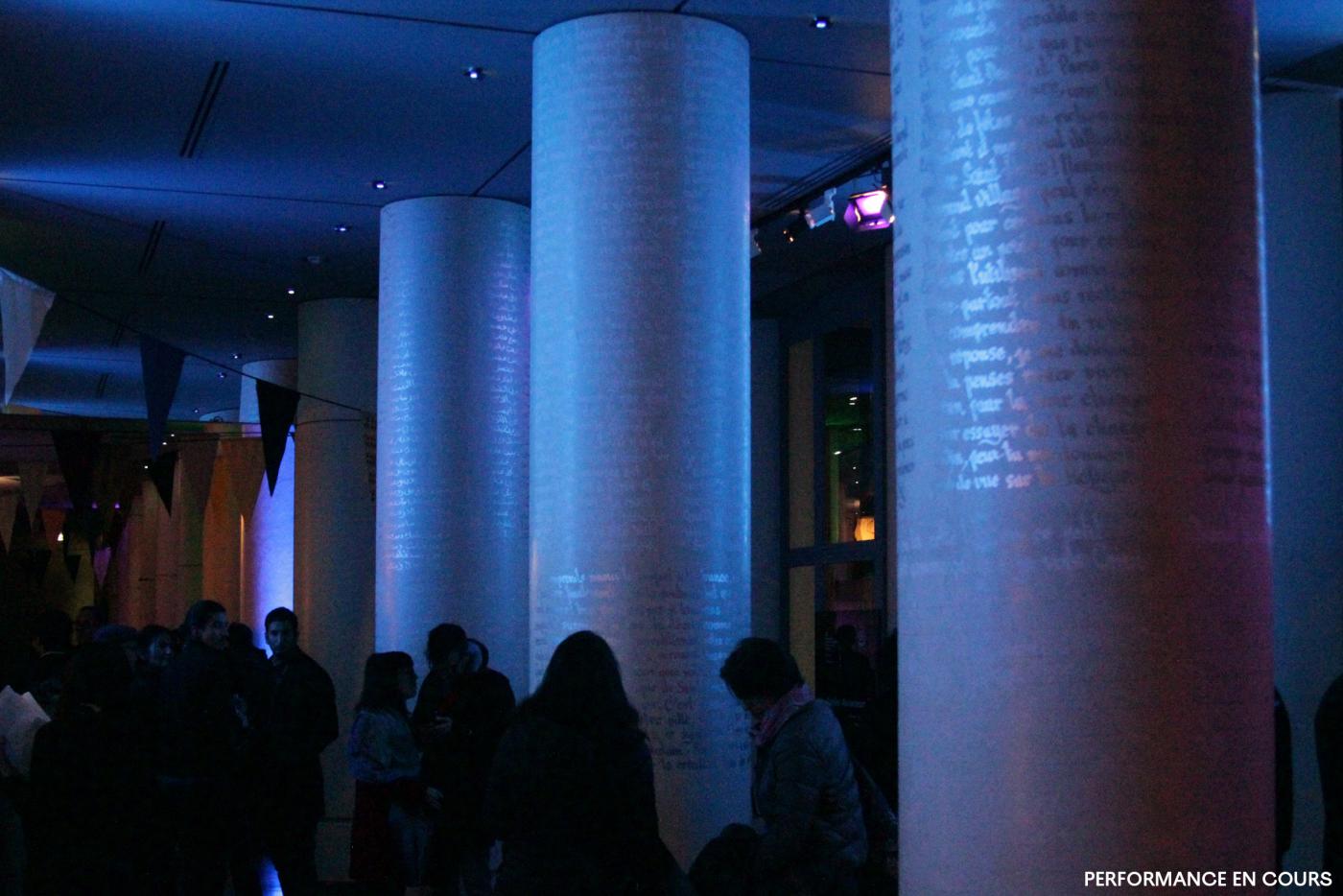
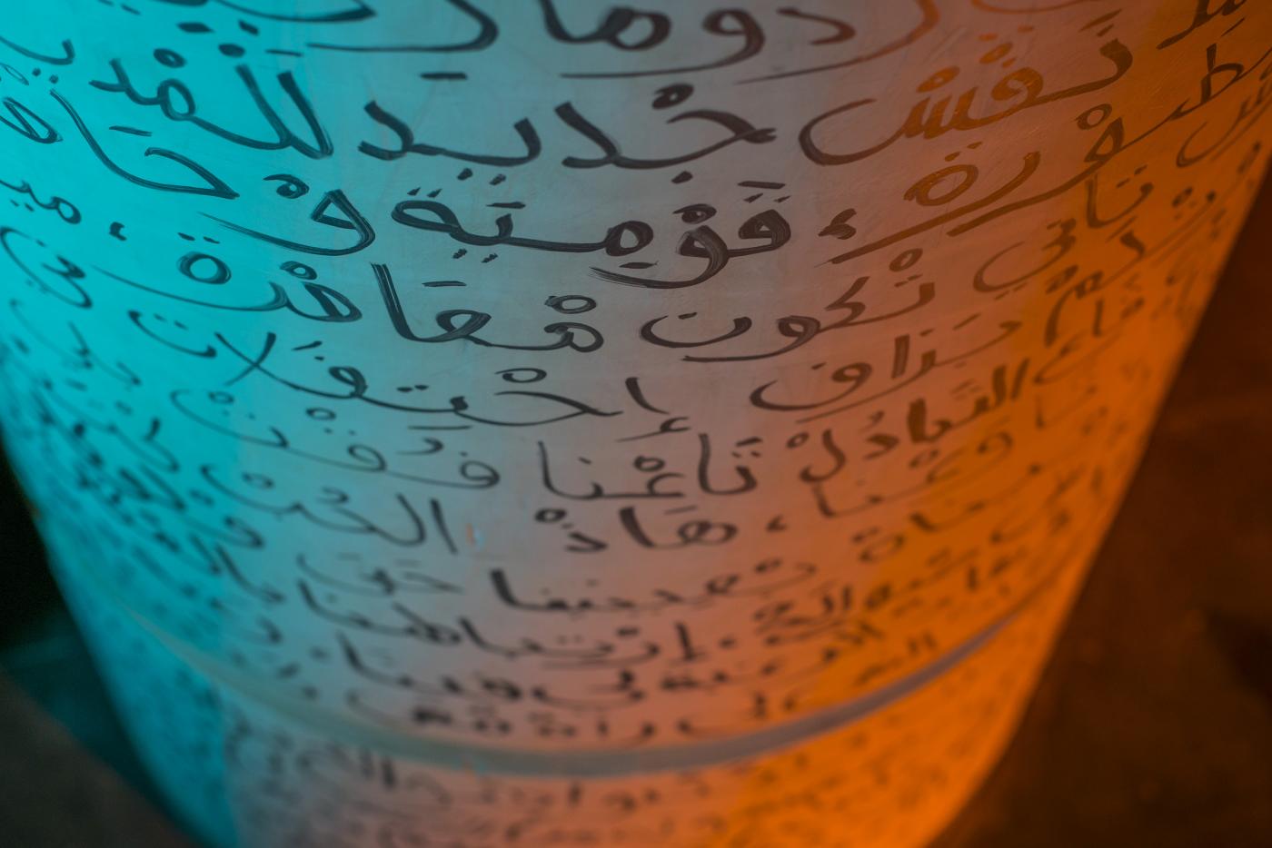
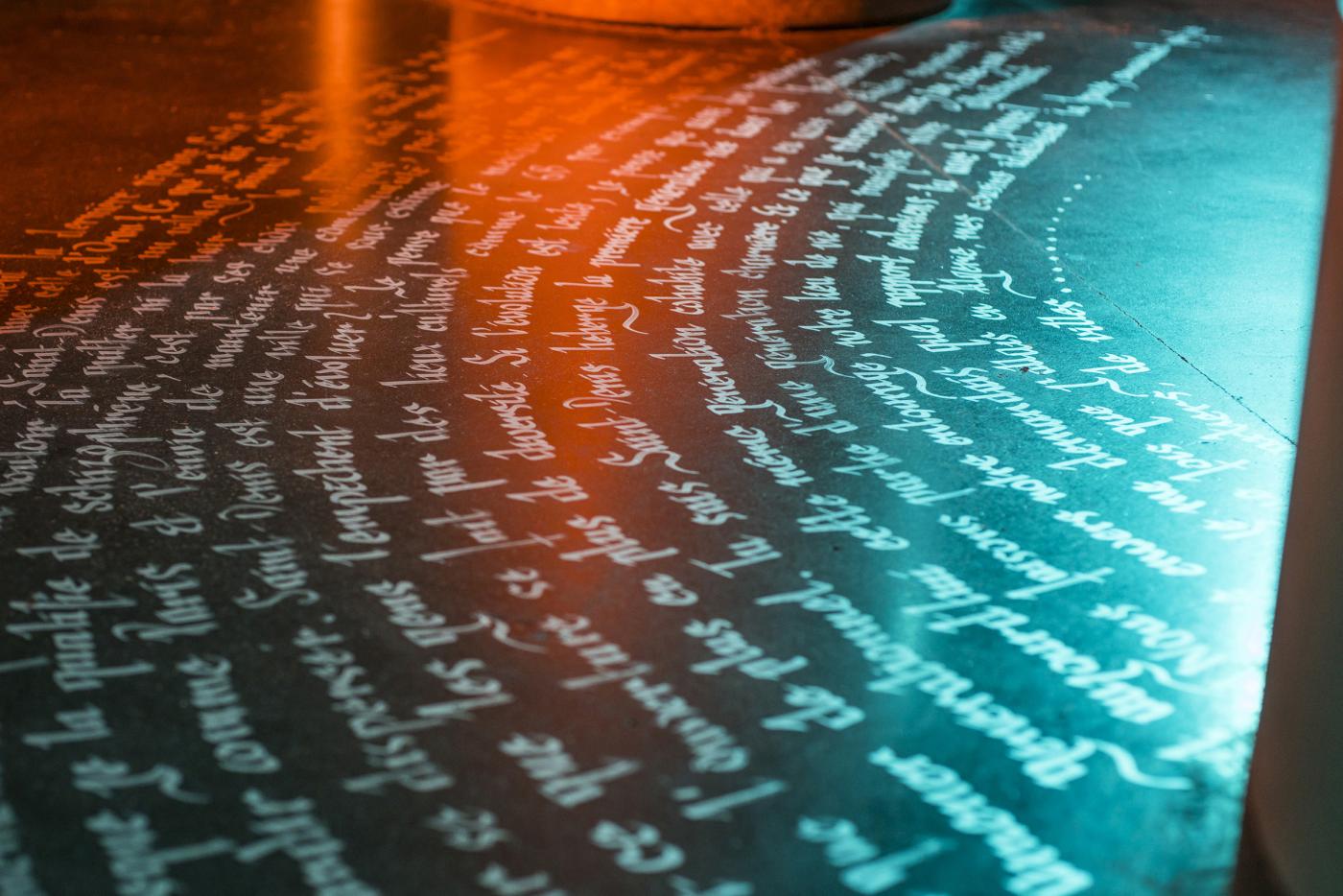
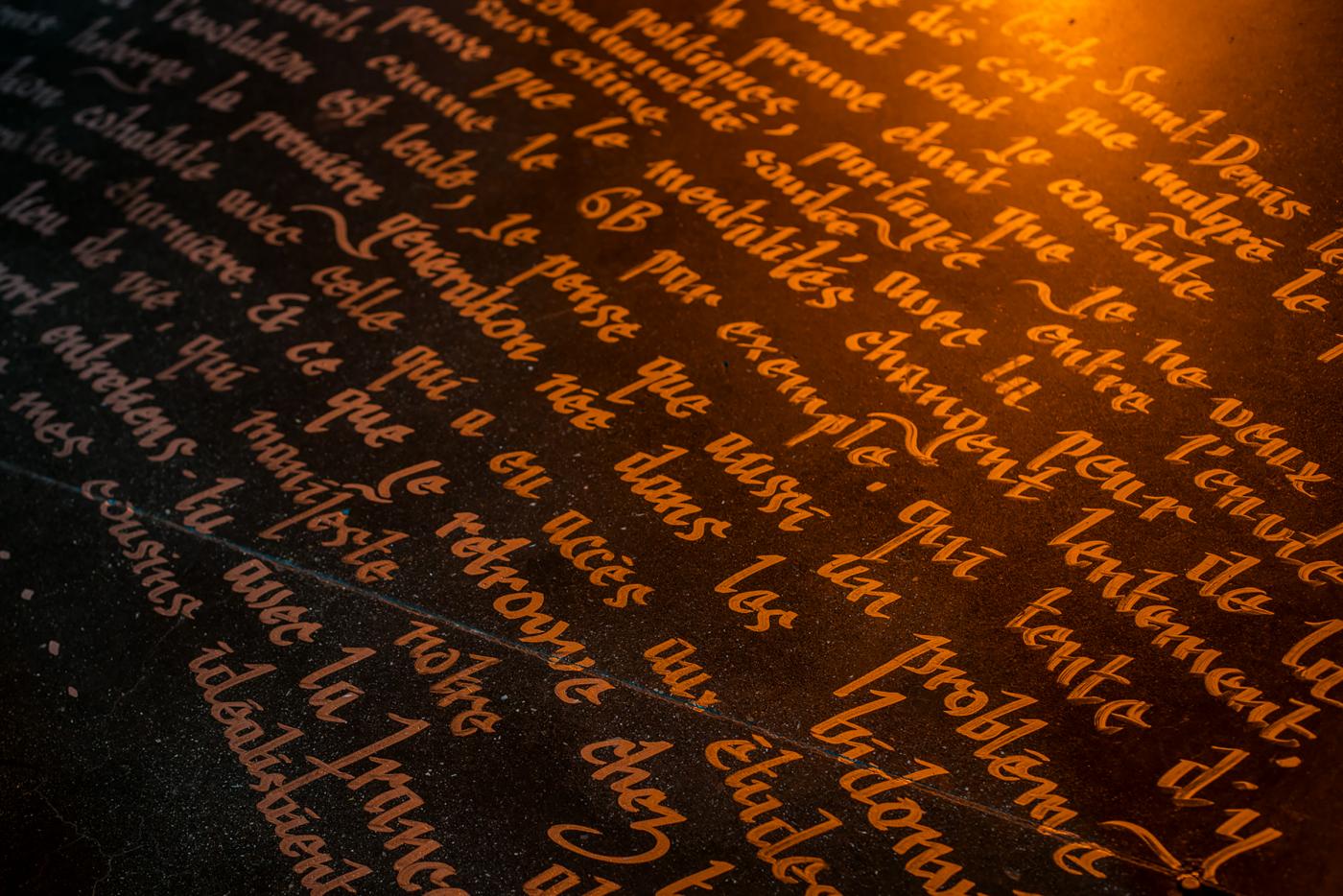
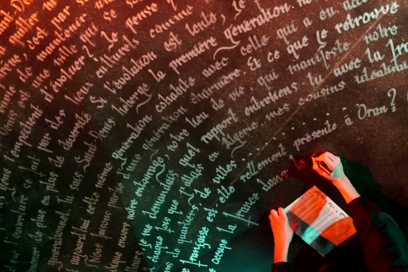
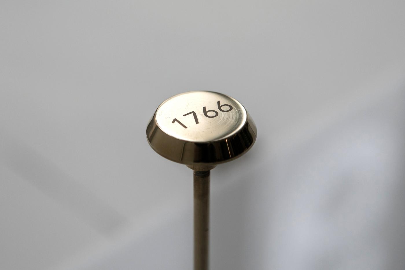
1766/5000 Selected by Jack Lang and Oxmo Puccino as part of the event celebrating the thirty years of existence of the Arab World Institute, this work proposes a textual intervention addressing the link between France and Algeria in the form of a discussion. Symbolically, the IMA is an ideal place to treat this subject. For that, I invited the writer Z.Tahar, living in Algeria, to write a dialogue together. By this intervention, we highlight certain nodes, certain subjects such as that of the place of religion, the life of a student in France or Algeria ... etc. How can we create debate through the link between a text and its space? How can we create a link through textual intervention? Taking into consideration the space and the original architecture of the place, I proposed to use three columns, three pillars. Entirely translated into Arabic, the text begins with the column of Paris (1), to join that of Oran (2), in the center (3). Only through words, questions, this text draws a bridge, between two people, between two cultures, between two countries. In the form of a performance, we have with Zoulikha written this dialogue during the exhibition, in front of the visitors. The act of writing becomes performative. Intrigued, the work quickly brings the visitors to take part in the performance, thus, the debate / discussion settles in a dispassionate way, in the middle of the exhibition, around these three pillars on the link between France and Algeria. The work is now part of the museum, and remains visible. Photo credits: Jim Winter, Helias Terki. 3D picture by Florian Dach. Thank you to the entire IMA team for coaching and coaching during the exhibition.
- C'est le terrain qui fait des vagues
- Catalog, Invitation and Communication
- École des Beaux-Arts de Paris
- Crous Galery
- Catalog, Invitation and Communication
- École des Beaux-Arts de Paris
- Crous Galery
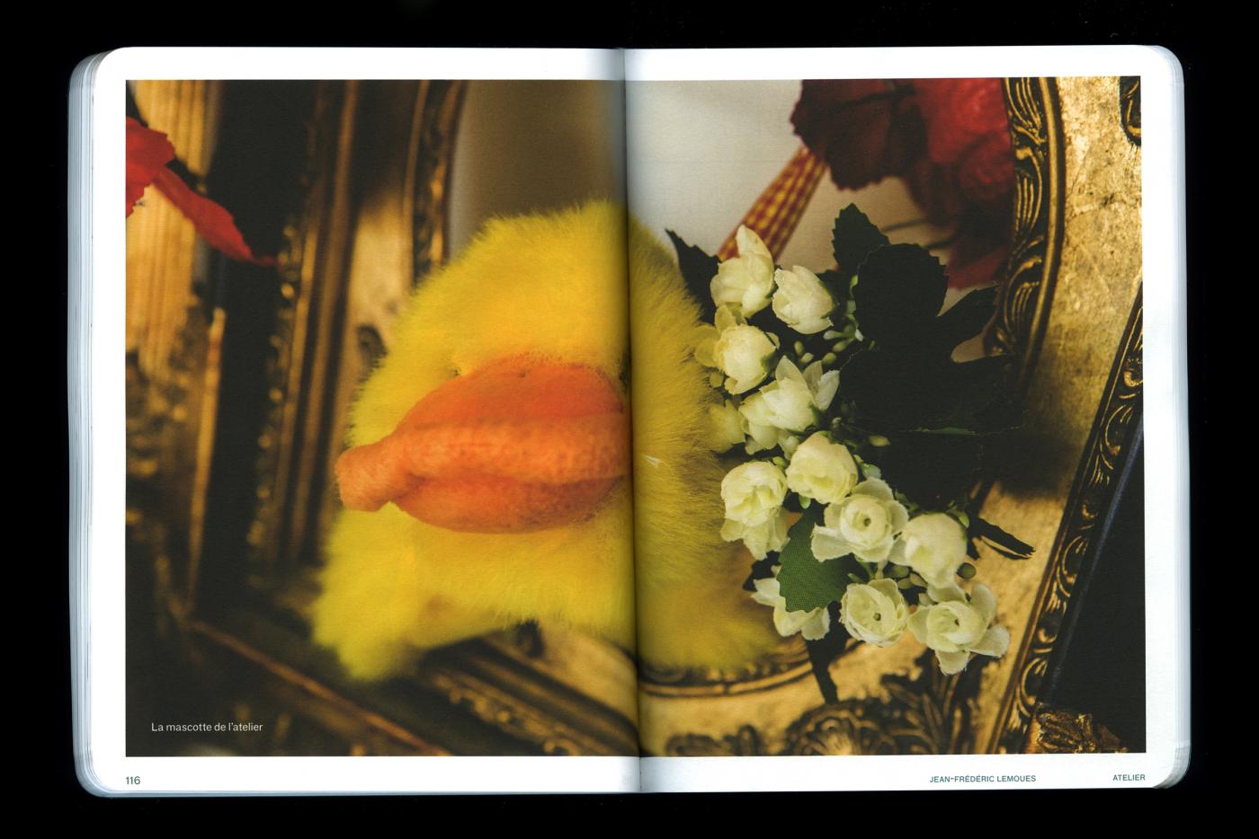
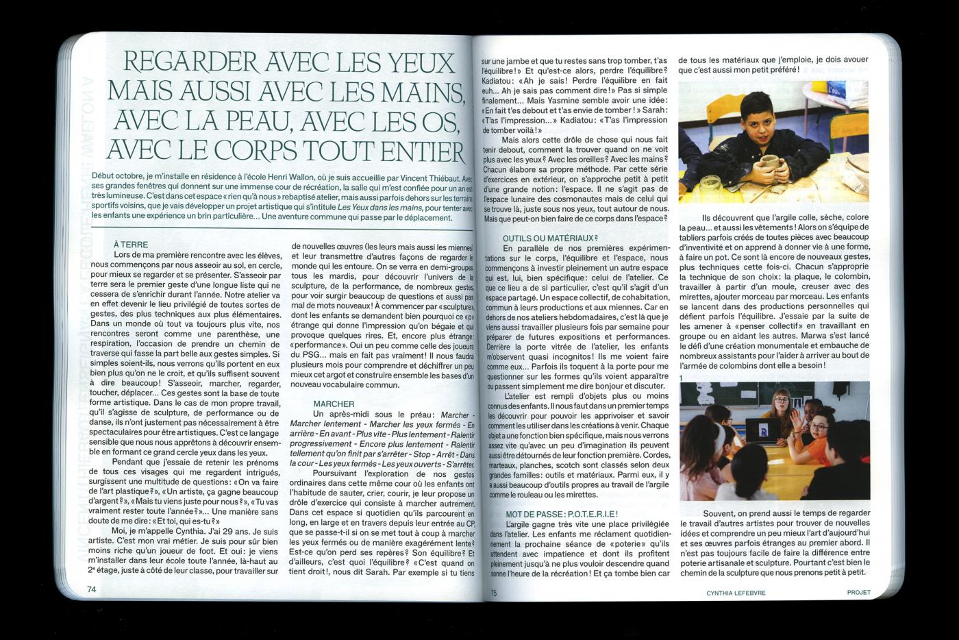
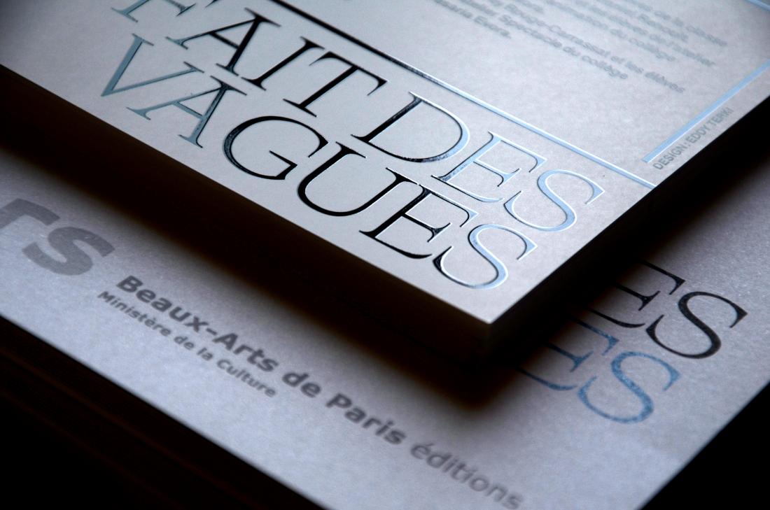
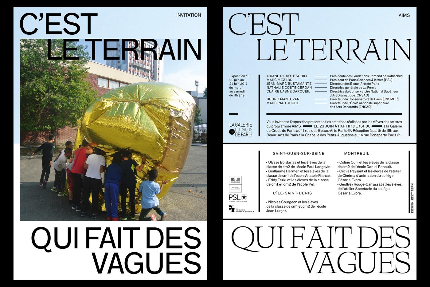
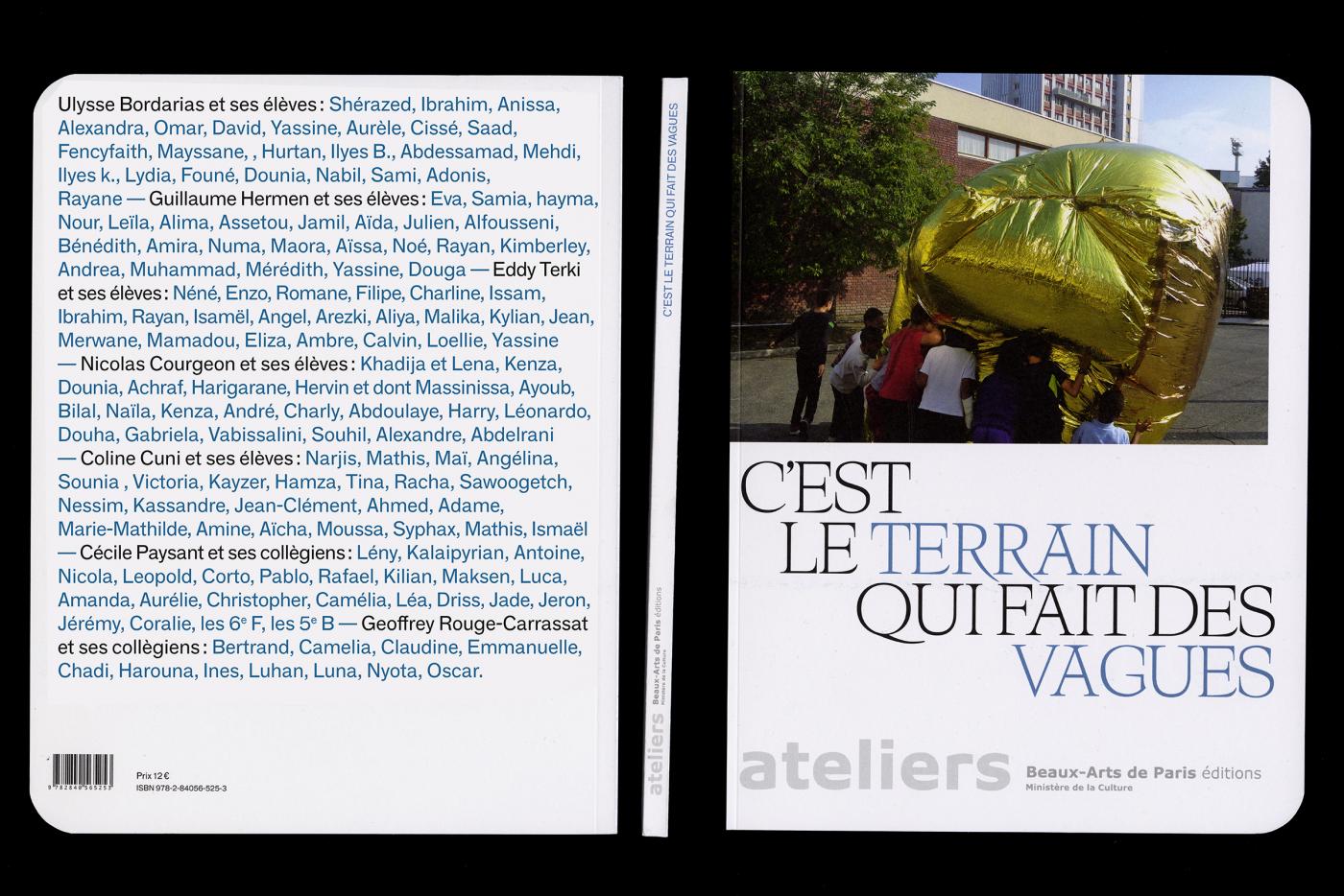
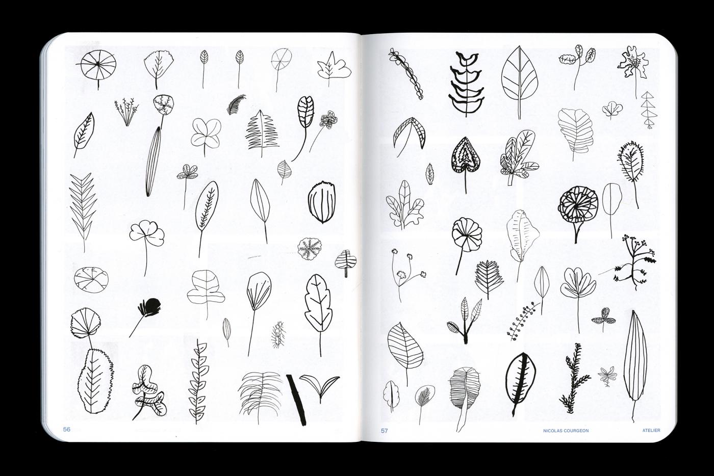
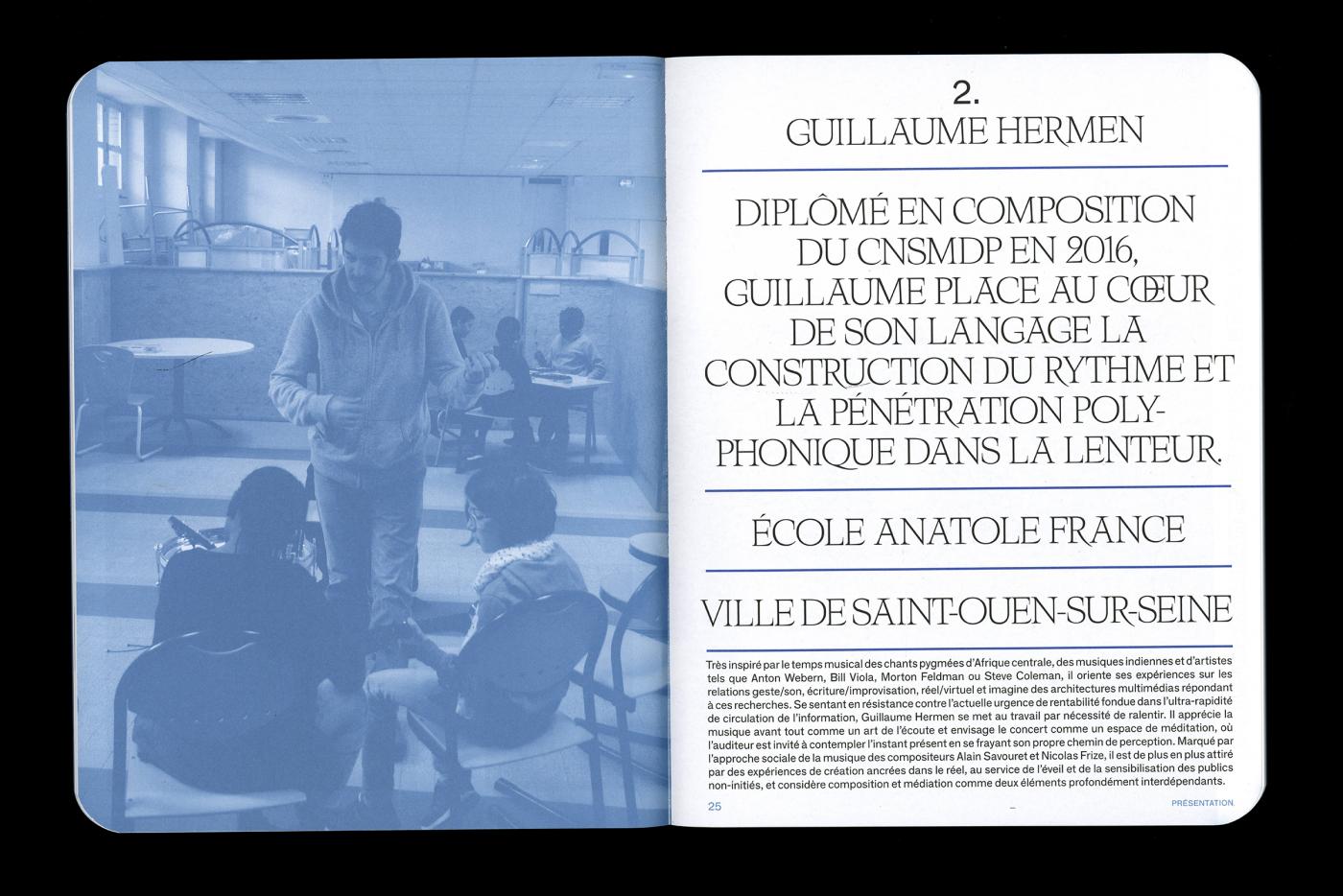
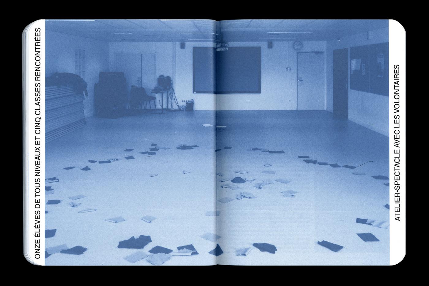
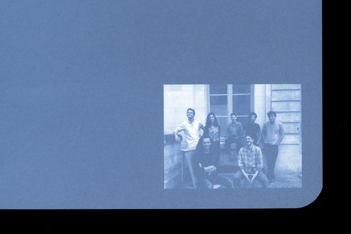
Invited to realize the design of the catalog of the exhibition « C’est le terrain qui fait des vagues », organized by the School of Fine Arts of Paris [The École nationale supérieure des Beaux-Arts de Paris]. The catalog was available for consultation and distributed during the exhibition at the Crous Gallery. The work presents the project of seven artists. This edition compound of 116 pages, and is printed « quadri + pantone » at Stipa in Montreuil, and distributed in 1500 copies.
- CAN ( CATALOGUE )
- Catalog, Invitation et Communication
- EnsAD — Paris
- Musée des Arts Décoratifs de Paris
- —
- Catalog, Invitation et Communication
- EnsAD — Paris
- Musée des Arts Décoratifs de Paris
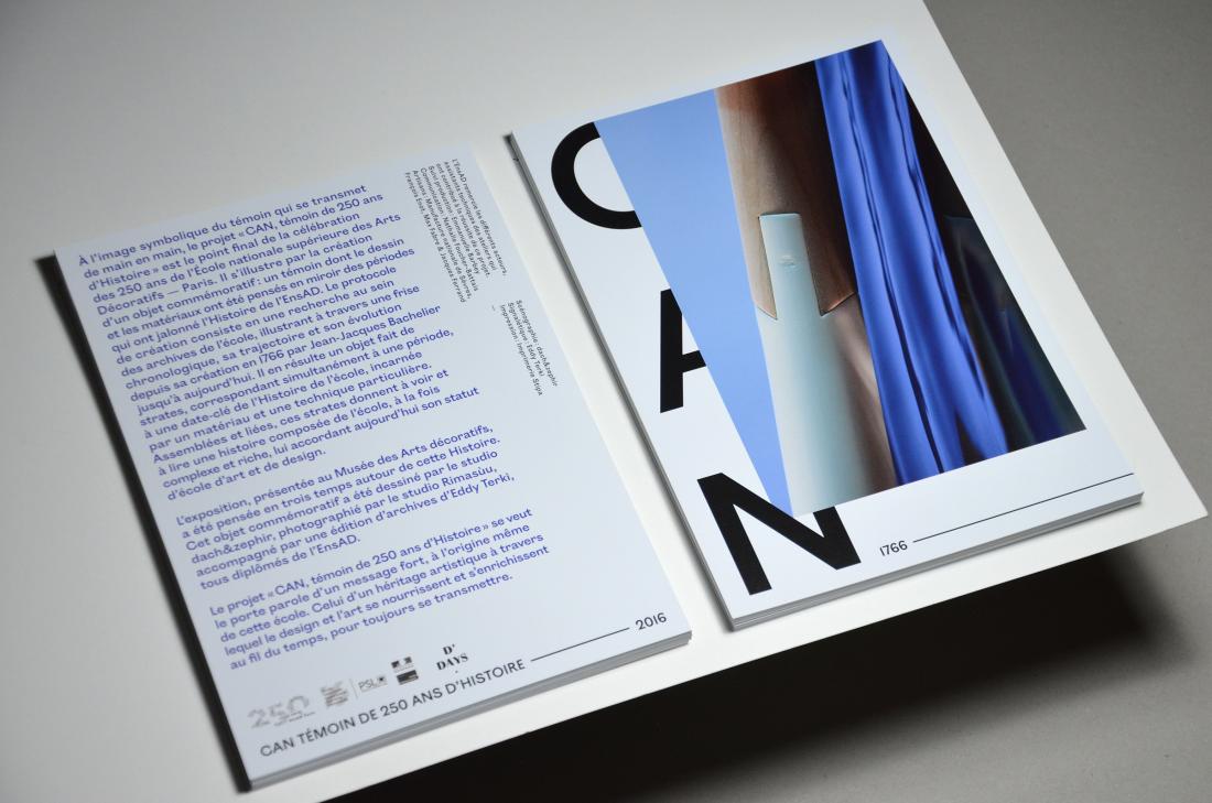
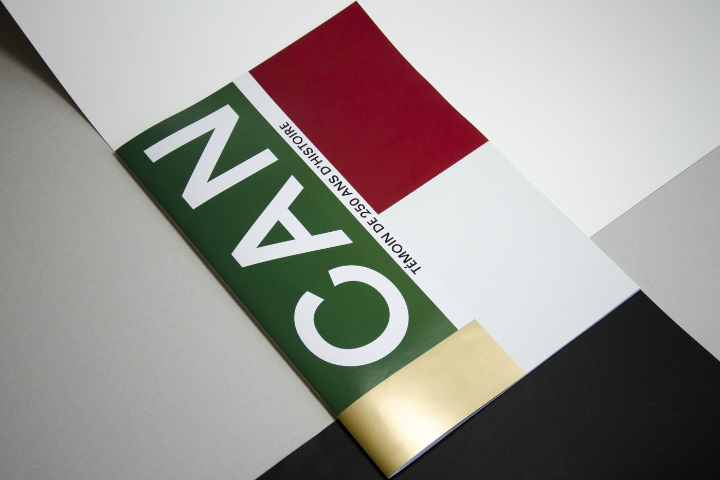
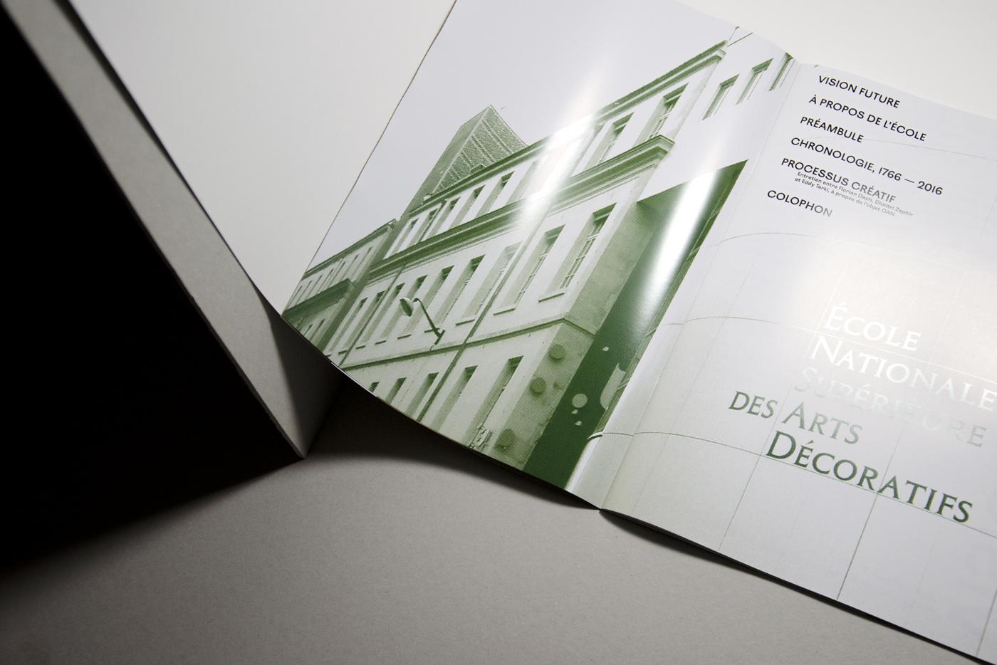
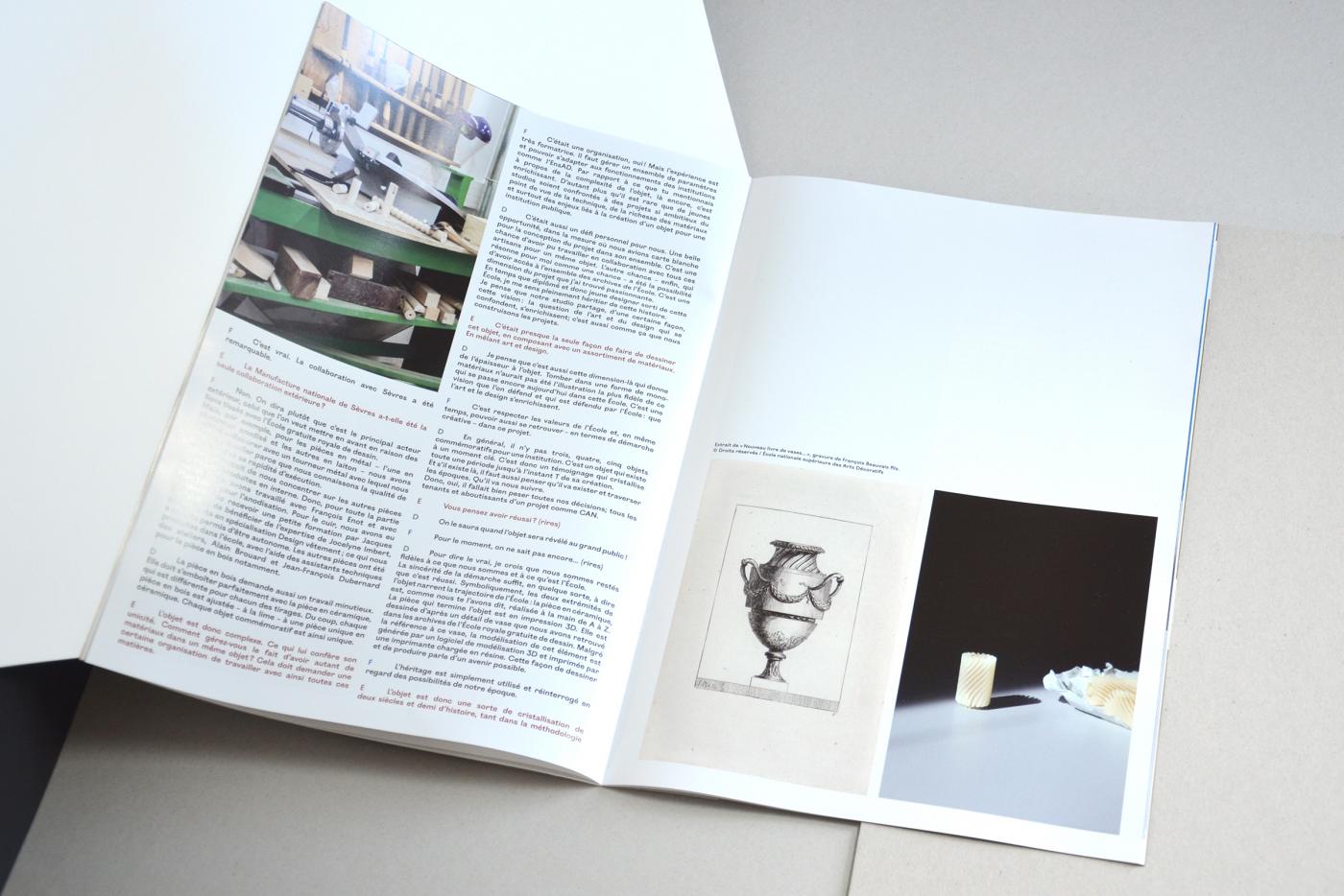
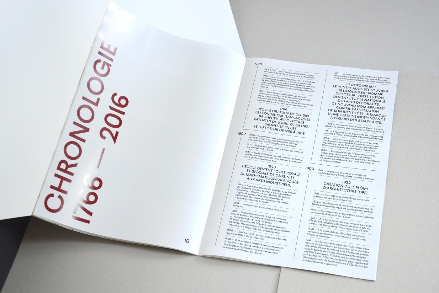
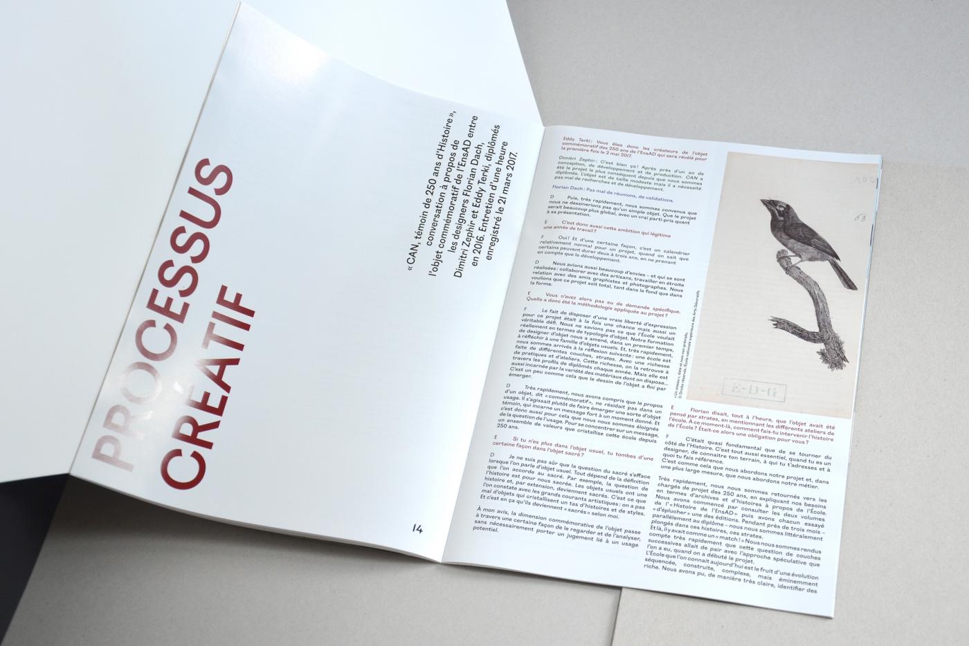
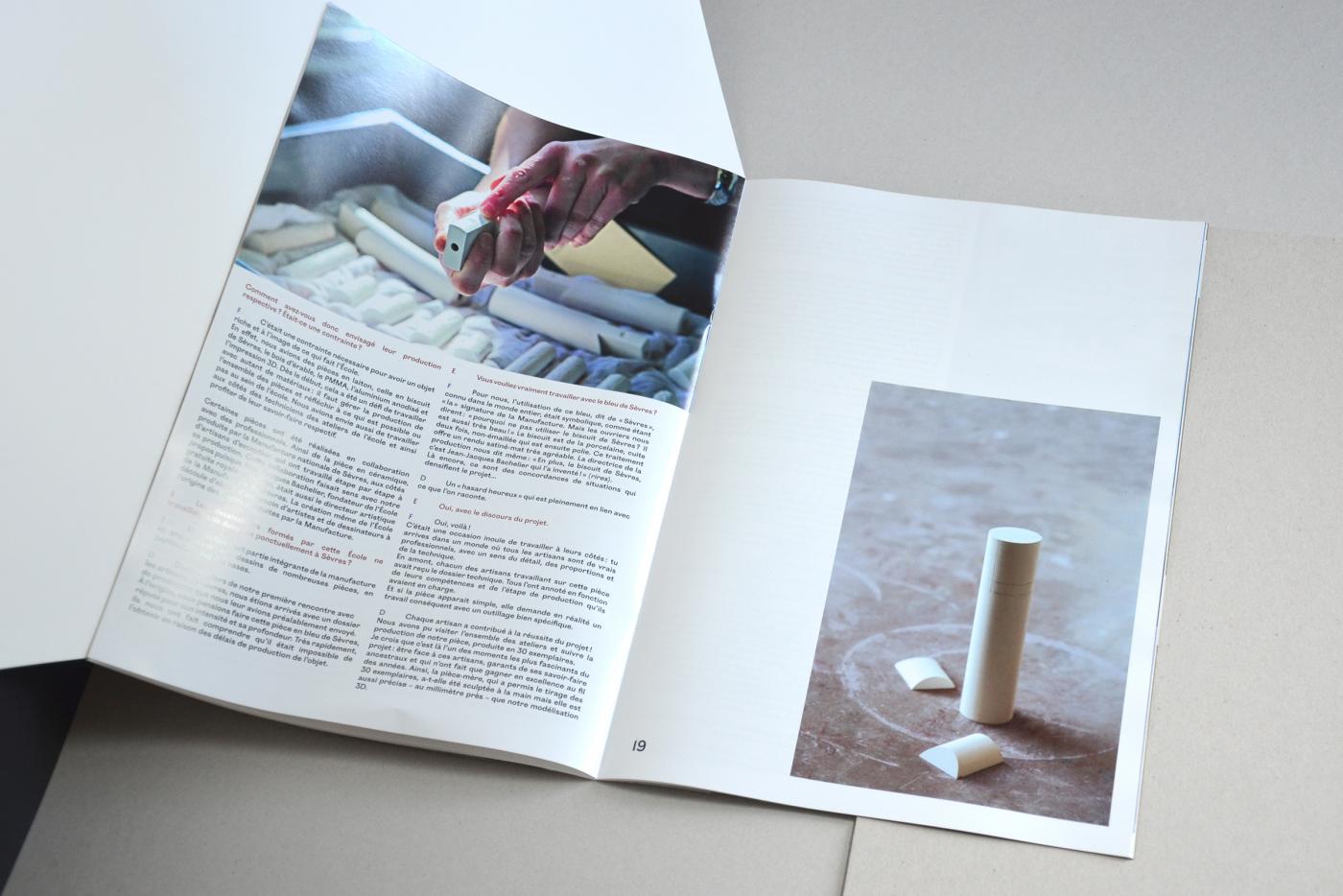
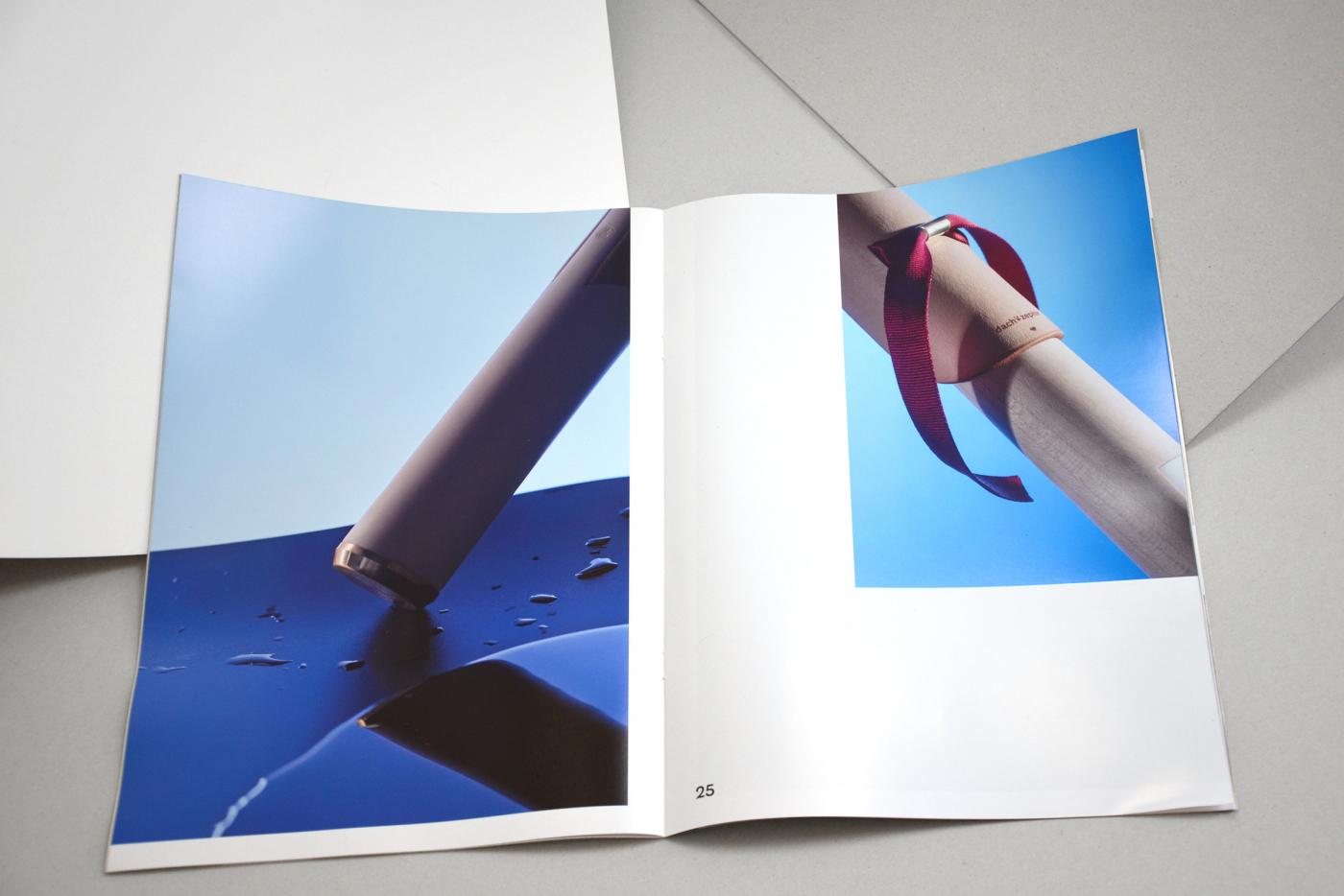
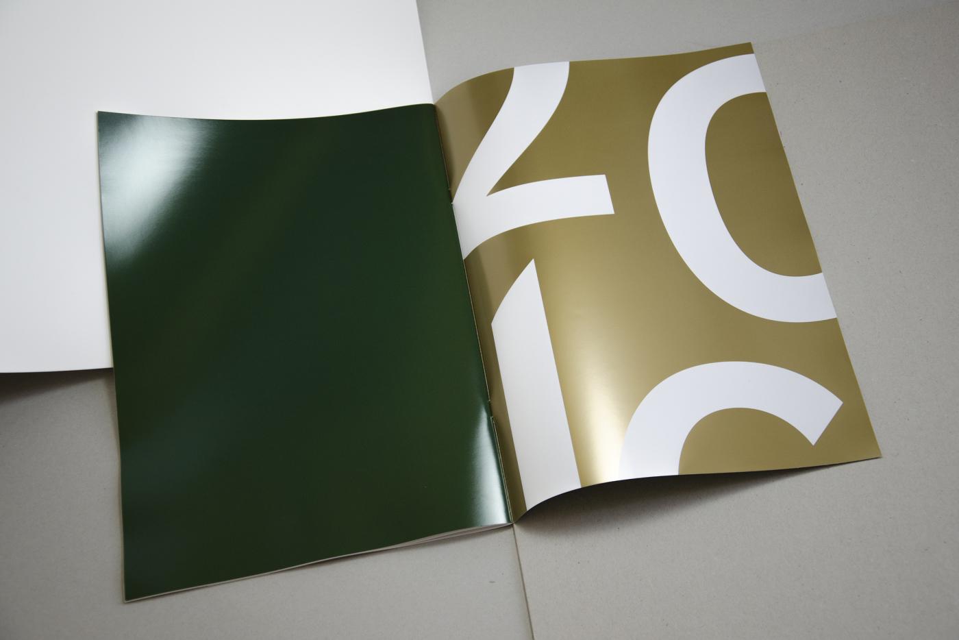
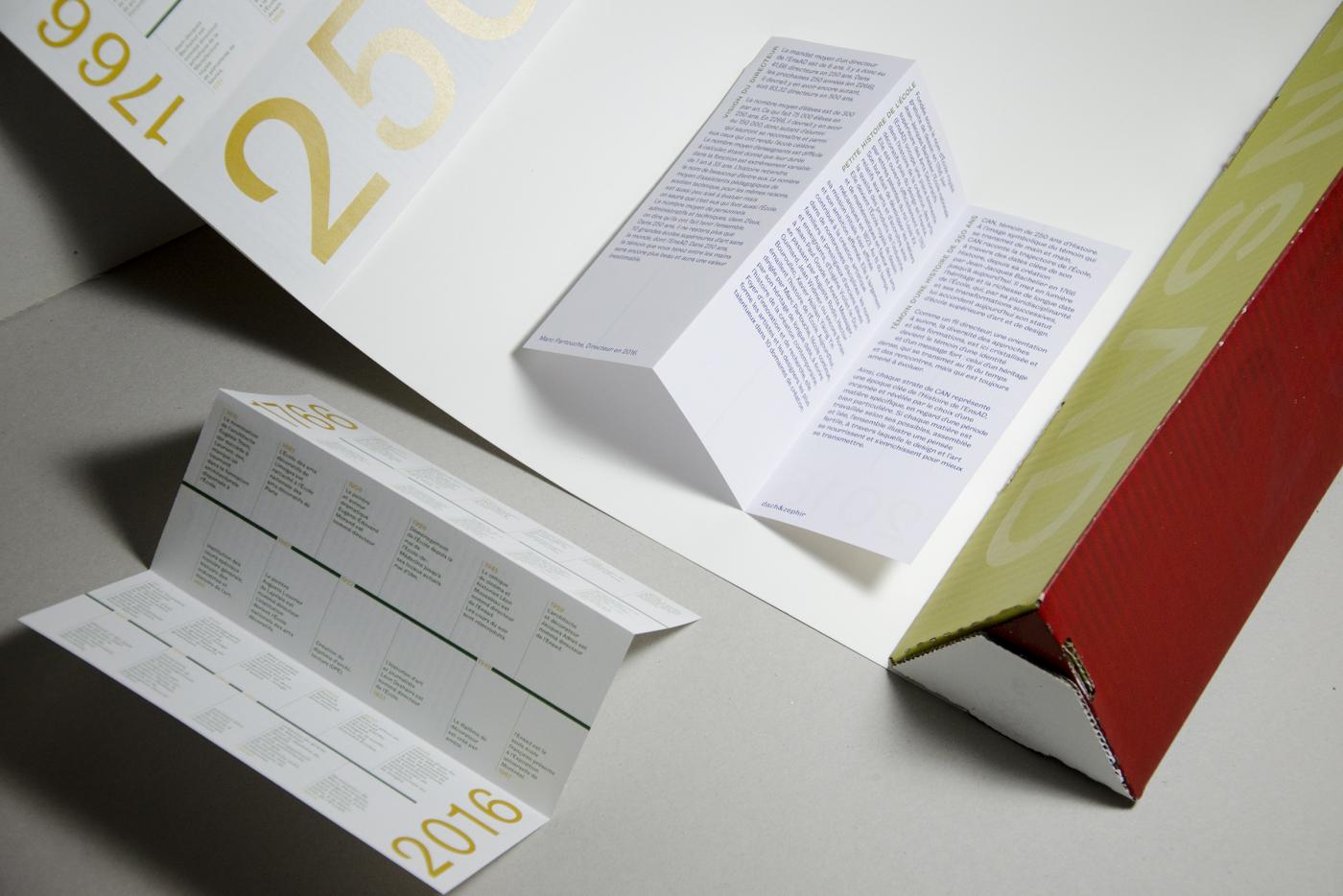
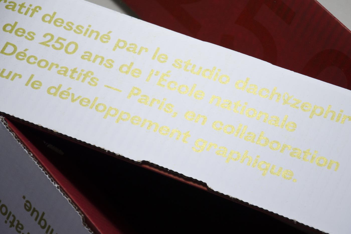
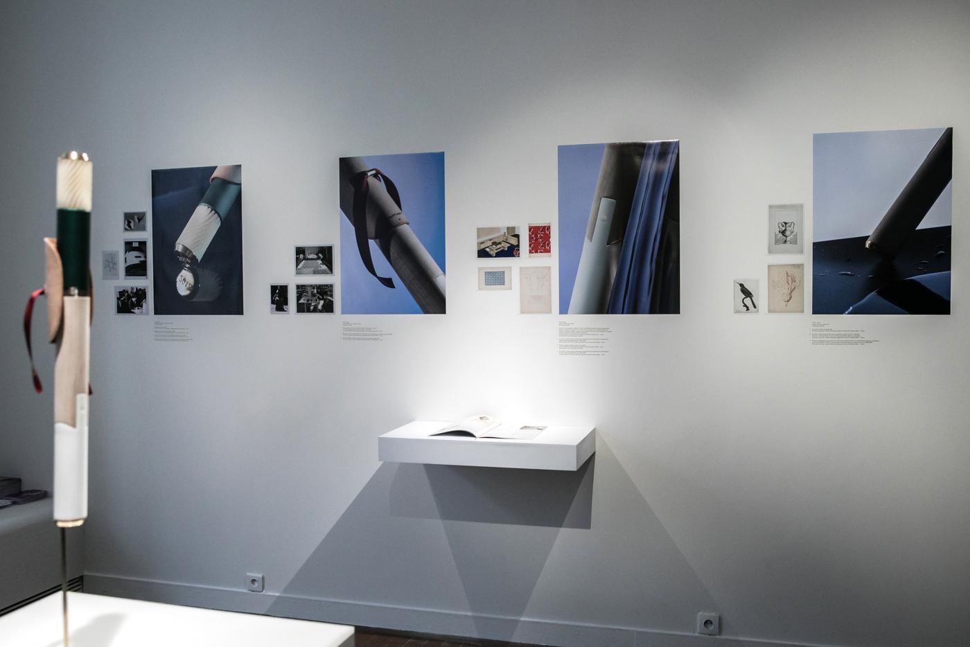
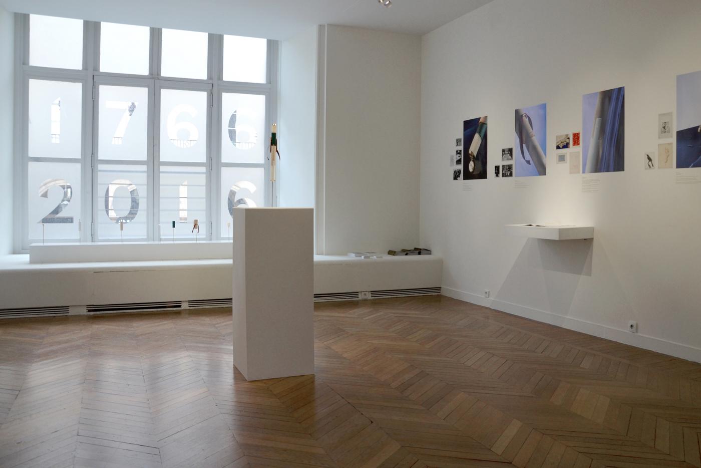
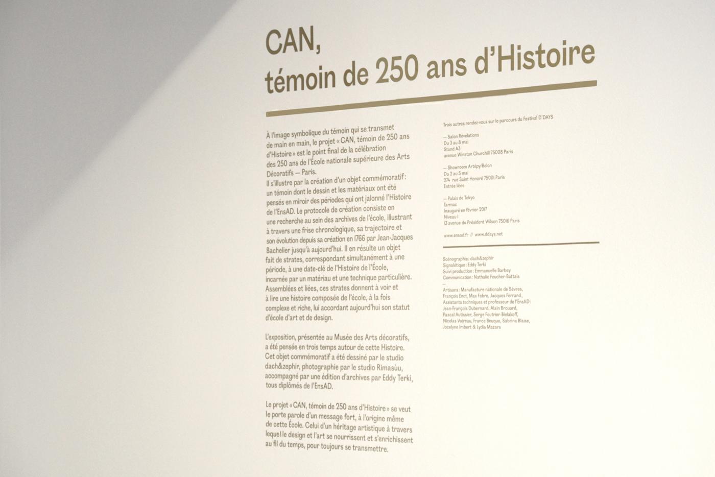
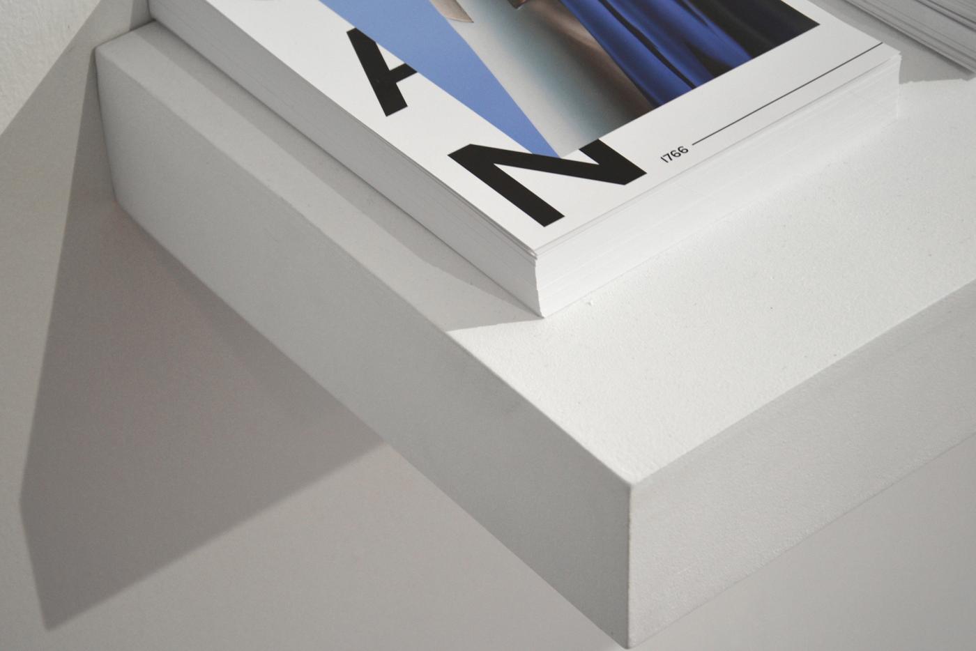
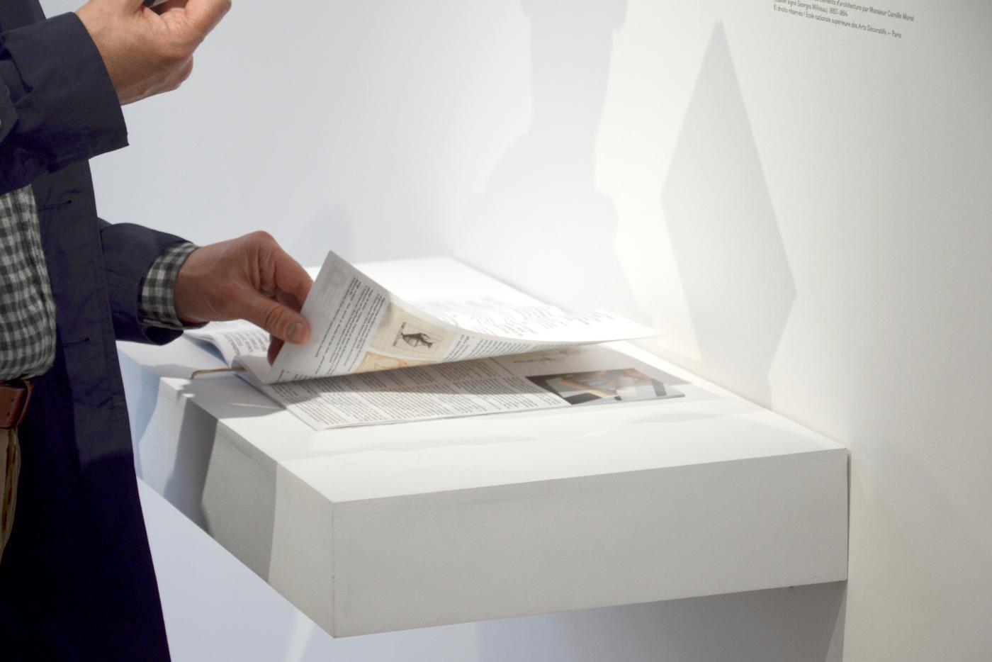
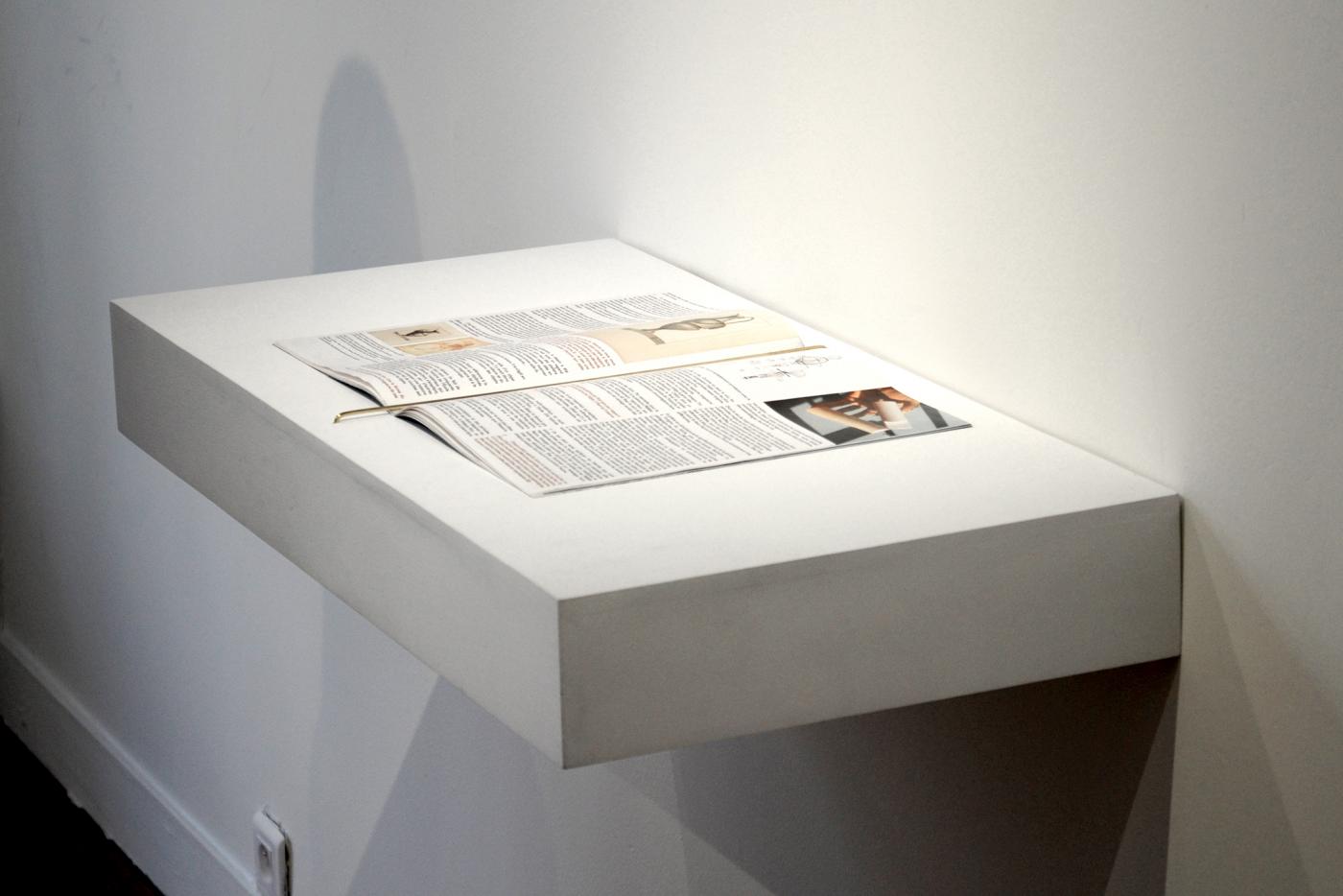
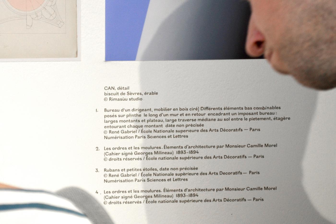
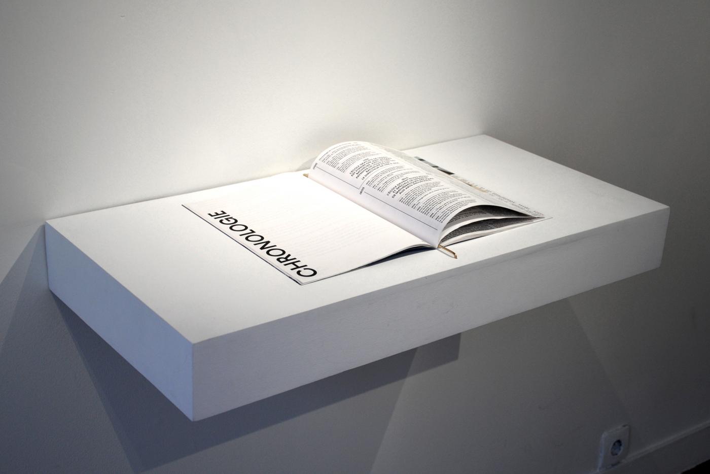
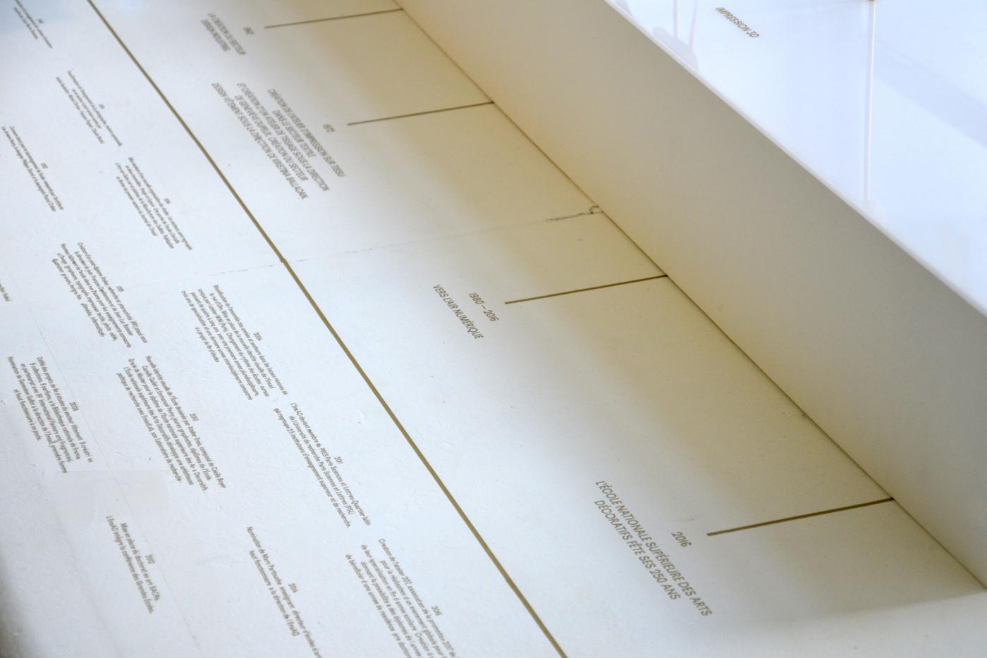
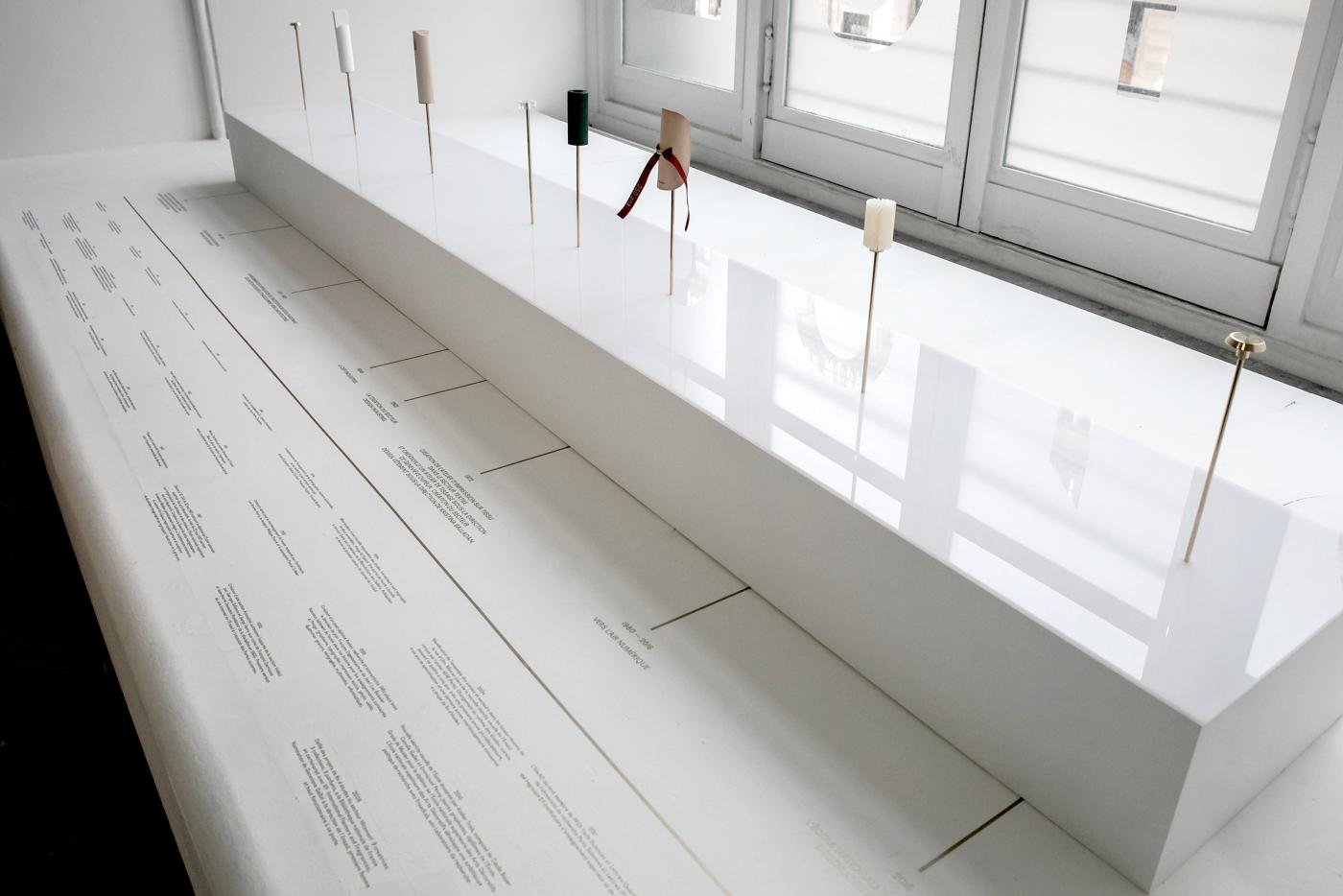
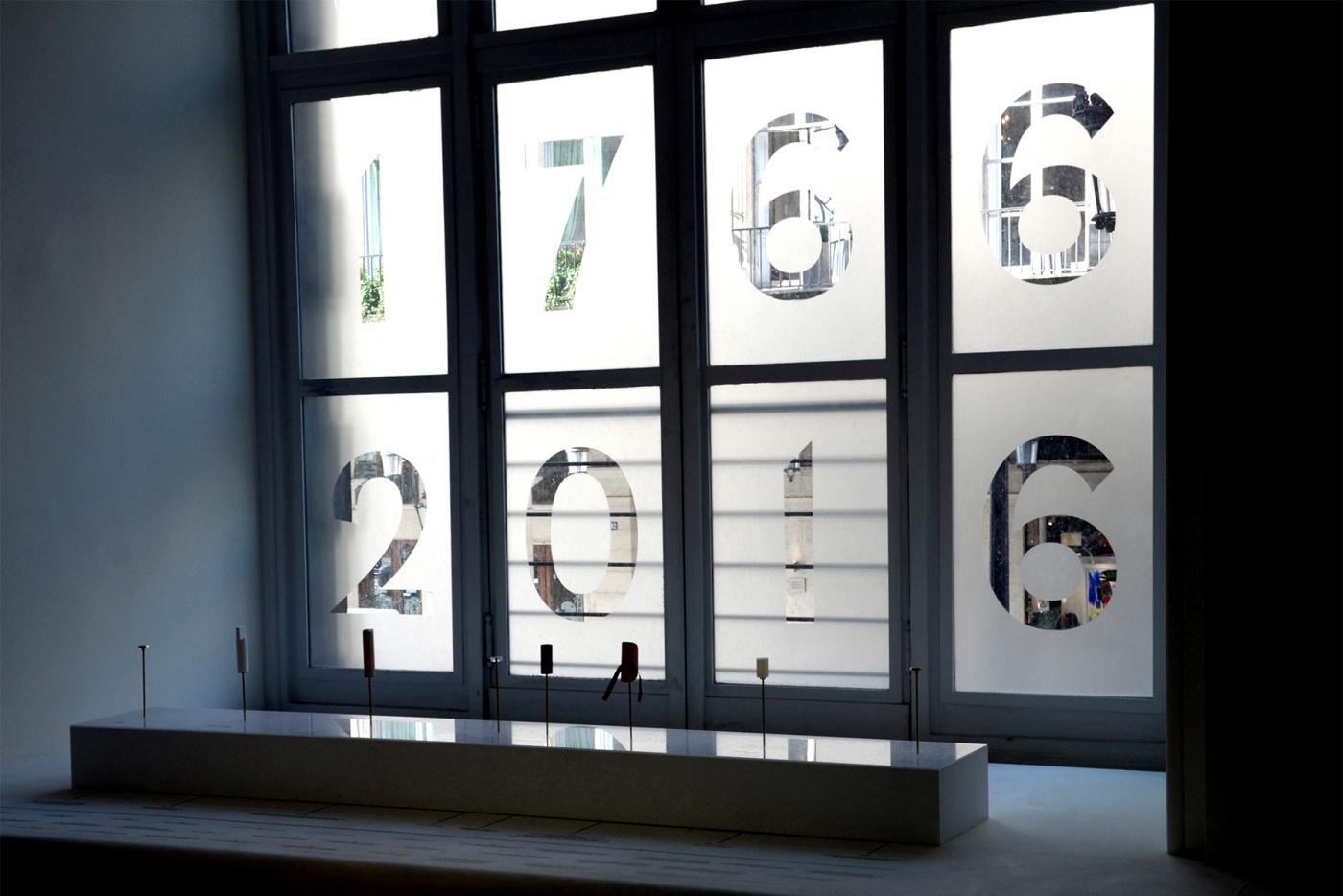
I had the opportunity to collaborate with the studio dach&zephir, invited to draw CAN, the commemorative object of 250 years of EnsAD - Paris. The graphic conception arises from the object CAN, and begins with an editorial object highlighting their researches, in the course of a discussion. The editorial object is itself witness of their vision of the design as well as their working process, as studio. Afterward, I developed the graphic communication within the framework of the D’day Festival, to the Musée des Arts Décoratifs de Paris to draw the identity of the exhibition. To end, all the photos of the commemorative object, used for various supports, is realized by Rimasuu Studio.
- CAN ( SCENOGRAPHY)
- Exhibition identity, museograpphy
- Design Day Festival
- Musée des Arts décoratfis de Paris
- —
- Exhibition identity, museograpphy
- Design Day Festival
- Musée des Arts décoratfis de Paris
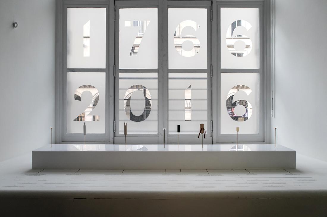
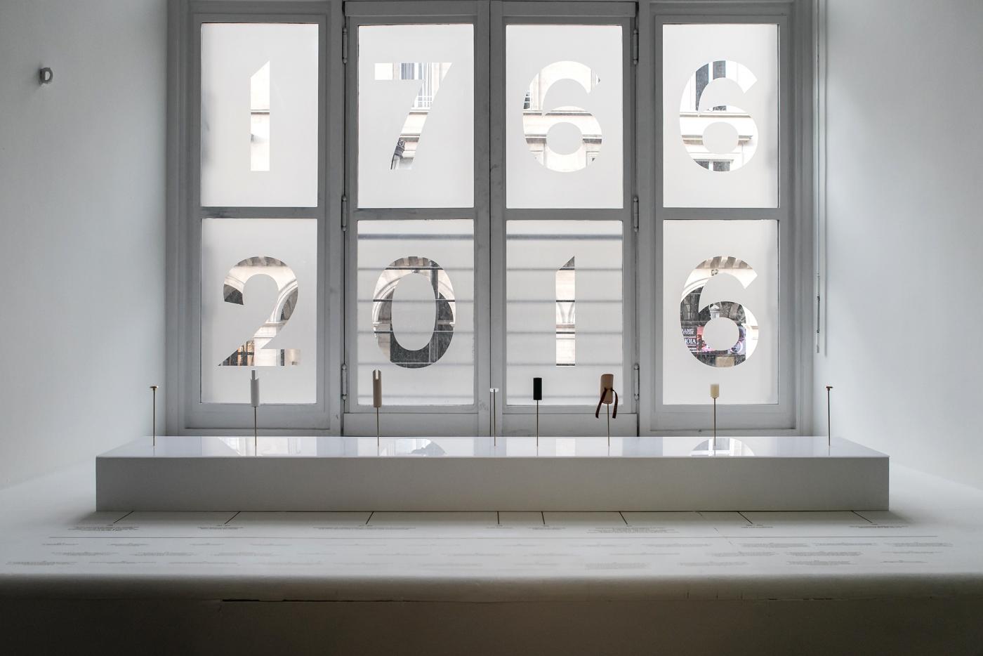
I had the opportunity to collaborate with the studio dach&zephir, invited to draw CAN, the commemorative object of 250 years of EnsAD - Paris. The graphic conception arises from the object CAN, and begins with an editorial object highlighting their researches, in the course of a discussion. The editorial object is itself witness of their vision of the design as well as their working process, as studio. Afterward, I developed the graphic communication within the framework of the Design day Festival, to the Musée des Arts Décoratifs de Paris to draw the identity of the exhibition. To end, all the photos of the commemorative object, used for various supports, is realized by Rimasuu Studio.
- Biennale of graphic design [Second prize-winner]
- Outil typographique, jeu de construction
- Biennal de design graphique de Chaumont
- Centre National de Graphisme à Chaumont
- Outil typographique, jeu de construction
- Biennal de design graphique de Chaumont
- Centre National de Graphisme à Chaumont
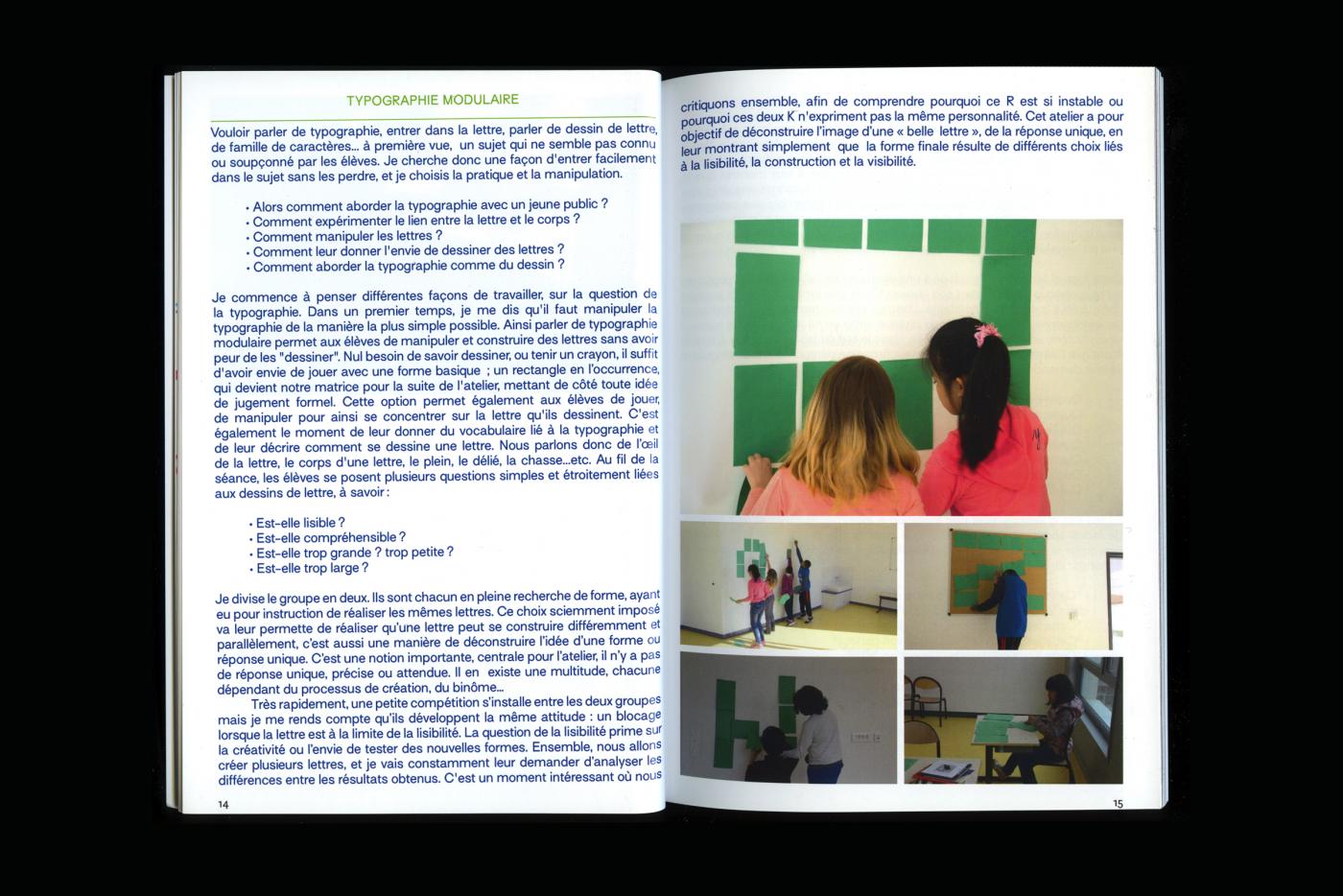
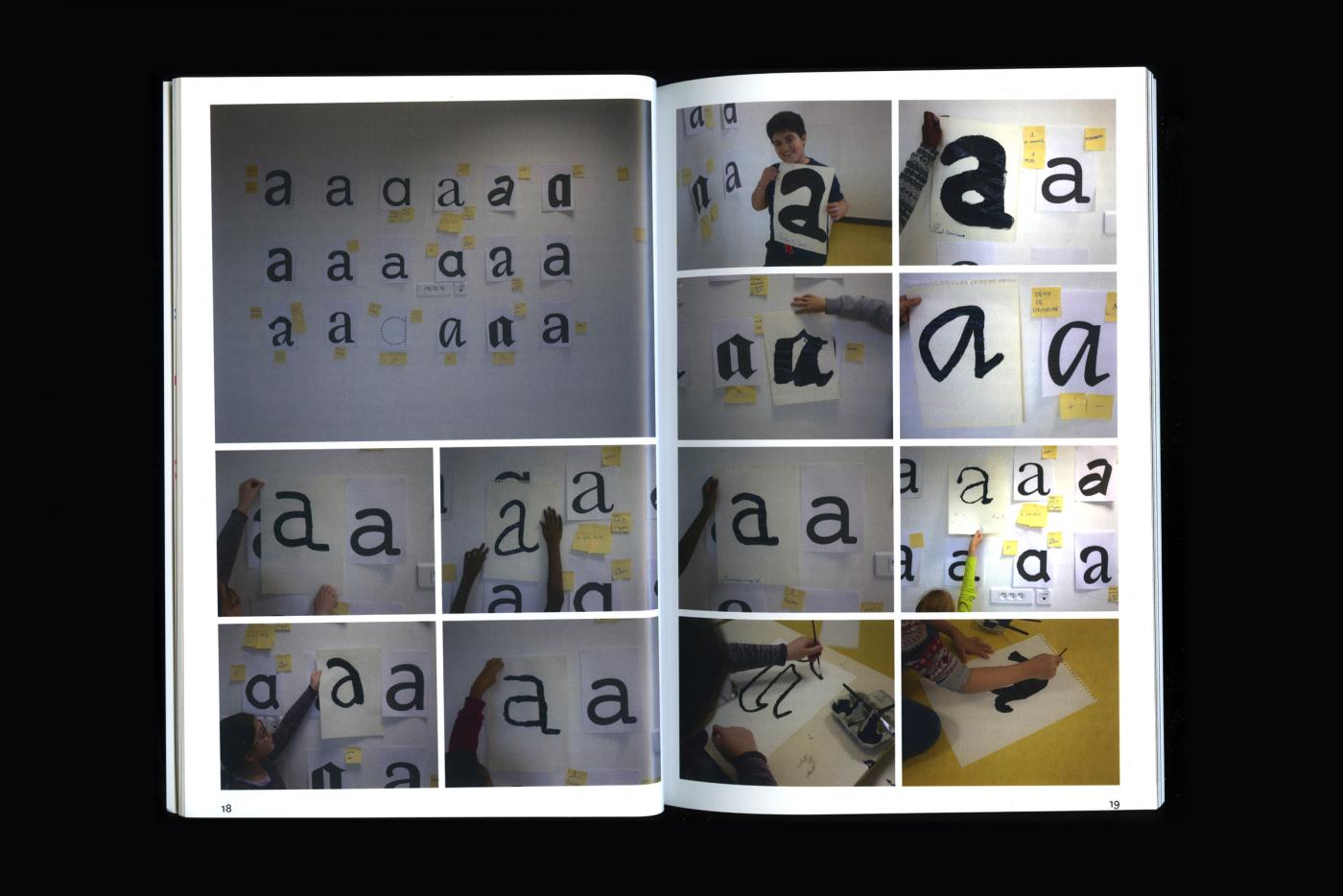
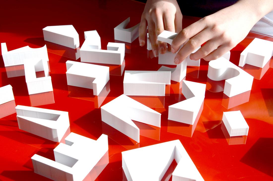
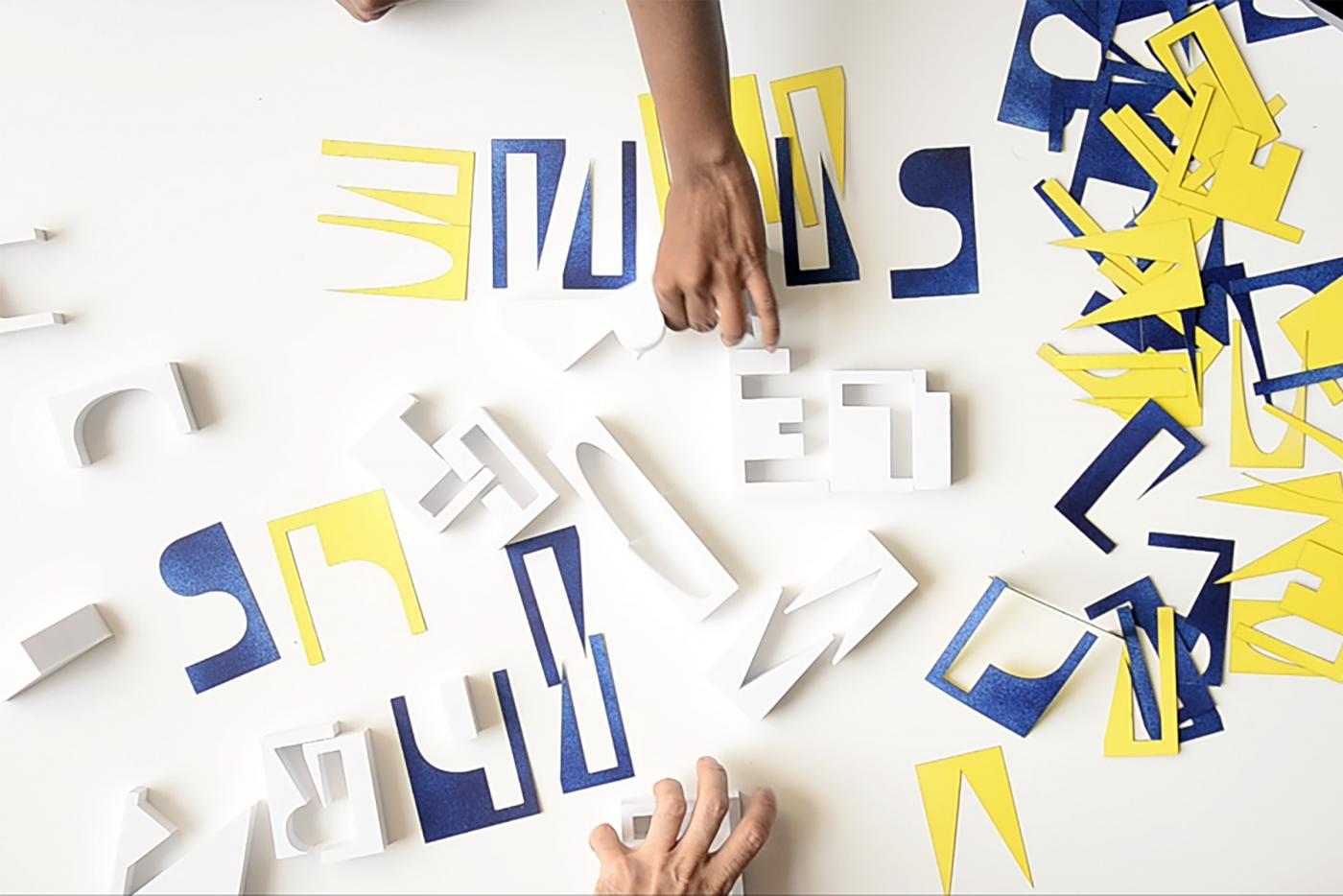
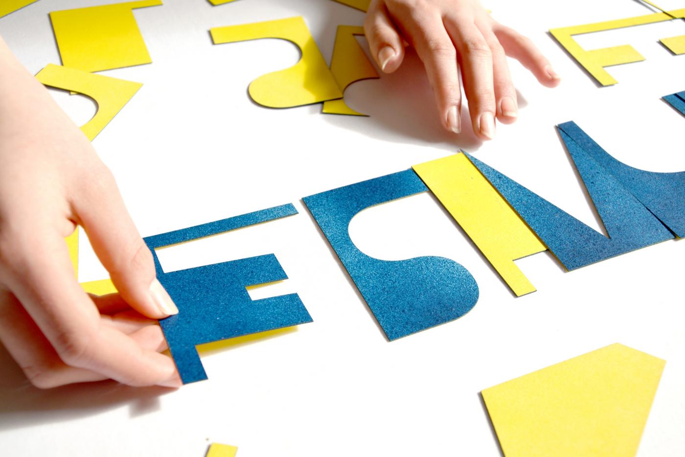
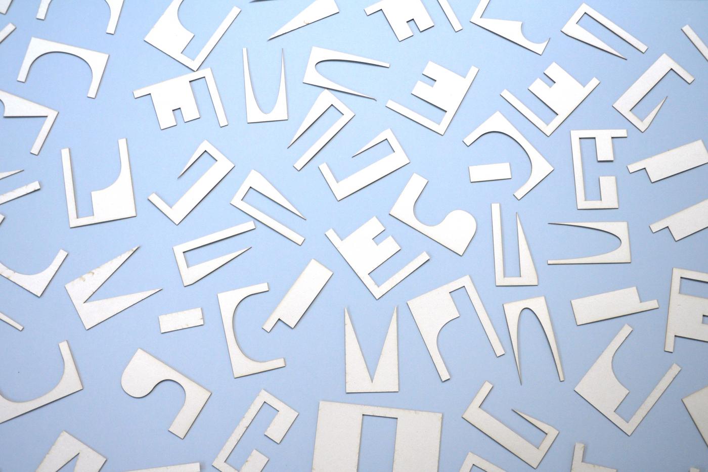
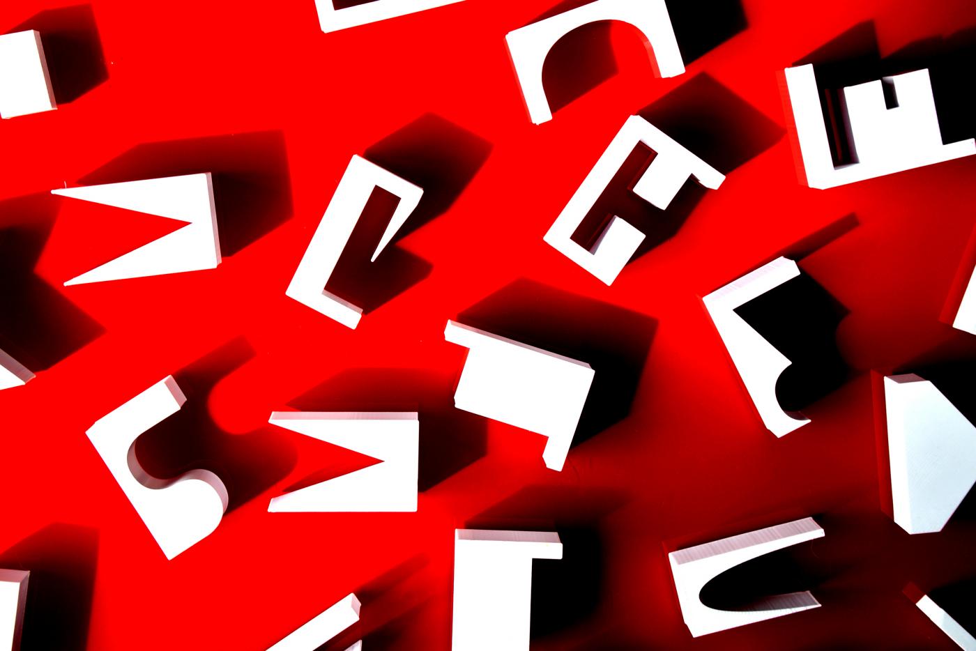
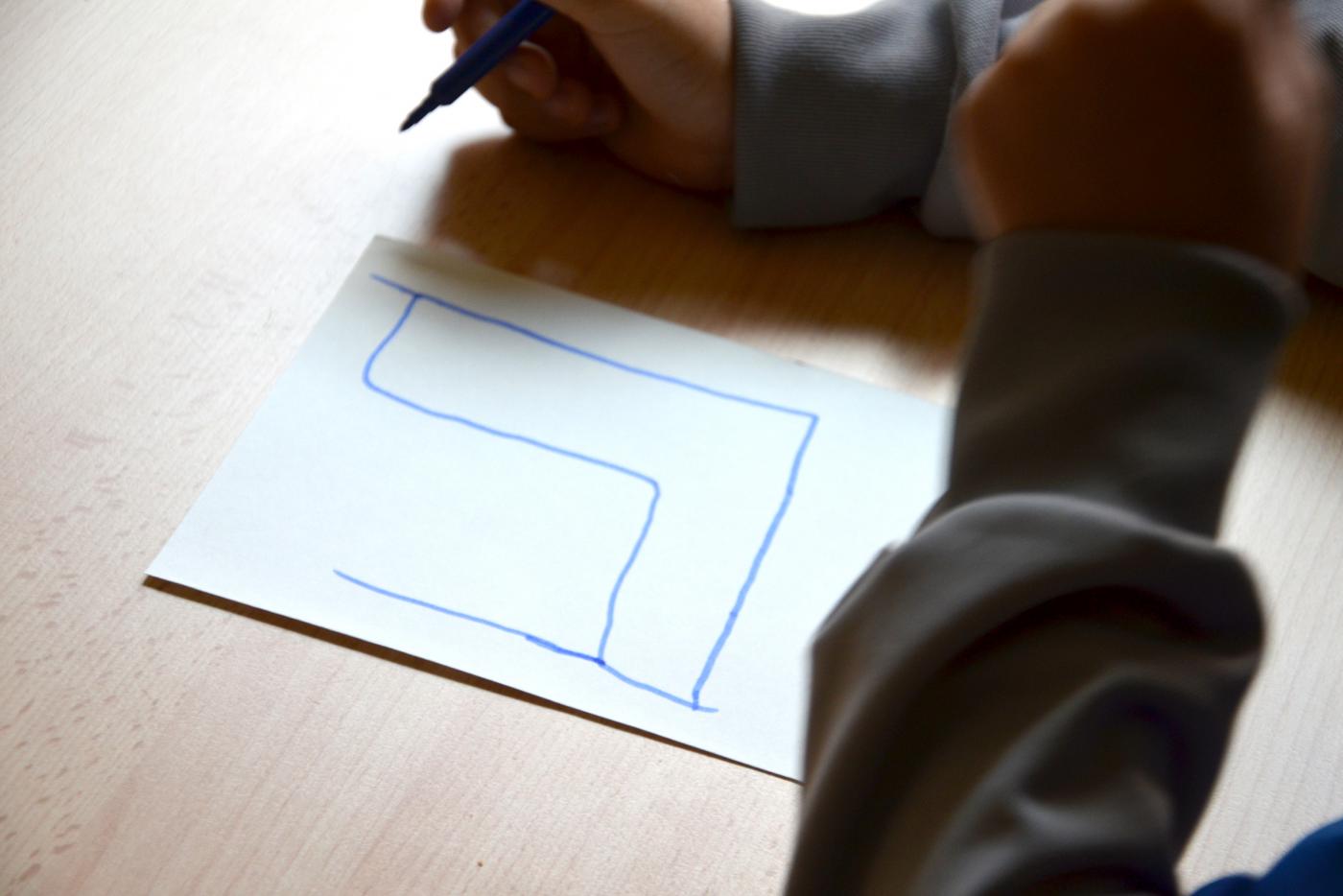
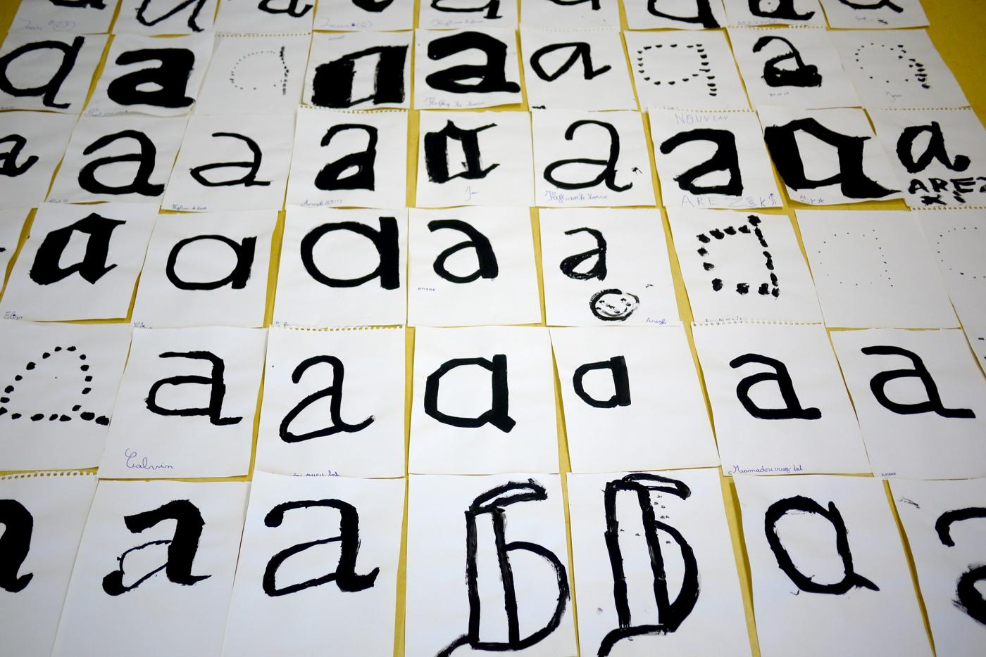
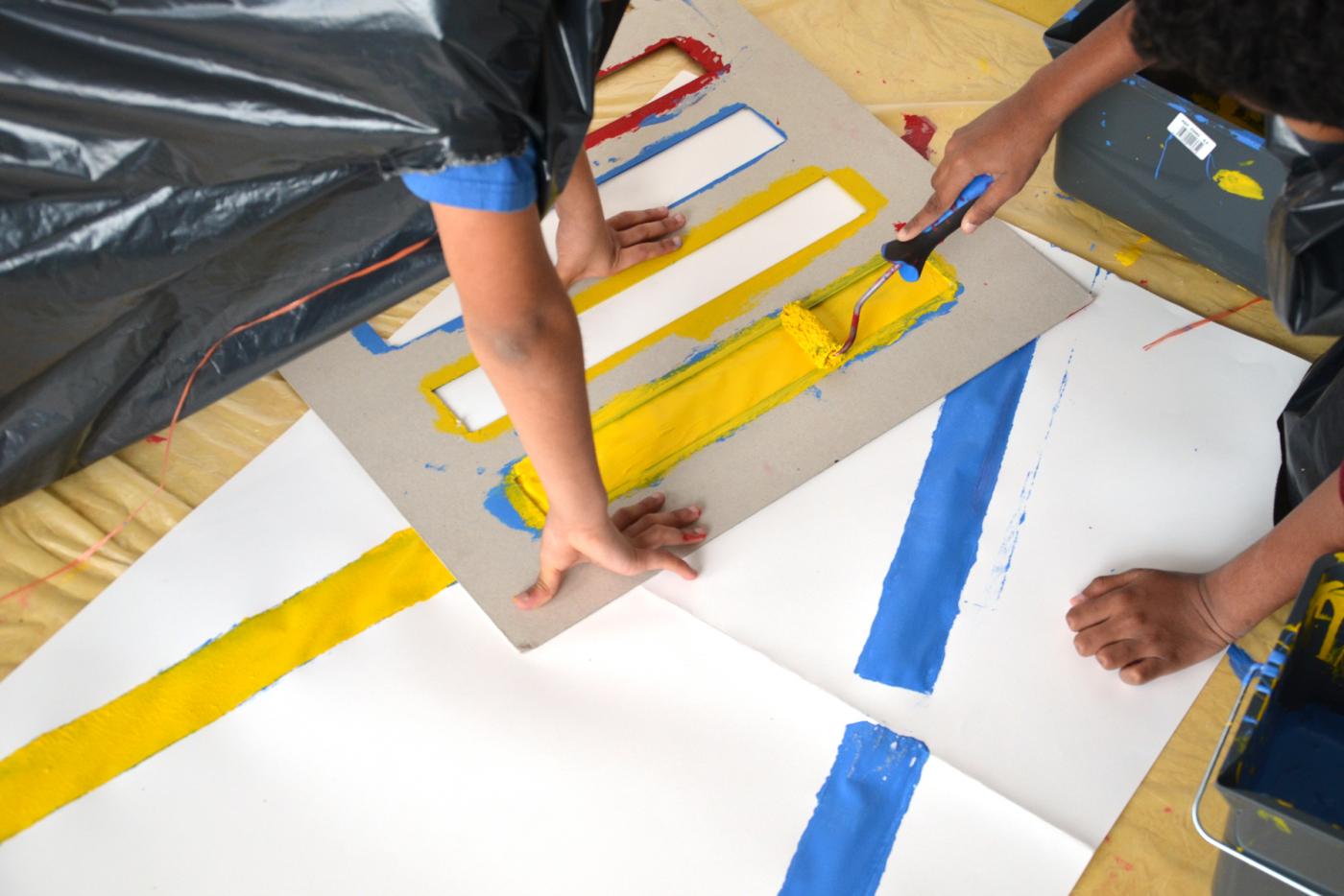
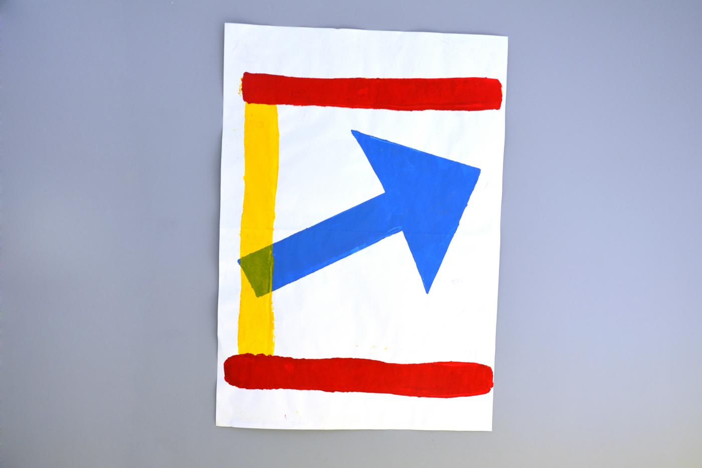
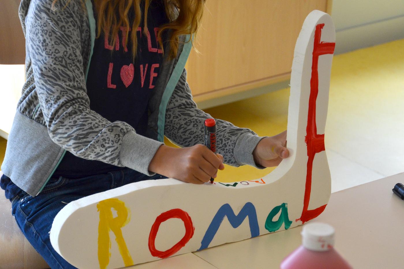
Second prize-winner of the student competition having for theme the Transmission, « Formes et contre-formes des mots dans l'espace » is a typographic tool thought in a purpose of transmission. Displayed to the National Center of the Graphic Design, within the framework of the Biennale of Graphic Design of Chaumont, this tool draws in three stages a bringing route the child (and the adult) to speak in the public place through a textual intervention. These three stages are: the child and the form, characterized by the manipulation and the creation of letter in 2D; the child and the word, characterized by the manipulation and the construction of words in 3D; finally the child and the space, characterized by the putting in space and the textual intervention.
- Intervention at school
- Residency, Workshop, Teaching, Transmission, School
- Fondation Edmond de Rothschild
- École PEF à Saint-Ouen
- —
- Residency, Workshop, Teaching, Transmission, School
- Fondation Edmond de Rothschild
- École PEF à Saint-Ouen
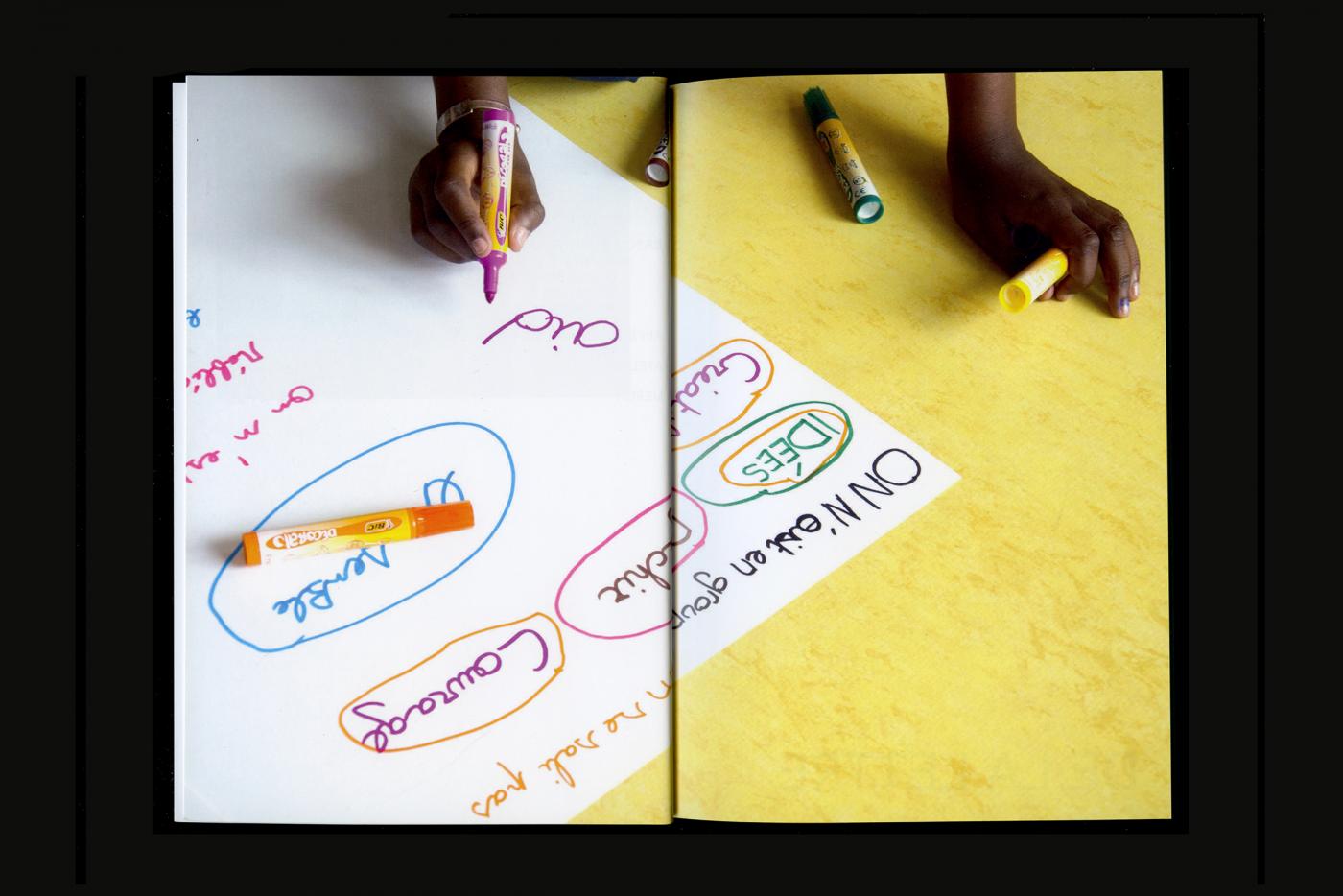
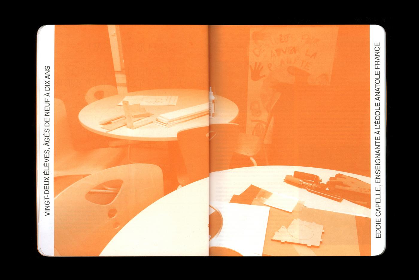
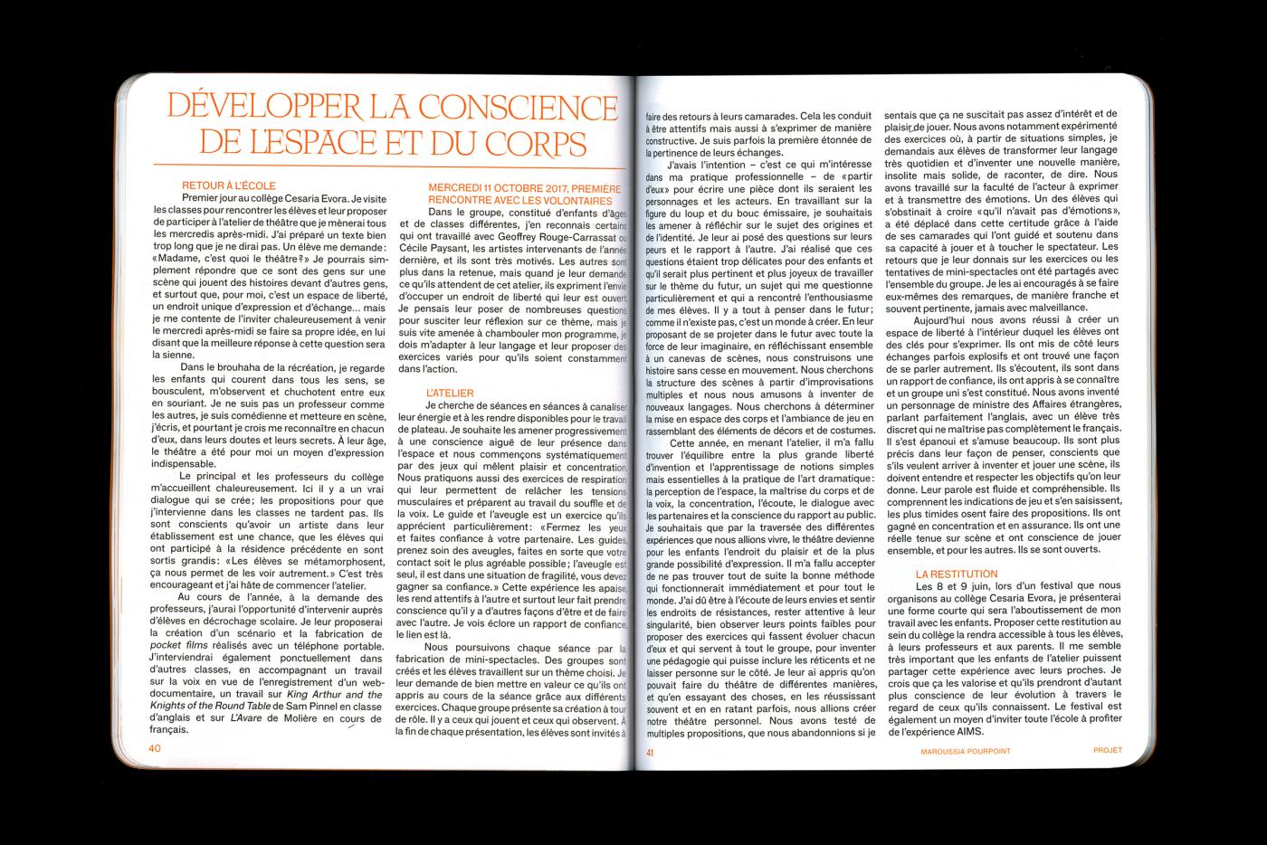
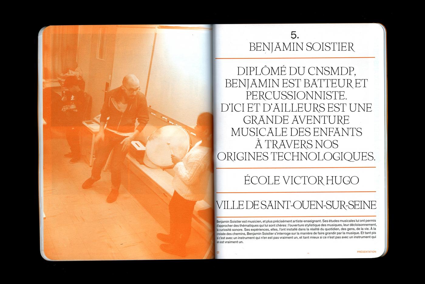
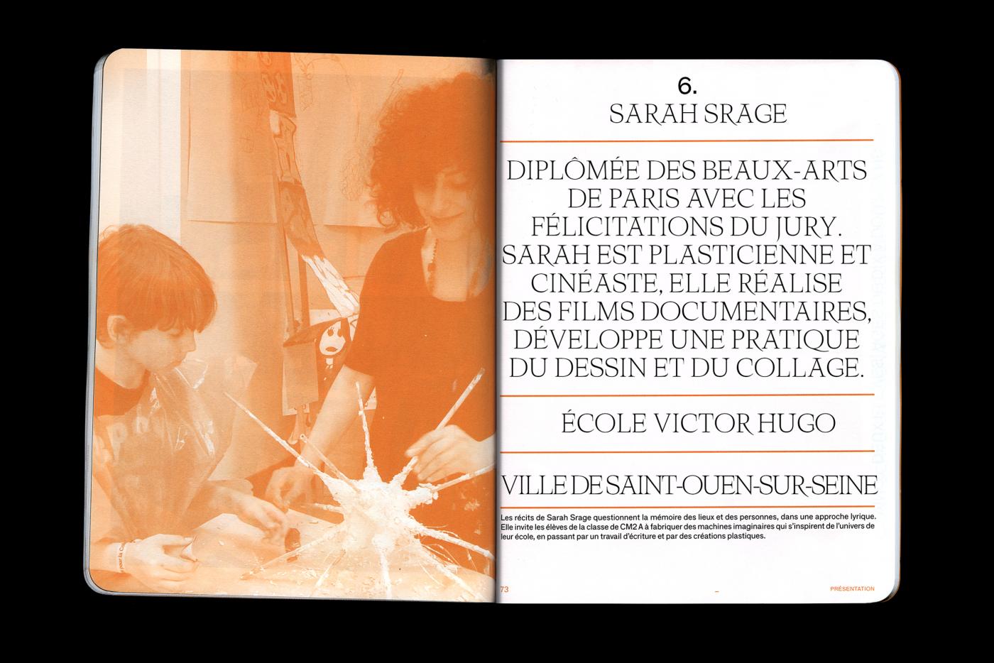
Within the framework of participant's program in schools, I taught in a class of the cycle 3 during one year. This program comes along with a follow-up and with a formation inviting me to document my work, by approaching questions connected to the stakes in the transmission and in the education, carried by the design. This formation grants me participant's diploma in schools. This whole work is available for consultation at this address: http://residenceaims.eddyterki.fr/propos
- Travel between the languages
- Signage, Writing in the public place, Social Design
- Ruedi Baur, Civic City
- Rapperswil Jona, Suisse
- Signage, Writing in the public place, Social Design
- Ruedi Baur, Civic City
- Rapperswil Jona, Suisse
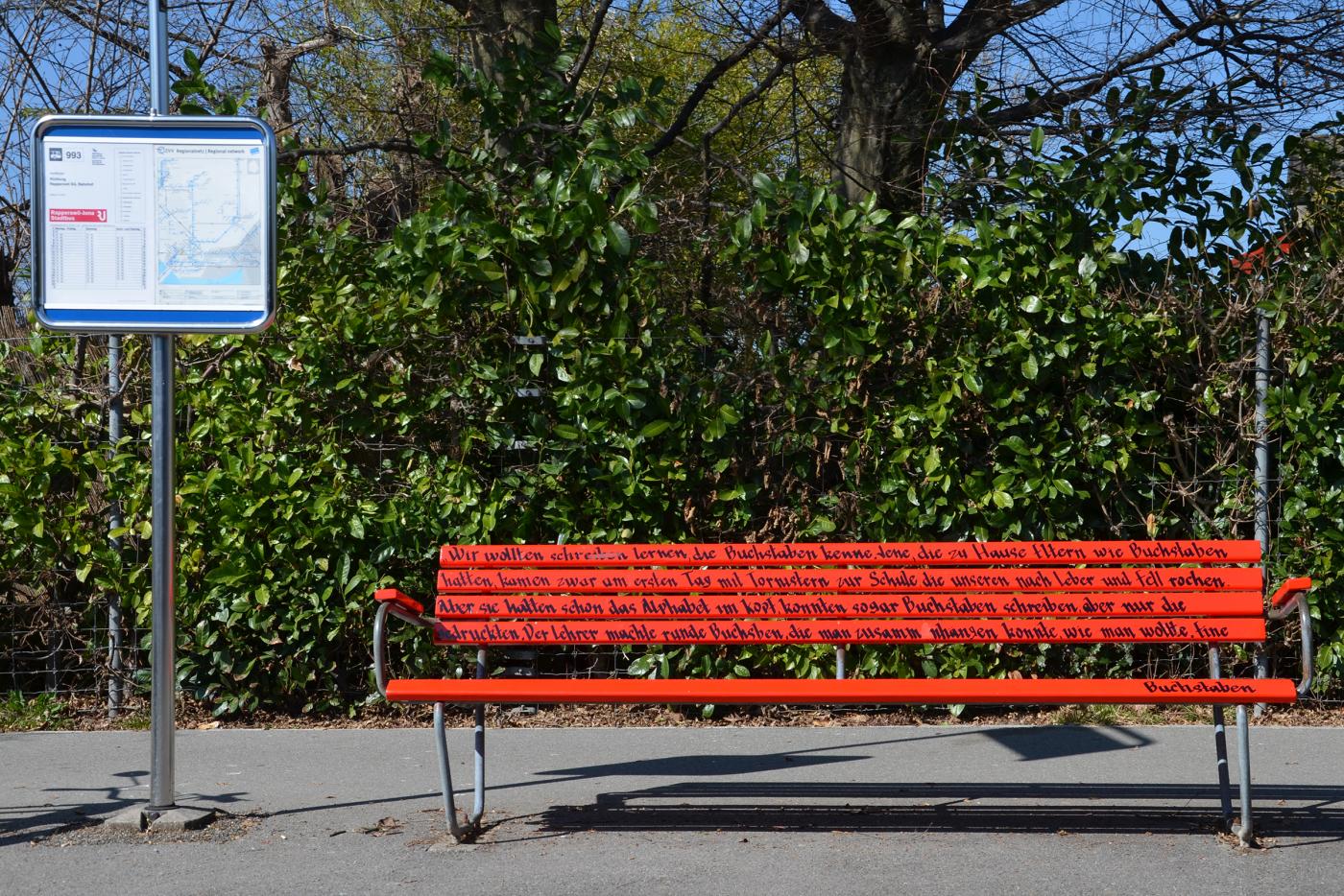
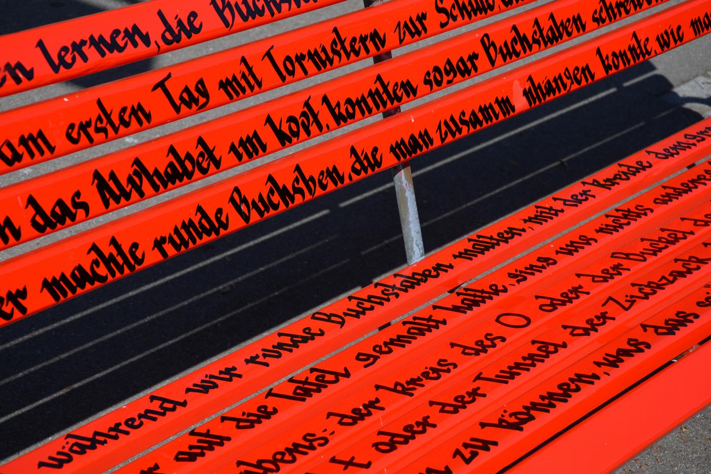
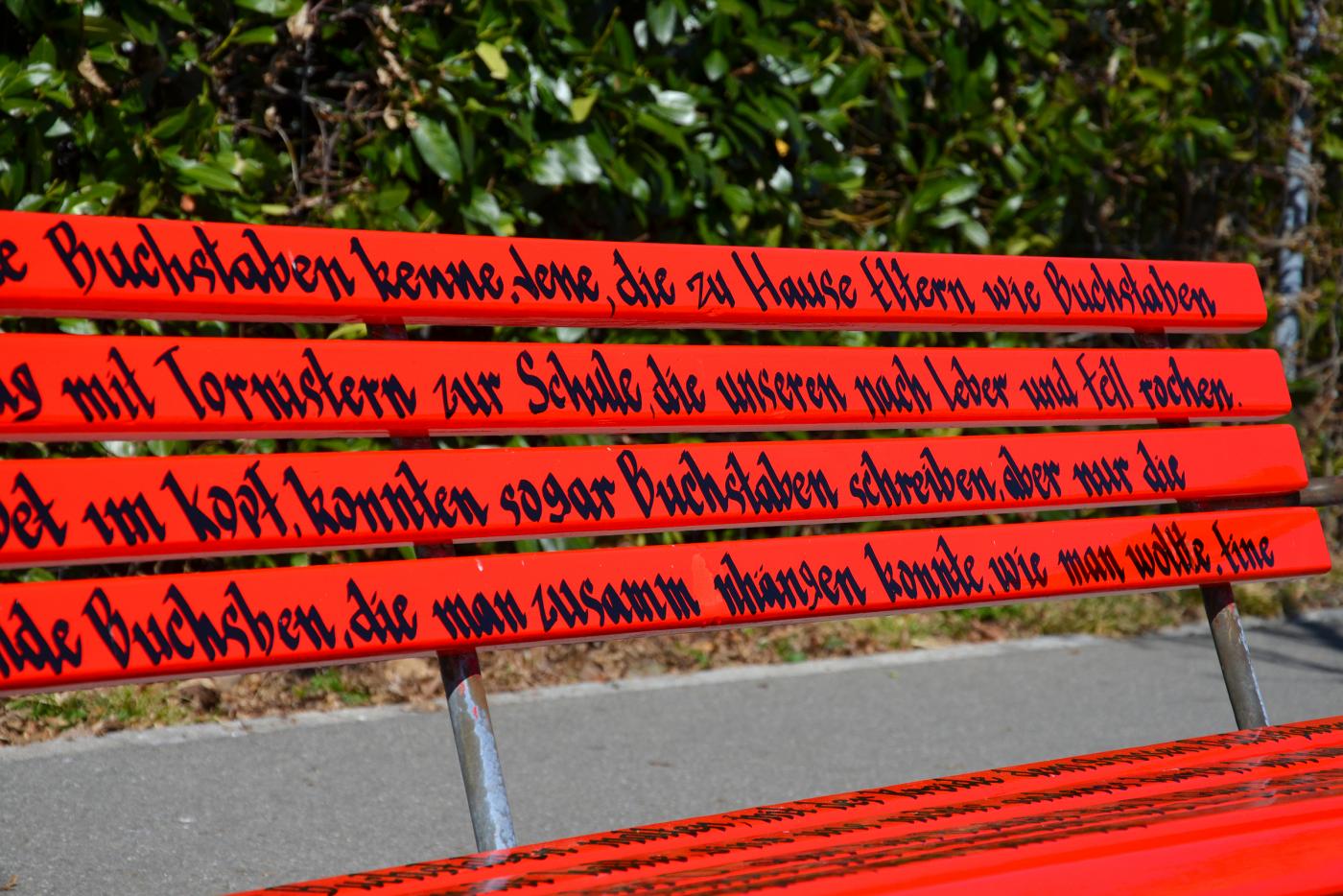
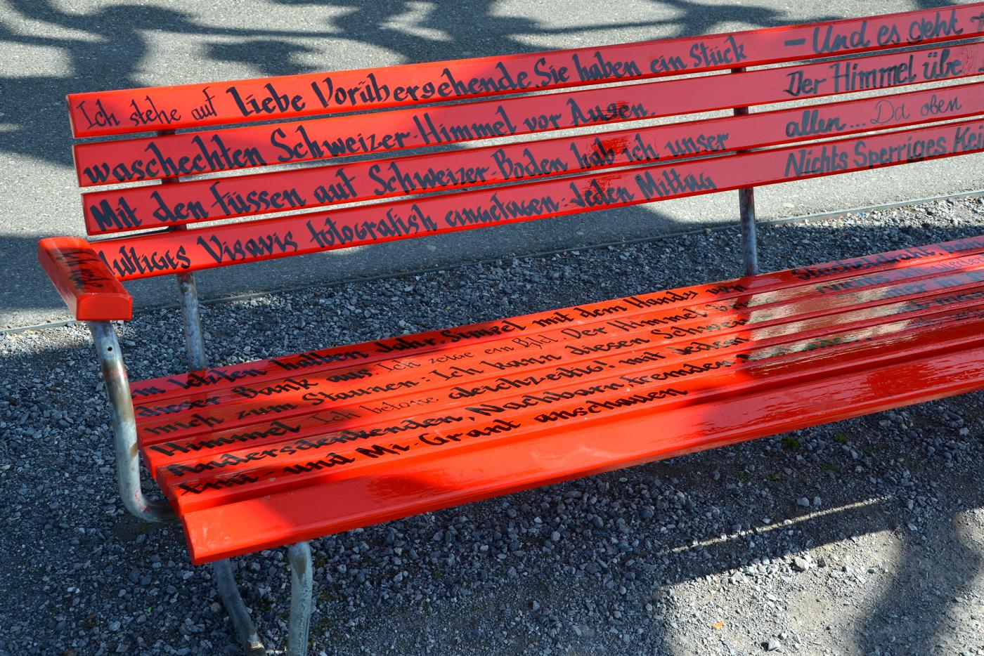
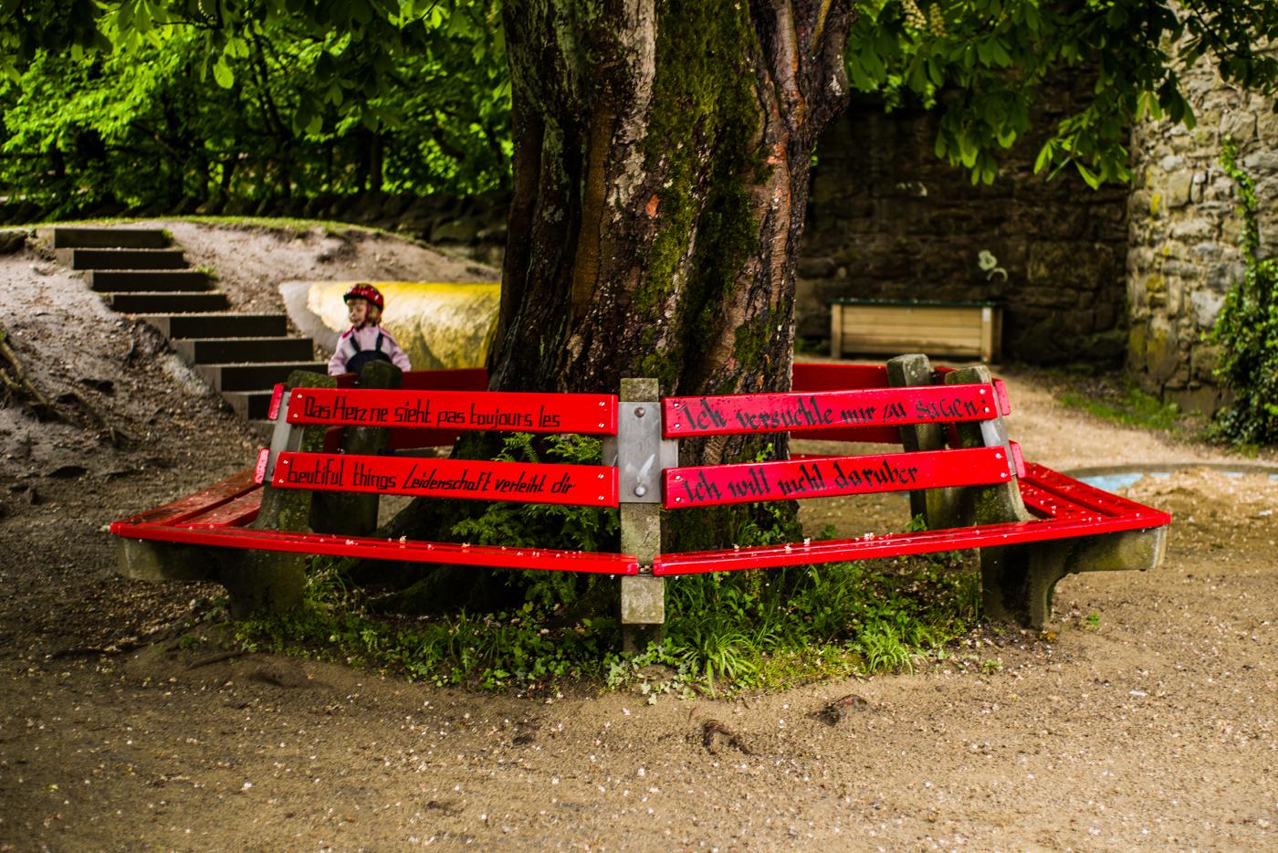
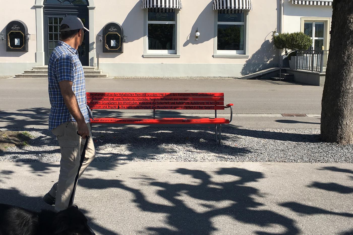
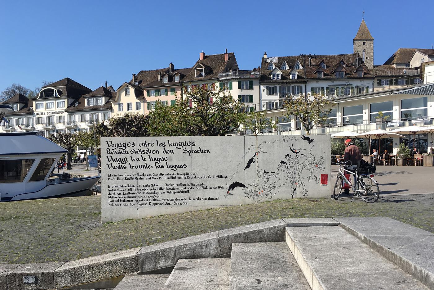
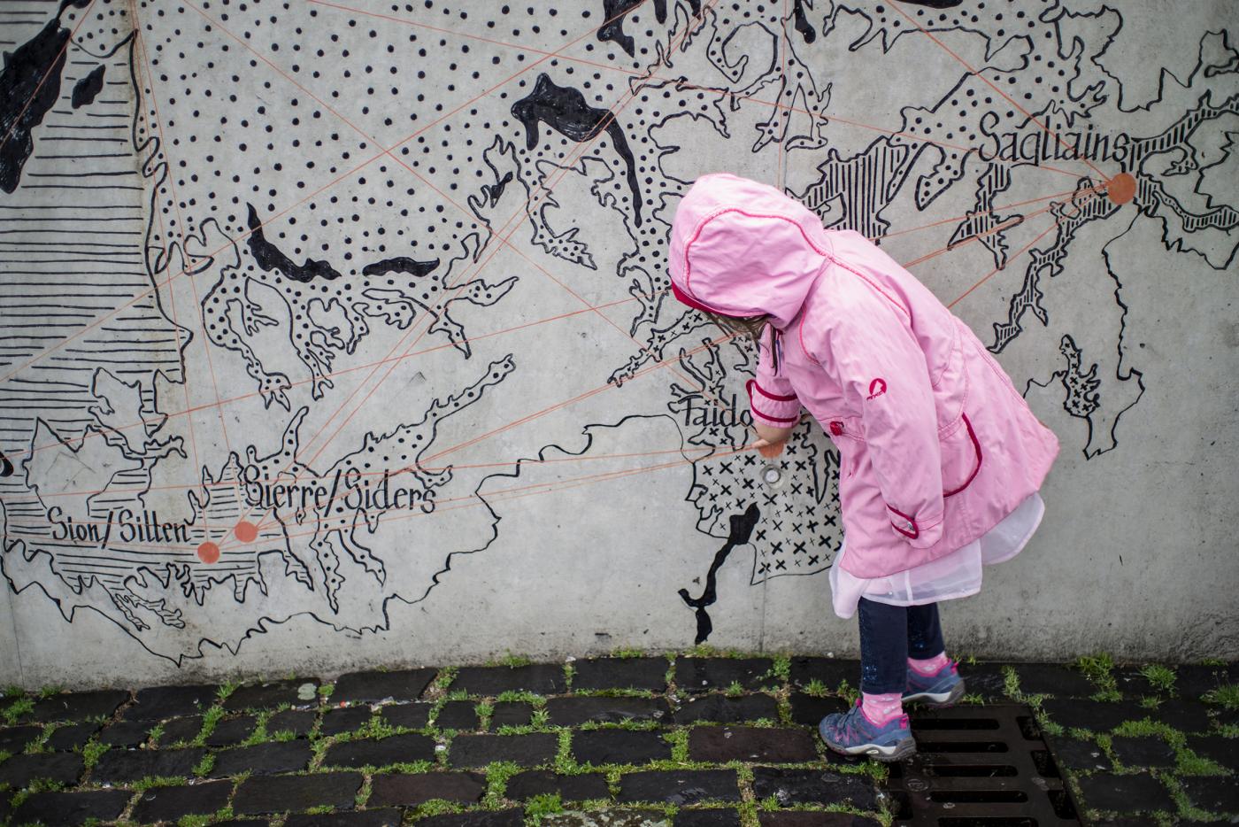
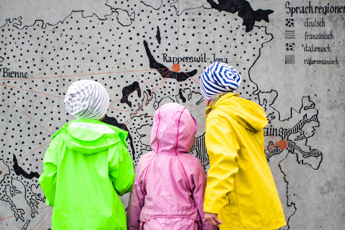
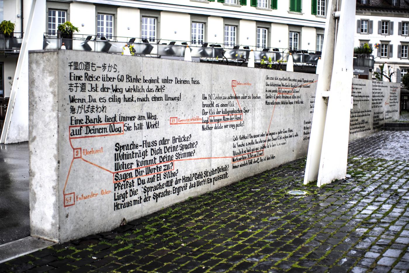
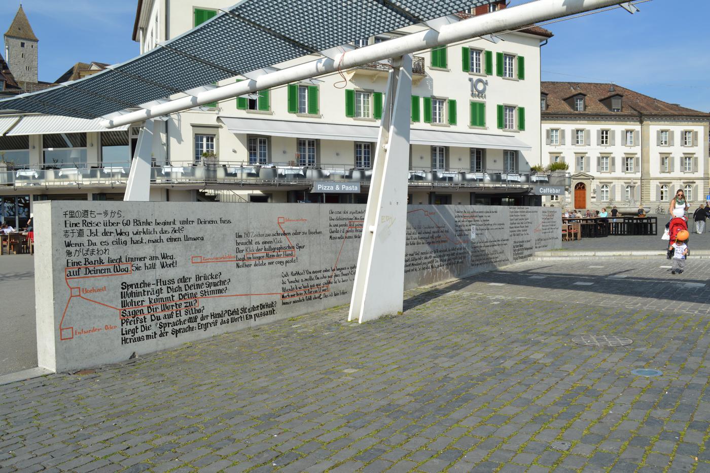
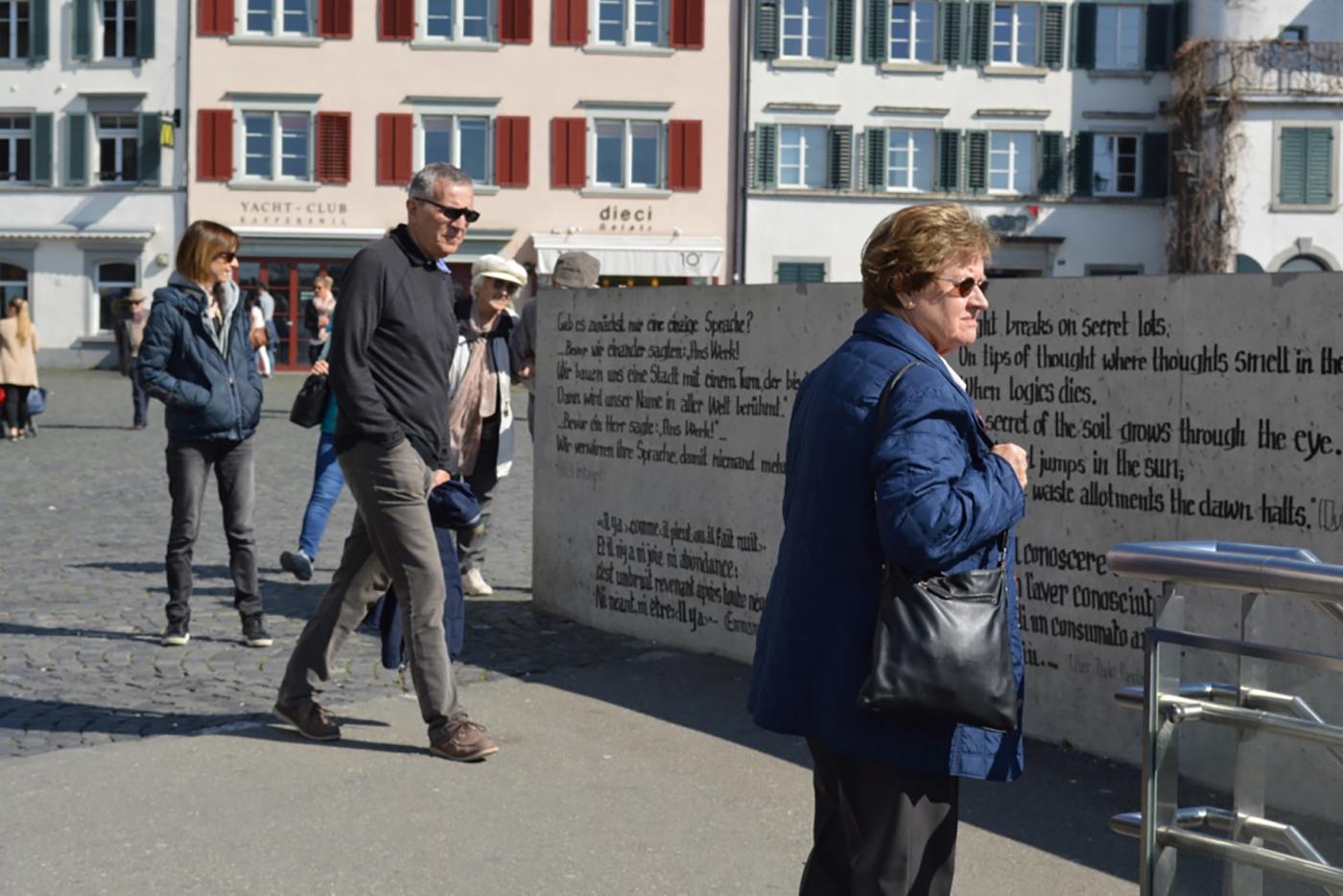
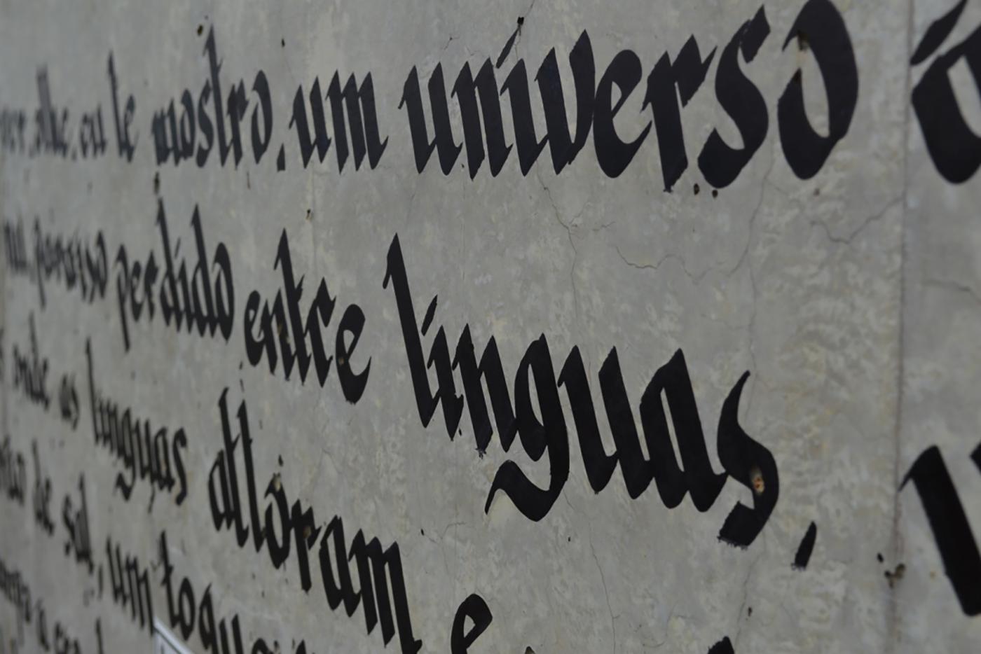
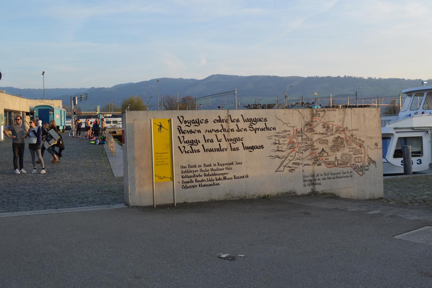
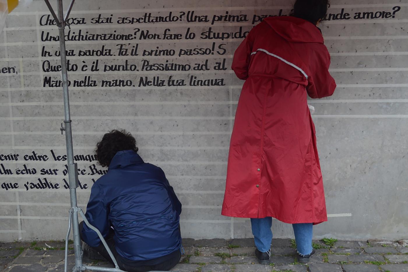
Project was realized in Rapperswil-Jona in Switzerland for Ruedi Baur Studio, it is about a collaboration with the poet André Vladimir Heinz, author of a lots of texts and poems questioning the languages, the link between the cultures, and the importance of the exchange between the cultures. With V. Heinz, we tried to know how to register and make his texts alive in the city. How did they have to interact with the people? In a city, where the langages mixing is very strong (German, English, Italian, French, Romansh Swiss, …). One working month, 70 benches and 42 meters of wall which will take life in the city. Photos represent several interventions which I realized. Work led with Danielle Rosales, Odyssey Khorsandian and Afrouz Razavi.
- Memorial of the Prison of Montluc
- Writing in space, Signage, Social Design
- Ruedi Baur, Civic City
- Memorial of the Prison of Montluc at Lyon
- Writing in space, Signage, Social Design
- Ruedi Baur, Civic City
- Memorial of the Prison of Montluc at Lyon
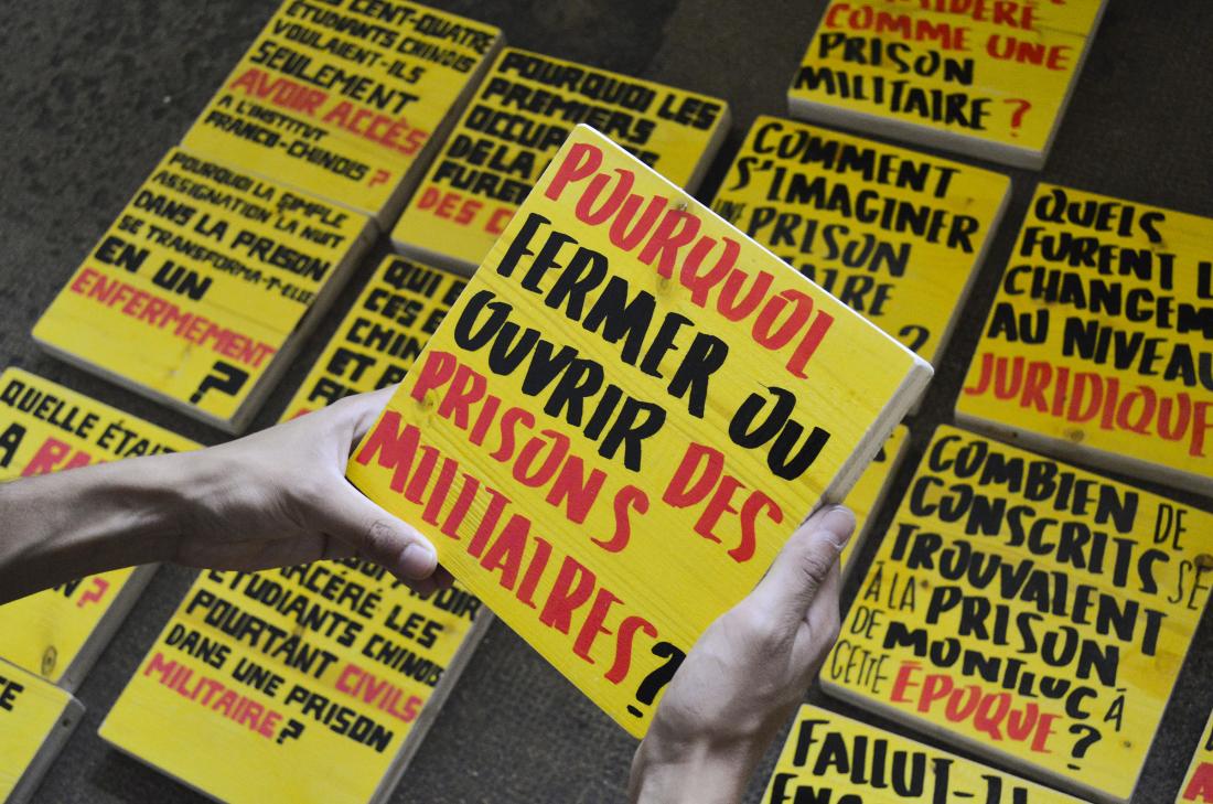
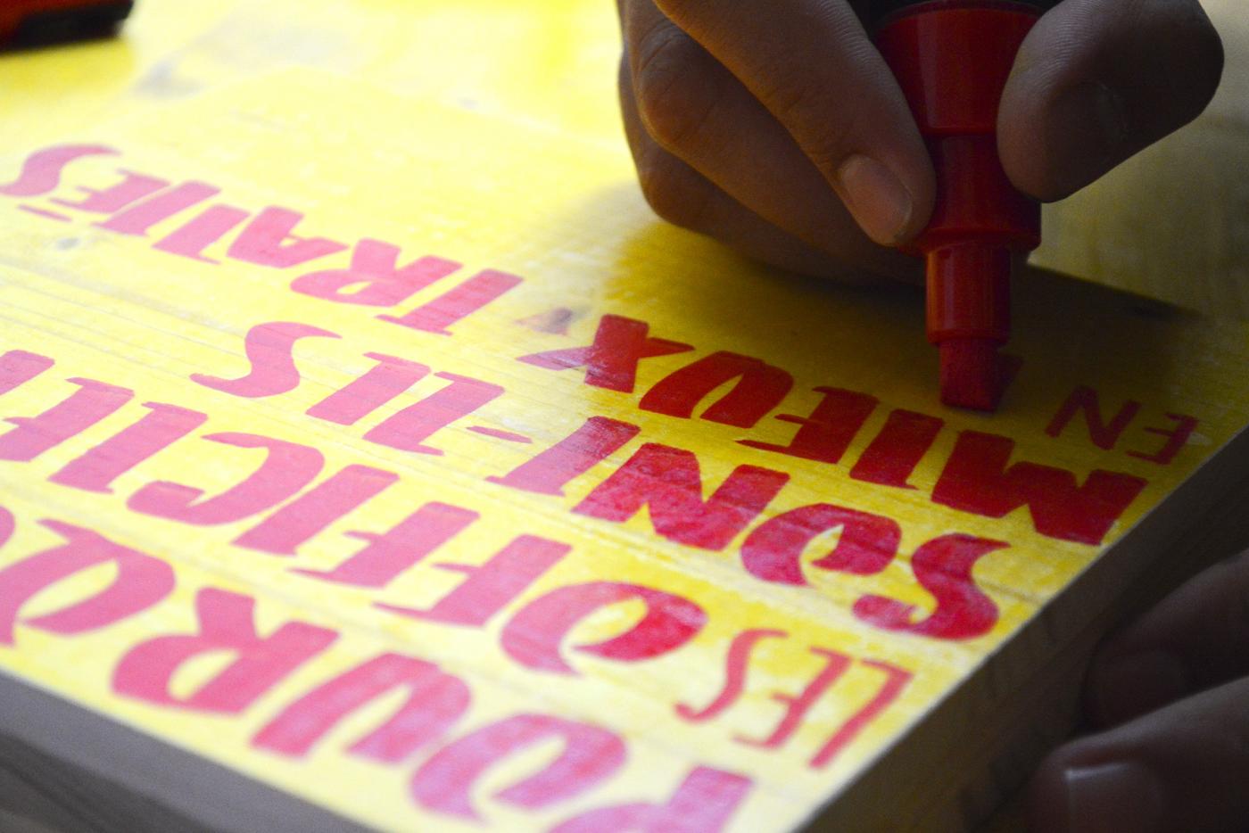
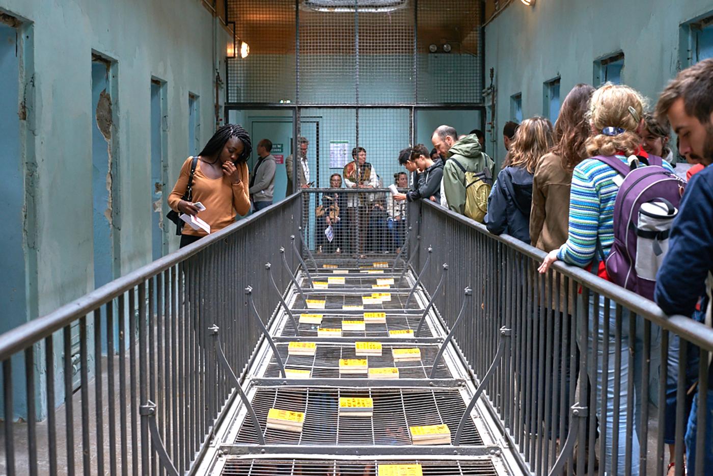
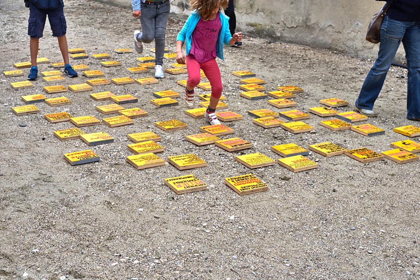
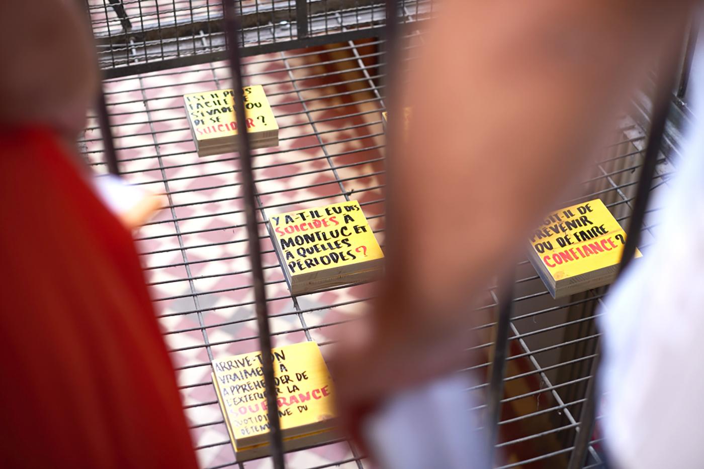
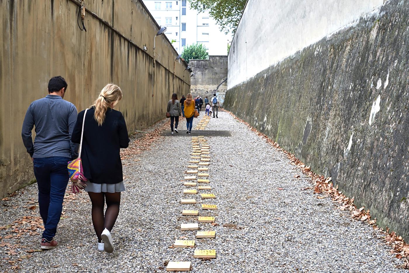
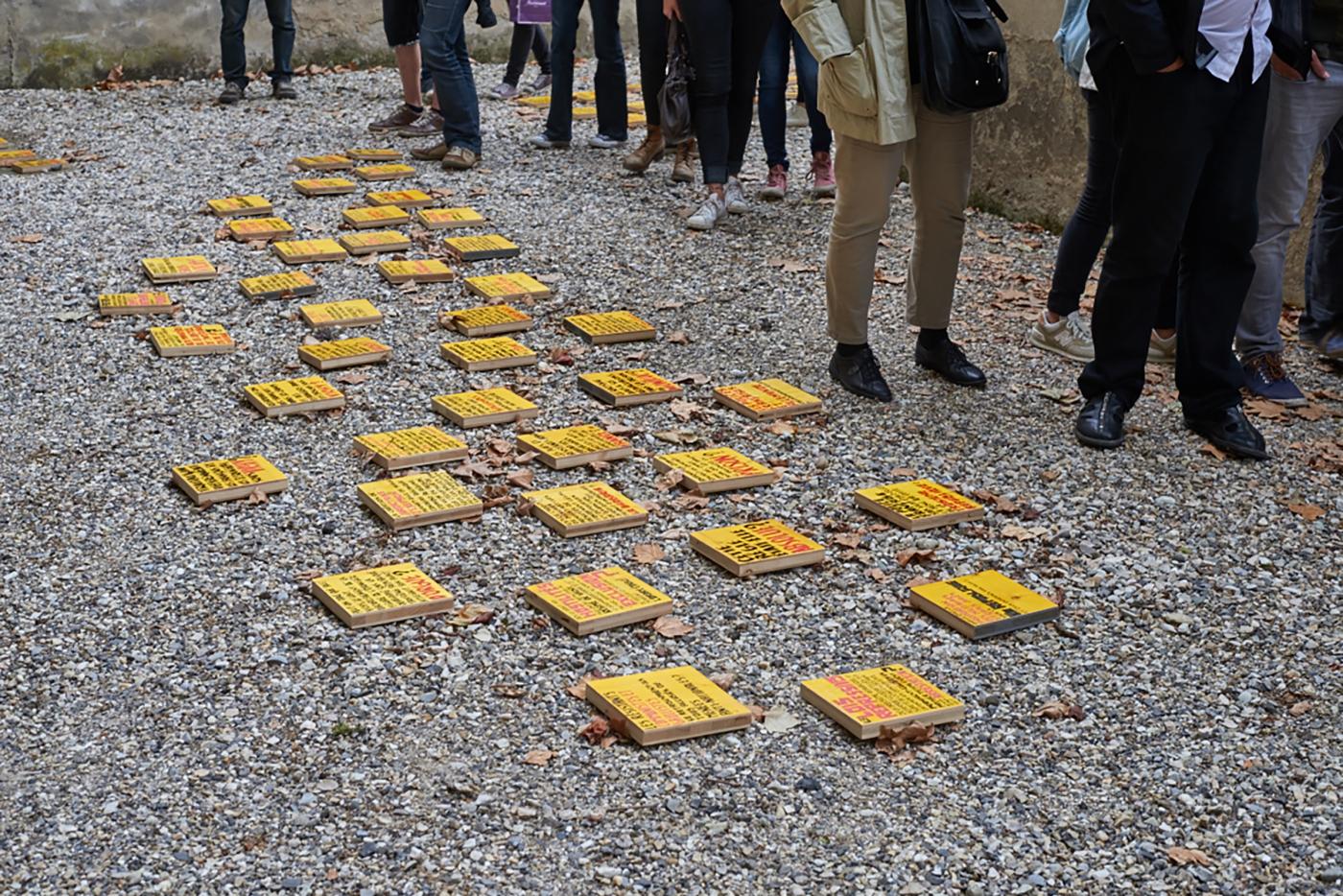
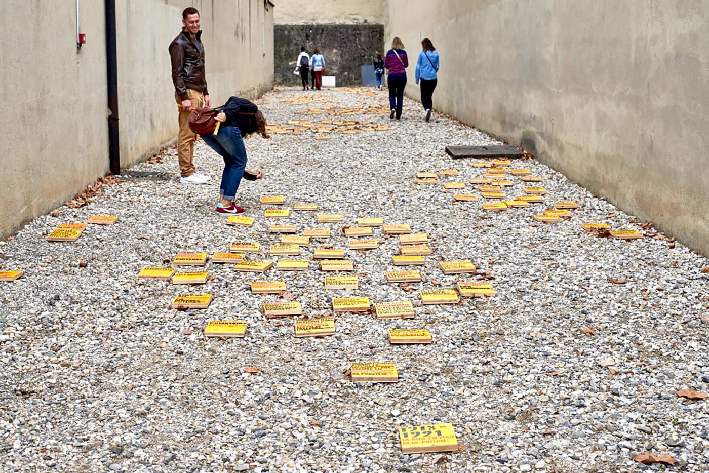
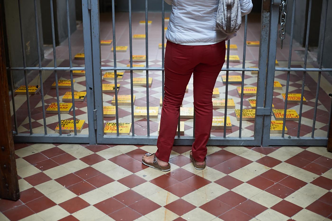
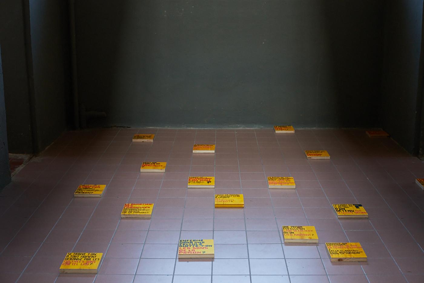
Work for Ruedi Baur and Civic City to the Memorial of the Prison from Montluc at Lyon. Creation of a route questioning the Memorial of the prison of Montluc through 1500 questions. This installation questions the prison but also the visitors about the history, often very dark past of this military prison become civil prison, witness of several conflicts (Second World War, Algerian War…). It is the route which also questioning the notion of detention, isolation, the place of the Man in front of the confinement. This project is realized with Afrouz Razavi. That installation lives during the European day of the heritage
- The Crystal Elephant
- Poster, Visual identity
- The Crystal Elephant
- Berlin, Madrid
- —
- Poster, Visual identity
- The Crystal Elephant
- Berlin, Madrid
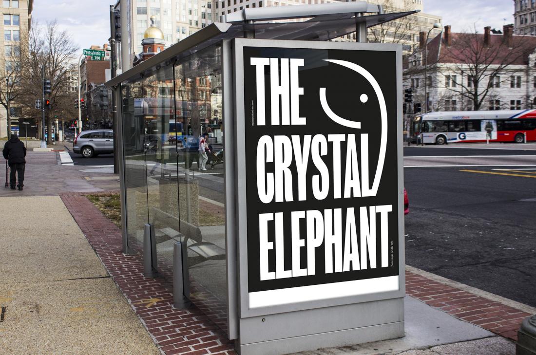
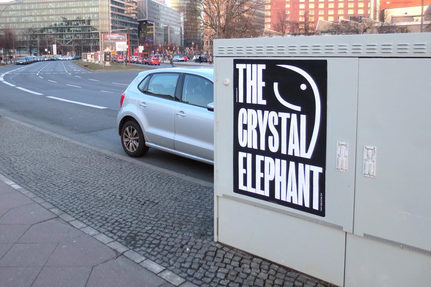
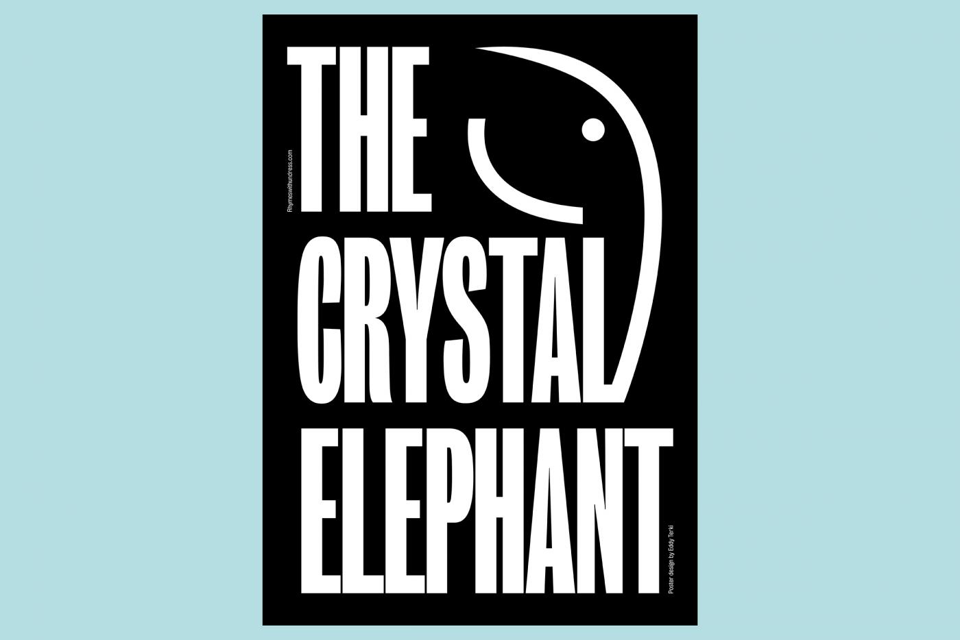
Development of the visual identity for TheCrystalElephant, Mexican singer based in Berlin and Madrid.
- The meeting between two bodies
- Typography, Diploma, Edtition, Graphic experimentation, writing, Public space,
- Projet personnel
- Paris, Saint-Denis, Aubervilliers
- Typography, Diploma, Edtition, Graphic experimentation, writing, Public space,
- Projet personnel
- Paris, Saint-Denis, Aubervilliers
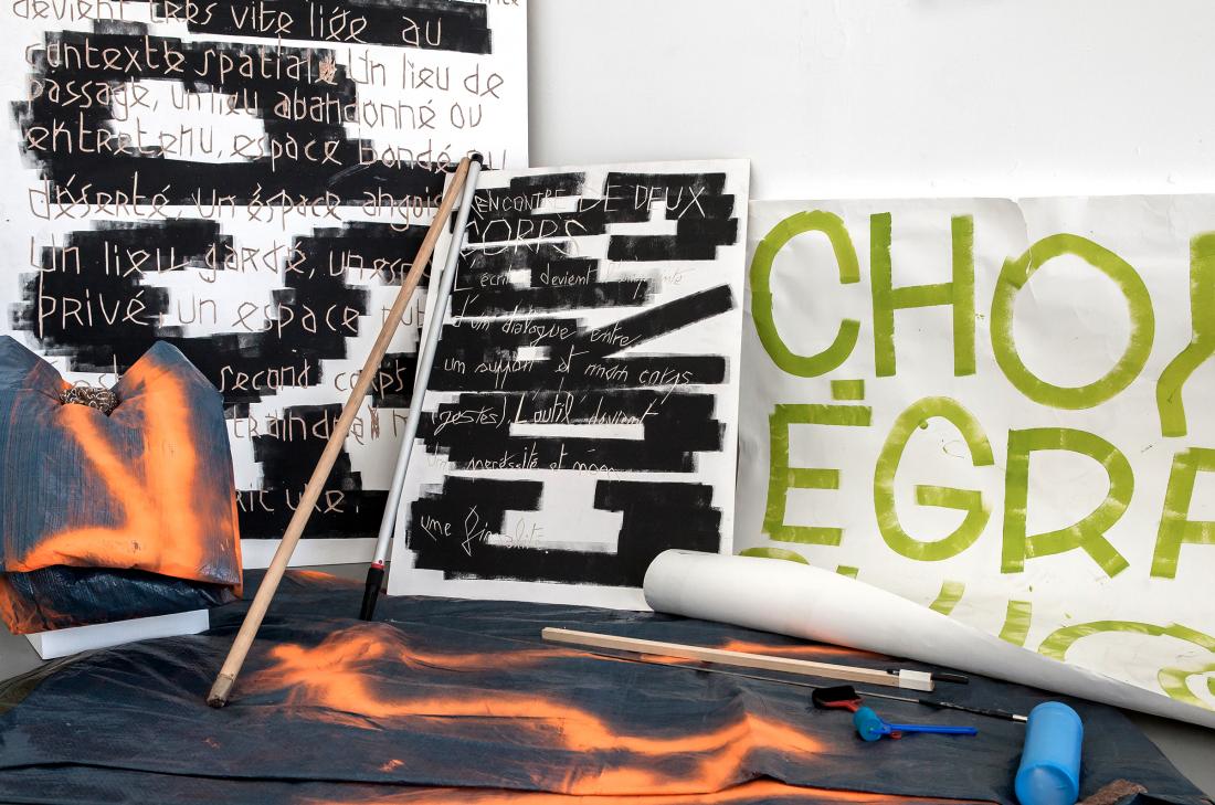
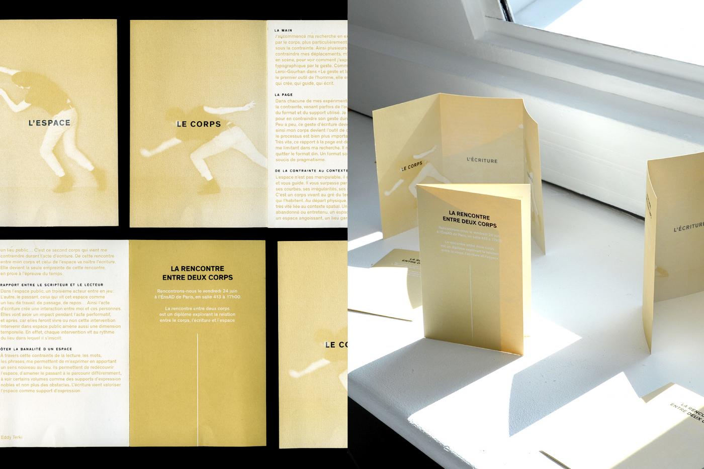
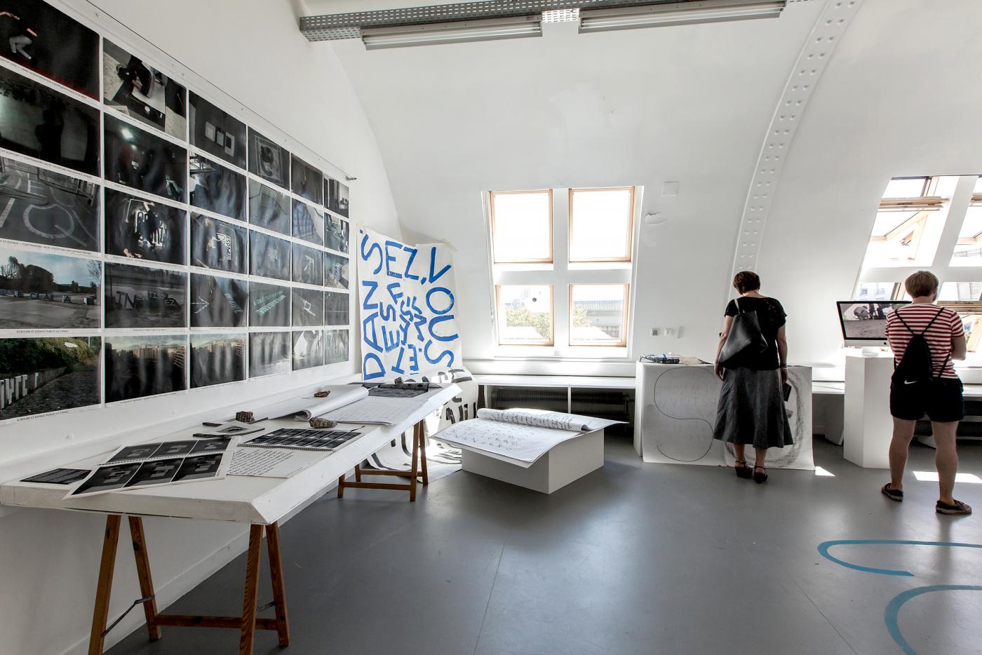
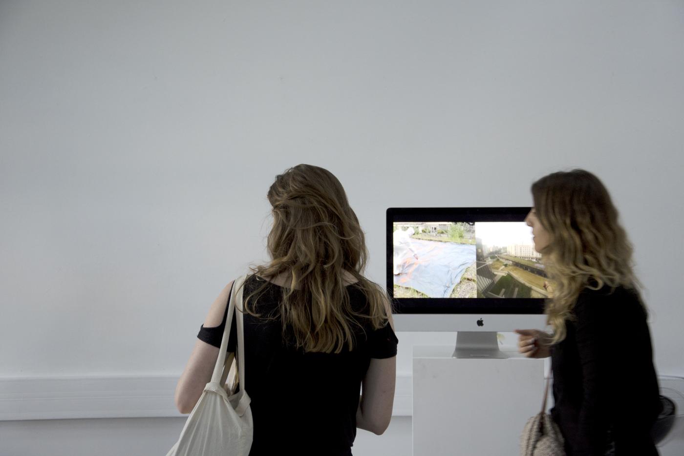
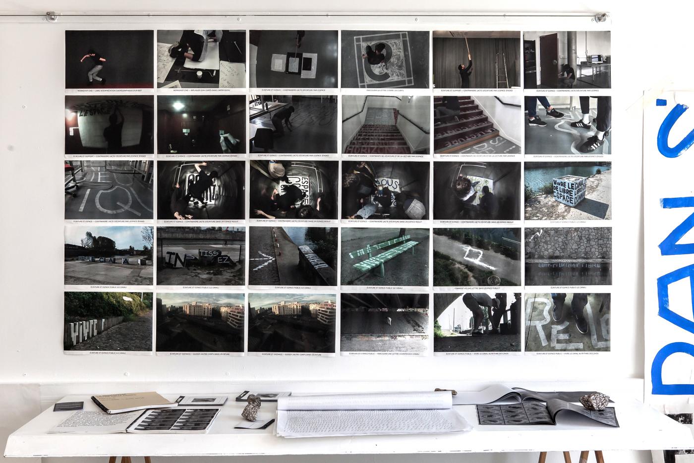
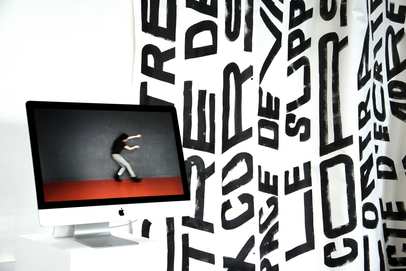
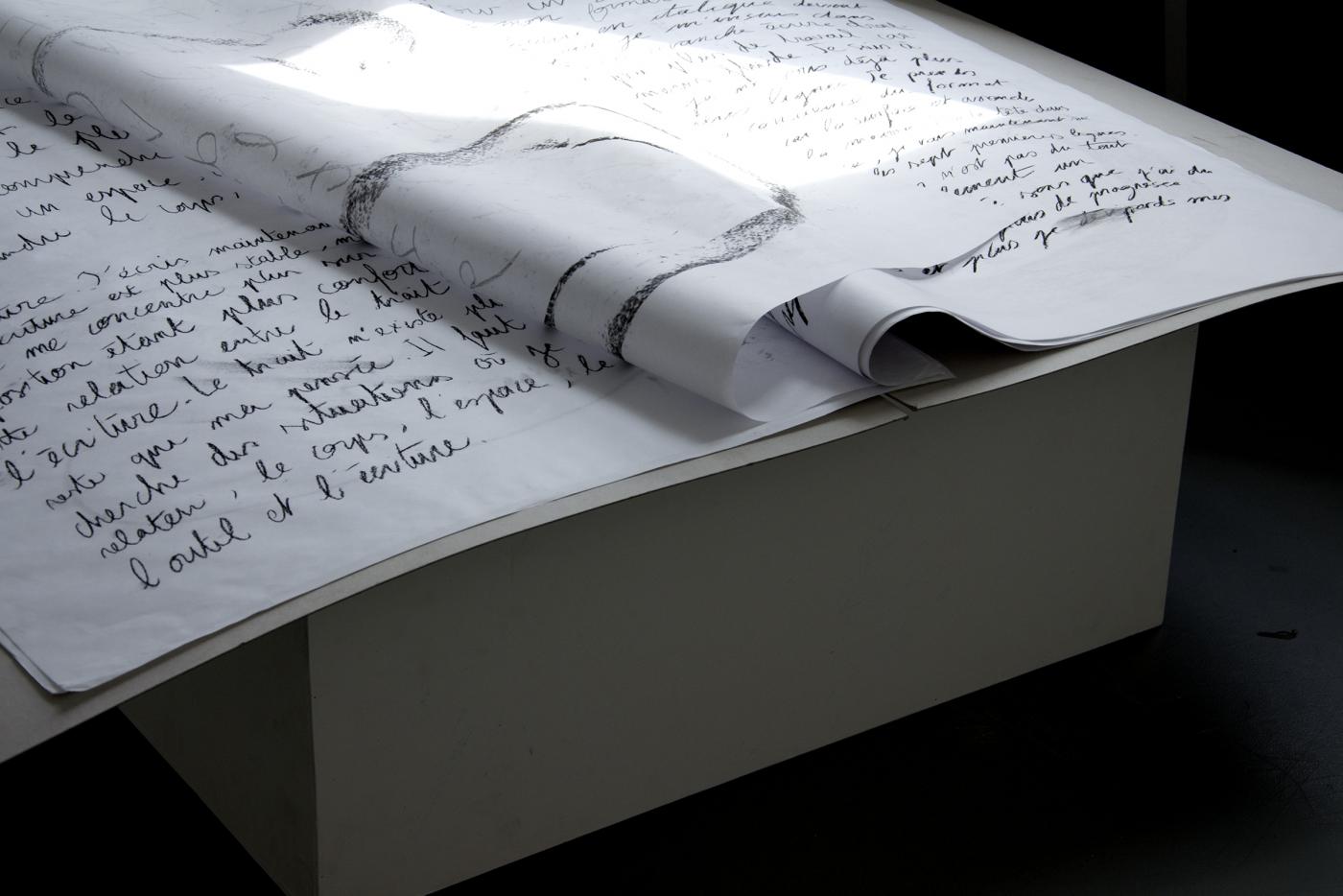
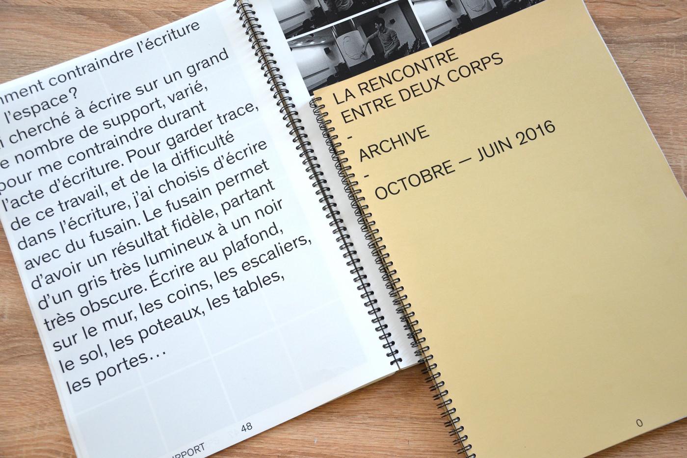
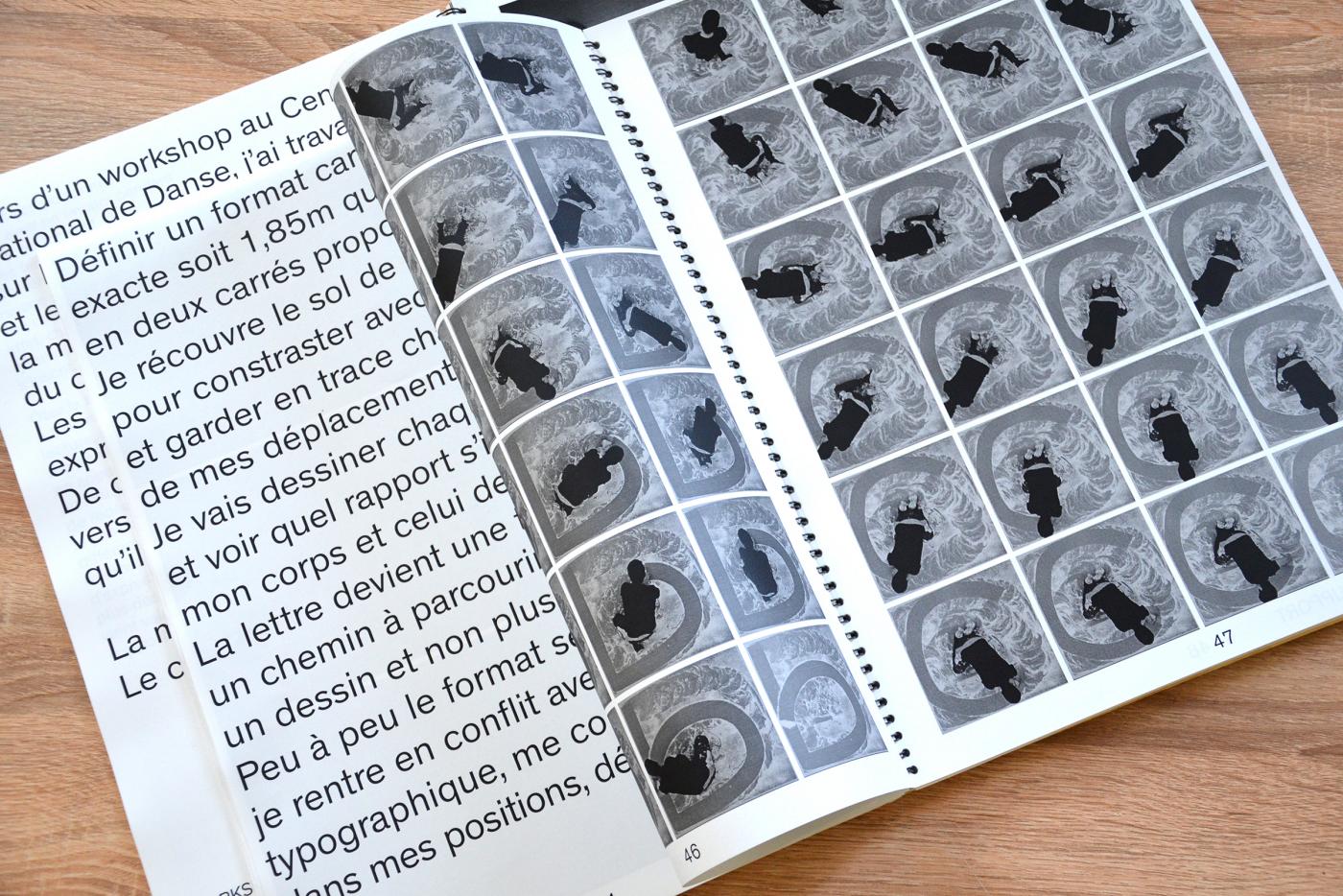
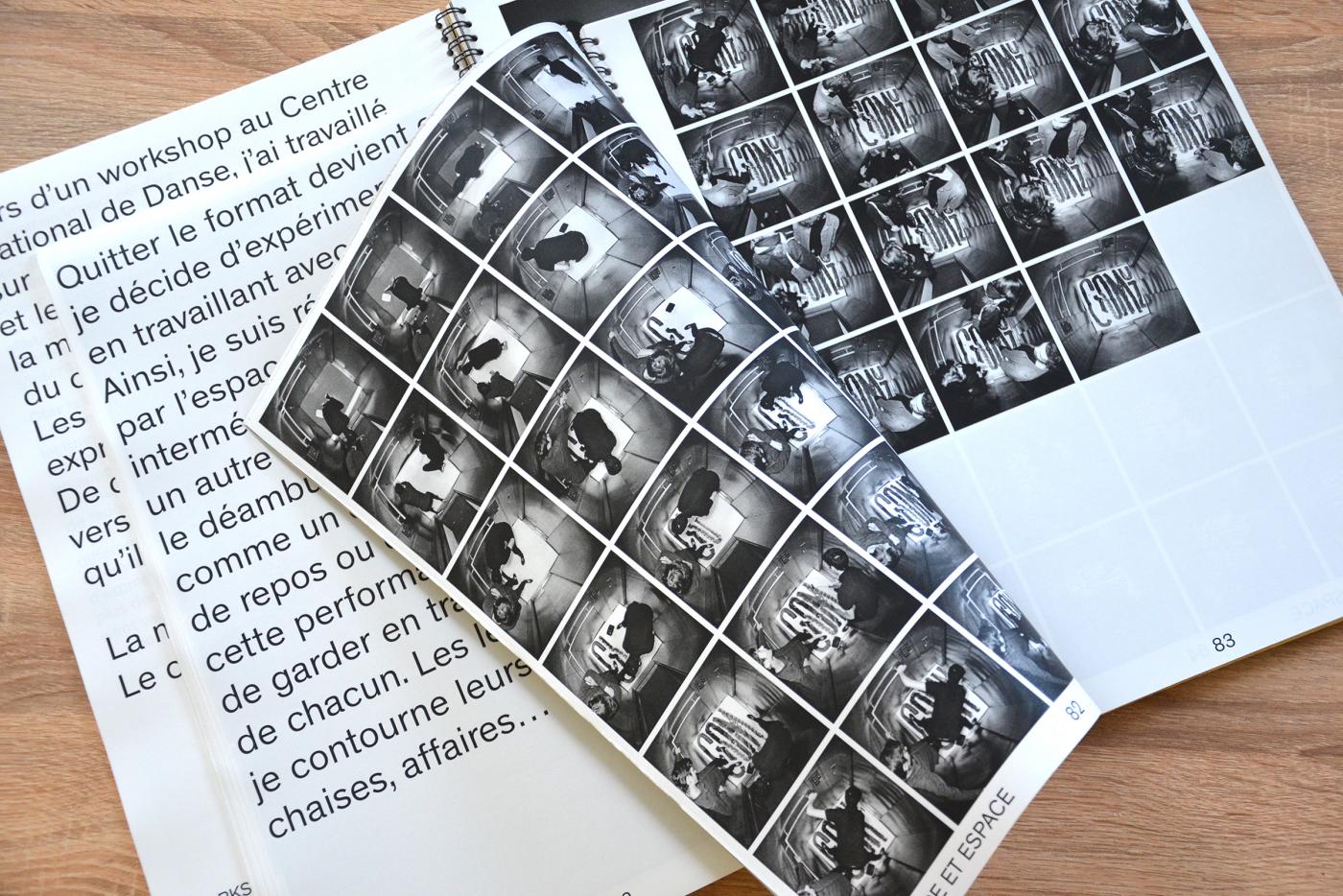
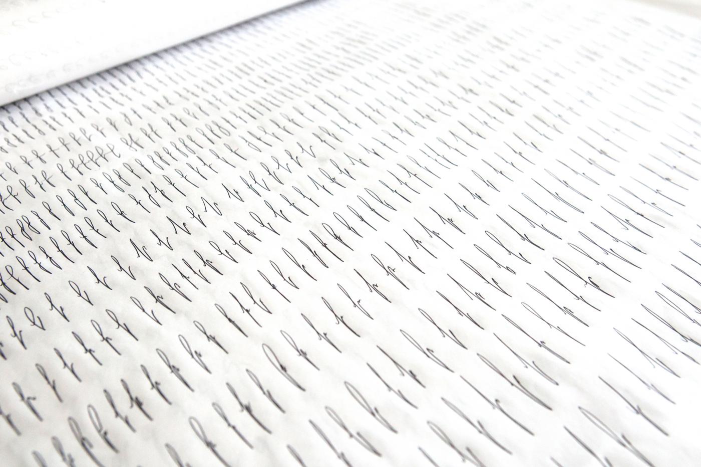
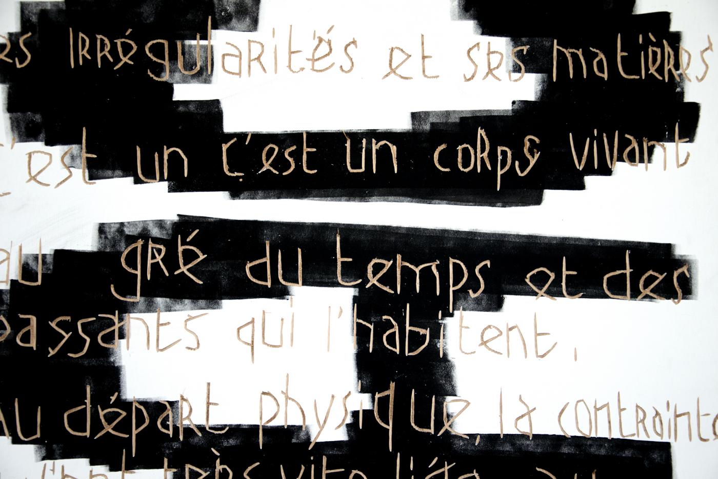
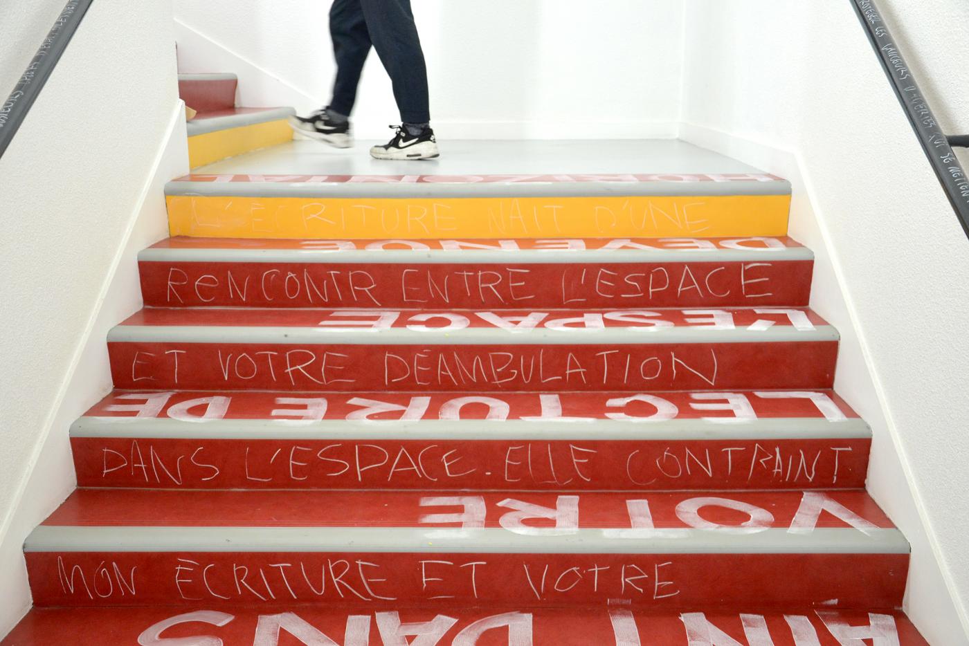
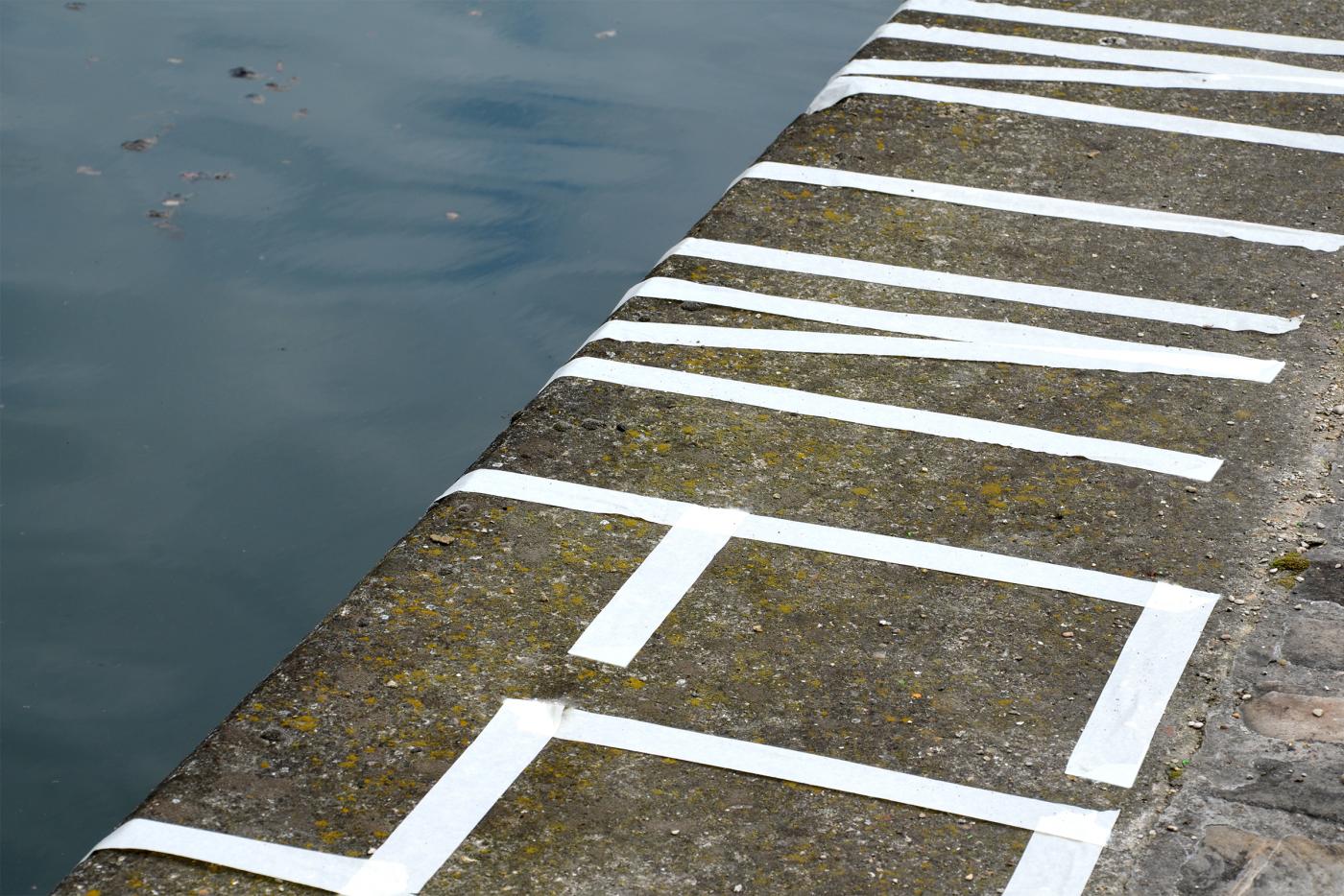
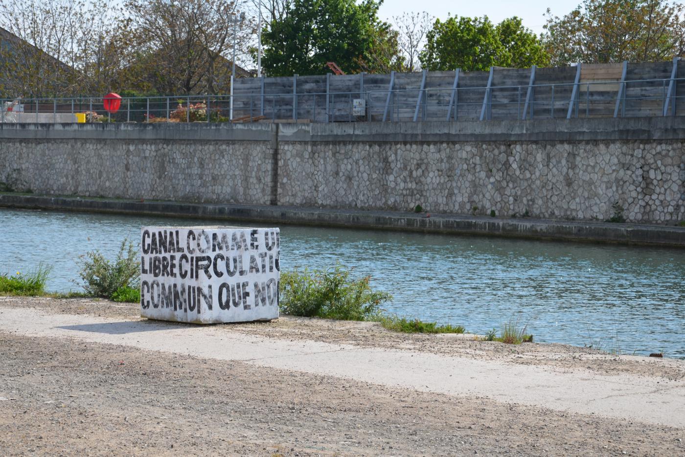
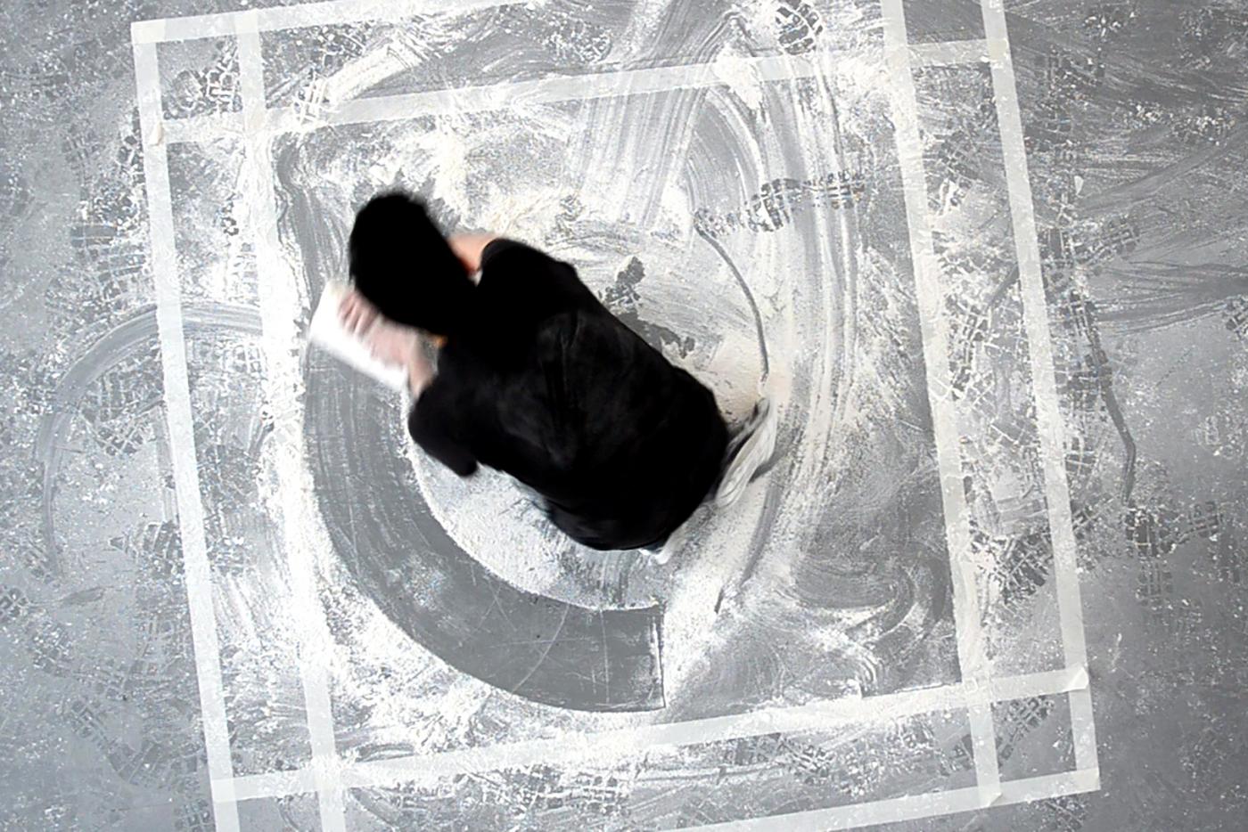
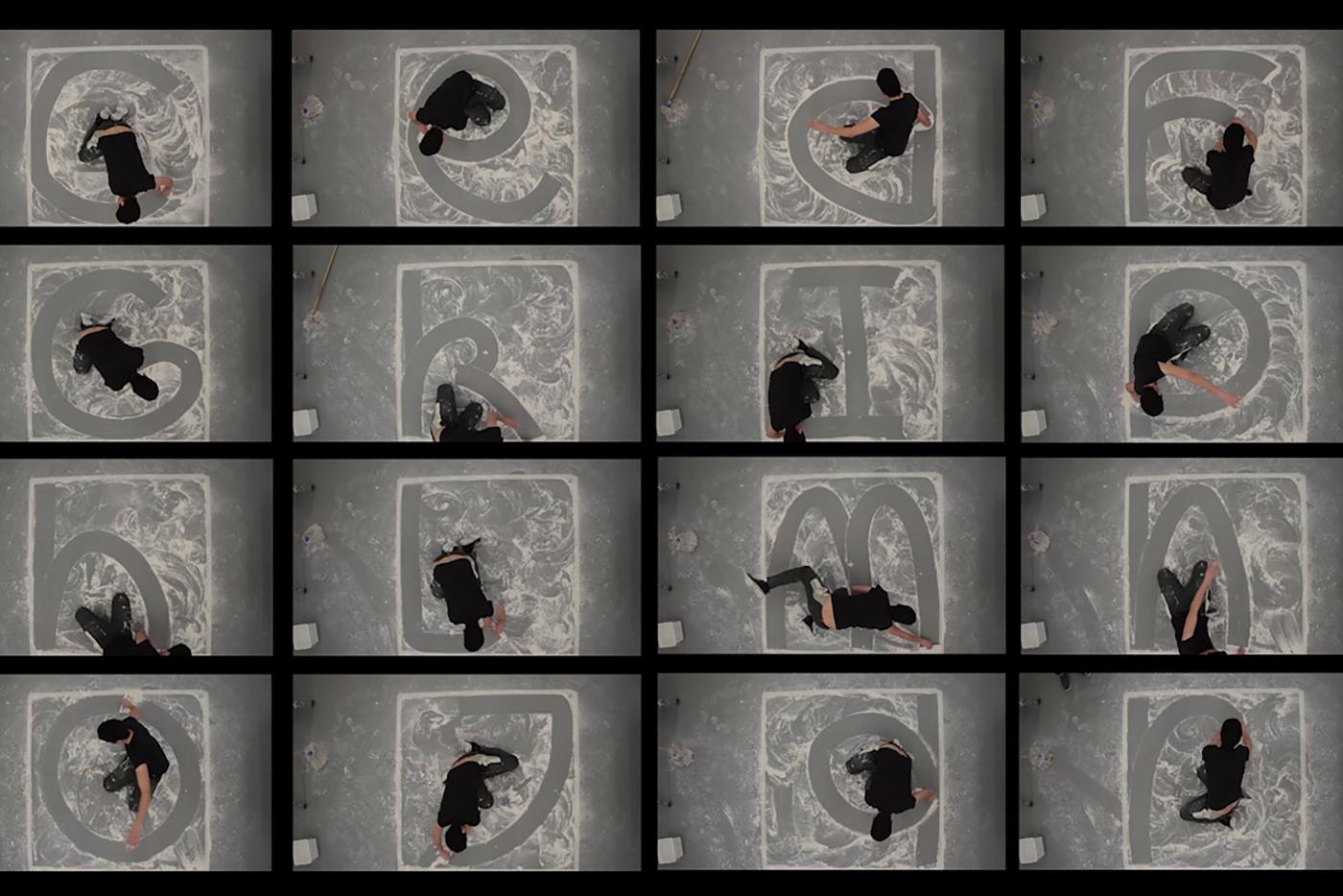
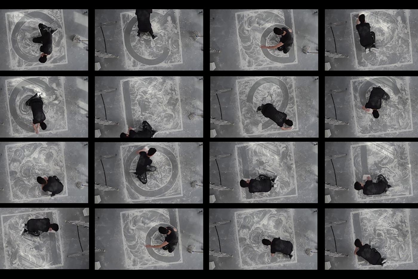
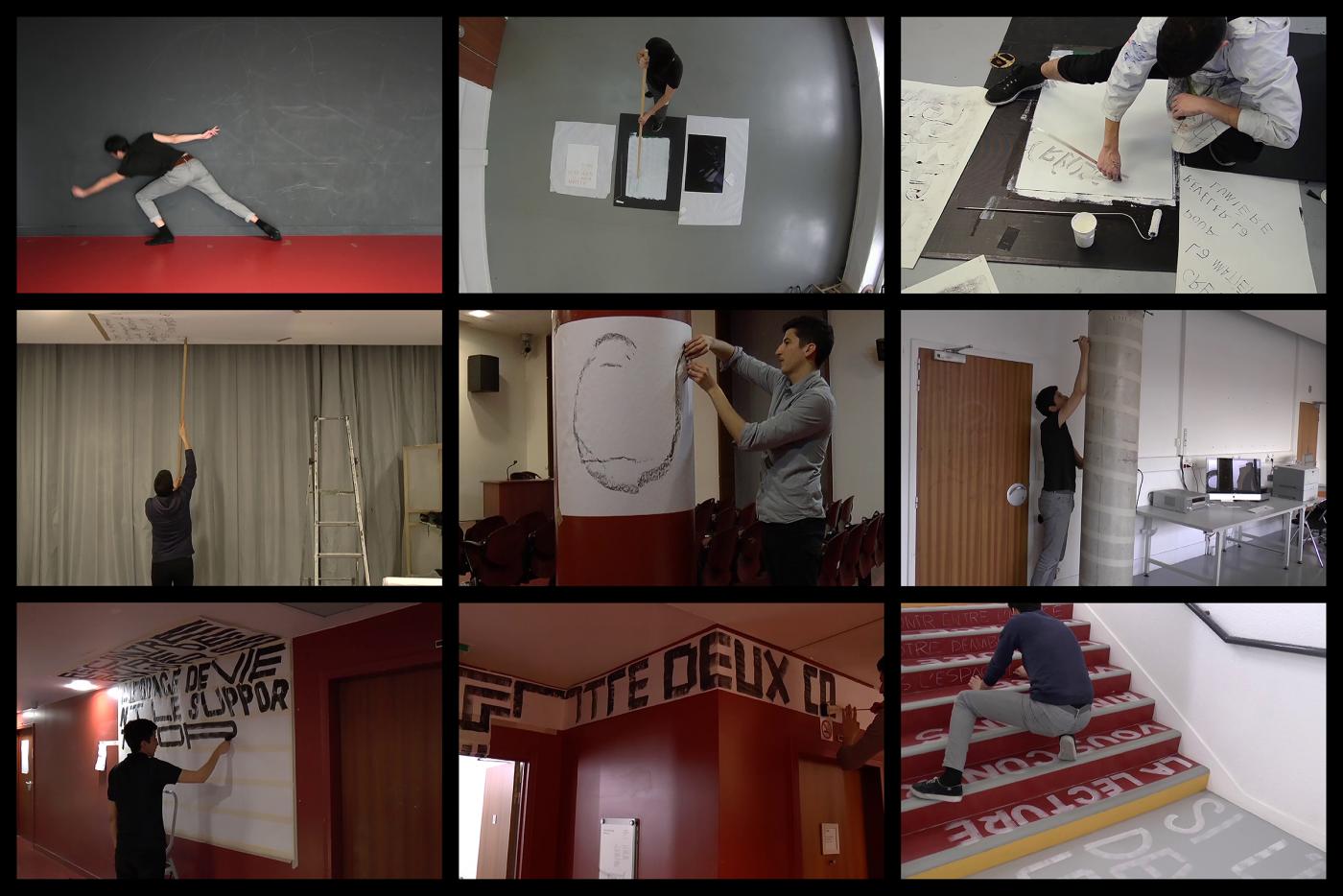
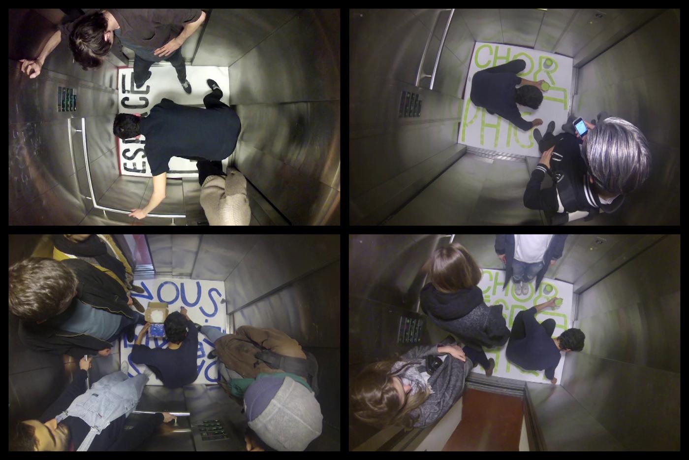
Diploma supported in EnsAD — Paris with the honnors. Summary: work on the link between the body and the space during the act of writing via the plastic experiment. What role plays the hand for the man? Which way of expression does it represent? Is not the hand the tool which creates the bridge between a precise intention and a gesture(movement)? The hand is the starting point of his work, bringing him little by little to imply the body during the act of writing. Therefore, the ladder of his work evolves. He leaves the page to confront with the space. How the body expresses himself and adapts himself under duress of a space? How does a space become a support of writing? How does the body become a producer of forms? This passage in the affable public place in his research for new constraints bound to the spatial context. He decides to invest a space which seems neglected by the municipality: the banks of the canal. So exploited, this place becomes a way to remove the commonness of a space and to make a support of writing.
- Ponctuation
- identité d'exposition
- Galerie Indépendante L'Amour
- l'Amour, Bagnolet
- identité d'exposition
- Galerie Indépendante L'Amour
- l'Amour, Bagnolet
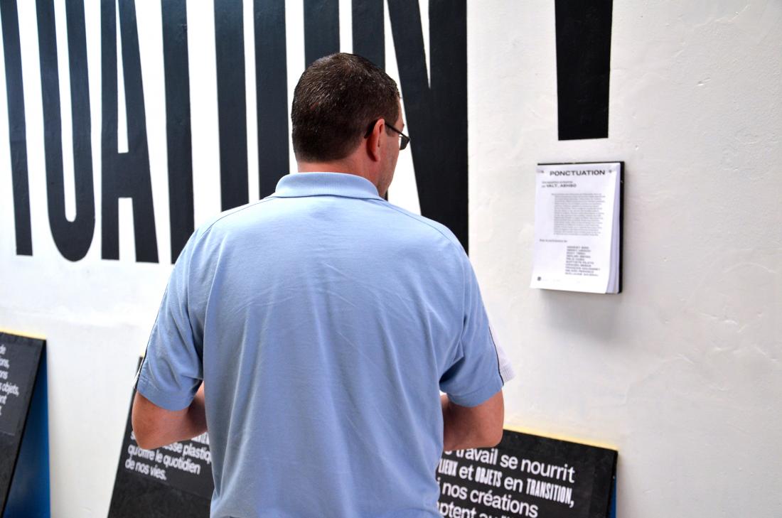
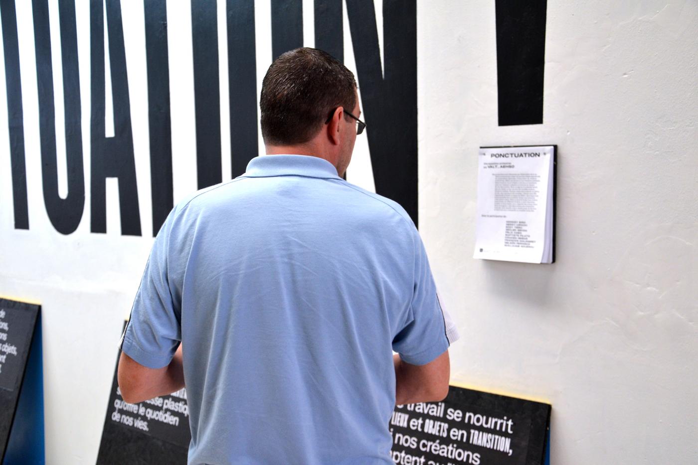
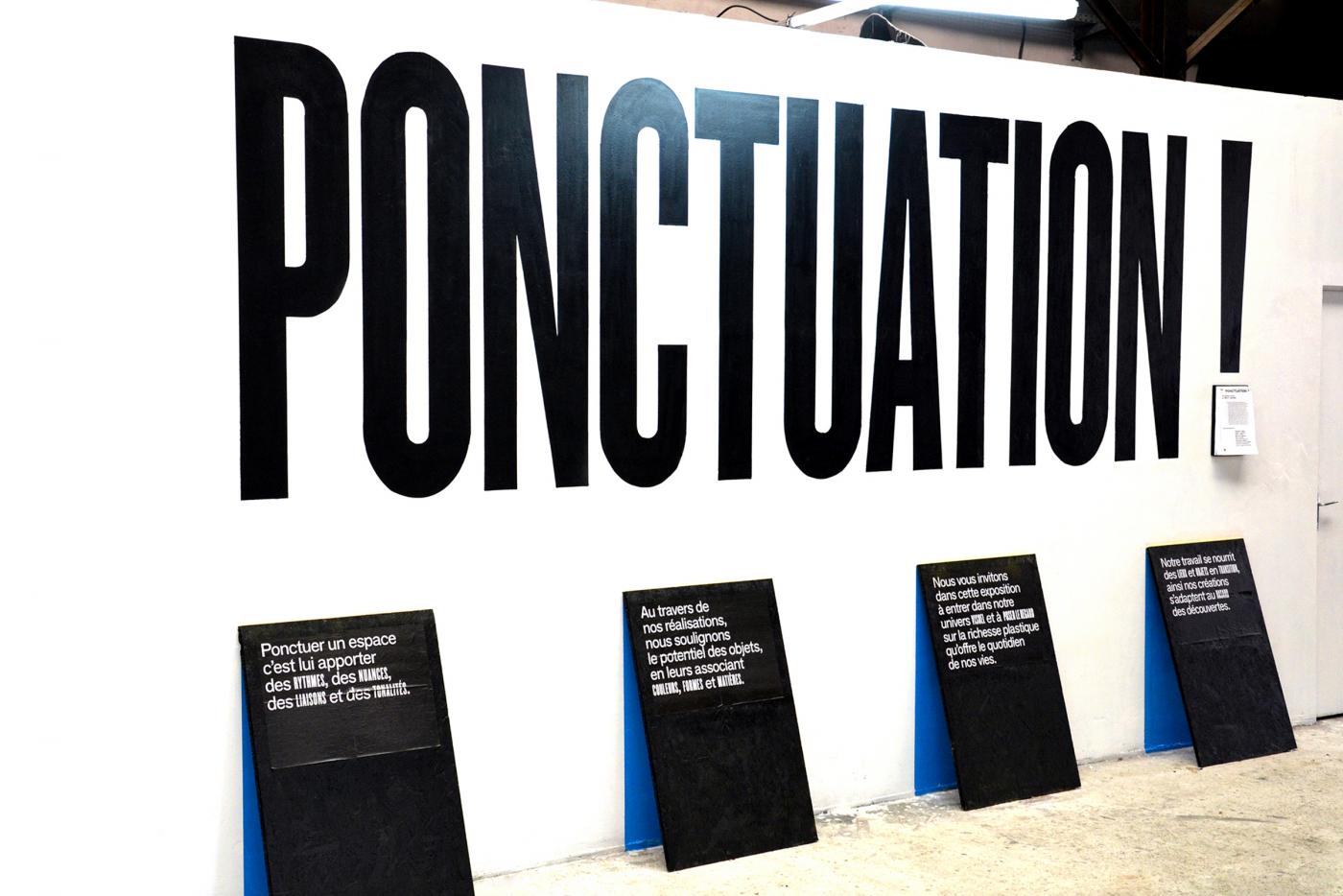
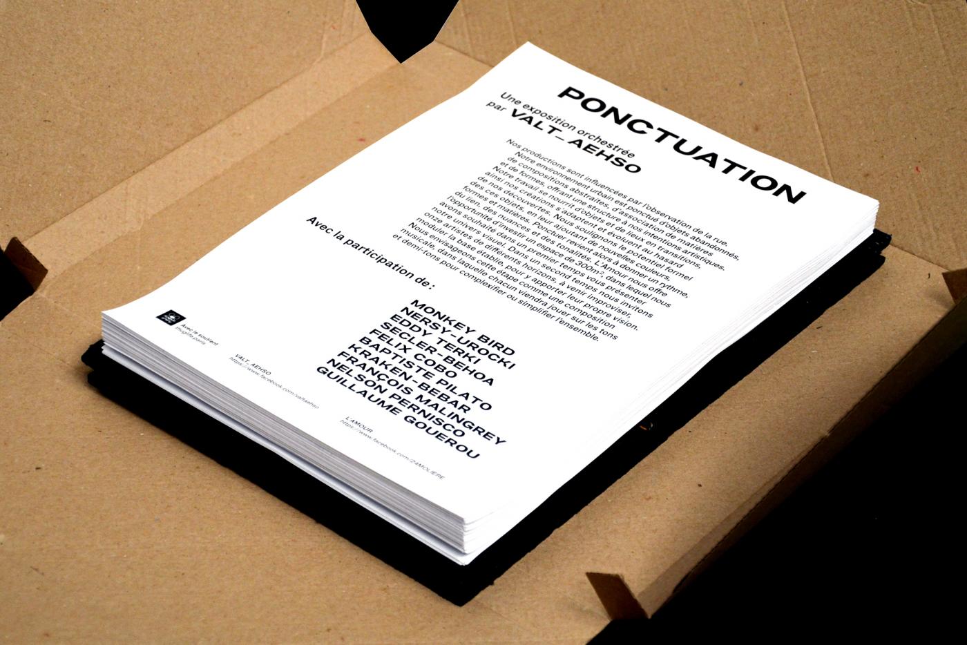
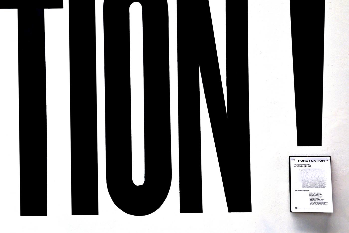
Ponctuation is an exhibition developed in L’Amour Gallery in Bagnolet by ValtAehso. Within the framework of this exhibition, opened for two weeks, we developed with ValtAehso a graphic univers to present the exhibition and his stakes. So, the typography installation punctuates too the entrance, presenting the various invited artists, and the principle of the exhibition. (opened during two weeks, Valt-Aehso invested L’Amour Gallery then invited of numerous artists to change their productions.
- The big Belgian exploits
- Édition
- Projet personnel
- Édition
- Projet personnel
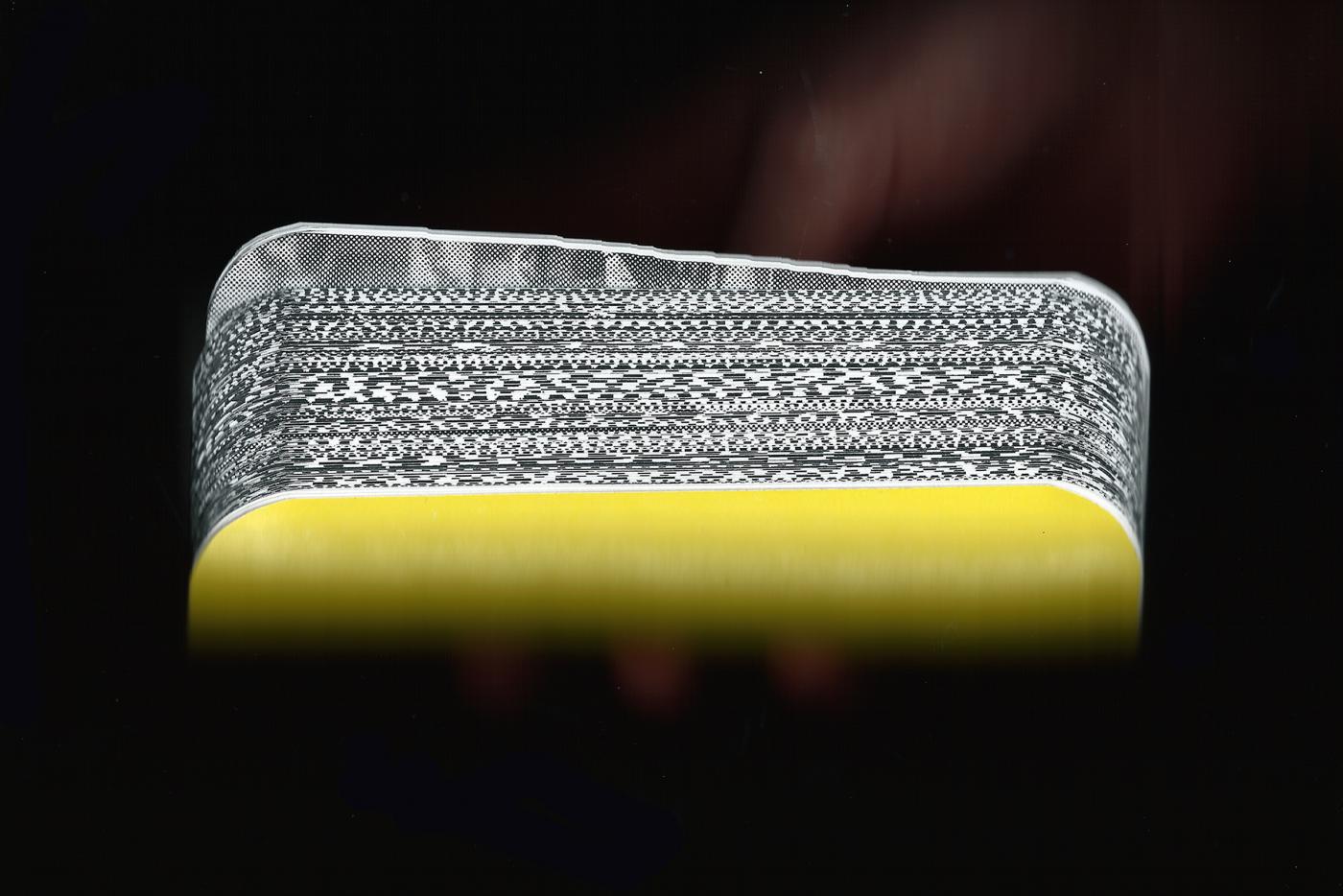
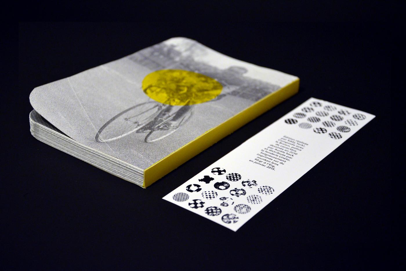
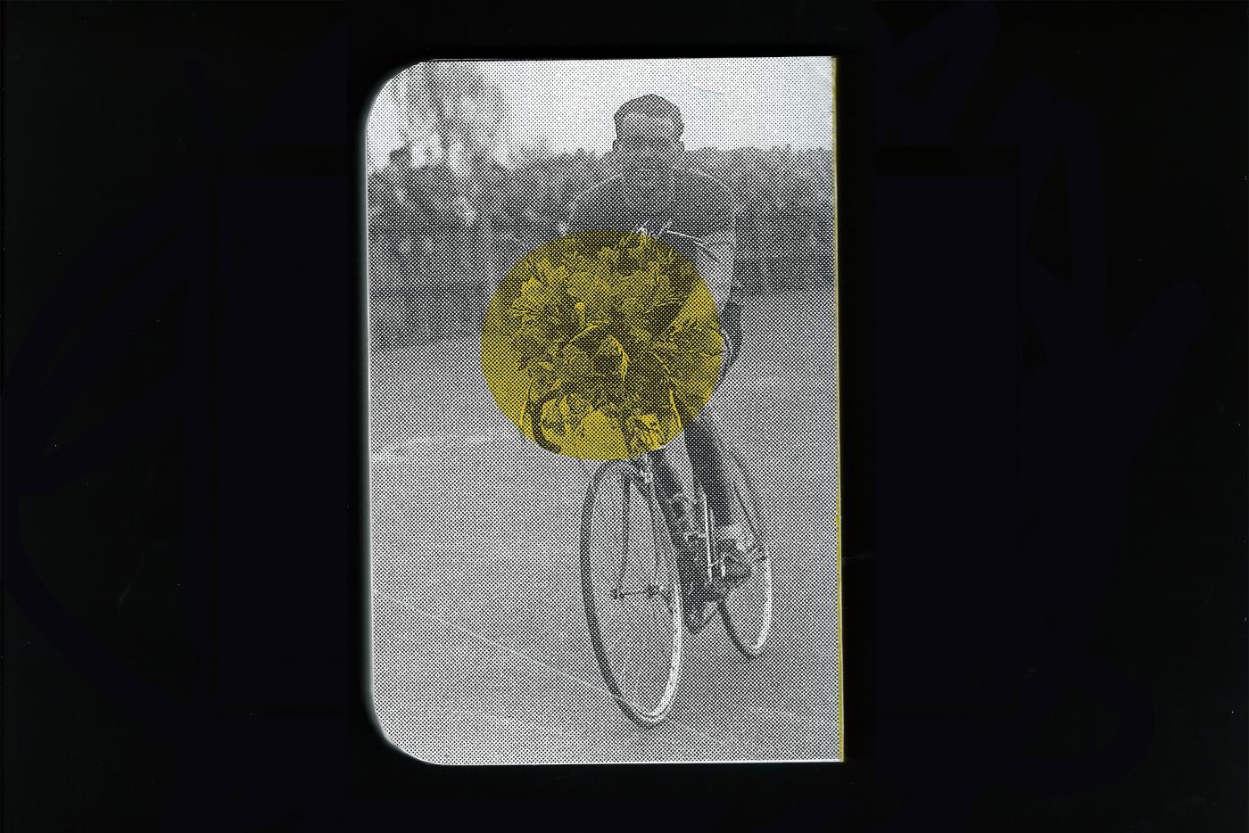
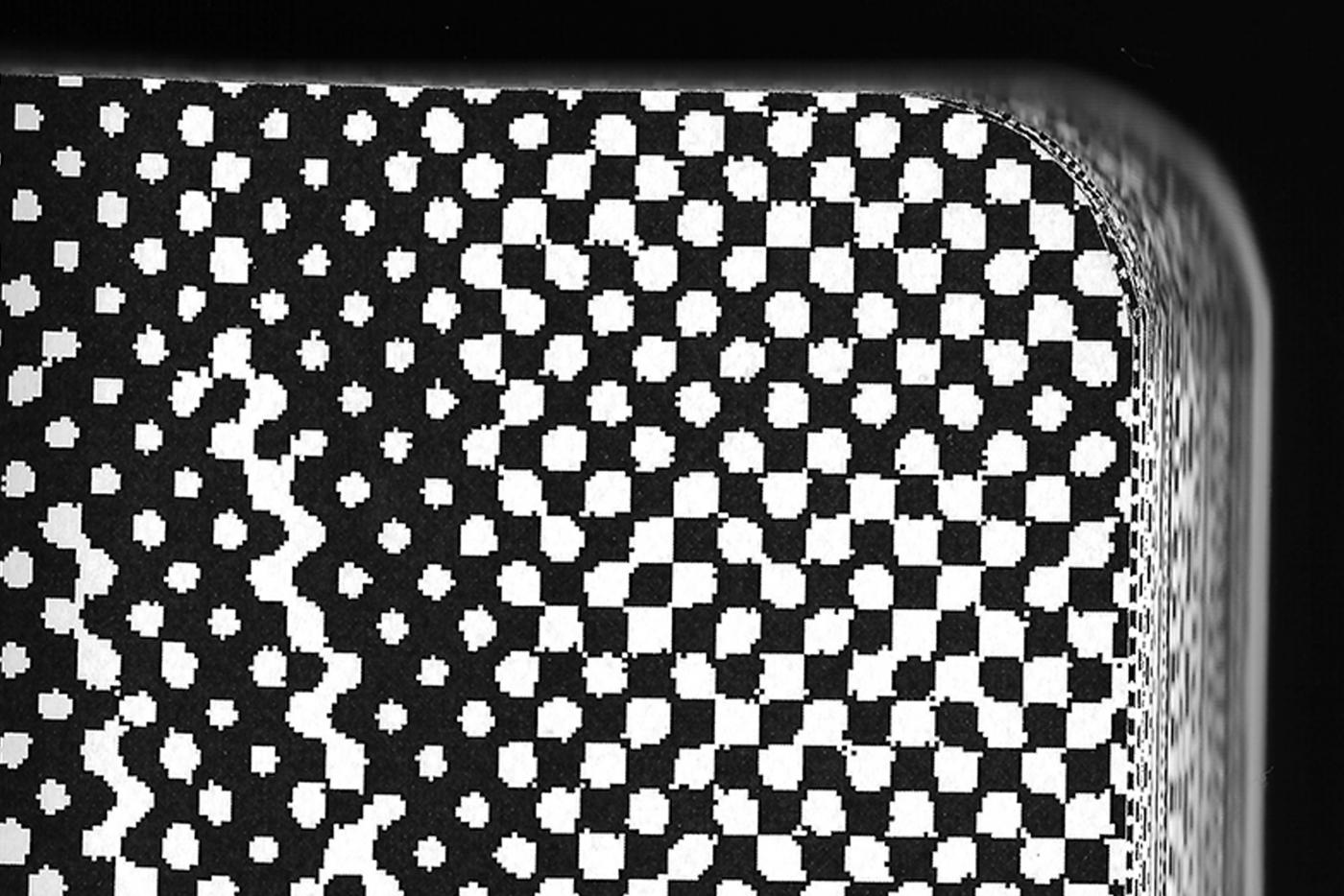
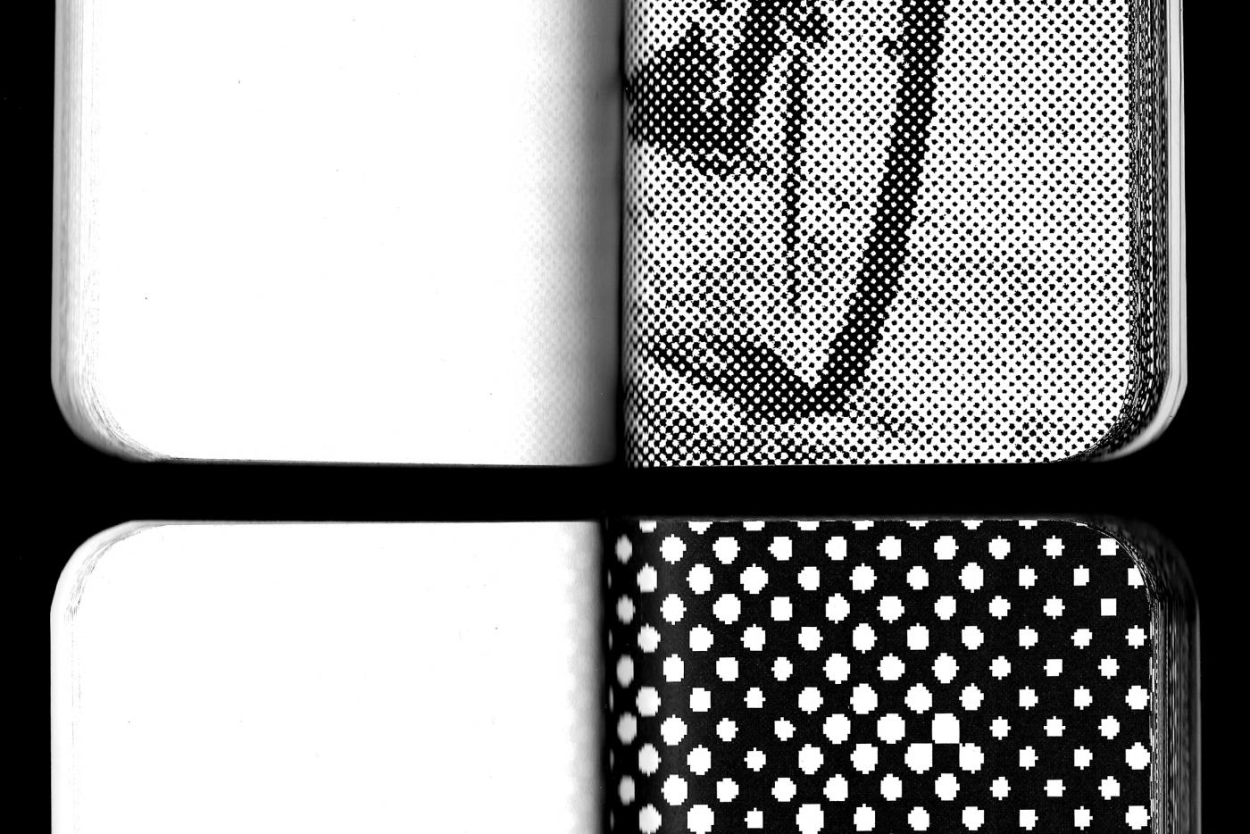
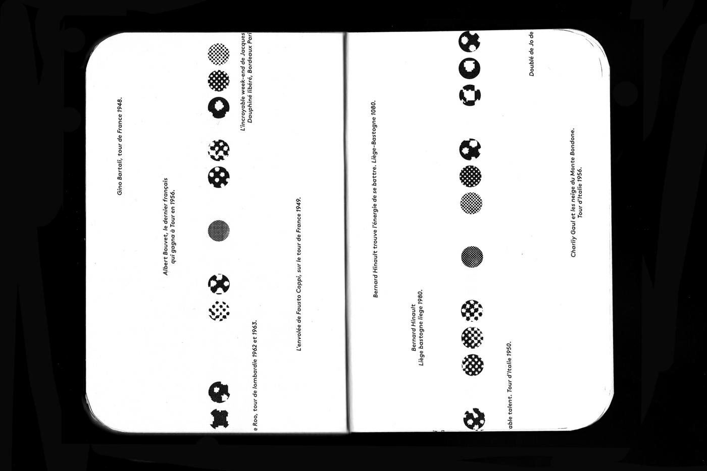
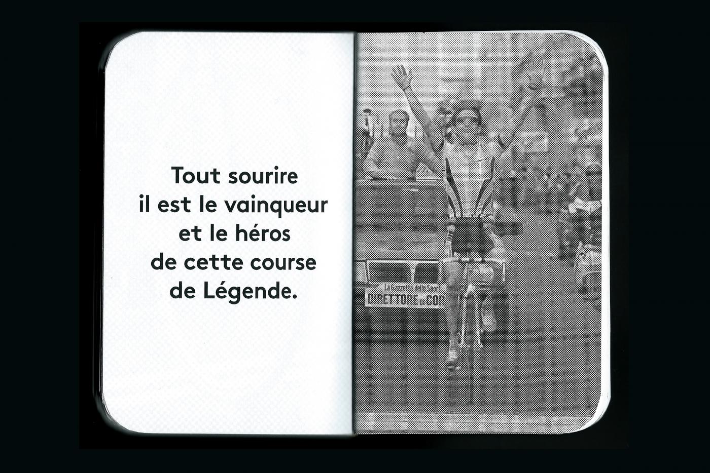
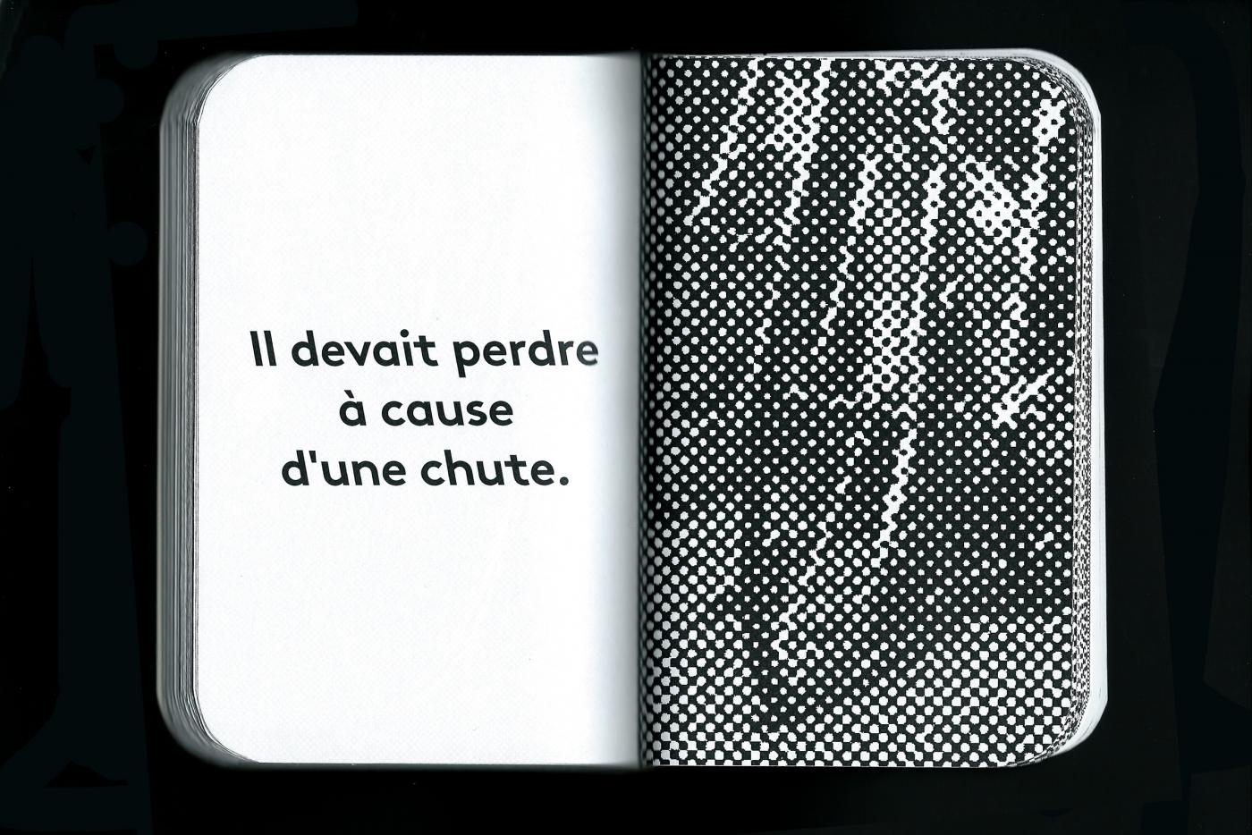
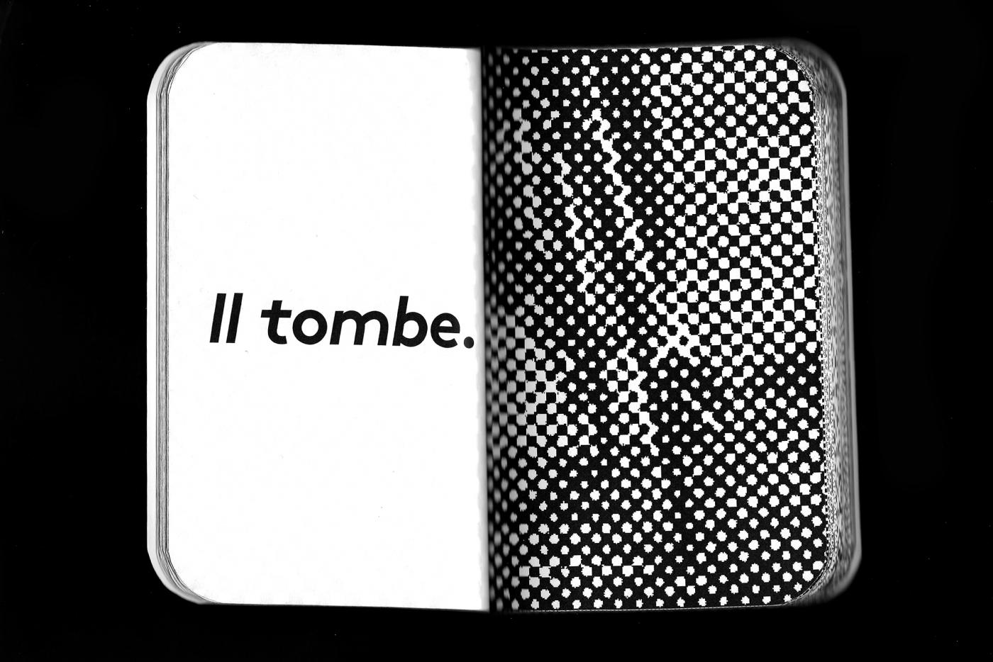
Edition presenting all the champions having contributed to the history of the Belgian cycling. Unique edition of 150 pages, handmade, printed in laser and serigraphy.
